
HbD Breakdown: St Louis Blues Heritage/Third Jersey
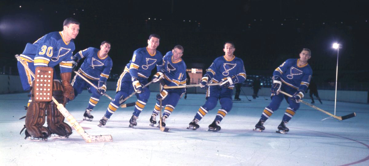
 After years of wandering through the Siberia of jersey design, the St Louis Blues continue their streak of putting out great jerseys. But this was an easy win for them: just take their universally beloved and admired 2017 Winter Classic jerseys, which was based on their original 1967 jerseys, and adapt them to the new Adidas Adizero template. For the Blues, it was really a no-brainer.
• More: HbD Breakdown: Blackhawks and Blues Winter Classic Jerseys
Part of design is knowing when to leave well enough alone. And in an off-season where we’ve seen almost entirely black jerseys that either (a) steal concepts from the bad jerseys from the past, or (b) badly modify concept from old jerseys, it’s refreshing to see a team that knows classic greatness when it sees it, and just leave it along. But what makes it so great? We’ll break it down after the jump.
• More: HbD Breakdown: Hurricanes and Coyotes Third Jerseys
• More: HbD Breakdown: Anaheim Ducks Third Jerseys
A Word About Heritage
I’ve seen the word “Heritage” thrown around a few times now regarding new third jerseys unveiled recently. While I haven’t seen any official announcement one way or the other, it would appear that the NHL is moving towards what the NBA established last season with naming their jersey “editions”: Association, Icon, Statement, and City. I’m not against it at all, and I really like how Nike zagged (scaling up with four specific sets of jerseys) when Adidas zigged (scaling down to two standard jerseys) with releasing their first attempts at developing new jerseys for their respective leagues. The NHL/Adidas could use some of that energy/innovation.
It would just be nice to have some clarity going forward. Is the “Heritage Jersey” a new designation for a set of jerseys, different from stereotypical third jerseys? Or is it just being thrown around whenever convenient?

Long-Time Reader, First-Time Collar
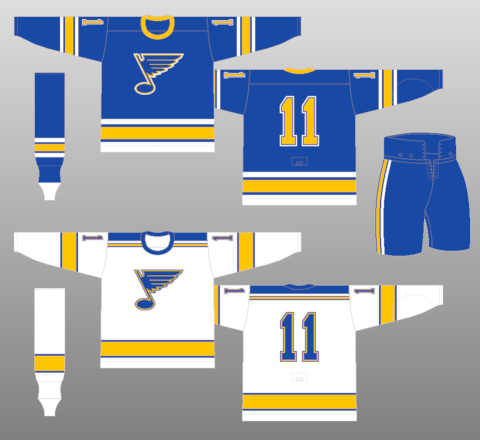
As mentioned above, there’s nothing particularly new about this jersey, which is a throwback to their 2017 Winter Classic jerseys, which was a throwback to their original 1967–73 blue jerseys, albeit with a few very minor differences.

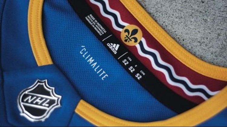
While the Heritage Classic mimicked the original’s ribbed collar (in honour of hockey jerseys originally being actual woollen sweaters), the new version doesn’t have that ability (yet?) because of the special Adizero collars, instead using a narrow yellow stripe to at least maintain a visual consistency throughout the three jerseys.
 While it may have been interesting to have either a thicker yellow collar that utilized the entire collar area, or a combination of thick-yellow/thin-white to mimic the sleeve and bottom stripes on the jerseys, the single thin yellow seems to be the better choice: it’s closer in size to the originals and it maintains the simple and minimalist approach of the rest of the jerseys.
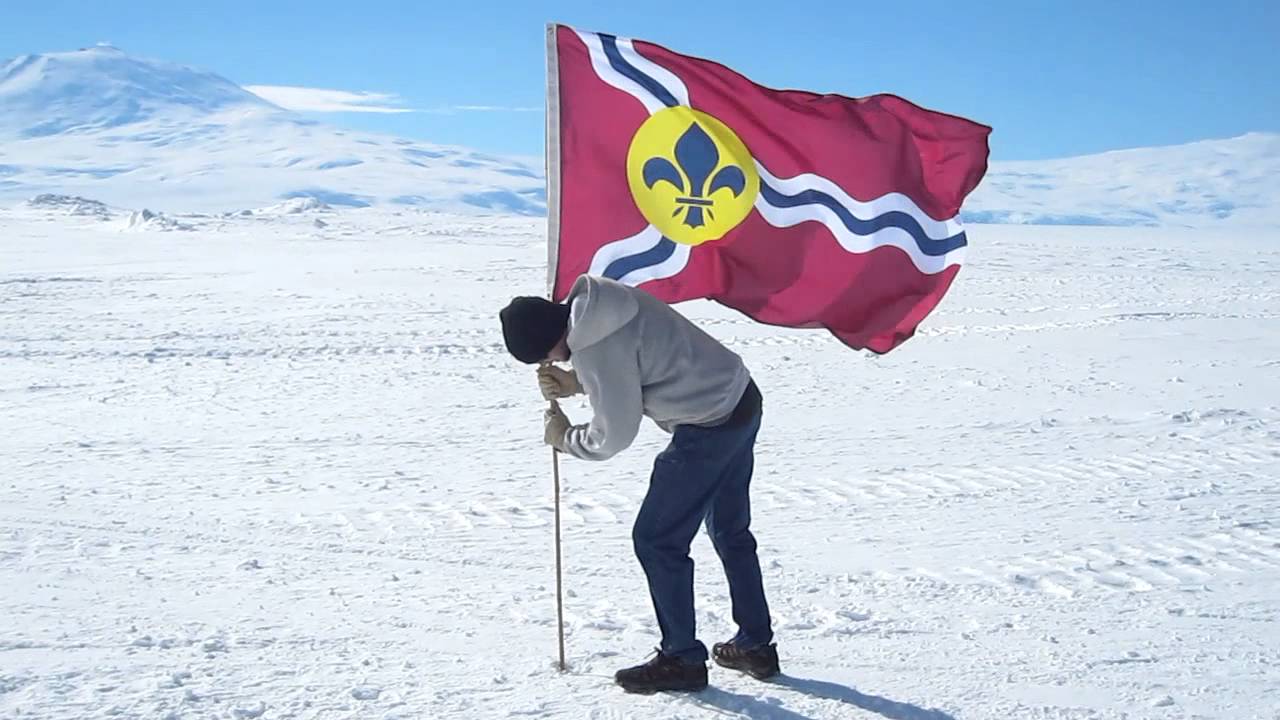
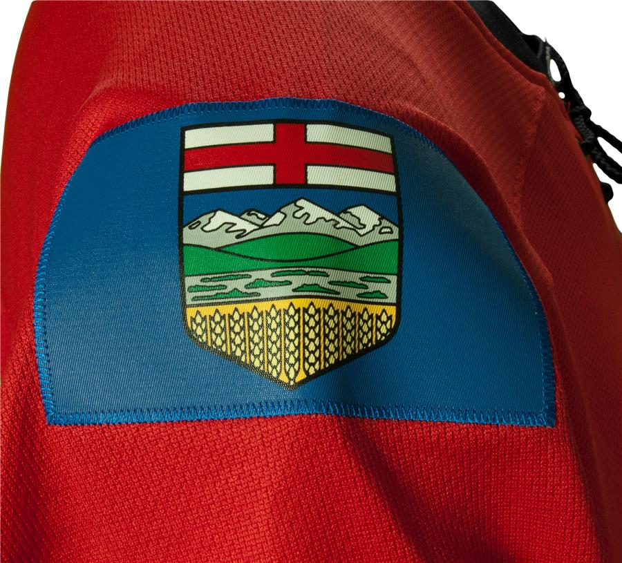
The other collar detail is on the inside, with the unique and charismatic St Louis city flag integrated into the jersey design. While not a new feature (as they’re also in their current jersey designs), it’s nice to see that element included in these Heritage jerseys, as it’s integrated smartly and creates a subtle element that’s as unique and charismatic as the flag. And since it’s so off-brand aesthetically, keeping it hidden inside the collar is a smart move. (Looking at you, Calgary.)
 Well, the rest of the jersey is pretty much identical to the 2017 Winter Classic jersey, so I’m going to be a lazy asshole and heavily borrow from that original post going forward.
You’re a Darker Hue, My Baby Blue
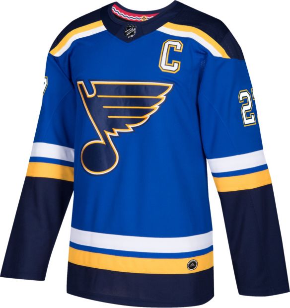
The other thing that immediately sticks out is the colours of the jersey. The current Blues jerseys use two tones of blue – a royal blue and a darker navy blue – both of which are noticeably darker than the blue tone used on this Heritage jersey, which can be best described as a dark baby blue. And it’s wonderful.
It’s hard to tell from what can be found online how close this blue is to the original 1967 jerseys (or even the 2017 Winter Classic jerseys), but they seem to be relatively equivalent. And, of course, there’s only one tone, with the Blues’ logo (which is awesome by the way) the same colour as the rest of the jersey. It’s a minor difference from their current jerseys – which always has the navy note on the blue jerseys – but it also adds to the historical aesthetic of the jersey.
• More: BTLNHL #4: St Louis Blues
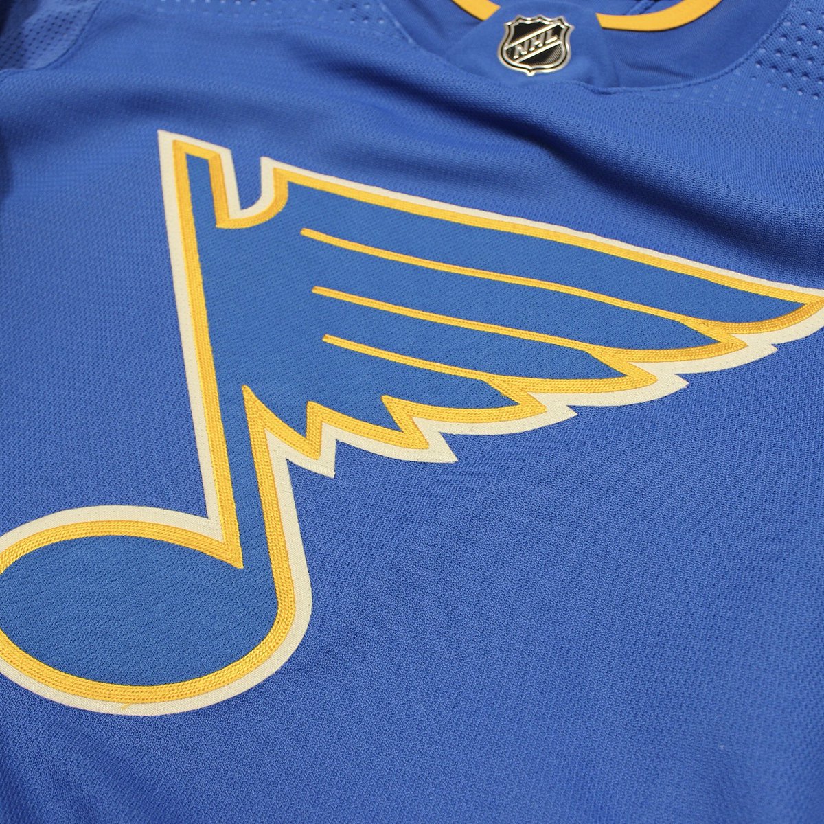 Plus, it’s a unique blue within the league, not seen since the days of the Nordiques. In a league that’s inundated with navy blue so dark it’s almost black, it’s incredibly refreshing to see a blue that stands out from the crowd.
Spot-on Stripes
The jersey’s striping is where it deviates from St Louis’ original 1967 jerseys most obviously, namely at the bottom of the jerseys.
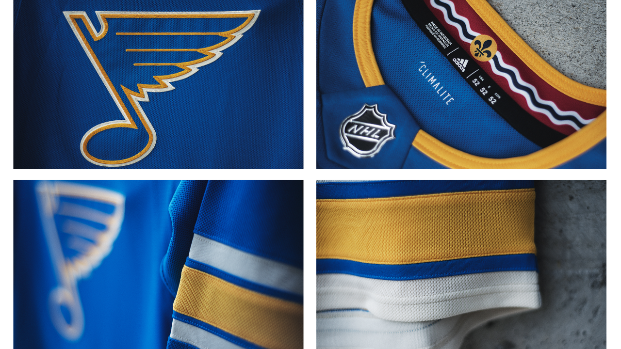 The original jersey has a lower white stripe going all the bottom edge of the jersey that’s much thicker than the white stripe above the yellow one. These new Heritage jerseys (like the Winter Classic ones) keeps it consistent in size with the upper white stripe. It was the right decision.
The sleeves are pretty much identical to the originals. My only complaint about the jersey’s stripes are that they’re slightly inconsistent, with the white stripes on the sleeve being thinner than the ones along the bottom. But that’s a pretty minor criticism.
Final Verdict
Love it. The striping is classic old-school aesthetics. The colours are fantastic. The Adizero collar – while not necessarily “Heritage” – made the best decision possible given the possibilities. And the logo is awesome, as always. For a Heritage jersey, it hits all the right notes.
Agree? Disagree? Let us know in the comments or join the conversation on Twitter, Facebook and Instagram!


This is a real nice jersey. Agreed that it’s nice to see a blue that isn’t navy. Makes me think Buffalo should go back to their lighter blue as well. I think they look too similar to their rival Bruins at the moment.
As for the heritage and alternate labels on the jerseys: I’ve read that heritage can only be worn a maximum 6 times for the season and can be replaced after the season with another jersey. The alternates can be worn up to 12 times per season and have to be kept for 3 seasons.
Thanks for the info, much appreciated!
[…] • More: HbD Breakdown: St. Louis Blues Heritage / Third Jersey […]
[…] • More: HbD Breakdown: St Louis Blues Third Jersey […]
[…] More: HbD Breakdown: St Louis Blues Third/Heritage Jerseys• More: HbD Breakdown: Blackhawks and Blues Winter Classic […]
I needed to compose a similar (or it appears comparable, based
on the info given) study newspaper back in 2015 when I was a student.
Gathering the necessary information was quite hard
and challenging. However, you were able to show the subject very
accessible and clear. Anyways, it was interesting to refresh a few things and discover
out something new.