
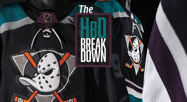
HbD Breakdown: Anaheim Ducks Third Jersey
 Leave it to Anaheim to take one of the most beloved, fawned-over, nostalgia-drenched jerseys in the history of the league…and fuck it up. They already have one of the worst jersey sets in the league thanks to awful colour combos, unnecessary and cloyingly inconsistent striping, and now they’ve managed to ruin their historical jerseys as well.
I know. “Oh, tell us how you really feel.” I will, after the jump.
🎶I See an Eggplant Door…🎶
First a disclaimer. I’m not a huge fan of the original Mighty Ducks jersey that this new one is based on, so I’m already coming in from a slightly biased state. But, most of this is based on their corporate-schlocking logo that’s the focal-point of the jerseys, and I’m glad it’s (mostly) gone. But the unique colour scheme and unconventional angled striping was something worth…wait for it…quacking about. Yes, I am a dad. What of it?
• More: Worst to First Jerseys: Anaheim Ducks
So, what’s changed between these jerseys and the originals that they’re based on? Well, a whole shitload actually. Including some incredibly obvious things, like how it’s not an eggplant-coloured jersey anymore.
Before the Ducks announcement, there’s been three third jerseys revealed so far this off-season, and they’re all black. Hearing rumours that the Ducks were going to bring back their Mighty jerseys this year, it looked like we’d get a reprieve from the emo/goth-influnced return of a black jersey dominance in the league…and then this happened.
• More: HbD Breakdown: Hurricane and Coyotes Third Jerseys
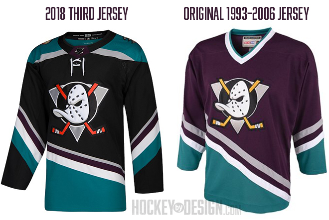 The famous teal-and-eggplant is now teal-and-black (oh, hai, Sharks!) and – like a veggie stirfry – with a tiny bit of eggplant throw in.
Why? The only reason that makes any sense is because – for better or worse – black is a dominant colour in the Ducks’ colour scheme today. But, if they’re going for consistency across their jerseys, I hate to break it to you fellas, a teal/black/eggplant jersey with a cartoon duck goalie mask doesn’t look anything like your current jerseys anyway.
Is it because of some misguided attempt at toughness (black = intimidating)? THERE’S A CARTOON OF A DUCK ON IT. Come on! And besides, didn’t we go through all this already in the ’90s and ’00s?
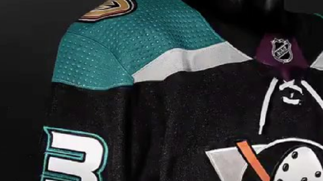
Against the backdrop of a black jersey, the eggplant is barely distinguishable and barely used now as well. It’s a filler stripe between silver and white stripes, and placed on the key-shaped league logo holder at the collar. Nobody would call this an eggplant-teal jersey.

Stripes Spotted
The striping on the jersey also got an update, becoming more erratic, inconsistent and haphazard than its predecessor. This is presumably – like the choice of black – to more closely align this jersey with their current jerseys, which has already been established as nonsensical. Plus, they already have one of the worst uniform sets in the league, so why do they want to copy that anyway?
• More: 2017 NHL Brand Power Rankings
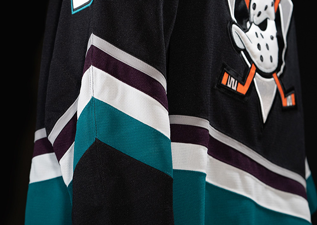 Giving credit where it’s due: I do like the more unconventional technique of having the teal go all the way to the bottom on the body of the jersey, but not on the cuffs. It breaks up the teal in a more interesting and unique way that adds more movement and flow to the jersey overall.
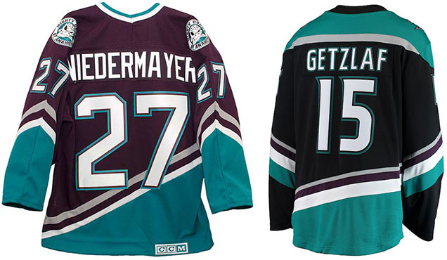
As well, the angle of the striping is a lot less dramatic, which was a good choice, as it doesn’t awkwardly overlap the numbers on the back of the jersey like the original version did.
See, I can say nice things.
The Yokes on Them
Another big difference between the old and new versions is the introduction of the teal-and-silver-striped shoulder yokes. (Oh, silver is referencing their 25th anniversary this season, if you didn’t know. So, it’s not just a hangover from the original edition of the jersey.)
 The designers of the original jerseys knew that the unique angled striping and unconventional colour palette – along with smartly having a white collar to add contrast at the top of the jersey – was enough to balance the whole thing out nicely.
With these new jerseys, they decided to add more colour up top. My guess is for two reasons: (1) the newly black collar left things looking bare up top, and (2) to balance out all that blackness. The course the original jersey took is much better, as these new jerseys then introduced another inconsistent stripe pattern with the single silver stripe, and unbalance the visual aesthetics of the jersey.
Colour Everywhere
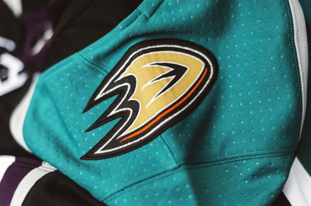
Finally, there’s the decision of taking a teal-black-eggplant-silver-white colour scheme and then add orange and beige to it. The orange is there in the cartoon duck logo, with the original yellow/gold hockey sticks switched to orange, because Orange County, or “the OC”, and it’s the Ducks other-than-black dominant colour in their visual brand.
 And then the beige comes in on the shoulder patches, with the current Ducks logo placed there, creating yet another visually incoherent addition to the jersey.
I can live with the orange hockey sticks. It’s somewhat logical (the OC) and in tune with the original jerseys having an oddball colour thrown into the mix in that spot. But just like the Flames Alberta flag patches, the Ducks’ logo patch sticks out and looks bad. Using an alternative eggplant-coloured logo instead of beige would’ve been cool. You could even keep this thin stripe of orange in there.
Final Verdict
As mentioned, I’m not as big a fan as most on the original jerseys that these new ones are based on, but there’s no question the originals are superior in almost every way. While trying to create a modern and exciting update to the original jerseys, almost every change imposed on these new jerseys have diminished the lustre, appeal, and nostalgia that made people love the originals so much. From inconsistent striping, to the odd choice to black as a base, they should’ve just stuck with the cleaner version that worked originally.
Agree? Disagree? Let us know in the comments or join the conversation on Twitter, Facebook and Instagram!


I agree, these new jerseys are horrible. The first thing I thought when I saw the colours was SJ Sharks. Now with the silver it’s basically a combo of their 2 biggestst rivals in LA ans SJ. Did they not notice that when designing them?
As a side note, I thought they were supposed to be getting a new jersey set for this season with orange as the predominant colour?
Yeah, not sure. I guess they ditched that orange jersey idea, or they’ll just add a fourth jersey at some point.
Hahaha, I guess so. It’s not really the biggest loss, I suppose. Until they sort out a colour scheme that works any jerseys they design are going to look rubbish. Those Orange 3rd jerseys from a few years back weren’t the most pleasing on the eye.
[…] • More: HbD Breakdown: Anaheim Ducks Third Jersey […]
[…] • More: HbD Breakdown: Hurricanes and Coyotes Third Jerseys • More: HbD Breakdown: Anaheim Ducks Third Jerseys […]
[…] • More: HbD Breakdown: Anaheim Ducks Third Jersey […]