
Top 5: Best Designs of 2017

Image: thumbsandammo.com
Christmas is over. 2018 is right around the corner, so it’s that time of the year where everyone and their top-5-favourite-dogs-of-the-year are counting down the best and worst lists for 2017. We’re not immune to such things. In fact, we do it on a semi-regular basis.
So today, we’re got the Top 5 Best Designs of 2017 in the NHL (we tackled the Worst earlier). Remember, these are the Top 5 Best Designs that were announced in 2017. Not all of them have necessarily been used in a game yet or some were excluded from this list because – even though they were used in 2017, they were announced in 2016.
• More: Top 5: Worst Designs of 2017
• More: Top 5: Best Designs of 2016
 Like the rest of their hockey jerseys from the past few seasons, the Wild’s new home jerseys continue a trend of finding the balance between modern and historical aesthetics in a way that both embraces the past and the future at the same time as well as finding the sweet spot between a jersey between too minimalist or too cluttered. Ask any designer: finding these balances are not easy things to pull off, but the Wild have been making it look easy lately. While there’s a few minor complaints, and the fact that it’s sad to see some of the previous jerseys fade into their archives, they replaced it with something that really works well and makes the visual branding a little more consistent and cohesive. It’s hard to see these as anything but a win for Minnesota.
• More: Hbd Breakdown: Minnesota Wild Home Jerseys
 Their new Adizero home jersey is essentially the love-child of their previous jerseys and their original jerseys, with the minimalism of their recent jerseys scaled back a bit, but not to the tacky and over-complicated point that they were before. No superfluous grey striping, no shoulder yokes, but yes to the hurricane-themed waist stripe, extra striping, as well as bringing back a ton of black. The hurricane-stripe works way better here, because it seems the good people at Adidas are readers of this site. On our Hurricanes’ Worst to First Jerseys post, I opined about how it would work better if it was more subtle, and that’s exactly what they did. And as expected, it’s way better. Less obnoxious, less demanding of attention. It they added it to the sleeve stripe as well it probably would’ve worked. While the previous jerseys were accused of ripping off the Canadian teams, these new ones are much more distinctive for Carolina and closer to their glory days. I’m usually a fan of more minimalism, but these are justified to move away from that and approached it well.
But oddly, they didn’t really change their road jerseys at all from the previous season.
• More: HbD Breakdown: Adidas Adizero Jerseys
• More: Worst to First Jerseys: Carolina Hurricanes


With the release of the new Adizero jerseys, Colorado stepped back into their jersey history, returning to the angled mountain-esque striping of their original jerseys. It’s one of the few jersey experiments from the ’90s that actually worked well, creating something distinctive and relevant for the Avs. All hail its return! For me, they’ve actually improved on the original jerseys here by including only one outline on the angled areas of blue, simplifying the original design while maintaining its distinctive nature. Gone (thankfully) is the Reebok-era piping. The only thing I’d like to see is blue striping instead of grey on the road white jerseys. But it’s still easily one of the biggest jersey improvements from the Adizero release.
• More: HbD Breakdown: Adidas Adizero Jerseys
• More: Worst to First Jerseys: Colorado Avalanche

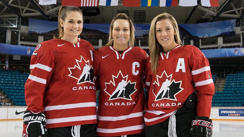
Following in the footsteps of one of the most polarizing masks of last season, Luongo took a stark and minimalist approach to his bucket for the new season. The artist is assumed to be Lu’s regular painter, Stephane Bergeron. The crisp white bucket, like Jake Allen’s Blues mask from 2017, features subtle renderings of the Panthers’ logos on each side, set off by a sh!t ton of gold foil throughout the design. The team’s primary logo is the showcase piece on the top of the mask, paired down into a single color variation and highlighted in a blue border. The blue lacquer cage and blue border on Bobby’s #1 on the chin tie the whole design together in a really cool and well-balanced way. What could have gotten gaudy real fast was kept tasteful and clean, so bravo on a successful and standout design.
• More: HbD Masks: 2017–18 Eastern Conference Preview
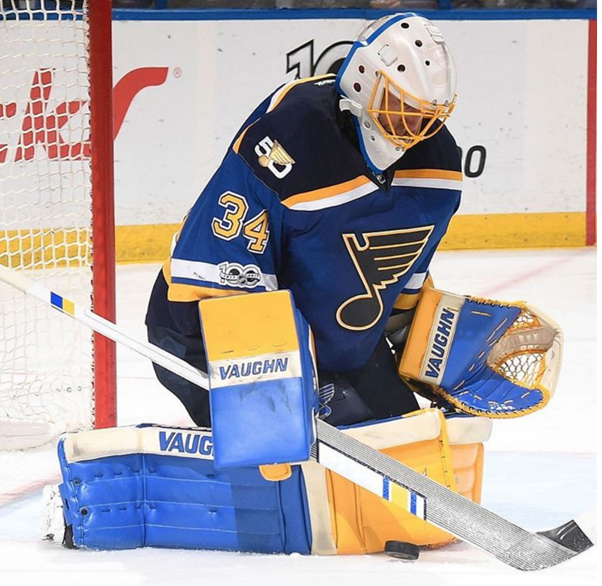
 There wasn’t much to sing huge praises about (design-wise) from this past year, but Adidas hit it out of the park with their first stab at some Winter Classic jerseys. Simply, they’re fantastic. They both blend both modern and traditional aesthetics really well while infusing the jersey with lots of character and intensity. This mix of classic hockey jersey aesthetics with contemporary twists perfectly commemorates what the Winter Classic is all about. For the Sabres, it could be the best jersey that they’ve ever worn. For the Rangers, it’s unique, it’s bold, it looks great, and it just needs to lose that chest patch. Both are easily superior to their previous Winter Classic jerseys, and they were pretty nice ones too.
• More: HbD Breakdown: 2018 Winter Classic Jerseys
Agree? Disagree? Let us know in the comments or join the conversation Twitter, Facebook and Instagram! And if you’re interested, we’re now on Pinterest too.


[…] today, we’re got the Top 5 Worst Designs of 2017 in the NHL. We’ll tackle the Best Designs as well, but Worst is first because you always pick the bad news before the good news when given […]
[…] • More: Top 5: Best Designs of 2017 […]
[…] More: Top 5: Best Designs of 2017• More: Top 5: Worst Designs of […]
[…] • More: Top 5: Worst Designs of 2018• More: Top 5: Best Designs of 2017 […]