
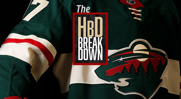
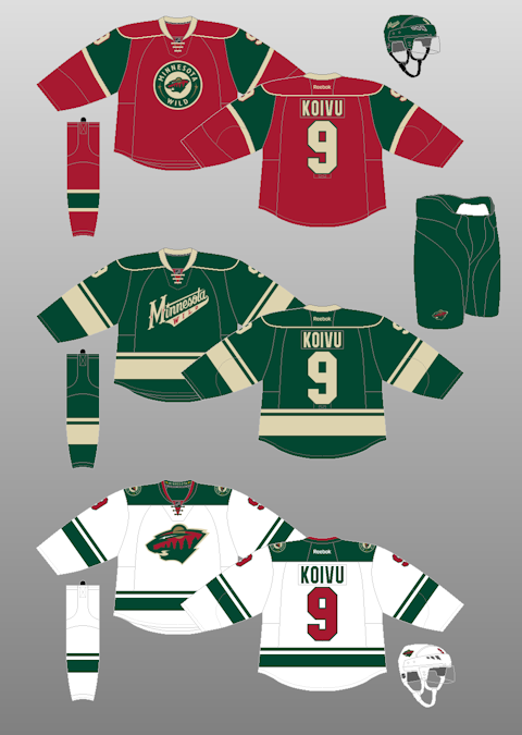
HbD Breakdown: Minnesota Wild Home Jerseys
 (photo via Minnesota Wild/NHL)
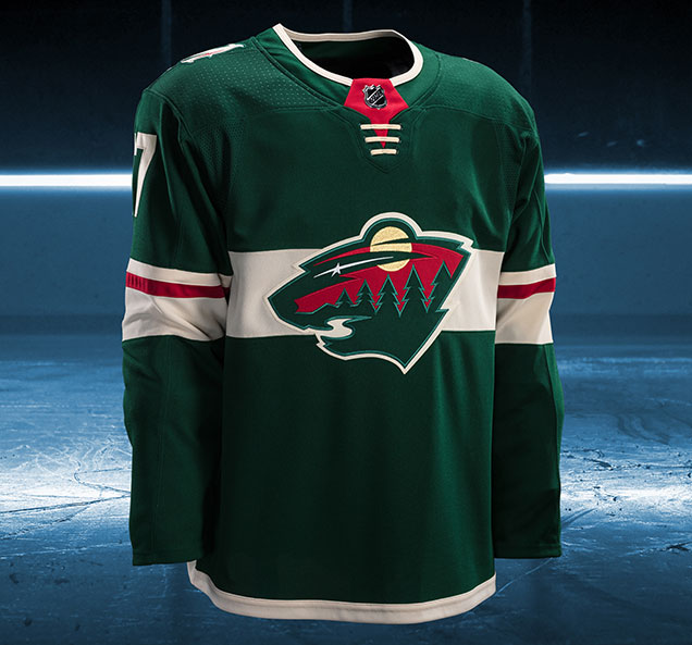
The only team that received what I would call a major re-design of their jersey at the Adidas Adizero unveiling was Minnesota. The Wild were actually one of the teams that we listed as the Top 5 teams that should dump their home jersey and wear their thirds full-time. But instead, as we know, they came up with something completely different.
• More: Top 5: Third Jerseys to Replace Home Jerseys
I’m a bit torn on this one. On the one hand, their previous jersey set was lit, if a bit disconnected. They were all designed somewhat independently of each other, without a really noticeably consistent design throughout all the jerseys. The third jerseys did have some similar striping to the road whites, but a totally different heritage aesthetic overall. And all three jerseys featured different logo crests. But they were all pretty wonderful independent of each other.
On the other hand, a consistent look would be great for the visual brand to give it a more clear direction moving forward. But can these new jerseys do that? We’ll find out, after the jump.
 Off-White Stripes
The most noticeable change to the jersey is the chest stripe, which has become all the range these days after decades upon decades of being owned by the Canadiens. First, Ottawa added a two-striped chest band with their alternate jerseys (and Heritage Classic jersey). Then Florida added one for their primary jerseys in last summer’s visual overhaul. And now Minnesota brings a solid off-white stripe to the party.
What it does is give a background to allow a green logo stick out more on a predominantly green jersey without multiple outlines, as hockey teams are somewhat wont to do. Instead, it’s a single off-white outlines that completely merges with the chest stripe (aside from the change is materials and stitching of course). The stripe is also just large enough to sneak in the negative space where the bear’s wolf’s animal’s mouth is, which probably helped determine how wide the stripe would be.
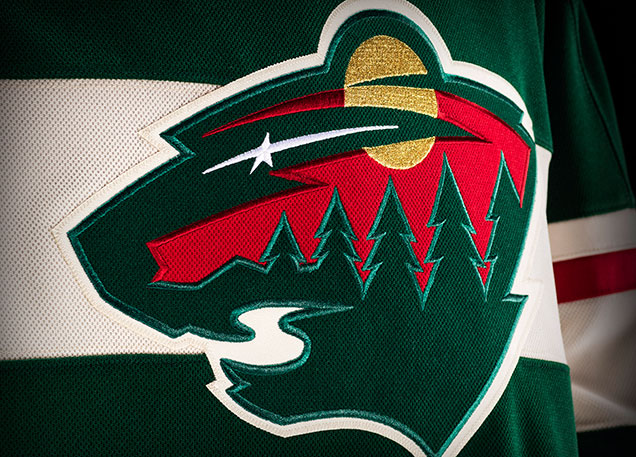 Because of this, the focal point of the entire jersey is the logo in the middle, as it should be. The stripe compliments it rather than detracts from it.
Maddeningly, however, is that the chest stripe pulls a Florida and doesn’t wrap around to the back of the jersey, presumably because it made it difficult to have off-white numbers that included some more red on the jersey by outlining the numbers with it. Just cutting off the strip at the sides has never been a good look, but I understand what was probably the reasoning behind it.
Red Band Jersey
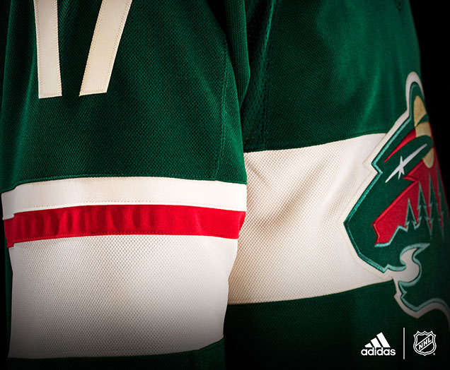 The chest stripe continues on the sleeves with the addition of a thin red band in the upper third of the off-white stripe. Usually this sort of inconsistency (that it’s just on the sleeves and not the chest) bothers me, but I get the justification for it here.
The simplicity of the chest stripe works and adding red would take away from both that simplicity and the logo. But having it on the sleeves keeps the jersey from creeping into over-minimalist/practice jersey territory (I’m looking at you Nashville). Especially considering the lack of waist striping aside from a thin, solid off-white stripe along the base of the jersey.
The red stripes also adds some red to balance out what would otherwise be a predominantly green jersey, which was my only complaint from their previous third jerseys. Red is part of the Wild’s visual branding, so it’s good to see it playing a bigger role here.
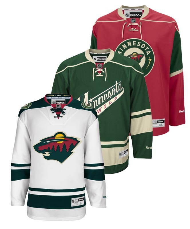
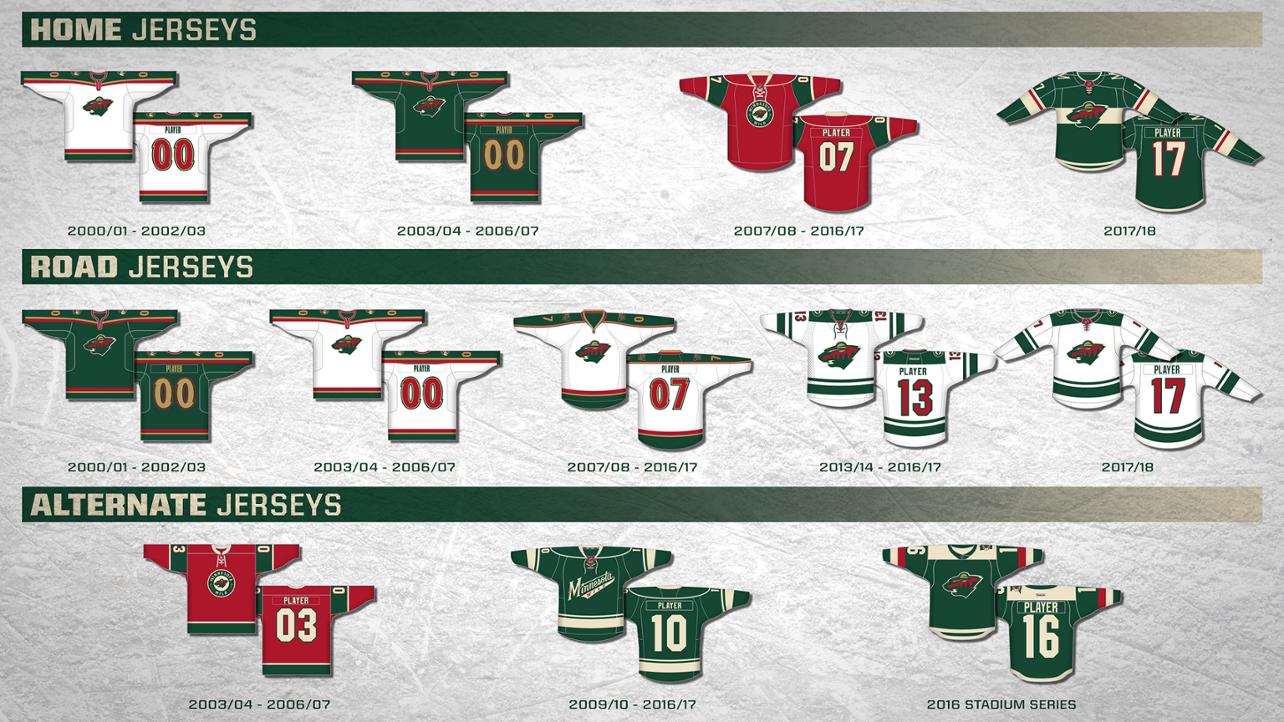
Plus, it mimics the same striping from both their previous third jerseys and road jerseys, there’s still an additional carryover from their previous designs coming through. This is especially important since they seem to be making no changes to their road white jerseys for next season (aside from the new template and collars, of course). Or at least, that’s what this handy infographic from their website says.
And as colour theory goes, red and green are complimentary colours, so for them to work well together, one needs to be an accent to the other, as is the case here with the red playing the accent to the green. Too much of both and they begin to compete with each other.

M is for Minnesota Millers
One holdover from the previous jerseys is the same stylized M that was used on the crest from the third jersey (and also on the pants of their Stadium Series uniform), this time moved to the shoulder as a patch (which maybe makes it an official secondary logo?).
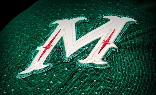 Other teams have tried to pull off the stylized script text as a logo crest, but Minnesota’s the only one to have pulled it off this well, so it’s great that an element of it will continue on.
And what I didn’t realize until now is that there is a historical basis for this design element. The Minneapolis Millers were a team in various minor- and semi-pro leagues from the 1920s to 1960s that wore a large M on their chests very similar to what the Wild now wear on their shoulders.
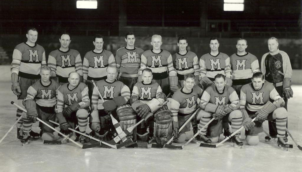 This photo (via Vintage Minnesota Hockey) from their days in the American Hockey Association in the 1940s shows the obvious similarity. The Wild added in red starbursts to both bring in their team palette but also make a stronger connection to their primary logo’s eyes/starburst. It’s smart, it’s classy, and it has meaning. It’s a huge win all around.
Collar Color
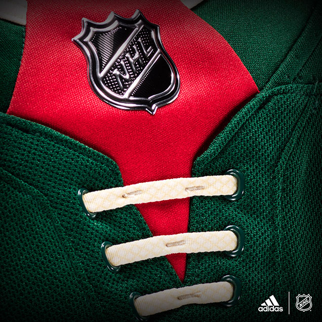 The last aspect to discuss is the collar. As stated in our article about all the new Adizero jerseys, I’m not crazy about the odd key shape that’s supposed to mimic the old v-neck design on what’s a crewneck jersey. It feels forced and adds an odd and purposeless shape to the jersey design. If you’re going to be a crewneck, don’t pretend to be a v-neck. Just be a crewneck. #lifeadvice
• More: HbD Breakdown: Adidas Adizero Jerseys
And the quasi-lacing that serves absolutely zero purpose aside from bringing a more historical aesthetic to the jersey. But there’s a difference between historical and authentic, because those laces are not authentic if they don’t serve any purpose. I’m not crazy about them.
What does work is the thin off-white collar stripe. It’s thickness mimics the thinness of the red striping on the sleeves and doesn’t overtake the rest of the jersey like a thicker off-white stripe would have.
Final Verdict
Like the rest of their hockey jerseys from the past few seasons, these continue a trend of finding the balance between modern and historical aesthetics in a way that both embraces the past and the future at the same time as well as finding the sweet spot between a jersey between too minimalist or too cluttered. Ask any designer: finding these balances are not easy things to pull off, but the Wild have been making it look easy lately.
While there’s a few minor complaints, and the fact that it’s sad to see some of the previous jerseys fade into their archives, they replaced it with something that really works well and makes the visual branding a little more consistent and cohesive. It’s hard to see these as anything but a win for Minnesota.
Agree? Disagree? Let us know in the comments or join the conversation on Twitter, Facebook and Instagram! And if you’re interested, we’re now on Pinterest too.


this is just more proof that people dont know what a good jersey is. utterly terrible, 4/10.
[…] • More: Hbd Breakdown: Minnesota Wild Home Jerseys […]
[…] • More: HbD Breakdown: Minnesota Wild Home Jerseys […]