
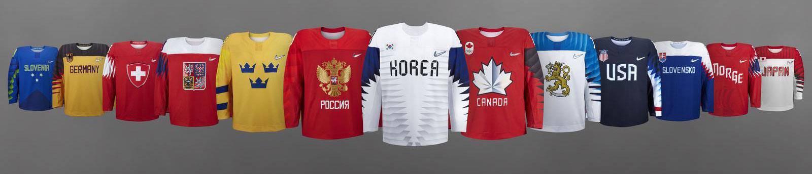
HbD Breakdown: 2018 Olympic Hockey Jerseys
 We here at Hockey By Design tend to focus on the NHL as much as possible (although if you love American college hockey, we got you covered there too), and as we all know, there won’t be any current NHLers or AHLers participating in the PyeongChang Olympic Games. But there definitely will be some former (and future?) NHLers participating. And really, these jerseys are interesting enough that they’re worth taking a closer look at (read: they got themselves some cray-cray stripes on ’em).
Wait, “cray cray” isn’t cool anymore? Well, I guess it’s old now, like, Bible-old, apparently.
So, let’s take a look at these jerseys in detail. First, we’ll break down the features that span the entire set, because there’s a definitely thread running through all of them, and then look at each one individually – ranking them from worst to first – after the jump.
Zigging When You Zag
There’s a certain of disconcertion regarding these jerseys among the public, and it’s same to assume that the primary source of this is the zig-zagging sleeve patterns. They’re featured on all of the jerseys to one degree or another (bless you Sweden!), or at least, they were when they were originally unveiled (more on that later).
• More: HbD Masks: 2018 Men’s Olympic Masks
• More: HbD Masks: 2018 Women’s Olympic Masks
From a strictly design perspective, they’re really interesting. They add non-traditional elements of electric energy and intensity that’s integral to the sport of hockey, and I’m all for interesting elements that move the needle in terms of hockey jersey design. For the most part, these symbolize unique and forward-thinking design for what jerseys could look like within the sport of hockey. And each of the individual country’s jerseys implement this pattern in a subtly unique way, whether it’s the layering, the length, the thickness, or the colours of the pattern.
Click to enlarge.
Those differences are still distinct enough to successfully stay away from all the jerseys looking like a simple template, with just a colour change to match the country’s flag and leave it at that. I’m not sure there’s much symbolism as to how each iteration of the pattern was applied to the specific country, but rather, it looks like an exercise to just throw a bunch of different versions together and see what might work best. (Or, less politely…)
In that sense, these are very experimental, and I really applaud that. But are they successful? Some more than others.
But here’s the major issue I have with the zig-zagging patterns…they force the sleeves to be the focal point for the jerseys, especially in combination with straight text on the chest instead of a team logo. Nice sleeves go a long way, but excellent jersey design should be visually balanced throughout, ensuring that the main focal point is the crest on the chest, not a superfluous design element. On this point, again, some of the jerseys are more successful than others.
But what the sleeves do balance out is the lack of striping along the bottom, which is a traditional element of hockey jerseys. The minimalist approach in that area is less problematic, as nobody is going to mistake these with overly-simplistic practice jerseys.
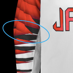 There’s one another issue with the sleeves. It’s hard to notice, but right around the elbow, there’s a hemline that chops right through the sleeve zig-zag patterns – or at least on the jerseys that have the zig-zag stretch fully down the sleeve – and the patterns don’t really carry through the hemline cleanly, forcing an already chaotic pattern get even more so, but inconsistently chaotic. The OCD in me is wrenching, because it can now never be unseen.
With that, let’s move to the individual countries, going from the least to the most successful.
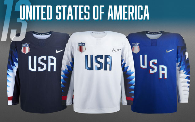 Sorry Americans, but your jerseys just don’t work well. Part of that is because of design issues, but the biggest problem of the jerseys for the Red, White and Blue is…where’s the red? Sure, the States have often had blue-dominated jerseys, but they’ve always had a strong red accent to them. Here, there’s nothing except for a single red stripe near the cuffs, which will be covered by the gloves. No red. Instead of red, we have multiple shades of blue.
To compensate, they’re wearing red gloves. Red gloves…when there’s no red anywhere else. If they were trying to draw attention away from the strong sleeve pattern, it worked. But the gloves are even less worthy of your focus.
 The “USA” crest in the faux-techy modernist sports-esque font is fine (and it’s the most successful styling of this font for all the Olympic jerseys), but you have a gorgeous crest just inches away from it that would look fantastic as a large crest, just like it was for the 2014 Olympics.
As for the sleeve pattern, because the outside of the sleeves keep the same dominant colour as the rest of the jersey, most of the detail is on the insides of the jersey, where it’s going to be seen the least. In that sense, it’s the most minimalist of the Olympic jerseys, and the most practice-jersey-esque. Plus, on the navy and white jerseys, the inside of the sleeves don’t carry on the colour of the sleeves, creating a visually-jarring inconsistency.
The most successful jersey of the set is the royal blue one, with the white of the sleeves wrapping around the entire sleeve and a better treatment of the “USA” crest.
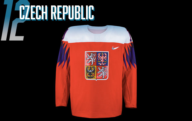 First off, I love the crest on the front of the jersey – the checkered bird, the classical detailing, the regality of it – it looks really great on there. When you have something like that to use, you use it. And they did. So good on you Czechia.
On the flip side, there’s very few things that I really detest on any of the jerseys, but that sleeve pattern sitting so close to the white shoulder yoke looks like absolute garbage, and that forced it this far down the list. It makes the entire jersey look cluttered, out-of-sync with itself, and slapped together. It’s painful to see.
As for the sleeve pattern itself, it’s not bad (and we’ll see other countries use a similar pattern more successfully), resembling more of a series of square flags wrapping around the sleeve. It’s probably the least interesting of the sleeve patterns on these jerseys, but the fact that it doesn’t get broken up by the hemline at the elbow makes it more consistency and structure.
Plus, in this instance, it has a nice visual connection to Czechia’s flag as well, with the blue triangle.
We haven’t seen the white jerseys yet (because the men’s tournament just started, and the Czech Republic isn’t in the the women’s tournament, and they don’t seem to be anywhere online), but I imagine they’ll be flipping the colours and keep the same general design.

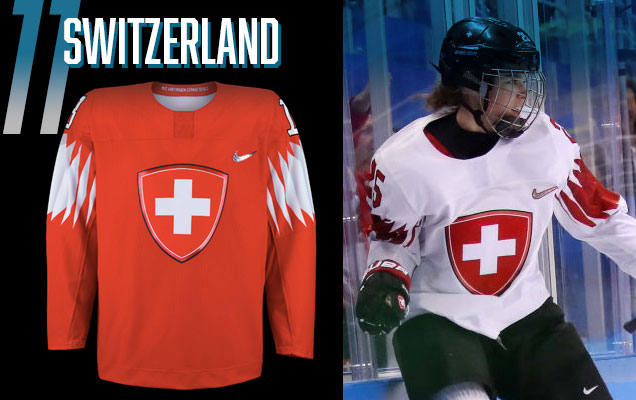 The Swiss used the same, relatively more simple, sleeve pattern as Czechia, but without any shoulder yoke to speak of, it’s allowed to stand on its own and becomes more an attribute than a distraction. It creates a more balanced and cohesive jersey.
But this balance is achieved at the cost of visual interest, with the Swiss jerseys coming off as a little dull. The Swiss white cross in the middle is the obvious standout, and the sleeve patterns in this case do a good job of bringing focus into the crest, but that’s all there is to it.
This jersey best illustrates another problem with the chaotic sleeve patterns: it becomes very difficult to add traditional stripes along the bottom because they’ll either be (a) totally inconsistent as simple stripes, or (b) waaaaay too busy with a similar chaotic pattern along the bottom.
The white jerseys are the better ones, because the red crest creates more visual contrast against the white, creating more depth instead of just a sea of red on the other jerseys.
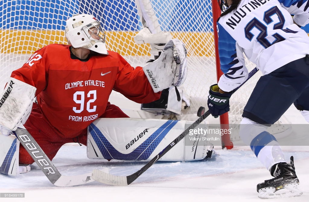
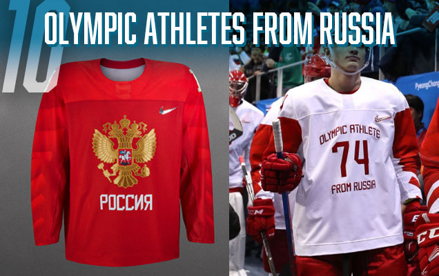 Well, there’s the jersey that Russia was supposed to wear, and the jersey that they are wearing. Because of the IOC ban on Russia at the Olympics – forcing the Russians to be referred to as OAR (Olympic Athlete from Russia) – the amazing two-headed crest originally featured on the Russia jerseys have been replaced by the OAR text and the player number. Yawn.
It makes these jerseys difficult to place. The original concepts, with the full golden crest, subtle sleeve pattern, and solid two-toned red reminiscent of their Soviet “Big Red Machine” days, it was as compelling and visually balanced jersey as any of the others on this list, and would’ve climbed much higher. But, these OAR versions – by removing the focal point of the entire jersey (the two-headed eagle) – come across as cheap, ill-conceived collegiate jerseys (with all due respect to college jerseys): bland, with no visual interest at all. The red version, in particular, are boring af.
And it plummets them down this list. Without the original concept considered, these would easily be last place.
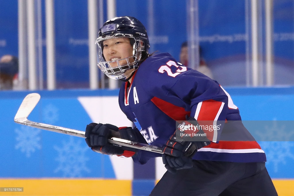
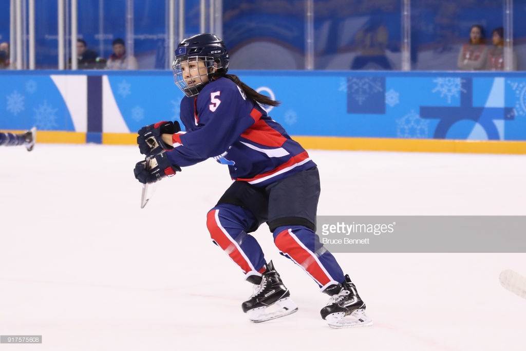
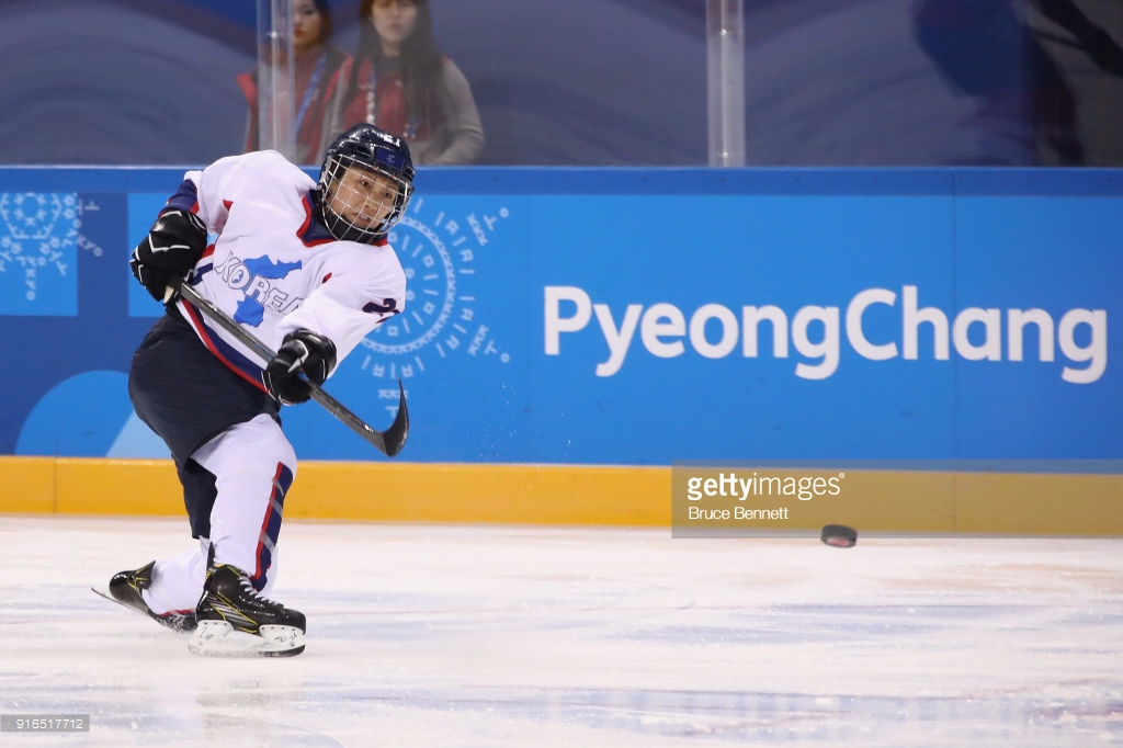
 Similar to Russia, the host team’s jerseys are another difficult one to rank because new jerseys got brought in at the last minute for the women’s team, who are wearing completely different jerseys than the men’s team. The reason? The women’s team represents a unified team between North and South Korea, and the decision was made to create a jersey showing the full Korean peninsula on it (see the Korea Herald article here). Speculation: Nike is an American company, and North Korea balked at the thought of wearing a Nike logo on their jerseys (these new women’s jerseys were made by Tackla, a Finnish company). Plus, the flag on the upper-left of the Korean jerseys are South Korea, and North Korea obviously has a different flag.
First, the men’s jerseys: I personally love them. There’s design problems, for sure, but it’s such a unique and interesting take on a hockey jersey that seems purely meant to move forward the conversation around the future of hockey jerseys that I admire it’s innovation and risk-taking. The mirroring of those layered…layers?…on the front (and backs) of the jerseys with the sleeve patterns makes the entire jersey visually well balanced, while the different colours on the sleeves adds some contrast and more depth. The “Korea” text is fine, but I’d rather have seen the yin-yang symbol from their flag front-and-centre on the chest.
For the women’s jerseys, these are about as bland a traditional jersey you can get. A map of the Korean peninsula with the word “Korea” in Helvetica italics can best be described as functional. Simple blue-and-white stripes line the collar and waist, while those stripes are oddly turned vertical on the bottom half of the sleeves. Additional chunks of colour are added to the sides of the jersey that’s more non-traditional, but also inconsistent with the rest of the jersey. The white jerseys are similar, but with the colours reversed.
The men’s jerseys on their own would push Korea further up this list. But the women’s jerseys drag them down to the #9 spot.
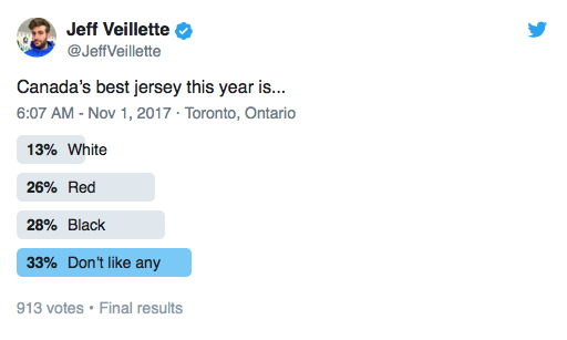
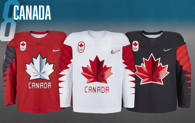 The defending gold medalists are the only other team aside from the US to feature three jerseys (cha-ching anyone?), with the obvious white, red, and black bases.
Here’s an instance where the sleeve patterns pair very nicely with the logo crest: both have jagged lines with pointed ends to them that create a visual balance to the entire jersey. With more time and effort (and less of a focus on have three of four different versions of the sleeve pattern for all the teams), the sleeve’s resemblance to a maple leaf could have been played up a lot more to create a really cohesive and forward-thinking jersey. But alas, it was not to be.
I’m not crazy about the sleeve pattern just ending abruptly at the should yoke either (foreshadowing)
The addition of patches of glossy material on the maple leaf adds some depth, but actually destroys it’s visual connection to the sleeve pattern, which relies on simple colour transitions to create depth, making the logo’s effects look like a kitschy add-on that was included just because it could be, rather than for any conceptual reason.
Glossy logo? Neat-o! Does it work with the jersey? Who cares!
The winner of the three jerseys is the white one, which doesn’t have the superfluous border around the logo crest like the red and black ones, and the simplicity of red and white sans any black. The “Canada” could’ve been dropped on all of the jerseys as well without any detriment.

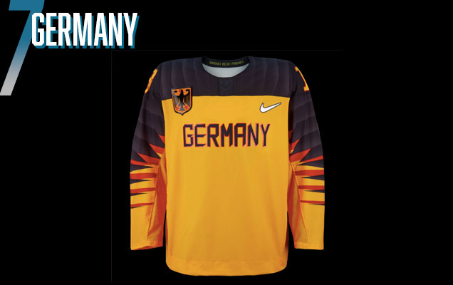 The Germans are the first on this list to showcase what I think is the best iteration of the sleeve patterns: going the full length of the sleeves and should yoke to form a continuous “stripe” that frames the logo crest really nicely and creates a more visually balance approach, regardless of what colours and crest is being used.
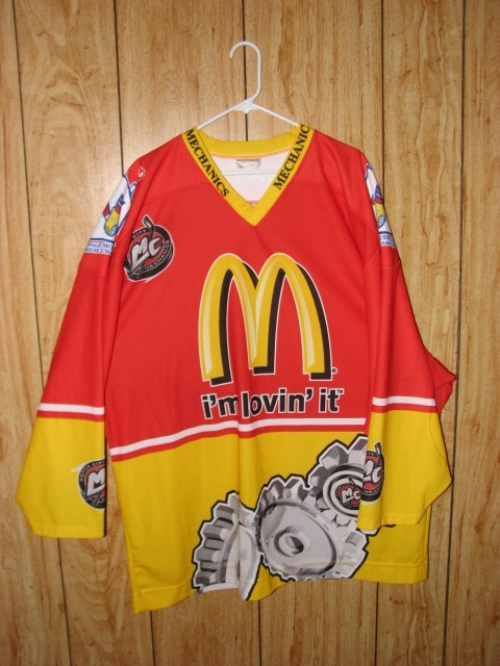
The problems with the German jerseys are (a) their decision to just use text as their crest instead of their amazing black eagle coat-of-arms. Nike did this with a few teams, having the crest as a small patch instead of the main crest, and it basically creates a strange juxtaposition where the front has two different “logos” (three, if you include the Nike logo). It more closely resembles a soccer/football jersey, where the team logo is a small patch and the team sponsor dominates the chest, but here, it’s two logos symbolizing the same organization. It’s totally unnecessary. Plus, shouldn’t it be in German?
Oh yeah, and (b), the colours. Sorry, I know yellow, red, and black are the colours of the German flag, so it makes sense to have that here, but it just reminds me of McDonald’s. It’s probably the least attractive colour combination of all the jerseys on this list.
Like Czechia, there’s no German women’s team, so we have seen what their black (or white?) jerseys will look like, but undoubtedly, it will be a similar design.
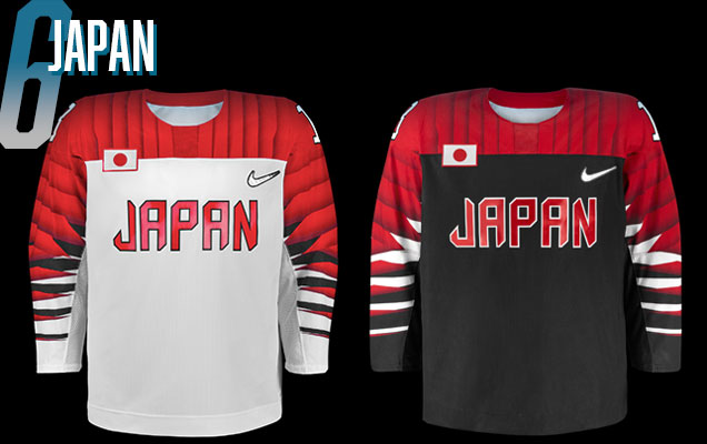 Another example of the sleeve pattern going full-yoke, the Japanese jerseys very closely mirror the German ones, but just with a colour change to reflect the Japanese flag.
They’re solid jerseys, but they have the same issue as the German ones: the use of two logos on the chest. How awesome would these have looked with a big red outlined circle in the middle of them, instead of “Japan” (but not in Japanese characters?). Slapping a simple geometric shape as a logo is both daring and bold, and would’ve been great.
Or even better, a big red circle with subtle elements within it, a la 2010 Canadian Olympic jerseys.
And there’s no question that the colour palette or red, white, and black is better than the German jerseys, putting it a notch higher. Would’ve rather seen red jerseys with a white sleeve pattern than the black jerseys though.
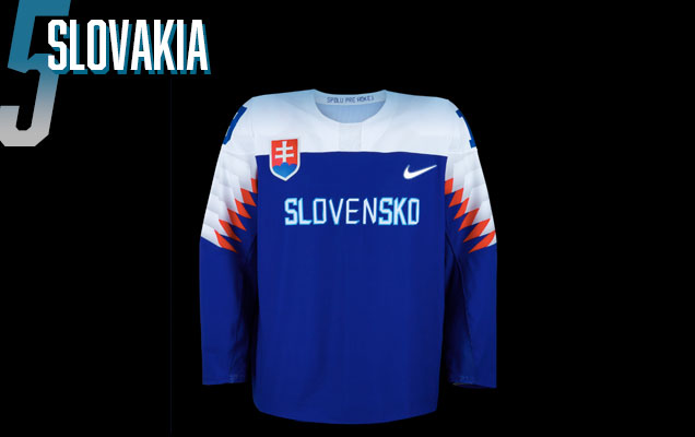 Another similar sleeve pattern to Japan and Germany, but with the pattern ending at the elbow hemline. It does eliminate that jarring change in the sleeve pattern at the hemline. It’s a bit abrupt, but it’s dampened by the straight-edge of the bottom stripe in the pattern. That is, the stripe doesn’t cut-off mid-stripe and just follows the same line as the hemline to finish off the pattern.
The pattern itself is also a little bit different, with more room for a secondary colour added in, which provides a great accent for the red and blue. It’s really a nice take on the sleeve pattern that still manages to nicely frame the main crest…
…which is the same as Japan and Germany with text and a coat-of-arms dually present. That coat-of-arms would work great as the main crest and should’ve been considered instead. At least they spelled Slovakia and Slovakian though.
Like Czechia and Germany, we haven’t seen the white jerseys yet, but I’m expecting them to just have the blue and white reversed, or something similar.
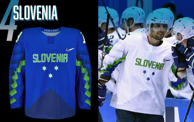 This is probably the most controversial ranking of the bunch. If it wasn’t for one small issue, they probably would’ve been ranked even higher. I love these jerseys: they’re unique, they forward-thinking, and the unique colour palette of the Slovenian Ice Hockey Federation’s colour palette is a perfect match to the unique sleeve patterns. It’s a bold, unique, and balanced jersey.
The country’s crest is integrated into the jersey more meaningfully than just slapping a small patch on the chest as well, with the three stars forming an underline for “Slovenia” (not in Slovenian, which is “Slovenja”). The subtle triangle pointing up from the base of the jersey mimics the mountains in the crest.
The triangle also frames the chest crest better than the rest of the jerseys too, and providing more visual balance to the jerseys as a whole. The entire jersey is well-designed and cleverly conceived.
The one issue is that this is most jarring example of the hemline at the elbow awkwardly cutting through the sleeve striping, creating a full and very apparent shift in the pattern. It’s annoying af.

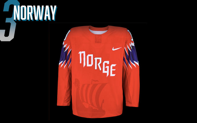 A viking ship! How fucking awesome is that!
That may be the most prominent (or at least, the most unique) element on the jersey, but there’s a lot more to like that just that.
The sleeve striping, perfectly brings in another colour, but the stripes within the stripes/layers is a perfect way to integrate more intensity to an otherwise completely red jersey, and also clearly symbolizes the striping in the Norwegian flag. Leaving the sleeve pattern just on the top of the sleeves also keeps the jersey visually balanced in combination with the viking ship.
The text is excellent too – if you have to have text instead of a logo crest on there – using a neo-blackletter/modernist typeface – and slanting it across the chest (a la NY Rangers). It makes the text more visually impactful, and also prevents the text from crowding either the Nike logo or the viking ship. It’s a great combination of minimalism, symbolism, and innovation.
Haven’t seen the white jerseys yet, but again, probably very similar.
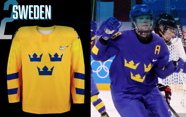 Bless the Swedes. Anytime a jersey manufacturer comes to them with a new template, or any wild and crazy ideas, the Swedes give them a polite middle finger and keep the exact same design. Any why not, if it works (and it definitely does), just stick with it. They’ve featured the Tre Kronor and two-striped sleeves for decades now, and it’s not going to change anytime soon.
But Nike fought back a little bit and demanded they have to use the sleeve pattern in some way. So Sweden said, “okay, gives us what you gave Russia, but in yellow and blue, respectively.”
So Nike gave them that concept, and then Sweden goes, “Great! Can you just lessen the difference in the two-tones of the yellow/blue sleeve pattern a bit?”
Nike does, and then Sweden goes, “Great! Can you just lessen the difference in the two-tones of the yellow/blue sleeve pattern a bit?” And Nike does, and then Sweden goes, “Great! Can you just…” (repeat a dozen times of so, and you get this jersey).
Enjoy it, revel in its beauty, and they’ll be happy to consistently find themselves at or near the top of rankings like this one.
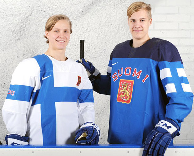
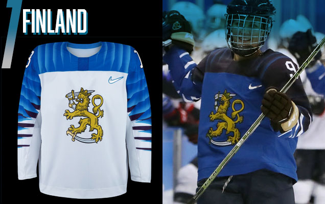 Once again, the continual yoke-full sleeve pattern appears, but this time in its most successful iteration, and the top of this list.
In this instance, the sleeve/shoulder pattern also perfectly frames the chest logo…and that chest logo is awesome. Finland has always seemed to have a more difficult time integrating it’s national elements (a minimalist flag, two-tones of blue, a red and yellow coat-of-arms, the “Suomi” text) into a fully cohesive jersey design, and for good reason…that’s just too much stuff to throw on a jersey.
Here, they’ve pared everything down to their most basic conceptual levels: the two tones of blue that represent all their previous jerseys and their flag’s colour, and then just the golden lion from their crest to commemorate their national crest. No red, no Suomi…just streamlined greatness.
Have I mentioned how great that logo crest is? The detailing is magnificent and the golden yellow matches perfectly with the two tones of blue to stand out against the multi-layered and two-toned sleeve pattern, which ends up working as a back-seated compliment to the crest rather than competing against it.
It’s a balanced, well-conceived jersey, and it’s nice to see Finland finally succeed in balancing all those different elements by paring it down to its necessities.
Agree? Disagree? Let us know in the comments or join the conversation Twitter, Facebook and Instagram! And if you’re interested, we’re now on Pinterest too.


Finally! I’ve been begging for this post since these jerseys were released! A few points of disagreement, however: While the U.S.’s home and aways are bad, I thought they would be placed higher solely because of the royal blue alternate. At least place them before Canada’s duds, in which their home uniforms feature no white whatsoever! Watching the women’sUS vs Canada game last night was brutal.
I have to say, those Swede sets might be the best they’ve ever worn. The two are stripes look great on the ice. I also love Slovenia’s home unis, the away ones were too bland. (Btw when I say ‘home’ I’m referring to the color ones unless tryouts Sweden and wear color for both.)
Yeah, took longer than I thought to get it written up.
I expect flack for the US ranking, but I’ll stand by it. Definitely, the Canadian reds are the worst of the three, but the white one helps bring it up a bit, on top of the what I already wrote.
Those Swedish ones, they’re always so good, so classy, so perfect. I hope they never change them.
[…] • More: HbD Masks: 2018 Women’s Olympic Goalie Masks • More: HbD Breakdown: 2018 Olympic Hockey Jerseys […]
[…] Here’s a fun and informative review of the Olympic hockey jerseys this year. [Hockey by Design] […]
[…] This is a enjoyable and informative evaluate of the Olympic hockey jerseys this 12 months. [Hockey by Design] […]
[…] Here’s a fun and informative review of the Olympic hockey jerseys this year. [Hockey by Design] […]
[…] Here’s a fun and informative review of the Olympic hockey jerseys this year. [Hockey by Design] […]
[…] Here’s a fun and informative review of the Olympic hockey jerseys this year. [Hockey by Design] […]
[…] Here’s a fun and informative review of the Olympic hockey jerseys this year. [Hockey by Design] […]
[…] Here’s a fun and informative review of the Olympic hockey jerseys this year. [Hockey by Design] […]
Talking about OCD. The pathern on the sleave often not align with the yoke. The blue Finland is one of them. Cant see anything else.
Yeah, I noted that in the post. Drives me crazy too for sure, but it looks worse on some jerseys than others.
[…] Here’s a fun and informative review of the Olympic hockey jerseys this year. [Hockey by Design] […]
[…] Here’s a fun and informative review of the Olympic hockey jerseys this year. [Hockey by Design] […]
[…] Here’s a fun and informative review of the Olympic hockey jerseys this year. [Hockey by Design] […]
[…] This is a enjoyable and informative overview of the Olympic hockey jerseys this yr. [Hockey by Design] […]
[…] Here’s a fun and informative review of the Olympic hockey jerseys this year. [Hockey by Design] […]
[…] Here’s a fun and informative review of the Olympic hockey jerseys this year. [Hockey by Design] […]
[…] Here’s a fun and informative review of the Olympic hockey jerseys this year. [Hockey by Design] […]
[…] Here’s a fun and informative review of the Olympic hockey jerseys this year. [Hockey by Design] […]
[…] • More: HbD Breakdown: 2018 Olympic Hockey Jerseys […]
What about Latvia? One of most surprising team!!! Or you guys are another rasists? Fuck you then!!!
Latvia wasn’t in the tournament, so…fuck you for calling us racists?
[…] • More: HbD Breakdown: 2018 Olympic Hockey Jerseys […]