Worst to First Jerseys: Columbus Blue Jackets
As we go through the 2019-20 season, we’ll be updating all of the Worst to First Jersey posts every Monday, as almost all the teams in the league have unveiled new jerseys since their original posts. We’ll start with the ones most needing updating and work our way through the league. Today, it’s time for the Columbus Blue Jackets to get updated.
Also, a huge thanks to SportsLogos.net and NHLUniforms.com for most of the jersey images and references.
Columbus – a relatively young franchise currently in its 19th season – don’t have a ton of different jerseys to their name. But they’ve got more than one, so if there’s a countdown list to be made, then let’s make it. And besides, some of the changes that the Blue Jackets have made to their jerseys over the years are among the best and worst in the league. Got your interest? Good…let’s get this list going.
Here’s how this works: we’ll count down, from worst to first, all the jerseys the Blue Jackets have ever worn. Homes and aways will be lumped into the same category (so, more of a jersey “era”) and we won’t worry about small changes (like slightly changed positions of piping for example). Third jerseys will stand on their own. And we’re focusing on the jerseys only, not the entire uniform. For the Blue Jackets, there’s 4 different jerseys/eras. And we’ll start with the worst one:
Bonus! Prototype Jersey
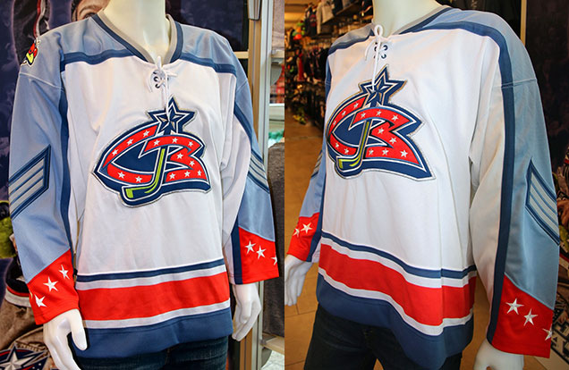
Okay, before we get into the real rankings, here’s the very first Columbus Blue Jackets jersey…a prototype that was never worn on the ice but was considered enough to be professionally manufactured, a rare find that any collector would be happy to grab.
There are some good elements here, especially the powder blue which there just isn’t enough of in the league. The chevron-themed sleeves are also interesting. You can see some of the elements in this jersey made it onto their inaugural jerseys, like the cuff-to-cuff shoulder yokes (which have been a feature of their main jerseys every since.
We’re not including these in the rankings, but while they definitely wouldn’t be in first place, they definitely wouldn’t be in last either. Okay, on with the show…
4. 2003–2007 Third Jerseys
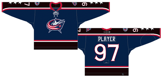
Third jerseys have a pretty sordid history, with the earliest third jerseys being among some of the worst jerseys the league has ever seen. But some third jerseys are also pretty excellent (foreshadowing). These aren’t even close to being the worst third jerseys ever, but obviously (as they’re in last place) they’re not really that great either.
As third jerseys go, they’re decidedly uninteresting. In that sense, they’re a real missed opportunity to do something interesting and play on the Civil War history for which the team is named. Instead, they gave us a slightly modified version of the regular home and away jerseys they wore during this era. Well, hey, at least they didn’t put Stinger on the front or anything.
The straight cuff-to-cuff shoulder yoke looks dated, as it’s mostly a by-product of the NHL in the ’80s. What’s worse, they made the yoke (and the large stripe at the bottom of the jerseys) black. When sitting right beside the navy blue that takes up the rest of the jersey, there’s not a whole lot of difference between the tone of the colours, so really, what’s the point as it does nothing to add any interest or contrast to the jersey. Making the yoke red, white, or even grey, would have been infinitely more interesting. Or, at least, impactful.
Other than that, it’s a pretty straight-forward jersey. The stripe patterns are relatively simple and consistent, and having a very thin white and red stripe is a solid choice to add some contrast to the jersey. The stars going down the sleeve are a nice touch (and similar to the jerseys for a team that also just got the Worst to First treatment) as it calls on the design of the Ohio state flag, and of course, the Blue Jacket’s main logo crest. Collar laces are almost always a good thing, unless they’re fake.
It’s a relatively simple and – because of that – a boring design for a third jersey, feeling more like a cash grab for jersey sales rather than an actual good addition to the can(n)on (get it?) of Blue Jacket’s jerseys. And this complete missed opportunity is the main reason it’s ranked last on the list. Design is not just about design, but also partly about the context around the design. Context is everything. At least they used the better (and current) logo design, which is still not that great.
• More: BTLNHL #23: Columbus Blue Jackets
Jersey Recommendation: #9 Vyborny. One of the few players who could really contribute offensively during this era for the Blue Jackets, and since Columbus was the only NHL team he played for before heading to the KHL, he gets the nod here. Hey, he even outscored Rick Nash for a couple seasons.
#3. 2000–2007 Home & Away Jerseys
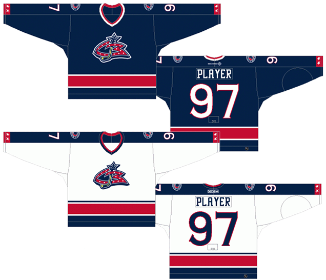
The Blue Jackets’ inaugural jerseys share many of the characteristics of the previously discussed jerseys. For one, there’s the straight cuff-to-cuff shoulder yoke on the white jerseys. Just like the third jerseys, it looks like delicious dessert squares: very dated.
But for the most part, these are a very safe hockey jersey design: a simple solid striping pattern on the bottoms of the jerseys, with coloured shoulder yokes on the white jerseys with some shoulder patches showing an alternate Stinger logo (for the first couple seasons anyway). There’s a couple stripes around the collar to match as well. It’s a pretty standard traditional jersey, so there’s not much to like, or not like, about it.
But there’s still a couple design elements that do make it more distinctive than a classic jersey, and mostly in a negative way. First, the typefaces used on the jerseys. They’re very unique in the league for actually using two completely different typefaces for the numbers and the nameplates. Sometimes, being unique is great. This is one of those times when it’s not great.
It’s not that obvious from the image of the jerseys above, but if you look at this image here, you can see the comparison of the numbers and the letters used on these jerseys. The numbers use a typeface that is serifed (it has small pointed elements coming out of the ends of the numbers) while the letters use a slab-serifed font, where the elements coming out of the ends of the letter are thick and of similar thickness as the rest of the letter. And this typeface is very oddly shaped. That M just looks stupid.
But not only that, there’s almost no similarities in the structure between the letters and numbers. The easiest way to see it is to compare the number 0 with the letter O. The zero is very rounded, the letter O is very squared, and that shows the underlying structure of all the numbers and letters. And that’s a problem, because it shows a lack of identity and clarity in the brand. The third jerseys previously discussed have the exact same problem.
Enough geeking out over fonts. The other different element on these jerseys is the very thin half-stripe at the cuff of the jerseys, with the stars in them. It’s pretty clear why that element is there, again drawing from the design of the Ohio state flag, but it’s small and too subtle. It’s one of the elements that their third jersey handled better.
Overall, it’s a very unoffensive jersey, with a few offensive elements.
Jersey Recommendation: #8 Sanderson. These were tough times for the expansion franchise, with a constant rotation of players coming in and out and no real stars. But Sanderson stuck around for parts of 5 seasons during this era and was one of the first Blue Jackets ever, taken during the 2000 Expansion Draft. Get it in the white jersey, with the original Stinger patches if you can.

2. 2007–present Home & Away Jerseys
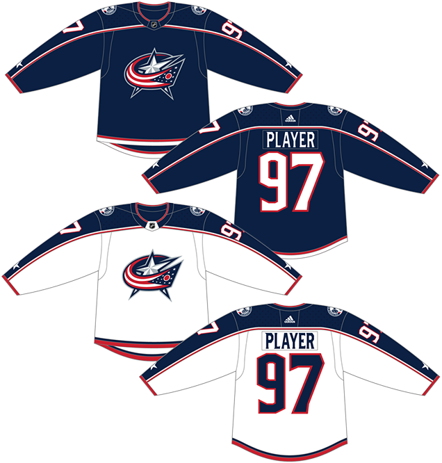
Their current primary jerseys are basically a slight re-working of their original jerseys. Some elements have changed slightly, but they took advantage of the introduction of the Reebok Edge jerseys to modernize the design, mostly in positive ways.
The cuff-to-cuff shoulder yokes are still there, and also added to the blue jerseys, but they’ve been given a slight wave to them making them look more modern. The thin striping around the yokes is a great subtle addition to the jersey as well. It was one of the few things that worked on the third jersey already discussed and it works here too.
Those thin stripes are also mimicked at the cuffs and along the bottom of jersey, creating a more consistent design that works with the new lines on the Edge jerseys.
The star on the sleeve is still there, but it’s been reduced to one star and the design is a combination of the previous two jerseys discussed, which makes it more subtle than the third jerseys, but less subtle than the original jerseys. Which becomes the best handling of it yet. You can see it better here.
Overall, the jerseys are straight-forward and minimal, like their original ones, but with a more unique and modern approach. Now, about those typefaces (still) being used…
Jersey Recommendation: #61 Nash. No? Okay, how about #9 Panarin? No? Okay, how about #72 Bobrovsky? No? Okay, I’ll stop. For real, how about #18 DuBois. He may be the power forward that will haunt the other Metropolitan teams for years to come. Get it in the home blues.
1. 2010–present Third Jerseys
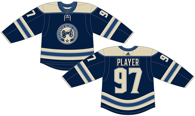
Remember how the original third jerseys represented a completely missed opportunity? Columbus’ second stab at a third jersey represents the exact opposite. They took advantage of the third jersey format to create a jersey that further established the Blue Jackets’ historical identity and looked more like an honest attempt at creating something unique and less like a jersey cash grab.
Heritage jerseys are all rage these days, with help from the popularity of both the Winter Classic and Heritage Classic jersey libraries. Columbus, based on their name and chosen identity, is one of the few teams in the league that can actually lay claim to a heritage jersey, and they go full throttle with it here.
• More: Heritage Classic Jersey Countdown (2019)
• More: Winter Classic Jersey Countdown (2019)
The creamy off-white automatically makes it look historical. The striping patterns are super-duper-stripey, which is also historical if you look at hockey jerseys from the 1930s. At least it’s consistent across the whole jerseys, on the sleeves and along the bottom. The shoulder yokes are simple and classic. And there’s laces, which are always a good thing. Again, unless they’re fake. Using just two tones of blue (and removing red from the equation altogether) makes it look deceiving simple as well, adding just enough visual interest to keep it from being boring. Being named the Blue Jackets, it also just makes sense.
But the real star here is the alternate logo, which is one of the best in the league. It’s way too complex and ornate to be used as a primary logo, but as an alternate, it’s awesome. And using a cannon is both historical and connected to the cannon blast that goes off in the arena. It establishes a brand that Columbus can be proud of.
This jersey marks the first time that Columbus actually used a different font for the numbers, one that is at least slab-serifed and more closely matches the font on the nameplates. It’s still a mis-step as there’s nothing really historical about the typeface at all, making it look more digital and modern. But at least it’s a little closer to the other typeface.
This is easily Columbus’ best jersey and one of the best third jerseys in the entire league as well.
Jersey Recommendation: #3 Jones. He could already be the best defensemen the Jackets have ever had, and he’s still got a long career in front of him, hopefully all of them in Columbus.
Agree? Disagree? Let us know in the comments below or join the conversation on Twitter, Facebook, or Instagram!


[…] • More: BTLNHL #23: Columbus Blue Jackets• More: Worst to First Jerseys: Columbus Blue Jackets […]
Yes! I remember flipping through the channels this year–my first as an avowed hockey fan–and seeing those beautiful alternates for the first time. What taste, what style! I had to catch the blue jackets the next time.
Next time I saw them on TV they had the unimaginative logo that seemed liked it was designed by a mid-level executive in the early 2000s. Why they haven’t switched to the alternate, I have no idea…
[…] • More: BTLNHL #23: Columbus Blue Jackets• More: Worst to First Jerseys: Columbus Blue Jackets […]
[…] • More: BTLNHL #23: Columbus Blue Jackets• More: Worst to First Jerseys: Columbus Blue Jackets […]
I don’t get all the hate for the star and flag logo. As an Ohio resident, I am proud to see our flag incorporated into the design. Ohio is the only state with a pennant shaped flag, and the flag itself is also a beautiful flag. As a huge Jackets fan and lifetime Ohio resident, I’ve always thought they knocked it out of the park with their current main crest. (The cannon logo is also awesome, and is perfect for an alternate logo).
I’m sorry. I came here because I was looking up how trash this jersey is.
It’s vanilla.
It’s early bedtimes.
It could be any team, USA.
No memorability whatsoever.
Sorry I’m being so brutal. I just can’t believe I thought it was so bad but found this saying it’s so good.