NHL Playoffs 2019: Cup Finals Countdown and Predictions
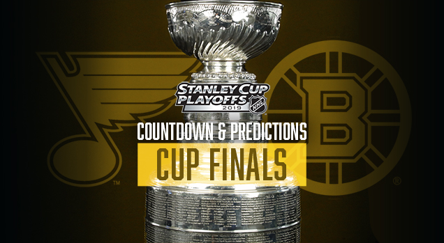
The Conference Finals gave superior branding a perfect 2-for-2, which brings us to 9-for-14 through three rounds. With only one more match-up to go, branding is guaranteed an above .500 success rate, which is probably more than you can say for your own bracket (myself included). Let’s see who we’ve got in the Finals.
• More: NHL Playoffs 2019: Conference Finals Countdown and Predictions
• More: NHL Playoffs 2019: Round 2 Countdown and Predictions
• More: NHL Playoffs 2019: Round 1 Countdown and Predictions
So how does it work? We’ll compare the overall branding of each series and see how they match-up. This includes the logos, alternate logos, jerseys, historical logos and jerseys, general legacy and everything else that builds a team’s brand. And it will be drawn from just the visual brand component (aka: categories 1 through 4) from our handy and comprehensive brand rankings that we did at the beginning of the season to help us out.
• More: 2018 NHL Brand Power Rankings
But on top of that, the match-ups are going to be ranked according to which will be the best to watch from an aesthetic standpoint. Some jerseys work better together than others, and you’ll see why.
But for this round, the Cup Finals, we’re ranking all 15 matchups from the entire 2019 playoffs. As usual, let’s start with the worst jersey match-up…
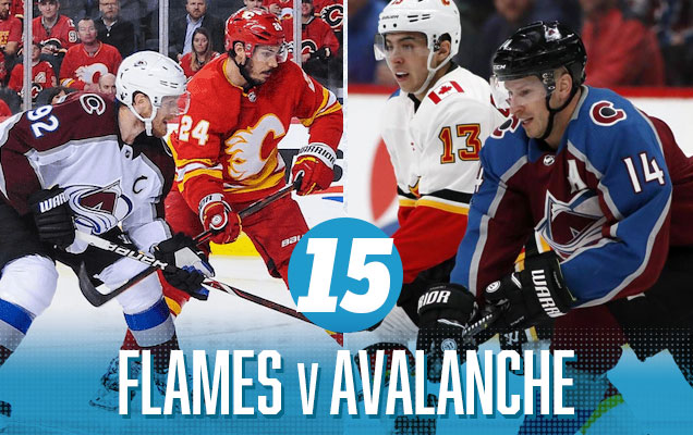
For the second year in a row, the Avalanche are stuck at the bottom of the jersey match-up rankings, and once again, it’s not really their fault. They continue to get stuck playing against jerseys that don’t look great with theirs. Last year, it was Nashville. This year, it’s Calgary, who own of the worst jersey sets in the league. But, they’ve announced that for the games in Calgary throughout the playoffs, they’ll be wearing their fantastic old-school alternates. It gets them some points, but it still leaves this match-up in the basement.
The main reason is that the colours on these jersey just clash the more you look at it…grating on your eyes and becoming painful to watch. The red, the burgundy, the blue, the yellow, the black, the silver, the clashing styles, it’s just too much of things that don’t work well together.
Calgary Flames Visual Brand Ranking: 8th. Their logo, visual legacy, and alternate jerseys were easily ranked in the top 10. Their regular jersey set? Easily one of the worst in the league. Luckily they’re not wearing them at home this playoff season.
• More: BTLNHL #13: Calgary Flames
• More: Worst to First Jerseys: Calgary Flames
Colorado Avalanche Visual Brand Ranking: 16th. Their third jerseys are nice, but the rest of the visual brand is decidedly middle-of-the-pack.
• More: BTLNHL #29: Colorado Avalanche
• More: Worst to First Jerseys: Colorado Avalanche
Brand prediction: Flames (0-for-1)
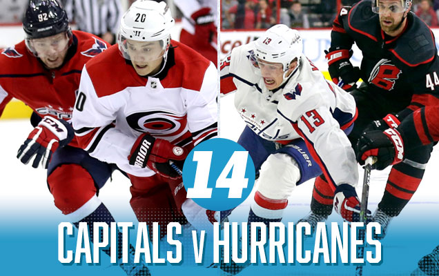
Where the previous match-up had way too much going on, here there’s just a lot of red and white. The Capitals do their best to make sure there’s some blue in there too, but let’s be honest. These Caps jerseys aren’t that great and it’s hard for anyone outside of DC to get too excited about seeing them regularly, especially against another team that also predominantly wears red.
Speaking of which, the Hurricanes have announced they’re ditching their solid red home jerseys in favour of the black alternates, which is disappointing since they’re clearly the least of the jersey set. I’m here for them wearing Whalers gear in the playoffs though. Oh, and I’m here for the playoff Storm Surges.
Washington Capitals Visual Brand Ranking: 30th. Being burdened with the consensus worst logo in the league isn’t going to help any brand, but lacklustre efforts with their jerseys – and, let’s be honest, they’ve never worn a really great jersey ever – means that they’re not really improving through any other category either.
• More: BTLNHL #24: Washington Capitals
• More: Worst to First Jerseys: Washington Capitals
Carolina Hurricanes Visual Brand Ranking: 19th. Carolina’s logo ranking doesn’t fare much better, but they have better jerseys and – all apologies to Connecticut – seeing those amazing Whalers unis on the ice again was absolutely fantastic! Having them as part of their legacy brand certainly helps.
• More: BTLNHL #19: Carolina Hurricanes
• More: Worst to First Jerseys: Carolina Hurricanes
Brand prediction: Hurricanes (1-for-2)

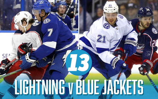
The previous match-up was a whole bunch of red with a little bit of blue. This reverses that with a whole bunch of blue with a little bit of red, giving it the same relatively uninteresting match-up from an aesthetic standpoint. But, it gets a higher ranking since there’s no bad black third jerseys being worn here (just kill those things Tampa), and they’re just better jerseys as a set.
Tampa Bay Lightning Visual Brand Ranking: 20th. Decent logo, pretty good uniforms, and a disastrous jersey legacy featuring some of the worst things that ever graced the ice, not to mention their newest addition to the third jersey nightmare library. It all leads to a middle-of-the-road ranking.
• More: BTLNHL #22: Tampa Bay Lightning
• More: Worst to First Jerseys: Tampa Bay Lightning
Columbus Blue Jackets Visual Brand Ranking: 26th. Columbus continues to rank as having one of the worst visual brand legacies in the league. Uninspiring jerseys and mediocre results elsewhere in their visual brand keeps them well in the bottom part of the league. The saving grace, keeping them from falling too far in the basement is their third jersey.
• More: BTLNHL #23: Columbus Blue Jackets
• More: Worst to First Jerseys: Columbus Blue Jackets
Brand prediction: Lightning (1-for-3)
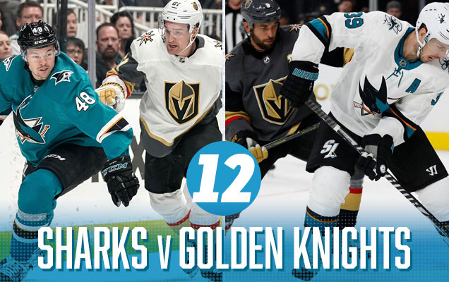
A rematch of the Western semi-finals last year, featuring the Sharks’ simplistic and classy teal jerseys which makes the Knights’ road whites look too circus-esque (sorry, still not a fan of the white gloves), and the Sharks over-simplistic road whites don’t bring enough colour to an otherwise grey vs white matchup. There’s some good elements interacting here (teal and gold) but overall, there are definitely better matchups ahead.
Vegas Golden Knights Visual Brand Ranking: 27th. The Golden Knights got some decent points for their jerseys, but the consensus take on their logo is that is buried in the bottom half of the league. Understandably, there’s no visual brand legacy to rely on either.
• More: HbD Breakdown: Vegas Golden Knights Jerseys
• More: HbD Breakdown: Vegas Golden Knights (Logo and Alternate Logo)
San Jose Sharks Visual Brand Ranking: 24th. The highest points the Sharks get with their visual brand is for their third jerseys, which confuses me as, personally, I think they’re boring and awful. And if that’s the best part of your brand (it’s not, as the teal jerseys are great), you’re in trouble. But, the Sharks get lucky this round!
• More: BTLNHL #25: San Jose Sharks
• More: Worst to First Jerseys: San Jose Sharks
Brand prediction: Sharks (2-for-4)

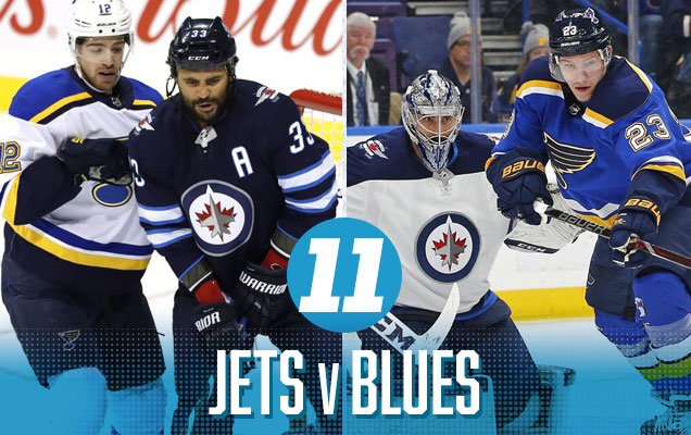
It’s another predominantly blue vs blue match-up, but the Jet’s royal blue accents match perfectly with the Blues’ jerseys, which also bring a punch of yellow to the table. The stripes on both jerseys really work together well, maintaining a consistent look and aesthetic. Although there’s still a lot of blue, there’s also a lot to like here.
Winnipeg Jets Visual Brand Ranking: 25th. The Jets took a big hit in this year’s visual brand component of the Brand Power Rankings from not bringing back their heritage third jerseys for this season. The rest of their visual brand (logo, jerseys, visual legacy) is considered mediocre at best.
• More: BTLNHL #15: Winnipeg Jets
• More: Worst to First Jerseys: Winnipeg Jets
St Louis Blues NHL Brand Power Ranking: 10th. Their brand is solid, with their logo, jerseys, and visual legacy all in the top half of the league, with their historical third jerseys being among the absolute best in the league. They’ve made missteps in the past, but there’s no denying the strength of their visual brand at this point.
• More: BTLNHL #4: St. Louis Blues
• More: Worst to First Jerseys: St. Louis Blues
Brand prediction: Blues (3-for-5)P
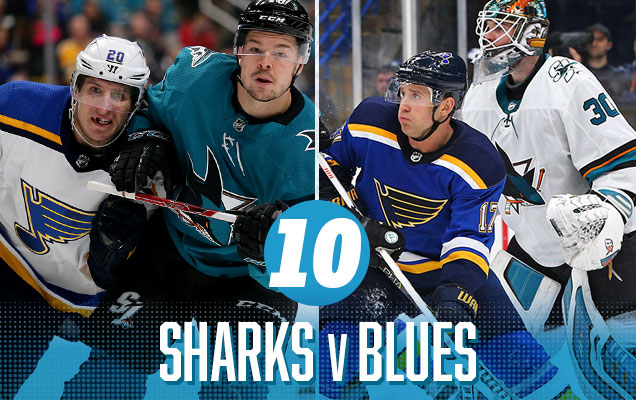
A Sharks-Blues matchup ensures that a jersey with something other than a red or black base has at least a chance to be lifting the Cup and breaking the red/black streak going on since 1994. They’re both solid jerseys one their own, but it’s just not enough contrast (ie too much blue/teal) to make it a great jersey matchup, as well as the contrasting styles between the Blues’ classic approach and the Sharks’ minimalism.
San Jose Sharks Visual Brand Ranking: 24th. The highest points the Sharks get with their visual brand is for their third jerseys, which confuses me as, personally, I think they’re boring and awful. And if that’s the best part of your brand (it’s not, as the teal jerseys are great), you’re in trouble. But, the Sharks get lucky this round!
• More: BTLNHL #25: San Jose Sharks
• More: Worst to First Jerseys: San Jose Sharks
St Louis Blues Visual Brand Ranking: 10th. Their brand is solid, with their logo, jerseys, and visual legacy all in the top half of the league, with their historical third jerseys being among the absolute best in the league. They’ve made missteps in the past, but there’s no denying the strength of their visual brand at this point.
• More: BTLNHL #4: St. Louis Blues
• More: Worst to First Jerseys: St. Louis Blues
Brand prediction: Blues (4-for-6)5

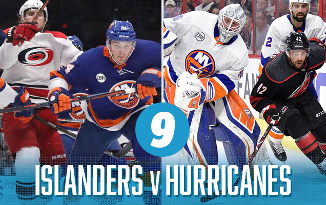
But the Isles-Canes matchup drops to 9th because of the Carolina third jerseys that they’re wearing throughout the playoffs. The games in Brooklyn is a classic red-vs-blue match-up with some orange thrown in and matching classic styles. But in Raleigh, it’s a grey/black ultra-modern style against a bold, colourful, and classic Islanders design. It drags down the whole match-up down.
New York Islanders Visual Brand Ranking: 29th. Their current classic look is great…for the Islanders. The consensus is that they still don’t have a great logo, their jerseys are not too bad, and nobody seems to like their third jerseys. Oh, and Captain Gorton is still too recent to be completely forgotten.
• More: BTLNHL #20: New York Islanders
• More: Worst to First Jerseys: New York Islanders
Carolina Hurricanes Visual Brand Ranking: 19th. Carolina’s logo ranking doesn’t fare much better, but they have better jerseys and – all apologies to Connecticut – seeing those amazing Whalers unis on the ice again was absolutely fantastic! Having them as part of their legacy brand certainly helps.
• More: BTLNHL #19: Carolina Hurricanes
• More: Worst to First Jerseys: Carolina Hurricanes
Brand prediction: Hurricanes (5-for-7)
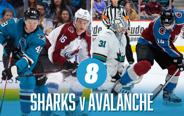
This is a great visual matchup to showcase more modern colours. It’s teal-vs-burgundy (a contemporary take on the classic blue-vs-red) with matching modern styles of simple, strong lines. Hey, they’re even both wearing black pants to match. But the games in Denver will be a little bland because of the Sharks über-minimalist road whites.
San Jose Sharks Visual Brand Ranking: 24th. The highest points the Sharks get with their visual brand is for their third jerseys, which confuses me as, personally, I think they’re boring and awful. And if that’s the best part of your brand (it’s not, as the teal jerseys are great), you’re in trouble. But, the Sharks get lucky this round!
• More: BTLNHL #25: San Jose Sharks
• More: Worst to First Jerseys: San Jose Sharks
Colorado Avalanche Visual Brand Ranking: 16th. Their third jerseys are nice, but the rest of the visual brand is decidedly middle-of-the-pack.
• More: BTLNHL #29: Colorado Avalanche
• More: Worst to First Jerseys: Colorado Avalanche
Brand prediction: Avalanche (5-for-8)\

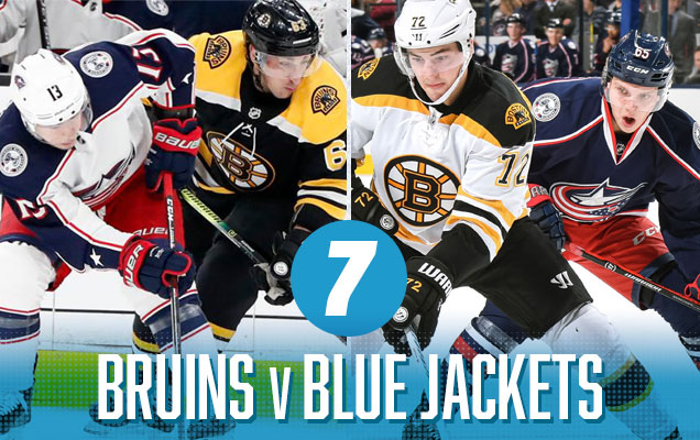
I wanted to dislike this matchup more, but I just can’t. As always, the Bruins bring a classic jersey with great punches of gold that elevate their basic black/white jerseys. Mix that with the red and blue of the Jackets, and you’ve got all your primary colours involved, but it’s balanced by the darkness of the navy blue and the good amounts of white thrown in. The styles of the jersey seem to match up well too, even though the Jackets have a more contemporary take on theirs.
Boston Bruins Visual Brand Ranking: 5th. All the Bruins’ visual brand categories rank between 4 and 7. They’re among the best in every single category from a visual brand perspective: great logo (2nd best imo), great jerseys, great legacy. They’re a beast. Really, how could they lose?
• More: BTLNHL Finals: Boston Bruins v Detroit Red Wings
• More: Worst to First Jerseys: Boston Bruins
Columbus Blue Jackets Visual Brand Ranking: 26th. Columbus continues to rank as having one of the worst visual brand legacies in the league. Uninspiring jerseys and mediocre results elsewhere in their visual brand keeps them well in the bottom part of the league. The saving grace, keeping them from falling too far in the basement, is their third jersey.
• More: BTLNHL #23: Columbus Blue Jackets
• More: Worst to First Jerseys: Columbus Blue Jackets
Brand prediction: Bruins (6-for-9)/
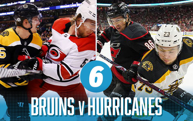
I’m still not a huge fan of the Hurricane’s third jerseys being worn throughout the playoffs (as it’s the weakest of their jerseys), and against Boston’s mostly black/white road jerseys, it’s a severely monochromatic matchup with only a few bursts of (mostly) gold and some red. But the jersey matchup in Boston is easily the best of this round: lots of bright, aggressive colours that provide good contrast and visual energy to the matchup.
Boston Bruins Visual Brand Ranking: 5th. All the Bruins’ visual brand categories rank between 4 and 7. They’re among the best in every single category from a visual brand perspective: great logo (2nd best imo), great jerseys, great legacy. They’re a beast. Really, how could they lose?
• More: BTLNHL Finals: Boston Bruins v Detroit Red Wings
• More: Worst to First Jerseys: Boston Bruins
Carolina Hurricanes Visual Brand Ranking: 19th. Carolina’s logo ranking doesn’t fare much better, but they have better jerseys and – all apologies to Connecticut – seeing those amazing Whalers unis on the ice again was absolutely fantastic! Having them as part of their legacy brand certainly helps.
• More: BTLNHL #19: Carolina Hurricanes
• More: Worst to First Jerseys: Carolina Hurricanes
Brand prediction: Bruins (7-for-10)/
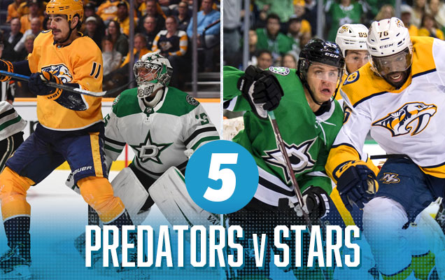
There aren’t many better match-ups for the über-gold Nashville jerseys than the Dallas “victory green” jerseys. It’s bright, it’s aggressive, it’s contemporary, and the simplicity of the colour palettes on both jerseys make sure they’re not clashing with each other. The Preds’ home golds are still too garish to really look good, but the mixture of gold/white vs green/black in Dallas are going to look fantastic.
Nashville Predators Visual Brand Ranking: 23rd. Our rankings gave them one of the worst regular jerseys in the league and a middle-of-the-pack logo and visual legacy. They’ve owned the gold, and I’ve always admired their ability to push the boundaries from a brand perspective, but their jerseys just kill them.
• More: BTLNHL #18: Nashville Predators
• More: Worst to First Jerseys: Nashville Predators
Dallas Stars Visual Brand Ranking: 14th. Basically, they’re smack dab in the middle on all their visual brand categories aside from a top 10 jersey set. Sure, we can never forget the mooterus, but it’s not hurting them too much at this point.
• More: HbD News: New Dallas Stars Logo Leaked
• More: Worst to First Jerseys: Dallas Stars
Brand prediction: Stars (8-for-11)

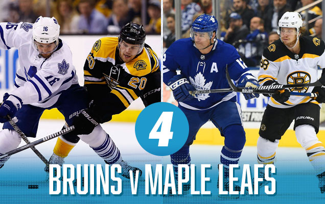
Now we get a classic Original Six matchup between the Leafs and Bruins feature classic jersey designs that use a nice amount of colour and contrast to make for a great visual matchup. It works because the Bruins bring a lot of gold into their jerseys, and the gold versus blue looks great. The game in Boston are a little bit lacklustre, mostly because of the Leafs not bringing enough blue to the table against a predominantly black Boston jersey, but hey, at least they’re not wearing all-white, amirite?
Boston Bruins Visual Brand Ranking: 5th. All the Bruins’ visual brand categories rank between 4 and 7. They’re among the best in every single category from a visual brand perspective: great logo (2nd best imo), great jerseys, great legacy. They’re a beast. Really, how could they lose?
• More: BTLNHL Finals: Boston Bruins v Detroit Red Wings
• More: Worst to First Jerseys: Boston Bruins
Toronto Maple Leafs Visual Brand Ranking: 1st. Oh, I guess Toronto could beat them. They’ve been bestowed the best logo and among best visual legacy in the league in our 2018 visual brand rankings, so it’s tough to see anyone somehow getting by the Leafs here. Although those white jerseys hurt them a bit, they’re an even bigger beast than the Bruins.
• More: BTLNHL #8: Toronto Maple Leafs
• More: Worst to First Jerseys: Toronto Maple Leafs
Brand prediction: Maple Leafs (8-for-12)\
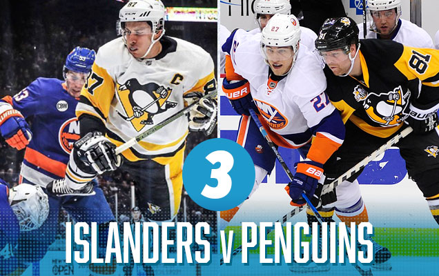
The next spot goes to two teams who experimented with different visual brands and jerseys throughout the ’90s and ’00s, and then came to their senses and brought their classic ’80s looks back. And it’s pretty glorious. The Penguins bring a large amount of gold to their otherwise black/white jerseys to compliment the Islanders’ blue-orange colour scheme. It’s a large amount of colour, the styles are similar and complementary, and the games both in Pittsburgh and Long Island will look great. Aesthetically-speaking, it was the best matchup of the first round.
New York Islanders Visual Brand Ranking: 29th. Their current classic look is great…for the Islanders. The consensus is that they still don’t have a great logo, their jerseys are not too bad, and nobody seems to like their third jerseys. Oh, and Captain Gorton is still too recent to be completely forgotten.
• More: BTLNHL #20: New York Islanders
• More: Worst to First Jerseys: New York Islanders
Pittsburgh Penguins Visual Brand Ranking: 9th. While the Penguins don’t necessarily excel in any of the visual brand categories, they definitely don’t suffer in any of them either (especially with their new/classic jerseys), with no categories ranking lower than 13th. It allows their visual brand squeak into the top third of the league.
• More: BTLNHL #6: Pittsburgh Penguins
• More: Worst to First Jerseys: Pittsburgh Penguins
Brand prediction: Penguins (8-for-13)
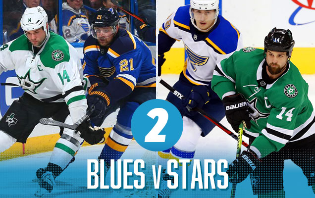
This matchup is (aesthetically) fantastic. Two teams – both with a great mix of classic and contemporary jersey designs – bring a ton of colour and aggressiveness to the party. The victory green-vs-royal blue is great, and the bursts of yellow from the Blues jerseys just bump things up a notch. It’s still tough to put this above some of the other matchups on the list, but for my eyes, this was a great series to watch.
St Louis Blues Visual Brand Ranking: 10th. Their brand is solid, with their logo, jerseys, and visual legacy all in the top half of the league, with their historical third jerseys being among the absolute best in the league. They’ve made missteps in the past, but there’s no denying the strength of their visual brand at this point.
• More: BTLNHL #4: St. Louis Blues
• More: Worst to First Jerseys: St. Louis Blues
Dallas Stars Visual Brand Ranking: 14th. Basically, they’re smack dab in the middle on all their visual brand categories aside from a top 10 jersey set. Sure, we can never forget the mooterus, but it’s not hurting them too much at this point.
• More: HbD News: New Dallas Stars Logo Leaked
• More: Worst to First Jerseys: Dallas Stars
Brand prediction: Blues (9-for-14)
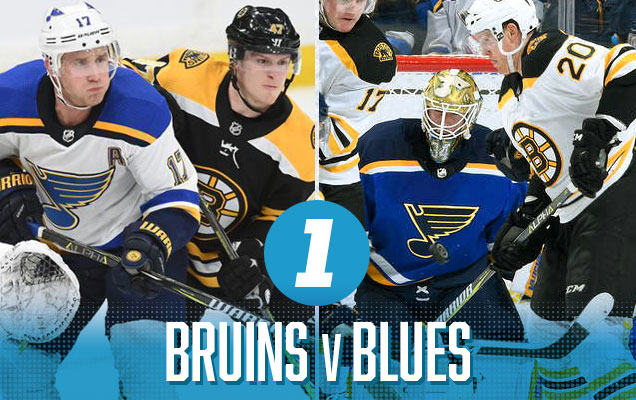
It’s not often that the Cup Final represents the best jersey matchup in the entire playoffs, but here we are: two jerseys featuring two of the best logos in the league, both with very similar jersey aesthetics (complete with stripes on the shoulder yokes) that have a clean, classic approach with some contemporary elements.
The Bruins always bring a good amount of colour for a black/white jersey, and the gold/royal blue combo for the Blues is a great one. And the consistency of with gold being a prominent accent for both teams makes them a perfect match for each other. It’s like they were destined to face each other in the Finals.
Boston Bruins Visual Brand Ranking: 5th. All the Bruins’ visual brand categories rank between 4 and 7. They’re among the best in every single category from a visual brand perspective: great logo (2nd best imo), great jerseys, great legacy. They’re a beast. Really, how could they lose?
• More: BTLNHL Finals: Boston Bruins v Detroit Red Wings
• More: Worst to First Jerseys: Boston Bruins
St Louis Blues Visual Brand Ranking: 10th. Their brand is solid, with their logo, jerseys, and visual legacy all in the top half of the league, with their historical third jerseys being among the absolute best in the league. They’ve made missteps in the past, but there’s no denying the strength of their visual brand at this point.
• More: BTLNHL #4: St. Louis Blues
• More: Worst to First Jerseys: St. Louis Blues
Prediction: Bruins in 7
Agree? Disagree? Let us know in the comments below or join the conversation on Twitter, Facebook, or Instagram!


[…] is fun: Ranking all the jersey matchups through the entire playoffs, as well as making a visual brand-based prediction for the […]
[…] is fun: Ranking all the jersey matchups through the entire playoffs, as well as making a visual brand-based prediction for the […]
[…] is fun: Ranking all the jersey matchups through the entire playoffs, as well as making a visual brand-based prediction for the […]
[…] is fun: Ranking all the jersey matchups through the entire playoffs, as well as making a visual brand-based prediction for the […]
[…] is fun: Ranking all the jersey matchups through the entire playoffs, as well as making a visual brand-based prediction for the […]
[…] is fun: Ranking all the jersey matchups through the entire playoffs, as well as making a visual brand-based prediction for the […]
[…] is fun: Ranking all the jersey matchups through the entire playoffs, as well as making a visual brand-based prediction for the […]
[…] is fun: Ranking all the jersey matchups through the entire playoffs, as well as making a visual brand-based prediction for the […]
[…] is fun: Ranking all the jersey matchups through the entire playoffs, as well as making a visual brand-based prediction for the […]
[…] is fun: Ranking all the jersey matchups through the entire playoffs, as well as making a visual brand-based prediction for the […]
[…] is fun: Ranking all the jersey matchups through the entire playoffs, as well as making a visual brand-based prediction for the […]
[…] is fun: Ranking all the jersey matchups through the entire playoffs, as well as making a visual brand-based prediction for the […]
[…] is fun: Ranking all the jersey matchups through the entire playoffs, as well as making a visual brand-based prediction for the […]
[…] is fun: Ranking all the jersey matchups through the entire playoffs, as well as making a visual brand-based prediction for the […]
[…] is fun: Ranking all the jersey matchups through the entire playoffs, as well as making a visual brand-based prediction for the […]
[…] is fun: Ranking all the jersey matchups through the entire playoffs, as well as making a visual brand-based prediction for the […]