HbD News: Senators’ 25th Anniversary Logo
It’s not often that we devote an entire article to something like an anniversary patch. Their lifespan is generally just one season, it’s typically little more than a primary or alternate team logo with some numbers or decorative text, and it’s generally meant to just sell more jerseys rather than be any concerted branding exercise. A few comments about them generally suffice.
But this Senators’ anniversary patch announced yesterday deserves something more, for all the wrong reasons.
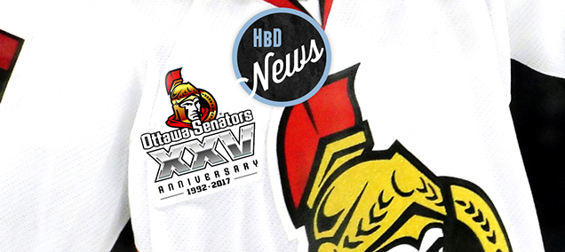
 First, it looks like incredibly lazy designing. There’s the Senators logo, on top of the team name, on top of roman numerals, on top of text. It’s paint-by-numbers as commemorative logos go. No thought is given to making it more cohesive and connected. To see what I mean, check out the Predators’ All-Star logo. That thing is a work of art, and it feels like a cohesive, self-contained single element. It’s not a bunch of disparate elements thrown together, like this Senators one is.
But the laziness doesn’t end there. Let’s rip this thing apart, from top to bottom.
The top element, the logo, is basically the Senators logo…all chromed-up. And it’s not even chromed-up well. It looks like a default Photoshop or Illustrator gradient that could be applied to anything within seconds. And there looks like there was no attempt to integrate the gradients into the design of the logo itself at all. I’m not a fan of the chromed-up logos the NHL used for the inaugural Stadium Series, but at least they were applied well, instead of just plastered on top, as it was here. It takes a so-so logo, and makes it worse.
Related Reading: HbD News: Stadium Series, All Chromed-Up
Related Reading: BTLNHL #21: Ottawa Senators
Next is the “Ottawa Senators” text, using some non brand-specific typeface. Commemorative logos like this don’t necessarily need to strictly follow a team’s brand – they’re short-lived and one-off – but it’s not a great typeface. It’s passable maybe, but then the way it’s applied here – super-squished (aka “tightly kerned” for typophiles), with a black outline – which accentuates the strange structure of the typeface.
And then there’s its placement, overlapping the Senators logo, giving the logo’s gladiator an S-shaped goatee. It’s the only attempt made in the logo to create a cohesive whole, and it fails. Oh, and the logo is right there(!), so it’s pretty much redundant too.
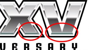
The “XXV” is next, with more chrome. Here, at least, the chrome is applied with some sort of thought instead of just slapped on top of letters, like it was with the logo. But there’s more problems, as the chroming is applied inconsistently between the two Xs and the V, which makes it look more like a mistake than a design choice.
 If you look at the image on the right, the Xs have a dark grey gradients coming up from the strip of teal (Why teal? No idea. Makes no sense.) along the bottom. On the V, the teal strip just ends with only white coming up the sides. Also, at the top of the V, there seems to be a double grey-to-white gradient on the sides of the top-half of the letter, which doesn’t exist on the Xs. And then there’s the fact that the V doesn’t have a base, looking more like two slanted pillars than a letter V.
Oh, and the gradients don’t line up either across the letters. The more you look at it, the more its apparent that the V was a mistake that got completely missed. I can’t imagine any competent designer letting that pass. It’s really awful.
Next up, the “Anniversary” text. Sadly, this could be the best part of the logo, but like the quotation marks on these signs, it’s completely unnecessary. If you look at the recently announced San Jose Sharks anniversary patch for example, the “Anniversary” part is generally implied. Nobody’s wondering what the 25 means.
For the Senators, “Anniversary” is using the same strange typeface as above, but at least it’s applied better, widely kerned (typophile for “lots of space between letters”) and all-capped. But again, it’s unnecessary.
And then there’s the “1992–2017” with the two bars. Again, unnecessary, although less unnecessary than the “Anniversary”, as some people aren’t very good at math, and calculating 2017 minus 25 can make the brain hurt. But, it’s only the third most unnecessary thing in the logo, behind the “Anniversary” and the “Ottawa Senators” text.
Ugh, this is just awful. And there’s not really any excuses for it. It is completely amateurish. This tweet actually sums it up quite nicely:
@drlari @HockeyByDesign @Senators sometimes I think hockey teams must employ interns from local high schools to do their design work
— Rusty Shackleford (@R_Shackleford9) July 7, 2015
Note: Silver Seven Sens pointed out to me something awful that I totally missed. The “1992–2017” at the bottom is also off-centre, shifted to the left, with the right bar not even extending to the edge of the logo. I have no idea who worked on or approved this clusterfuck of a logo, but man, they deserve to get fired. Or moved out of the Sens’ design team. Or something.
Agree? Disagree? Let us know in the comments below!


Looks like shit. Jay Earle designed a way better one.
Do you have a link to it?
For me, This might all be forgivable if the chrome effect on the Senator logo wasn’t so obnoxiously awful . . . AND if his chin wasn’t resting on the ‘S’, which is incredibly distracting.
Yeah, that chrome probably the worst part of the whole thing. Just so badly applied.
Great write-up, and absolutely agree! The chrome effect is bad and that font… can’t stand it.
Someone mentioned Jay Earl’s logo, I couldn’t find it on his website (http://www.wolfworks.ca/) but he posted in a group. Here it is http://imgur.com/lmJCKpA
Cheers,
D.
Not crazy about the Trajan typeface, but yeah, a hundred thousand million times better.
It looks like it was done using MS Word’s, WordArt function.
Another massive f-up on this clip art excuse for a logo, why is the “XXV” font in silver? I understand 25th anniversary is generally considered the “Silver” Anniversary, but the Sens aren’t getting married. Gold, Red, Black, and White are your colors, so doesn’t Gold make natural choice for any shiny metallic color you want to use?
As they say, there are too many hats on this logo. Chrome on top of strokes, on top of gradients, on top of differently kerned (and misfitting) type, literally on top of your logo. IMO, this would barely get a pass in the ECHL.
Absolutely agree. It’s just so bad on so many levels. ECHL may even be too good for it.
My favorite leauge is WAY too good for it, no matter how horrible its design can get.
[…] Related Reading: HbD News: Senators’ 25th Anniversary Logo […]
[…] 2.0 mask hasn’t changed much since 2014 in composition, but due to the chromed look of the oh-so-unfortunate Sens’ anniversary logo, Hammy’s mask has presumably been given the same treatment. The Hamburglar still sits in front of […]
Let’s think about this…Kelly has a broken leg. Murray can’t be tanlikg about him.Alfredsson or Fisher? He’s have to be crazy to call out those two. I’m not aware of any other prominent Sens on the injured list, now that Stillman is back.That would seem to mean that somebody else is playing hurt. And Murray doesn’t think they’re playing through it as well as the need to.Heatley? Spezza? Redden? It would certainly explain their timid (even moreso than usual) play lately. Maybe Neil’s pride isn’t the only thing hurting.
well that’s not something that should surprise people since she knows his music considering she has sang backup with him live. if i’m not mistaking , i read, that’s hwo they met. (not sure) and another thing, this song is dedicated to her if you didnt know
This is a great step for telling Google what videos are on the site. How will Google proceed to rank those videos in search results and determine relevance? And will these video publishers be part of the universal search initiative?
I understand that this professional team has tons of money to toss at a logo designer but It’s always easier to smear someone else’s work. No need to be cut-throat bruh! On the other hand there are way too many Youtube trained Photoshop monkeys out there calling themselves designers so…
If there’s one design that we’ve covered on this site that deserved to have its throat cut, it’s this one. It’s unforgiveable.