Top 5 Best and Worst Designs of 2013
 It’s that time of the year, where everyone and their top-5-favourite-dogs-of-the-year are counting down the best and worst lists for 2013. We here at Hockey By Design are not immune to such things. Why? Because they’re addictive. Have you ever watched WatchMojo videos on YouTube? Good god, I’ve lost hours in that timesuck.
So today, we’re doing the Top 5 Best and Top 5 Worst Designs of 2013 in the NHL. But we’re starting with the worst first. Why worst first? Because you always pick the bad news before the good news when given the option. ALWAYS.
Top 5 Worst Designs of 2013
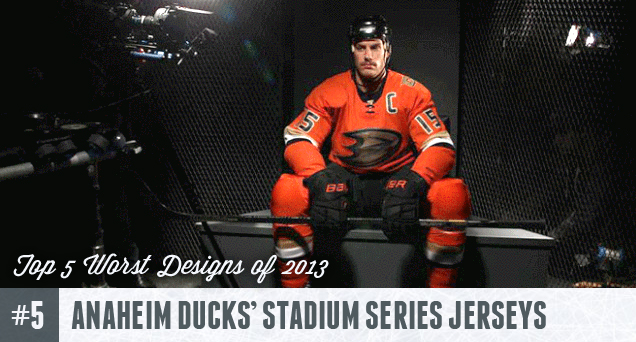 There’s some things in general that we can gripe about with all of the jerseys introduced in the Stadium Series, but this one has got to be the worst of the bunch. From it’s presentation – of Ryan Getzlaf all Movembered-up, looking like that creepy uncle that you see only at holidays and weddings/funerals, in a jersey that looks oddly frumpy and way too form-fitting – to its overall design, this is pretty awful. The extreme simplicity of the jerseys works against it, looking more like orange pyjamas than a professional hockey jersey. We have nothing against orange, but it’s not helping to fight that whole pyjama thing either. See our full analysis of these jerseys here.
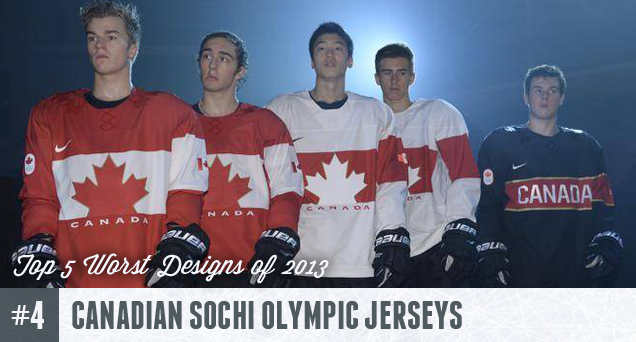 There were some pretty bad 2014 Olympic jerseys released over the year, but the Canadian ones are the worst of the bunch. Part of that is the expectations being so incredibly high for the hockey-mad country, but the criticism it has garnered is not unwarranted. The design is cheap-looking, appearing like something you could buy at a dollar store in the weeks before Canada’s national holiday. That Copperplate Gothic font is generic and awful. The third jerseys are unnecessary in a tournament 8 games long and poorly designed. It’s a complete missed opportunity. See our full analysis of these jerseys here.
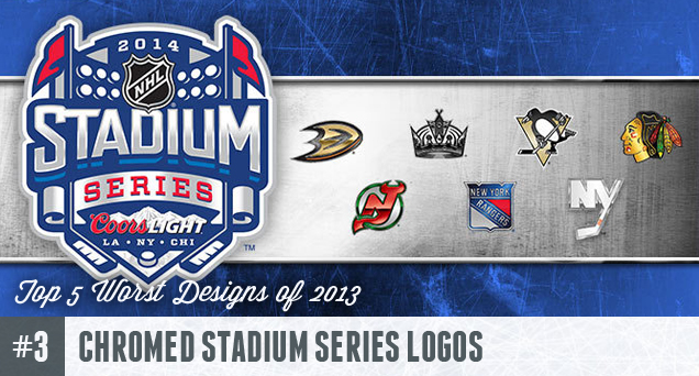 When the four Stadium Series games were announced, it was made clear this was not part of either the Winter Classic or the Heritage Classic, both of which tend to focus on historical aesthetics. To prove their point, the NHL’s first announcement of the aesthetics around the Stadium Series was showing off this set of logos, chromed all to hell. Four of the seven logos (Anaheim, Pittsburgh, Chicago and the Rangers) are exactly the same as their current ones, but with cheap Photoshop chrome effects added in. Two more logos (New Jersey and Los Angeles) use previous logos with the same cheap effects. Only the Islanders tried something new, minimizing their current logo to just the “NY”, but yes, again, with the same cheap effects. It looks tacky, cheap and uninspired. And it looks awful on the jersey designs, which followed a completely different design aesthetic. See our full analysis of these logos here.
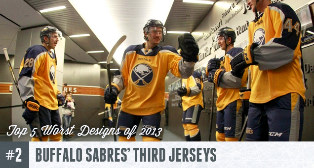 They’ve been nick-named the Turd Jerseys for a reason. The Sabres were recently on the path of good design by going back to their original look after the Zombie Buffalo and Buffaslug monstrosities, and then they threw general jersey aesthetics out of the window in favour of these third jerseys. Yellow on the front, with blue on the back looking almost like they’re wearing capes. Design so badly thought-out, longer names don’t fit the design and the captaincy patches were forced to the shoulders. The “Buffalo” on the front is borrowed from football and doesn’t work on a hockey jersey. Instantly reviled and panned by everyone as soon as they were seen, there’s some much going wrong with this jersey. To find out more of those things, read our full analysis here.
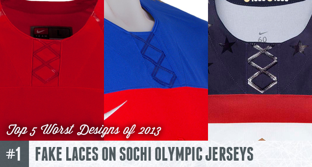 The worst design to emerge from the entire year has to be the fake laces on all of the Sochi Olympic jerseys. This one we can lay at the feet of Nike, who has overseen and implemented all of the designs for all of the teams, obviously following a template which, for one reason or another, has to feature fake, glossy laces. I understand wanting to not use laces if the designers were going for something a little more futuristic or wanted to innovate jersey design, but then just don’t put them on there. Here’s what the designers behind the fake laces are saying visually: “usually, there’s something here, but we didn’t want to put it there, but we wanted to remind you that the something you expect to be there is not actually there, so you can definitely notice what we didn’t put there, which we didn’t want.” This design decision just baffles us. So much fail. So deserving of coming in first for being worst. Read our original rant about the fake laces here.
Worst Designs of 2013 Honorable Mentions
- Stadium Series’ Jerseys Slanted Numbers (Full Analysis)
- Dallas Stars’ New Logo (Full Analysis)
- Los Angeles Kings’ Stadium Series Jerseys (Full Analysis)
- Almost all of the Sochi Olympic Jerseys
Top 5 Best Designs of 2013
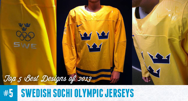 These jerseys can be considered one of the best designs of the year not because of anything innovative or great, but that they just didn’t completely suck at all, considering the rest of the Olympic jerseys that Nike unveiled over the last few months. The jerseys are classic Swedish Tre Kronor jerseys: simple, distinctive, with classic hockey jersey aesthetics. And the subtle glossy element of the boating vessel (a viking ship?) on the shoulders is an interesting and innovative addition. Sweden was adamant about not letting Nike do anything too crazy with the traditional design, and that can only be seen as a positive thing at this point. Classic, Swedish and one of the best jerseys that will be worn during the Sochi Olympics. Still…those fake laces! Read the full analysis of these jerseys here.
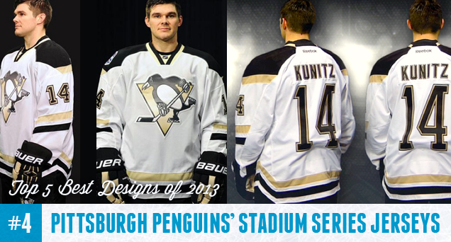 There will be some pretty bad jerseys worn during the Stadium Series in the new year, but the Pittsburgh Penguins’ entry into the Stadium Series will not be one of them. Easily the best jersey to come out of the Series, mostly because the designers realized that the unique – to use a kind word – elements used in the jersey templates (slanted numbers, cut-off sleeve stripes, angled shoulder yokes, angled striping on the jersey’s bottom) was enough innovation and invention and kept the rest of the jerseys simple and on-brand. The effect is that it makes all of the Stadium Series’ unique elements stand out in a positive way, looking innovative instead of tacky. Good on Pittsburgh for working with what the NHL and Reebok had given them. Read the full analysis of these jerseys here.
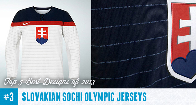 Another one of the few bright spots that came out of the Nike, fake-laced, Olympic jersey debacle was the Slovakian jerseys. The overall design themselves are fine, following the Nike-induced template with the solid shoulder yokes and Nike-logo-accentuating stripe right below the shoulder yoke. But the addition of subtle, thin stripes across the entire jersey adds a hint of history and authenticity (as old jerseys were covered in stripes) and those stripes being the Slovakian national anthem adds a unique design element for a mini-tournament of nations, nicely blending historical and innovative design with a patriotic appeal. And the rest of the jerseys were kept simple to allow this innovative element the attention it deserves. Read the full analysis of these jerseys here.
 In a league that loves blue, red and black when it comes to team branding, it’s refreshing to see a team embrace something different. Bright green jerseys like this have not been seen since the days of the Whalers and the North Stars, so Dallas went back to their Minnesotan roots and went with a solid green unique to them in the league. They can own it and they can leverage that in their branding and marketing within the league. And they also did a great job of designing the jerseys, mimicking the Blackhawks home reds with the thick white/black bottom on their home greens, and then designing wonderful traditional jerseys with solid striping and angled shoulder yokes for their road whites. Now, about that logo… Read the full analysis of these jerseys here.
Best Designs of 2013 Honorable Mentions
Before getting to the best design of 2013, here’s some of the honourable mentions:
- Vancouver Canucks’ Millionaires Jerseys (Full Analysis)
- 2014 Winter Classic Jerseys (Full Analysis)
- Buffalo Sabres’ Captaincy Patches (Full Analysis)
- Carolina Hurricanes’ Jerseys (Full Analysis)
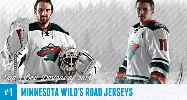 The best design to emerge from the past 12 months belong to the Minnesota Wild. It’s a brilliant blend of traditional hockey jersey aesthetics while taking small innovative steps to create something unique and innovative. The squared-off shoulder yokes, the consistent and simple striping pattern along the sleeves and bottom of the jerseys, the fonts used for the numbers and nameplates, the laces, the use of red as a minimally-used accent colour and letting the green dominate, it’s all well thought out and well designed. I didn’t give this jersey too much praise when it first came out (because the Sabres’ monstrosity was announced at the same time), but it’s a solid jersey and deserves top spot. Read the full analysis of these jerseys here.
What’s your best and worst designs from the past year? Let us know below! And Happy 2014 to all of you!


Always a pleasure to see beautiful jerseys.
Thanks for the analysis!
Also, I am definitely a fan of this website’s aesthetics. T’would be quite ironic to criticize jerseys with a site from the 90s.
[…] that’s new, but old at the same time. While that can sometimes be a compliment (see: the Wild’s new road jerseys), it isn’t in this case. The element comes together nicely, but not in any exciting or unique […]
[…] As for Minnesota, they have what’s the best logo out of all the expansion teams and logo redesigns that emerged during the ’90s, but that’s not setting the bar very high and only gets you ranked at #16. But, they have maintained a very consistent brand, with no logo changes and very minimal jersey changes since their inception, as well as introducing some pretty sweet third jerseys that they’re still using. I’m not crazy about the Christmas-themed jerseys (Clutterbuck is actually singing the “Do you hear what I hear?” holiday carol here), and they’re moving away from being branding as the mind-numbingly boring team from the Lemaire years. And they have awesome new road jerseys, the best thing to come out of hockey design in 2013. […]
[…] saw this one coming, right? If you read our Top/Worst 5 of 2013 post from a couple weeks ago, you know how we feel about the Ducks’ orange pyjamas uniform. […]
[…] So today, we’re starting with the Top 5 Worst Designs of 2014 in the NHL. Tomorrow we’ll be doing the Top 5 Best Designs of 2014. Why worst first? Because you always pick the bad news before the good news when given the option. Always. Remember, these are the Top 5 Worst Designs that were announced in 2014. We covered stuff like the Sochi Olympics last year. […]
[…] So today, we’re moving to the Top 5 Best Designs of 2014 in the NHL. Yesterday, we did the Top 5 Worst Designs of 2014, and you can read that here. Why worst first? Because you always pick the bad news before the good news when given the option. Always. And remember, these are the Top 5 Best Designs that were announced in 2014, so no Sochi Olympics here. We covered that last year. […]
[…] saw this one coming, right? Regular readers who have read our Top/Worst 5 of 2013 post from last year would know how we feel about the Ducks’ orange pyjamas uniform. There’s […]
[…] saw this one coming, right? Regular readers who have read our Top/Worst 5 of 2013 post from last year would know how we feel about the Ducks’ orange pyjamas uniform. There’s […]
[…] boring team from the Lemaire years. And they have awesome new road jerseys, the best thing to come out of hockey design in 2013. So, again, it’s a close […]
[…] saw this one coming, right? Regular readers who have read our Top/Worst 5 of 2013 post from last year would know how we feel about the Ducks’ orange pyjamas uniform. There’s […]