HbD News: New USA and Russian 2014 Jerseys Unveiled
Seeing the Russian and American 2014 Olympic jerseys side-by-side, there’s a few elements that make it painfully clear that Nike strong-armed the design process of all the jerseys to conform to some elements that they specifically wanted. For whatever reason, one of those things is fake laces: super-glossy criss-crossing (not Kriss-Krossing) lines at the collar.
Let me get this out of the way right at the beginning. Those laces are truly awful. For regular readers of this blog, they’ll know that I value minimalism. But more than that, I value design elements making sense and these fake laces make absolutely none. If you don’t want laces on there, don’t put laces on there. Don’t put on fake ones that serve absolutely no purpose whatsoever except as a useless design element that forces teams to confine to something that your designers thought would be a good idea and would set your jerseys apart from the rest in the worst way possible. GAH!
I understand the desire to be unique and create something new and exciting, but if it serves absolutely zero purpose, it’s superfluous and tacky. It’s a strange combination of historic and futuristic and it doesn’t mesh together well at all. I know I’m more of a traditionalist when it comes to hockey designs, but c’mon, fake laces? Good god, that’s just madness.
The other Nike-induced design element is the gigantic shoulder yokes. When I saw the Russian red jerseys yesterday, I didn’t like it, but I understood that had something similar in the last Olympics. Now seeing the American jerseys, it’s obvious that it’s another Nike thing. Why? Because it forces their logo to be displayed more prominently.
Pop quiz. Where’s the Reebok logo featured on NHL jerseys? Is it even featured on the front? Nope, it’s on the back, above the name plate and below the collar. Nike, as they’ve done on many national team jerseys in all sports, placed theirs on the front, right below what will be used as a solid colour divider on most of the jerseys I’m guessing. The human eye is naturally attracted to lines and order and, when your eyes naturally follow that strong line across the upper chest of the jerseys, it will hit the Nike logo. Really, I think it’s as simple as that. It’s a branding/marketing exercise for Nike, which would be fine if it was for a Nike-specific event, but forcing design elements on teams for the Olympics…that’s just ludicrous. I know, they probably paid millions to sponsor this whole hockey Olympic tournament. But still, really?
Nike. You’re drunk. Go home.
Russian Jerseys
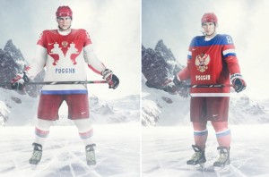
 Now, putting those two elements (fake laces and shoulder yokes) aside for now, what about the actual jerseys? Russia’s unveiling yesterday (another photo of them here) shows one jersey that’s pretty much par for the course as Russian jerseys go in terms of design and aesthetics: a red jersey with the double-headed eagle crest with blue and white trim elements. Aside from the previously-mentioned shoulder yokes that extend across the entire jerseys (aside from just the shoulder patches from the 2010 Olympic jerseys), they’re pretty much the same. The stripes on the arms and bottoms of the jerseys are minimalized slightly, which is good. The red Russian jerseys get a pass, but they’re nothing extremely exciting or unique in terms of previous Russian jersey designs.
The whites, however, now those things are bad-ass. I couldn’t decide at first whether I like them or not, as they’re pretty non-traditional and slightly smell of some pretty horrible NHL jersey designs from years past. But these manage to walk the line between modern/unique and minimal, and all the while still respecting some elements of traditional hockey jersey design. I likey.
Because the crest on the front of the jersey is much more busier than usual, with the silhouetted double-headed eagle, they rightfully minimalized all the other elements. The traditional blue element in Russian jerseys is just a single blue stripe along the jersey’s skirting and the blue Slavic “Russia” lettering. It’s tasteful and makes sense.
But it’s not all great on these white jerseys. The eagle feathers that come out of both side of the collar don’t work. I’ve seen other sports teams use elements like this very successfully (best example is the University of Oregon Ducks), but it works best when it’s more subtle or not competing with other elements on the jersey. With the strength and aggressiveness of the silhouetted eagle, the dainty and lacy feather elements don’t make that much sense. The two elements don’t play nice together.
Also, I’m not entirely sure what’s happening on the sleeves, but according to the press release, there’s “8 gold crowns on the right sleeve reminiscent of the golden legacy of the Soviet team.” I can’t comment without seeing them more closely, but I’m not against something like that if done well. But, there’s some weird shapes happening on the sleeve from the images that I’ve seen. I’m guessing now that I’m not going to be a fan of them.
But overall, the white Russian jerseys are pretty cool. It’s reminiscent of the old Canadian 1987 Canada Cup jerseys and 1972 Summit Series jerseys, which are just awesome. And as the Russians are hosting the Olympics this year, good for them on trying to make a splash. Canada did it in 2010 with the subtle crazy-busy Native-inspired design inside the maple leaf, so I hope this trend continues in the future. Can’t wait to see South Korea’s Olympic hockey team jerseys in 2018! (?)
American Jerseys
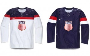
 The main problem with the American jerseys is that they went retro and futuristic at the same time, creating a jersey that feels disjointed. (Additional photos from the official release here.)
Historically, they streamlined the jerseys to feature a logo crest for the first time in a while, and while it’s been unpleasantly associated with interstate/highway route markers, I actually like it. It’s got a classic appeal and it’s much better than a stereotypical collegiate “USA” crest that they had in the last Olympics. Now, they actually have a logo and if you’re going retro, it’s a fine fit. And perhaps the bronze outline on the crest will be the perfect omen for their actual Olympic performance.
And the retro logo fits well with the overall design: minimal, clean and simple. In that sense, the solid navy blue jerseys are more successful than the white jerseys. The blue jerseys have a simple solid colour and a thick red and white stripe around both arms. And that’s it. Clean, understated, solid and will probably look great on the ice. The white ones, however, are crowded near the top. Every single design element on this jersey (other than the logo) happens within inches from the top of the jersey, which is otherwise completely white. It creates a visual imbalance that forces you to focus on elements other than the main one: the logo/crest. And even the logo is crushed up against the red stripe going across the entire jersey. The white jersey still has a great retro look, but overall, it’s visually off balance.
Speaking of the red line, anyone else notice how it nicely frames and accentuates that Nike logo? That makes it lose points right there.
Okay, now those f%*$ing stars.
The only positive thing I can think of for those glossy stars is that I imagine the designers staring horrified as the fake laces that they were being forced to work with and thinking, “well, if you can’t fight them, join them”. It almost covers up the fake laces or, at the very least, makes them feel more integrated into the design of the jersey. But, I’ve just spent the last few paragraphs explaining how retro these jerseys are, and then they throw in extremely modern elements like super-glossy stars. It just doesn’t mesh together and detracts completely from the retro appeal they’re establishing.
I hate the stars less on the blue jerseys since at least the stars are somewhat subtle in that they’re the same navy blue colour as the jersey, so without other design elements around them, they become even more subtle. However, on the whites, the stars become much more prominent and noticeable since that’s where every single other element on the jersey is, and it just becomes visual clutter.
I appreciate what they were trying to do with the stars, but it just doesn’t work. In the end, they come out feeling unnecessary and distracting. Just like the fake laces.
Agree? Disagree? Let me know in the comments. But if you defend those fake laces at all, may god have mercy on your soul.


Totally agree with ya, man. The USA jerseys are very poorly executed. The potential was there; they just couldn’t reach it. I’m having a very hard time understanding why someone would ever create those jerseys. Russia’s are a tad bit better, but goddamn… they could have been sooooooo much better. Overall, I’m pretty disappointed with Nike and their decision to use these jerseys.
what the fuck, nike?
I would also agree! There are so many beautiful ways that you can pay homage to just about any era of hockey through the design of your jerseys, but it seems like you lose all of that when you try to mash up the old with the new. It seems like the best way would be to split up the old and the new, like using vintage design aesthetic with modern manufacturing techniques. There are several gorgeous examples of vintage jersey designs being sublimated onto advanced moisture-wicking, poly-mesh materials (check out ProJoy and Athletic Knit for examples). Take a look at the new NFL Jersey fabrication techniques. Many of their jerseys are designed to look like the classic NFL Jerseys, but they are so filled with technology that the athletes love to wear them.
Absolutely. I think the only team to recently create something that balances traditional hockey aesthetics with something new is the new Wild road jerseys. They’re pretty spot on, and I wrote about them here.
[…] on all the 2014 Olympic jerseys and which I discussed in further detail on the review of the American/Russian jerseys that emerged in the summer. It always follows the same very minimalist aesthetic that the American jerseys use. Regular […]
[…] adding those stupid fake laces to which I, obviously, am unabashedly opposed to (as outlined in my USA/Russia jersey critique). The other glossy element on the jersey is the viking ship on the shoulders. Honestly, I […]
[…] Stadium Series jerseys. And it’s also on both these jerseys. Is it worse than Nike’s fake laces on the upcoming Olympic jerseys? I’m not so sure, but it’s definitely in the same […]
I said it a few times already and I’ll say it again: ALL of the Olympic jerseys are just plain awful, this USA jersey included. OK, the Russian jersey actually has something going for it.
Man, why didn’t they just come up with something that was actually modern and throw in the vintage crests to make sure there would be no hint for the national sports association?
Speaking of which: Sweden seems to be exempt of this rule: The boat is in the Swedish Ice Hockey Association logo – why are THEY allowed to have it?
[…] a simple design, one that has the fake laces and plastic looking finish in the shoulders that also appeared on the Russian and American jerseys. The fake lacing has been widely ridiculed, and for good reason, and it doesn’t look any […]
Why don’t they just wear the 1980 Miracle jerseys every time? It’s iconic and is on-brand