
Worst to First Jerseys: New Jersey Devils

As we go through the prolonged 2019-20 season, we’ll be updating all of the Worst to First Jersey posts every Monday, as almost all the teams in the league have unveiled new jerseys since their original posts. We’ll start with the ones most needing updating and work our way through the league. Today, it’s time for the New Jersey Devils to get updated.
Also, a huge thanks to SportsLogos.net and NHLUniforms.com for most of the jersey images and references.
The Devils has been the model of consistency since moving from Colorado to New Jersey in 1982. While some teams seemingly announce new jerseys every couple seasons, the Devils have only done one major (and one kind of minor change to their uniforms in the 35 years of their existence. And they’ve never worn a specially-designed third jersey, or a special event jersey, or anything like that. In almost 40 years. Let that sink in. This may be the shortest list so far, so I’d like to thank Lou Lamoriello for making this week’s ranking a little easier to produce.
Here’s how this works: I’ll count down, from worst to first, all the jerseys the Devils (and their franchise predecessors) have ever worn. Homes and aways will be lumped into the same category (so, more of a jersey “era”) and I won’t worry about small changes (like slightly changed positions of piping for example). Third jerseys will stand on their own. And I’m focusing on the jerseys only, not the entire uniform. Devils, there’s three different jerseys/eras. And we’ll start with the worst one.
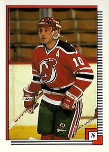
3. 1982–92 Home & Away Jerseys, 2014 Stadium Series Jersey, 2010–present Heritage Jersey

Sacrilege! The original Devils jerseys, as the worst‽ Well, yeah, but there’s only three jerseys to rank, which means these aren’t especially bad. And we’ll explain why they’re ranked here.
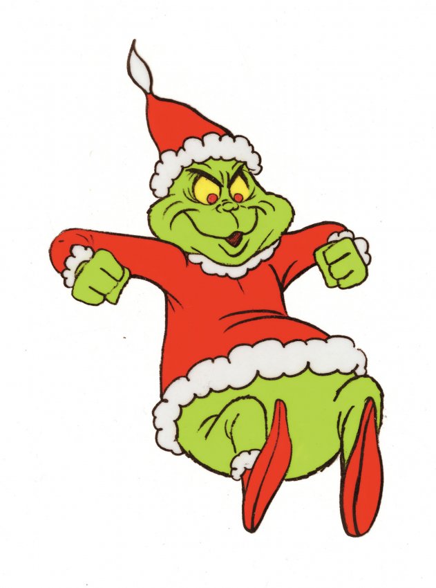
Not many teams have ever tried the red and green colour scheme (only Minnesota does it today), mostly because it’s the stereotypical Christmas colour combination and it’s difficult to design something that uses those colours and doesn’t automatically make you think of the Grinch, creepy stop-motion animations and Michael Jordan on a model train. Minnesota has mostly succeeded, but this jersey doesn’t really try to avoid it.
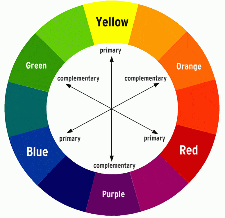
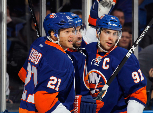
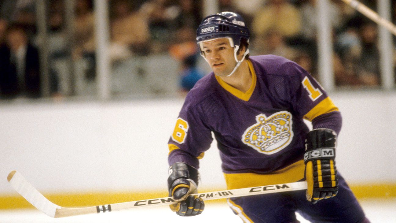
That’s not to say that green and red aren’t a good colour combination. In fact, they’re complimentary colours, just like the blue-and-orange of the Oilers and Islanders, and purple-and-yellow (formerly) of the Kings. But using complimentary colours in relatively equal doses, without letting one dominate the other, makes for a very aggressive jersey. And in this case, very Christmas-y as well.
It’s fun, unique and aggressive, but it’s hard to disassociate from the Christmas colours, and I’m not sure where the green comes in when you’re a team called the Devils. Because it’s the Garden State, I guess?
Other than the colours, the striping on the jerseys is interesting, as they’re different between the home and away jerseys…kind of. They’ve both got red and green stripes surrounded by white, but on the red jerseys, that causes extra white stripes to be included, which makes the red jerseys too complex, and the lesser of the set. But the white jerseys add an unnecessary extra stripe to the shoulder yokes, which doesn’t really work either.
It’s a strangely consistent but inconsistent jersey set with some great quirks and unique colours, but it’s just not refined enough to push the jersey out of the bottom spot.
As an aside, I’ve gotta give kudos to Uncle Lou for essentially giving the finger to the League and Reebok by refusing to use the chromed-out logos and slanted-number jersey templates in the 2014 Stadium Series (which were mostly awful), and just bringing these jerseys back instead.
• More: 2020 Stadium Series Jersey Countdown
Jersey Recommendation: #9 Muller. The problem with having only two jerseys throughout 35 years of existence is that there’s not enough jerseys to go around to honour all the players. But Muller was the captain of the Devils during these years, and with the team exclusively during this jersey era. Sure, he went on to greater accomplishments elsewhere, but he was the heart and soul of the Devils at one point. Get it in the whites. Other good picks…#3 Daneyko, #10 Broten. Get one of those in the reds.

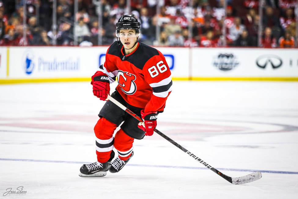
2. 2017–present Home & Away Jerseys

The 2017 switch from Reebok to Adidas as the supplier for the NHL’s jersey signalled a seemingly once-in-a-lifetime change for the Devils – a major jersey re-design (perhaps non-coincidentally, when Lou Lamoriello was no longer with the team). Well, “major” is kind of relative, but this is still the Devils we’re talking about. While there were expectations (hopes?) with a rumoured Jersey jersey change to see a return of the green-and-red colour palette, the red-and-black has remained (except for the collar).
• More: HbD Breakdown: Adidas Adizero Jerseys
The interesting thing is that the only major change is the removal of the stripes around the waist in favour of a single black stripe along the bottom, but it makes a big difference. For me, the Devils had the most stereotypical classic hockey jersey. You could take this jersey, change the black and red to any other two colours, slap a new logo on it, and it would work. If there was a (figurative) blue-collar hockey jersey, this was it. No nonsense, got the job done. And with the removal of the waist stripe, it’s not that at all anymore.
Making the sleeve stripes equally thick (instead of thinner outside stripes) also changes the aesthetics of the jerseys, and it’s a good exercise to see how minor detail changes can produce large changes.
And that seems to be the most shocking aspect of this jersey: intentionally or not, it visually changes the Devils brand and ethos.
A lot of their changes are rooted in the history of the franchise (including references to it’s time in Denver and Kansas City) which I really like, but there’s an undeniable modern and minimalist trend for this new design that’s not quite in sync with its symbolism. And that keeps it from the top spot on this list…just barely.
Jersey Recommendation: #86 Hughes. Sure, his rookie season hasn’t been Calder-worthy, but there’s yet to suggest he won’t step into his role as a bonafide star in the league. For a rebuilding Devils team, it’s a jersey with its sights set to the future of the franchise. And at this rate, there won’t be another Devils jersey until 2049 or something. Get it in the reds.
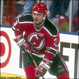
1. 1992–2017 Home & Away Jerseys

The top spot goes to a hockey jersey that has been streamlined to create what is the quintessential hockey jersey. Simple, thin-thick-thin consistent striping on the sleeves and waist. A solid-coloured shoulder yoke. Both jerseys are identical to each other, with the white and red swapped, and when you’re working with red, white and black, it works really well. And it’s matched perfectly with a simple, iconic logo.
• More: BTLNHL #17: New Jersey Devils
If you’re ever looking to create a beer league hockey jersey and just want something standard to base your design off of, this is probably the best place you could start. Change the colours and logo to whatever you need, and bang, you’ve got a traditional no-nonsense hockey jersey. It’ll look great, and it’ll get the job done.
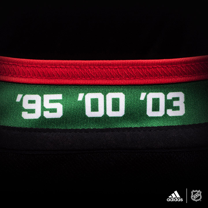
And it’s been doing its job for almost a quarter century now: simple, straight-forward, standard, no gimmicks, no frills. And that’s also a perfect representation of Lou Lamoriello’s era with the team, which has easily been the team/franchise’s most successful era as well, with Cup wins in 1995, 2000, and 2003.
That could also be a rub against this jersey though. There’s nothing here that pushes it to greatness – no risks taken, nothing innovative – just a simple, classic design that keeps things focused on things other than the jerseys. But it’s still the best thing they’ve ever worn.
Jersey Recommendation: #30 Brodeur. What can I say that hasn’t been said already. One of the best goalies to ever put on skates. Multiple record holder. The best player to ever put on a Devils jersey. Despite his weird defection to the Blues, he’s still the iconic Devil. Get it in the 1995 and 2003 Cup-lifting whites.
Agree? Disagree? Let us know in the comments or join the conversation on Twitter and Facebook! And don’t forget, we’re now on Instagram too.


Great writeup!
As a (almost – I was born a year before the Devils came to New Jersey) lifelong Devils fan, I have a lot of jerseys spanning the their three eras.
Your point on the red-and-green jerseys basically being too busy and not toned down enough is spot on. I love those jerseys, as most Devils fans and (I think) hockey fans of a certain vintage do, but you are totally right.
As for the 1992-2017 “glory years” jerseys, I never thought of just how simple and great they really are. Much like the team of that era, and Lou himself, no frills. Just getting the job done efficiently and (mostly) successfully.
As for the current jerseys, many fans do not like them. They have grown on me, but the simple, elegant 1992-2017 jerseys are still the best to me.
Again, great article. I love the whole series and everything you guys do on this site as well. Keep up the fantastic work!
Thanks Chris, much appreciated!
I like this writeup. I was just searching for the Devils colour scheme to get a goalie mask wrap done and came across this blog post. I found it interesting, and I have to admit I can’t really argue with your conclusions. My heart wants me to rate the green and red above the new jerseys, but like you said, those jerseys make the team look like Christmas trees on ice.
At the end of the day, you just can’t beat the “glory days” jersey for the Devils. Although I’d argue that you should get #30 in white and #4 in red.