
NHL Playoffs 2018 (Cup Finals) Countdown and Predictions
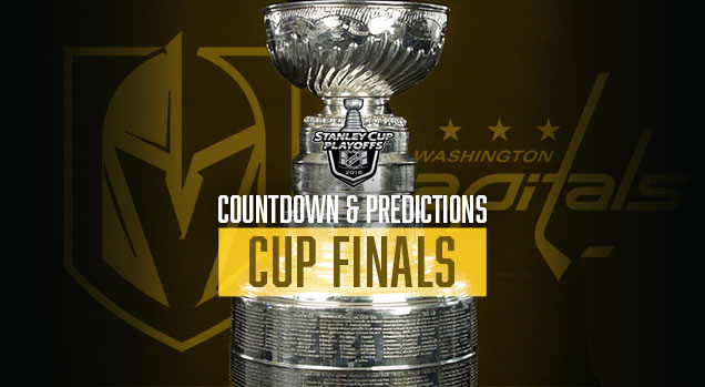 Ouch. Superior visual branding went oh-fer in the Conference Finals, which brings us to 4-for-14. At this point, with just one series left, we can’t even make it look respectable anymore. But, that won’t stop us from making our predictions for the Cup Finals.
• More: NHL Playoffs 2018 (Round 1) Countdown and Predictions
• More: NHL Playoffs 2018 (Round 2) Countdown and Predictions
• More: NHL Playoffs 2018 (Round 3) Countdown and Predictions
For the predictions…how does it work? We’ll compare the overall branding of each series and see how they match-up. This includes the logos, alternate logos, jerseys, historical logos and jerseys, general legacy and everything else that builds a team’s brand. And it will be drawn from just the visual brand component (aka: categories 1 through 4) from our handy and comprehensive brand rankings that we did at the beginning of the season to help us out. Here’s the link for that if you’re interested:
• More: 2017 NHL Brand Power Rankings
But on top of that, the match-ups are going to be ranked according to which will be the best to watch from an aesthetic standpoint. Some jerseys work better together than others, and you’ll see why. But for this round, the Cup Finals, we’re ranking all 15 matchups from the entire 2018 playoffs. As usual, let’s start with the worst jersey match-up…
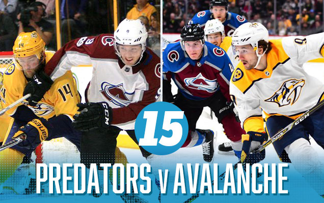 At first, I liked this jersey match-up: contemporary colours, a lot of bright visual energy, good amount of contrast between the jerseys. But, the more I look at it, the more it’s just too much. The colours start to clash the more you look at it, it grates on your eyes and becomes painful to watch. And I mostly blame Nashville. The Avs have one of the most improved jerseys from last summer’s Adizero updates, but the Preds represent the most colossal downgrade, going from unique and innovative to abrasive and coying overnight. And while the gold helmets didn’t bug me as much last season, but this season, with the jerseys that feature even more gold, it’s way too much.
Nashville Predators Visual Brand Ranking: 30th. Our rankings gave them the worst regular jerseys in the league and a bottom-5 visual legacy. Not hard to see why their second-last.
• More: BTLNHL #18: Nashville Predators
• More: Worst to First Jerseys: Nashville Predators
Colorado Avalanche Visual Brand Ranking: 12th. Their much-improved jerseys bumped them into the Top 10 in that category, as did their nice alternate jersey from last year. The other categories are mediocre, but they’re also facing the one of the worst visual brands in this matchup.
• More: BTLNHL #29: Colorado Avalanche
• More: Worst to First Jerseys: Colorado Avalanche
Our Prediction: Avalanche in 5. Uh…nope. 0-for-1.
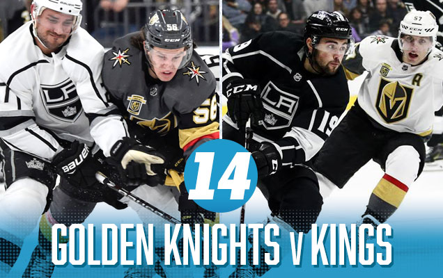 Welcome to the playoffs Vegas! It’s kind of sad when it’s the grey/black and white/grey jerseys that bring the most colour to the match-up. The little flashes of gold are nice to see in this match-up…and yes, the red as well, but only because the Kings bring so little to the table. Otherwise, it’s easily the most monochromatic and boring visual match-up from the entire first round. The bright spot is that since Vegas gets home-ice advantage in this series, we’ll only have to suffer through those white gloves for a maximum of three games.
Vegas Golden Knights Visual Brand Ranking: 26th. The visual brand component was the one area that we could rank the Golden Knights in our annual brand power rankings, and they didn’t do too well. To be fair, it’s hard to have a great visual brand legacy in your first season.
• More: HbD Breakdown: Vegas Golden Knights Jerseys
• More: HbD Breakdown: Vegas Golden Knights (Logo and Alternate Logo)
Los Angeles Kings Visual Brand Ranking: 27th. Oh, and look who’s right behind the Knights! With one of the worst logos in the league, and mediocre-to-bad rankings in the rest of the categories, the Kings don’t manage to take advantage of facing an expansion team in the playoffs. It’s a race to the bottom with these two.
• More: BTLNHL #28: Los Angeles Kings
• More: Worst to First Jerseys: Los Angeles Kings
Prediction: Golden Knights in 7 (in 2OT). It wasn’t the 7-game epic we predicted, but we’ll take the W. 1-for-2.
 It’s the match-up of the two most patriotic jerseys in the league. There’s red, there’s white, there’s blue, and there lots of stars and stripes. It’s also one of only two class red-vs-blue matchups in the first round. And while this would usually get it some points, the problem is that neither of these jersey sets are the great. Bad logos, mixed with erratic striping from the Caps and minimalist (in a bad way) striping from the Jackets make this a match-up that has it’s classic peaks (visually speaking), but also some deep valleys.
Washington Capitals Visual Brand Ranking: 28th. Being burdened with the worst logo in the league isn’t going to help any brand, but lacklustre efforts with their jerseys and, let’s be honest, they haven’t worn a really great jersey ever, means that they’re not really improving through any other category either. As a certain DC resident might say…Sad.
• More: BTLNHL #24: Washington Capitals
• More: Worst to First Jerseys: Washington Capitals
Columbus Blue Jackets Visual Brand Ranking: 25th. Aside from Vegas (which has no legacy to speak of, being an expansion team), Columbus has the worst visual brand legacy in the league. Uninspiring jerseys and mediocre results elsewhere in their visual brand keeps them well in the bottom part of the league. But it’s still better than the Caps!
• More: BTLNHL #23: Columbus Blue Jackets
• More: Worst to First Jerseys: Columbus Blue Jackets
Our Prediction: Blue Jackets in 7. Nope. 1-for-3.

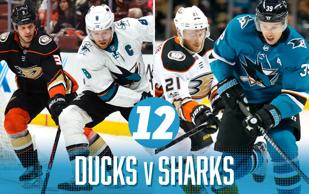 Anaheim? This far up? I’m as surprised as you are, but the annoying inconsistent stripes and beige/0range combo is actually balanced somewhat by the simplicity and relative minimalism of the Sharks jerseys. And the orange and teal combo represents a complimentary colour combination. There’s still not enough orange in the Ducks’ predominantly white and black jerseys, but the Sharks do their part to drag the Ducks up these rankings, kicking and screaming all the way.
Anaheim Ducks Visual Brand Ranking: 21st. Nostalgia wins the day in Anaheim, as their brand legacy (and use of that brand legacy in their most recent third jerseys), push them further up these ranking than this humble writer thinks they deserve. The only thing keeping them in the bottom third of the league are those atrocious jerseys.
• More: BTLNHL #30: Anaheim Ducks
• More: Worst to First Jerseys: Anaheim Ducks (Redux)
San Jose Sharks Visual Brand Ranking: 29th. All the worst visual brands are showing up in the playoffs this year. The updated 2017 Brand Power Rankings were not kind to the Sharks, at least from a visual brand perspective. Laden with bottom-third rankings in all the visual brand categories push the Sharks down, deeper than an ocean abyss. Because sharks, right?
• More: BTLNHL #25: San Jose Sharks
• More: Worst to First Jerseys: San Jose Sharks
Our Prediction: Ducks in 6. Didn’t happen. 1-for-4.
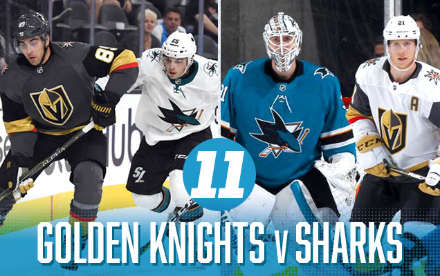 Each team gets a better match-up in the second round than the first, with the Sharks playing a team that doesn’t have the worst jerseys in the league (see: Ducks), and the Knights playing a team that actually have some colour. But the Sharks simplistic and classy teal jerseys make the Knights’ road whites look too circus-esque, and the Sharks over-simplistic road whites don’t bring enough colour to an otherwise grey vs white matchup. There’s some good elements interacting here, but not enough to push it farther up the list.
Vegas Golden Knights Visual Brand Ranking: 26th.
San Jose Sharks Visual Brand Ranking: 29th.
Our Prediction: Golden Knights in 7. Unexpectedly, Vegas keeps helping us out. 2-for-5.
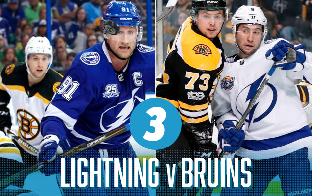
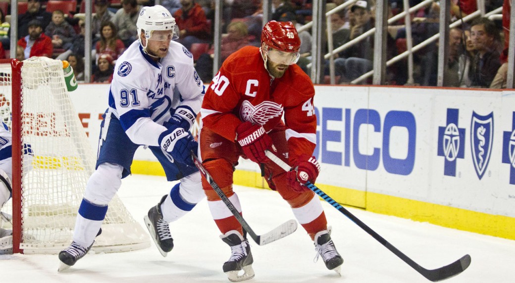
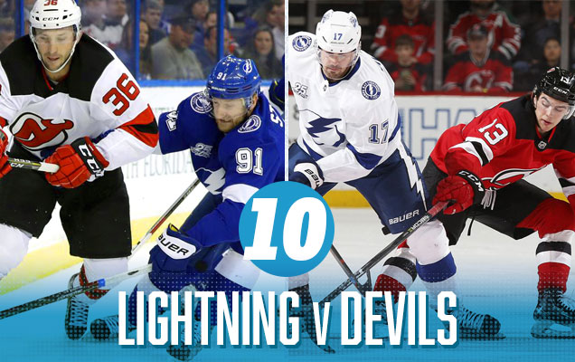 The other red-vs-blue classic match-up from the first round featured Tampa and New Jersey. Both of these jerseys are clean, minimalist, and – on their own – quite nice. But when they’re faced up against each other, it’s almost too minimalist with not enough character and too much contrast, especially with the Devils’ heavy-on-the-black approach. For example, the Bolts versus the Red Wings…beautiful! Somehow, New Jersey has just enough elements to make this match-up less interesting. Design is weird sometimes.
Tampa Bay Lightning Visual Brand Ranking: 19th. Nice logo, pretty good uniforms, and a disastrous jersey legacy featuring some of the worst things that ever graced the ice, not to mention some of the worst third jerseys we’ve seen in recent years. It all leads to a middle-of-the-road ranking.
• More: BTLNHL #22: Tampa Bay Lightning
• More: Worst to First Jerseys: Tampa Bay Lightning
New Jersey Devils Visual Brand Ranking: 17th. From a visual brand perspective, New Jersey has nailed the bland category. It sounds insulting, but it’s not meant to be. The Devils have just never been very adventurous at all with their logos or uniforms (Hi there Lou!), which gives them the expected middle-of-the-road result. Solid, but nothing exciting.
• More: BTLNHL #17: New Jersey Devils
• More: Worst to First Jerseys: New Jersey Devils
Our Prediction: Devils in 7. Another no. 2-for-6.

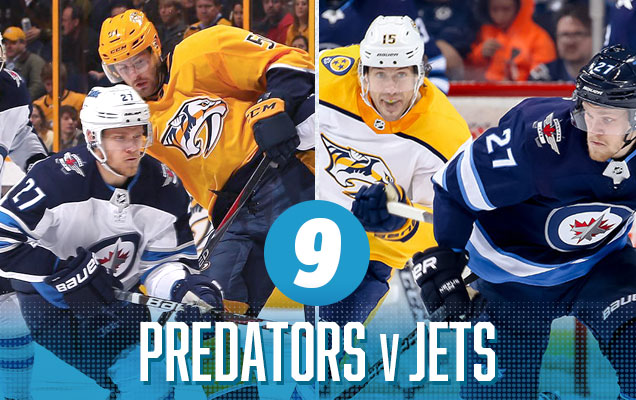 The Jets jerseys compliment the gratingly-gold Predators jerseys much better than the Avs did, with a somewhat more simplistic two-tone blue combo, especially since they’re both sporting a navy blue that provides a bit of consistency. And aesthetically speaking, blue and gold are a great match-up. It’s not enough to pull this match-up further up the list, but at least this 2nd round match-up wasn’t as much of an assault on the retinas as the Preds’ first round matchup again Colorado was.
Nashville Predators Visual Brand Ranking: 30th.
Winnipeg Jets Visual Brand Ranking: 18th. Another ranking being slightly propped up by nostalgia, the Jets’ most recent Heritage Jerseys move them up the rankings in terms of a visual brand. But their logo and current uniforms flounder in the bottom third of the jersey. Might that improve as the Jets find some success? Because success always makes a jersey look better.
• More: BTLNHL #15: Winnipeg Jets
• More: Worst to First Jerseys: Winnipeg Jets
Our Prediction: Jets in 5. Wasn’t that easy, but the Jets still advanced. 3-for-7.
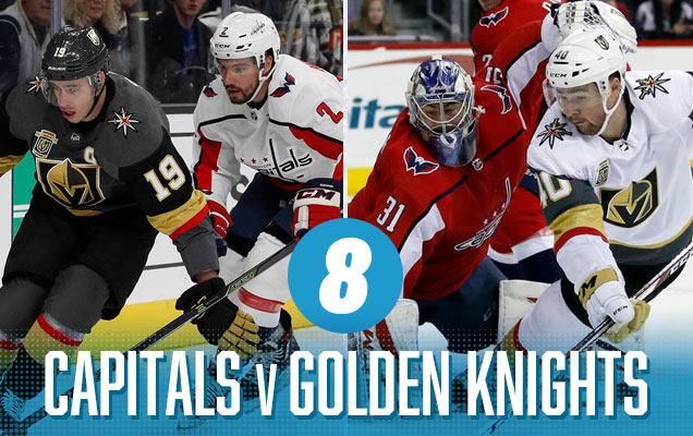 The Cup Finals match-up comes in smack dab in the middle of the rankings. There’s definitely some positives with this match-up. The differing but decidedly contemporary approaches to the jersey designs compliment each other, with thick chunks/stripes of colour mixed with narrow striping and a lack of significant striping along the bottoms of the jerseys. And the red in Vegas’ jersey gives it a visual connection to the Caps’ jerseys. But, there’s definitely some negatives to the match-up as well. Washington’s jerseys are just not very good, and we’ve never been huge fans of the Knights’ ones either (or the white gloves). Also, the games in Vegas won’t really have colour to speak of, being a predominantly grey/black-vs-white matchup. So, the middle of the pack seems about right.
Vegas Golden Knights Visual Brand Ranking: 26th.
Washington Capitals Visual Brand Ranking: 28th.
Prediction: Golden Knights in 7 (in OT)
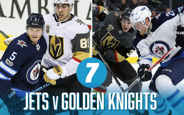 If I had to choose between the Jets or the Preds to face the Golden Knights in the Western Conference Finals, Winnipeg is definitely preferable from an aesthetic standpoint. There’s little bits of red that visually connect both the jersey sets, and they both bring more contemporary approaches to jersey design to the table. And like the Preds-Jets matchup, the blue-and-gold combination looks pretty good. But sorry, those Vegas jerseys are just not that great. Have I mentioned the white gloves before too?
Winnipeg Jets Visual Brand Ranking: 18th.
Vegas Golden Knights Visual Brand Ranking: 26th.
Our Prediction: Jets in 6. Another L. 3-for-8.
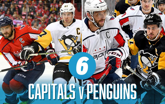 This is, aesthetically speaking, a great match-up. The Pens’ blast of gold go well with the reds and blues on the Caps jerseys, creating a primary colour mash-up with enough white and black thrown in to prevent it from getting too…clownish. The only thing holding this back is the clashing styles of the ultra-modern Capitals design with the more old-school Penguins design. It’s minor, but it’s the little things that can drop you. The games in Washington, with the heavy use of red versus gold, will look fantastic.
Washington Capitals Visual Brand Ranking: 28th.
Pittsburgh Penguins Visual Brand Ranking: 10th. While the Penguins don’t necessarily excel in any of the visual brand categories, they definitely don’t suffer in any of them either (especially with their new/classic jerseys), with all the rankings hovering in low-to-mid teens. It allows their visual brand squeak into the top third of the league.
• More: BTLNHL #6: Pittsburgh Penguins
• More: Worst to First Jerseys: Pittsburgh Penguins
Our Prediction: Penguins in 5. Ovi proving us all wrong. 3-for-9.

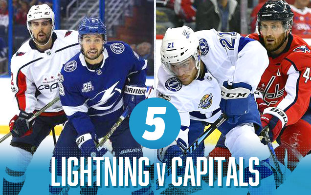 It’s a classic red-vs-blue matchup that takes top spot in the Conference Finals. Both teams bring a healthy amount of colour to their home jerseys. The Caps road whites are somewhat too minimalist, but it’s not enough to drag it further down the list. The primary negative in this matchup is the contrasting styles in these jerseys. The Caps have a more contemporary approach (with outlined yokes, unique patches of colour, etc) while the Bolts have a much more minimalist classic approach. But again, it’s enough of a good match-up to keep it in the Top 5.
Tampa Bay Lightning Visual Brand Ranking: 19th. Nice logo, pretty good uniforms, and a disastrous jersey legacy featuring some of the worst jerseys that ever graced the ice, not to mention some of the worst third jerseys we’ve seen in recent years. It all leads to a middle-of-the-road ranking.
• More: BTLNHL #22: Tampa Bay Lightning
• More: Worst to First Jerseys: Tampa Bay Lightning
Washington Capitals Visual Brand Ranking: 28th.
Our Prediction: Lightning in 6. Damn Ovi, why you play us like that? 3-for-10.
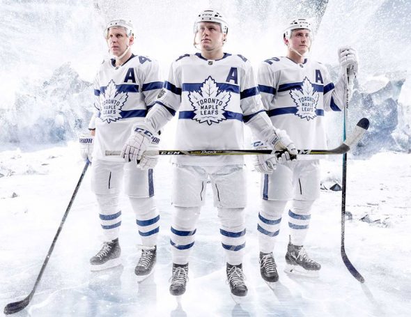
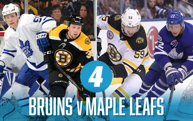 Now we get to the really good stuff. A classic Original Six matchup between the Leafs and Bruins feature classic jersey designs that use a nice amount of colour and contrast to make for a great visual matchup. It works because the Bruins bring a lot of gold into their jerseys, and the gold versus blue looks great. The game in Boston are a little bit lacklustre, mostly because of the Leafs not bringing enough blue to the table against a predominantly black Boston jersey, but hey, at least they’re not wearing all-white, amirite?
Boston Bruins Visual Brand Ranking: 4th. All the Bruins’ visual brand categories rank between 4 and 7. They’re among the best in every single category from a visual brand perspective: great logo (2nd best imo), great jerseys, great legacy. They’re a beast. Really, how could they lose?
• BTLNHL Finals: Boston Bruins v Detroit Red Wings
Toronto Maple Leafs Visual Brand Ranking: 1st. Oh, I guess Toronto could be them. They’ve been bestowed the best logo and best visual legacy in the league in our 2018 visual brand rankings, so it’s tough to see anyone somehow getting by the Leafs here. Of all the teams the Bruins had to face…
• More: BTLNHL #8: Toronto Maple Leafs
• More: Worst to First Jerseys: Toronto Maple Leafs
Our Prediction: Leafs in 7. Close, but the last game swung the other way. 3-for-11.
 Almost anything I said about the Leafs-Bruins matchup right above can be said again here. Why? Well, there’s not too many differences between the Leafs and Bolts jerseys. Now we get to the really good stuff. Again, it’s classic jersey designs that use a nice amount of colour and contrast to make for a great visual matchup. It works because the Bruins bring a lot of gold into their jerseys, and the gold versus blue looks great. The games in Boston are actually a bit better again Tampa than Toronto, since Tampa uses thicker stripes of blue, adding some more necessary colour to the matchup. Easily the cream of the crop from the second round.
Tampa Bay Lightning Visual Brand Ranking: 19th.
Boston Bruins Visual Brand Ranking: 4th.
Our Prediction: Bruins in 5. Nope. Again. 3-for-12.

I accept catching some flack for this one, but there’s so much to like about this jersey matchup. There’s equal amounts of black and white to make these jersey visually connected, but the bright gold against the bright orange make sure they stand apart from each other very clearly. It’s energetic, it’s aggressive without being abrasive, it’s two different approaches to classic jersey design that still both use simple blocks of colour to make them look cohesive together. It’s really pretty brilliant and a lot of fun.
Pittsburgh Penguins Visual Brand Ranking: 10th.
Philadelphia Flyers Visual Brand Ranking: 15th. The Flyers are decidedly middle-of-the-pack when it comes to their visual brand – never above 10th, never below 20th – in their categories. Personally, I value their visual brand much more than our Brand Power Rankings do – their logo is top 3, easy…don’t @ me – and I’ve always loved their latest/classic jerseys. But hey, the rankings are the rankings.
• More: BTLNHL #3: Philadelphia Flyers
• More: Worst to First Jerseys: Philadelphia Flyers
Our Prediction: Penguins in 6. Finally, a win! 4-for-13.

What I like about this match-up is that both sets of jerseys are full of contemporary and (relatively) unique colour schemes, with no black anywhere to be seen. The Jets’ two tones of blue are nicely offset against the Wild’s predominantly forest green jerseys, and both have strong, solid chunks of colour that keep them visually cohesive when they’re on the ice together. And both jersey sets have a great combination of classic and contemporary jerseys designs that compliment each other well. But what really sells it for me is that both have small elements of red to visually connect them, creating a visual string that runs through both jersey sets.
Winnipeg Jets Visual Brand Ranking: 18th.
Minnesota Wild Visual Brand Ranking: 5th. The logo is loved, that’s for sure, as they’re sitting at 4th-best in the league. That, and some really great, understated jersey design over the last decade has solidified their visual brand as the best to emerge from the most recents waves of expansion in the last 20+ years.
• More: BTLNHL #16: Minnesota Wild
Prediction: Wild in 5. Not even close. 4-for-14. Ouch.
Agree? Disagree? Let us know in the comments or join the conversation on Twitter, Facebook and Instagram! And if you’re interested, we’re now on Pinterest too.


[…] The Stanley Cup Final also starts tonight in Las Vegas. The narrative will be amazing whether it’s the expansion Golden Knights winning or all-time great Alexander Ovechkin finally lifting the Cup. (If you’d rather talk about the narrative of the jerseys, this is a fun read.) […]
[…] The Stanley Cup Final also starts tonight in Las Vegas. The narrative will be amazing whether it’s the expansion Golden Knights winning or all-time great Alexander Ovechkin finally lifting the Cup. (If you’d rather talk about the narrative of the jerseys, this is a fun read.) […]