Top 5: Vancouver Canucks Logo Concepts
 We’re back with another team’s entry into the Logo Concept canon, this time focusing on the Vancouver Canucks. Their current logo seems to split the Canucks’ fandom and hockey fans in general (i.e. me versus everyone else, apparently), so they’re a prime candidate to look at some of the best concepts that the online hockey design community has to offer for alternatives.
Hate the orca? Then this post is for you. Love the orca? You may be convinced otherwise. But one thing is clear from researching this post…the blue and green combo is much loved. At least by the design community.
• More: Top 5 Logo Concepts Series
• More: BTLNHL #10: Vancouver Canucks
• More: Worst to First Jerseys: Vancouver Canucks (Redux)
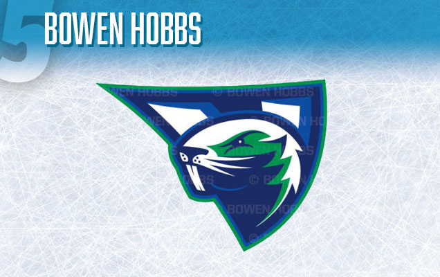 Bowen Hobbs (San Clemente, CA) :: Website :: Behance :: Concept Page
Bowen has made the Top 5 concepts list before, specifically for his concept for the Washington Capitals, and he makes another strong entrance here. What struck me was creating a concept that didn’t have (a) an orca, (b) Johnny Canuck, or (c) a V as the centrepiece. While I do have some concerns about the general shape of the logo – the elongated left side would be always look strange and off-centred on a jersey – the originality of using the proud Canadian (aka Canuck) symbol of a beaver as the centrepiece was completely unique. It’s a truly original concept from almost everything else that’s out there. Containing the beaver within a triangle that also contains a V in the background helps strengthen the concept. And there’s obviously talent in his illustrating skills.
• More: Top 5: Washington Capitals Logo Concepts
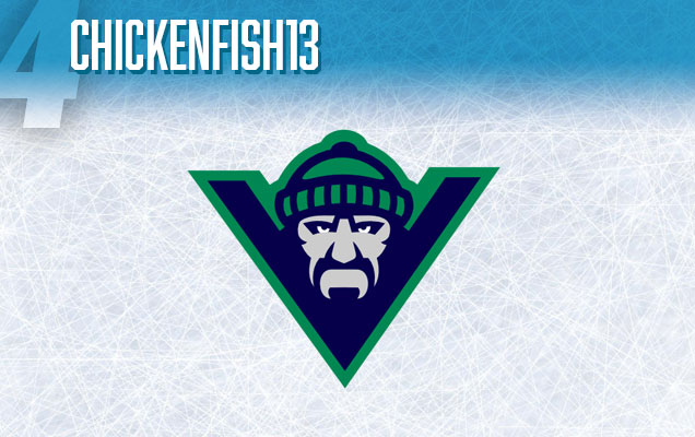 chickenfish13 (Canada) :: Website :: Concept Page
There were many Johnny Canucks concepts out there – the bearded lumberjack that graces the Canucks’ current alternate logos. Some were better than others, but chickenfish13’s (probably not his/her real name) concept went a route different than the glut of different 3-dimensional, multiple shading, and complex shapes concepts that are everywhere, going instead with something simple and more iconic. You end up with a fiercer looking Johnny who looks like he’s leaning forward menacingly and ready to attack (not unlike another “Johnny”), staring through your corneas down into the deepest, darkest corners of your soul. And the geometric V – much wider/extended than usual – adds some more modern character and and compliments the flatness perfectly.
 Brandon Moore (Miami, FL) :: Dribbble :: Behance :: Concept Page
Brandon Moore also makes another appearance on a Top 5 logo concept list, who also had his work included on the Maple Leafs list. What’s great about this concept is the combination of simplicity and complexity. The predominant shape: a simple V. But within that V is a load of detailing that is purposely reminiscent of traditional First Nations aesthetics, an extremely prevalent part of Canadian culture along the Pacific. It’s part of the reason I’m a fan of their current logo as the same aesthetic is used in the orca. The detail of the C (presumably, for Canucks) near the base of the logo is a smart and simple touch, as are the inclusion of the wings to give the logo more movement. The only thing I might suggest is switching out the red with a silver or lighter tone of blue. It’s too much competing colours otherwise (you listening Vegas?).
• More: Top 5: Toronto Maple Leafs Logo Concepts
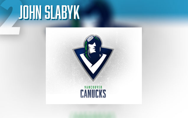 John Slabyk (Washington, DC) :: Website :: Concept Page
There’s little out there about John Slabyk, a professional designer who helped design the now-famous Obama logo. Maybe that’s because he’s famous enough he doesn’t need to advertise, or it might have something to do with a Kickstarter controversy surrounding him. Regardless, before he went into hiding, he released the best Johnny Canuck logo out there. The illustrative quality is excellent, the detailing exquisite, and the concept simple and strong with Johnny’s slightly-upward-gazing head emerging from a V-shaped crest. It’s also more historically accurate to the original Johnny Canuck from the comics from WWII, where he was depicted as as a war pilot, often dressed in a flight jacket, goggles and headwear. This Johnny looks less menacing than the bearded lumberjack Johnny we know today, but it better represents the grace and skill that are integral to hockey as well. And the icing on the cake is the subtle reference to the original Canucks logo in the goggles.
 Agoork (BC, Canada) :: Website :: Concept Page
It was never my intention to place this one in first when I came across it. But as I ranked these, the more trouble I had ranking it below the others. There’s an extreme simplicity and timelessness that still carries a lot of symbolism in it. Plus, it’s combination of strength, movement, aggressiveness and grace kept kicking it up the list higher and higher. Does it need a bit more refinement? Definitely. But the structure is there and its solid. There’s the obvious V-shaped crest, as well as the white V in the negative space of the logo. The green also forms the tail of an orca, with the animal’s obvious connection to the current Canucks logo and to Vancouver in general. And if that’s an orca tail, then it’s emerging from the blue water beneath it. The blue and white also has some morphed mountain elements to it, or the green point represents Stanley Park sticking out into the water. That’s the thing that sold me on this: each person will see something different that’s representative of Vancouver, but it’s simple enough that it’s timeless and could be used as the Canucks’ logo for another 50 years, which is twice as long as any other Canucks logo has lasted so far. That’s the makings of a good logo concept.
Agree? Disagree? Let us know in the comments or join the conversation on Twitter, Facebook and Instagram! And if you’re interested, we’re now on Pinterest too.





So…your top choice is a rip off of the Whalers logo?
If you’re going to be inspired by a logo, why not be inspired by the best?
There’s inspiration, and then there’s stealing. Not saying it looks bad by any means lol
Picasso: “Good artists borrow, great artists steal.” 😉
I like chickenfish13’s Johnny Canuck design. It’s the only one that fits. A Canuck is not an animal…orca, beaver, eagle, First Nations, whatever. The Canucks were named after Johnny Canuck. The lumberjack version is a tribute to the lumber industry that built the City of Vancouver and has longstanding roots in BC.
A strong logo tells a story. A story about the club’s beginnings. Johnny Canuck has that storytelling history and strength. It’s a logo that would unite the majority of the Canucks fan base. I proudly grew up with the the Flying V and Skate brand. However, as I got older and learned about the history and legacy of Johnny Canuck and how it influenced the Canucks name, I have advocated for Johnny ever since. I also believe that the Canucks will never ever win a Stanley Cup until they ditch the corporate orca and embrace Johnny Canuck as their primary mark.