
Top 5: Toronto Maple Leafs Logo Concepts
In this edition of Top 5 Logo Concepts, we scoured the internet for the best Toronto Maple Leafs logo concepts. It’s no easy feat to find designers willing to re-brand one of the most classic and recognizable teams in the NHL! With the recent news of Toronto getting a logo and jersey update for the upcoming 2016-17 season, it got us thinking, what makes a successful Leafs logo concept? Let’s be realistic, there’s going to be a freakin’ maple leaf on it. Right in the middle. It’s not going away. Ever. It’s also going to be blue and white. So within those boundaries, where is Toronto going to take this? Well these designers have a few ideas for us…
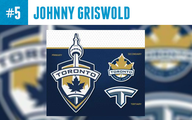 Johnny Griswold :: Concept Source Page
Johnny Griswold, the author of the now defunct hockey design blog “Puckdrawn”, came up with a bold Leafs concept that still has the leaf front and center, but it’s real focus is on the city of Toronto, working the CN tower into the logo and reducing the wordmark to just ‘Toronto’. The logo is framed with a shield and anchored by a letter ‘T’ at the bottom. The real shocker here is the inclusion of a third color into the Leafs sacred blue and white branding, a shiny gold addition that is a far cry from the Leafs current look, but maybe an all-new design is exactly what this organization needs…just don’t tell them about the Seattle Sounders logo.
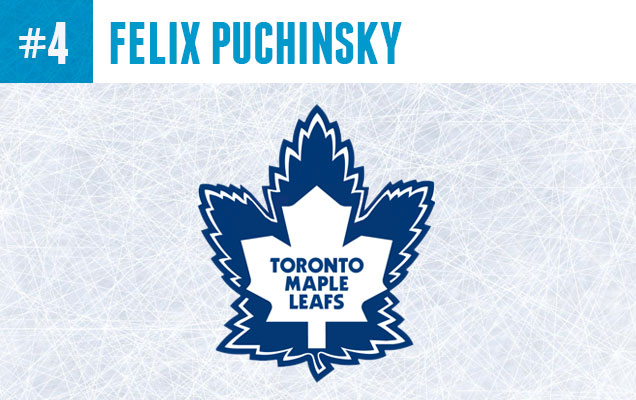 Felix Puchinsky
The modern leaf silhouette cut out from the 1963-67 leaf seems like a lazy solution at first glance, but actually it’s really good. I mean, why not? I couldn’t find much information on this designer, but he has tapped into a solution that maybe the pros haven’t considered: a literal fusion of the old and new leafs that represent the franchise’s history equally. The team hasn’t won any cups with the modern leaf, so why does it deserve more jersey time than the old leaf (sorry Leafs fans)? Is this concept too complicated for the Leafs branding? Maybe, but the NHL certainly has much more complicated logos than this one.
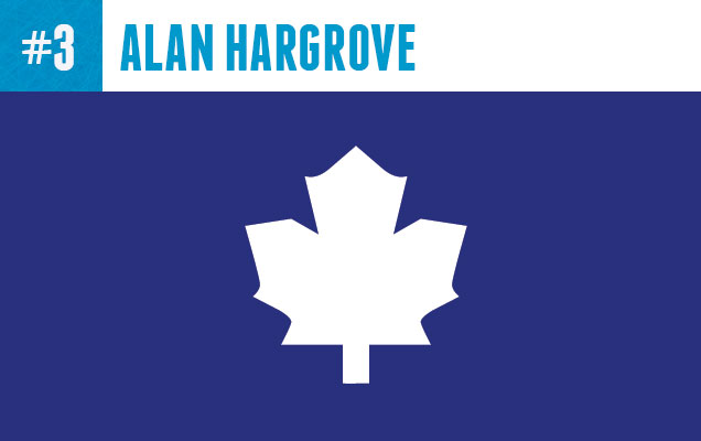 Alan Hargrove :: Dribbble :: Concept Source Page
Here’s a rather obvious direction that really falls in line with modern minimalist design aesthetic: Just take the words off the leaf and BOOM, new logo. Designer Alan Hargrove, actually did an entire NHL series of minimalist logos that can be found here and his Maple Leaf seems to work the best out of all of them. The Maple Leafs organization has hinted at taking this direction as well, as they are currently using a word-less leaf on Twitter (@mapleleafs) and various other social media.
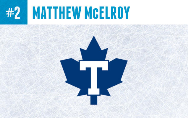 Matthew McElroy :: Dribbble :: Concept Source Page
This concept combines Toronto’s modern leaf with the ‘T’ logo of the Maple Leafs 1917-1919 predecessors, the Toronto Arenas. This is a smart concept that simplifies the wordmark on the leaf without completely getting rid of it. The secondary wordmark that designer, Matthew McElroy also included is really interesting and lets the team’s name take center stage while the maple leaf is much smaller and playing more of a flair role. Though, their strict branding may never go for such a concept, I can’t help but think that this would look great on a jersey.
Related Reading: Top 5: Anaheim Ducks Concepts
Related Reading: Top 5: New York Islanders Concepts
Related Reading: Top 5: Tampa Bay Lightning Concepts
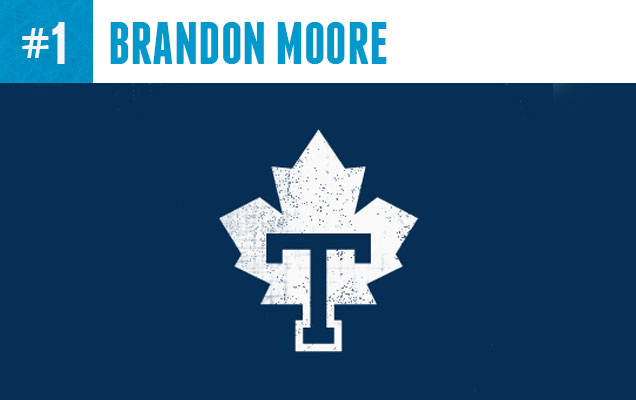 Brandon Moore :: Dribbble :: Concept Source Page
Brandon Moore’s Leafs logo, like the previous concept, is reminiscent of the Toronto Arenas. We all know that hockey fans, maybe more than any other sports fan, love their nostalgia and this one fits right in with the best of them, while still feeling modern and fresh. Also, the base of the letter ‘T’ fits in perfectly as the stem of the leaf, which is a very nice design detail, and a great solution for how to put the ‘T’ and the leaf together. It has earned this concept the top spot for this Top 5 edition.
What do you think? Have you seen other awesome Leafs concepts out there? Let us know in the comments below, or join the conversation on Twitter and Facebook!


There’s only 3 concepts here. #4 is just two logos pasted onto each other which doesn’t look good and the #3 is already a logo they have used.
No say it isn’t so I’ve heard this for a while. Next they’ll be trying to change the winged wheel or the Bruins B. Bad enough they’ve messed with the Black Hawks crest. So much for tradition.
[…] artists take a shot at redesigning the logo of the Toronto Maple Leafs. No. 5 is just crazy enough that it might […]
[…] Reading: Top 5: Toronto Maple Leafs Concepts Related Reading: Top 5: Anaheim Ducks Concepts Related Reading: Top 5: New York Islanders Concepts […]
[…] the edge for me, but the graphic layered leaf-on-star design is still quite nice. Not unlike the layered leaf concepts we’ve seen popping up for Toronto’s upcoming rebrand, this design does a nice job of fitting […]
No say it isn’t so I’ve heard this for a while. Next they’ll be trying to change the winged wheel or the Bruins B. Bad enough they’ve messed with the Black Hawks crest. So much for tradition.
The graphic layered leaf-on-star design is still quite nice. Not unlike the layered leaf concepts we’ve seen popping up for Toronto’s upcoming re brand, this design does a nice job.
[…] You see, when the Springfield team was looking for a logo designer they approached Matt McElroy (who has been featured on our site before), who had previously submitted a logo concept for the Seattle Thunderbirds over on the Icethetics […]
Full of informative material
The graphic layered leaf-on-star design is still quite nice. Not unlike the layered leaf concepts we’ve seen popping up for Toronto’s upcoming re brand, this design does a nice job.
This is very nice blog i read full and its too much informative about designs and everything creative ideas, Business Logo Design, corporate logo design.
The logo is famous but I would not call it iconic. It’s not as ugly as, say, the New Jersey Devils logo. Simple as it is, I find the Maple Leaf logo attractive but certainly with room for improvement.
I wouldnt call this iconic as well, a lot of improvement can be done and a decent designer can do a nice facelift in just several hours, right now its pretty dull, no offense.
[…] • More: Top 5: Toronto Maple Leafs Logo Concepts […]
Surprised we haven’t seen more concepts with the new logo… Love this. However, the yoke and stripes on the away don’t seem to mesh particularly well. I would add a blue outline to the blue numbers (on the away, separated by white) and a white outline to the white numbers (separated by blue). The yoke might look better on-ice though. Great work!
I think that the 5th one should be the 1st one in terms of creativity and ideas. While 4, and 3 are just same there is no difference.
I am not a logo designer but it is obvious that the first and fifth one is the only logos that fall in the category of a team or club logos. While 2, 4 and 4 are just as simple without any message or creativity.
Being not a logo designer by profession, but it is clear and cut that the first and fifth one is the only logos that fall into the category of a team or sports logos. While 2, 4 and 4 are just as ordinary, no piece of attraction.
Great Article about Logo design and Colors. Thanks !!!!
This is an very interesting concept I really inspired from your design maybe It will be good inspiration for my work.
I have seen all but the 2nd one is very good and but how about going towards this digital marketing agency in karachi
Wedding photography in Paris is a dream of couples all over the world.
There you have it. Engagement photos will last forever and will be one of your most precious reminders of this special time.
Myzerodeal is a site that promotes affiliate products. These products can be digital or physical but most of these sites promote physical products. Unlike selling on eBay or Amazon, you do not own these products. You promote other people’s products through affiliate links and earn a commission.
Hi,
I just read your post on the topic – about maple leaf logo design concepts. Very useful information. I write about related topics on my company blog. My company [Enthof] focuses on subjects, that your readers might also be interested in reading. I was also on a lookout, if I get backlinks to my domain?
Let me know if I can give you any more information or help out in any way.
Thanks and Regards,
Kshama Bilgi
I’m so amazed together with you that will make your blog like this to be really great so we truly wanted to have a nice and interesting blogs such as this.
Do you want to take your business to new heights?
I’m so amazed together with you that will make your blog like this to be really great so we truly wanted to have a nice and interesting blog such as this.
Vaginismus is a condition in which involuntary muscle spasm prevents vaginal penetration. This often results in pain with attempts at sex. Often it begins when sexual intercourse is first attempted. The underlying cause is generally a fear that penetration will hurt.vaginismus treatment in lahore
Technosys is one of the best & reliable company for Cell Phone Repairs In Brampton, Canada. We do Broken screen repairing, water damage, battery replacement, power jack replacement. We accept all brands.
i think they could try some color variations.
Lycos gears is one of the brand in the international market which become famous cause of their unique and quality stuff. We use high quality material for professional bike riders. Millions of customers around the world is happy with our product. Our first priority is customer satisfaction, we are selling joker football gloves, If you’re thinking about famous brands like Suzuki, Honda or Yamaha jackets, Don’t worry we are also selling such quality
I really like the way you have explained the concepts about the maple leafs logo.
Lycos gear bring high quality summer collection Must visit joker batting gloves
Good post to follow, already bookmarked it
Nice sharing information.
If you needs graphics design company like social media marketing, Logo design services, Packaging design services then visit my site show my portfolio design.
if you show my current work design on our social media platform.
I really like the way you have explained the concepts about the maple leafs logo.
i think they could try some color variations.
Thank You So Much i have shared it with my friends it helped… Board Certified Autism Technician
Thanks for sharing with us. like this website so much it’s really awesome.I have also gone through your other posts too and they are also very much appreciate able and I’m just waiting for your next update to come as I like all your posts
I really like the way you have explained the concepts about the maple leafs logo.