
Top 5: New Kids (and Logos) On the Block
 While the summer heat keeps the NHL’s Las Vegas expansion on our minds over here at HbyD (Black Knights? Aces? What’s it going to be?!), five new teams across the North American minor leagues have quietly emerged and have revealed some unique (and sometimes odd) names, branding, and logos to begin the 2016-17 season. In this addition of ‘Top 5’ we welcome the newest teams on the block (there’s only five, so that’s easy for the purposes of our list) and rank the design and staying power of their logos. Sink or swim, we’re jumping into the deep end…
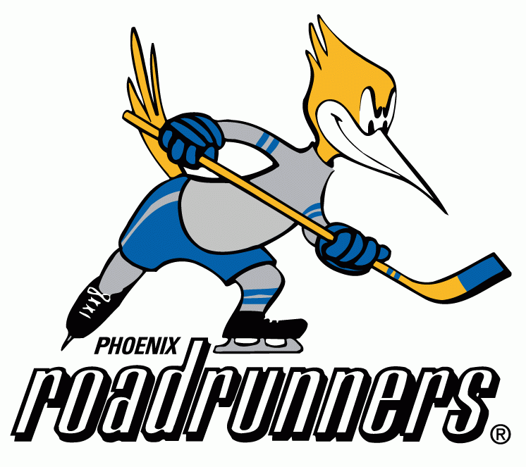
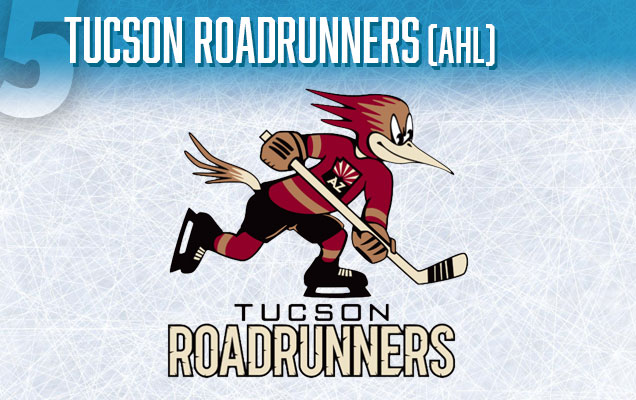 The Roadrunners name has been used many times by various Arizona hockey teams dating as far back as 1967. The current rendition is the newest AHL affiliate of the NHL’s Arizona Coyotes, which is apparent in the Roadrunners color scheme and the use of the Arizona flag on the bird’s jersey (also used by the Coyotes as a shoulder patch). So what’s up with this logo? Is this the result of some lucky 3rd grader winning a logo contest? To better understand, we have to take a look at the original IHL Phoenix Roadrunners logo, the new version is an obvious homage to it, but the retro charm has been all but lost. Or how about the much more professional looking Phoenix Roadrunners of the ECHL, who disbanded in 2009? There’s some obvious similarities between all of them, but the latest version is the worst possible version, leaving us with more questions than answers about what kind of decisions led to this design being approved in a league with some otherwise pretty great logos.
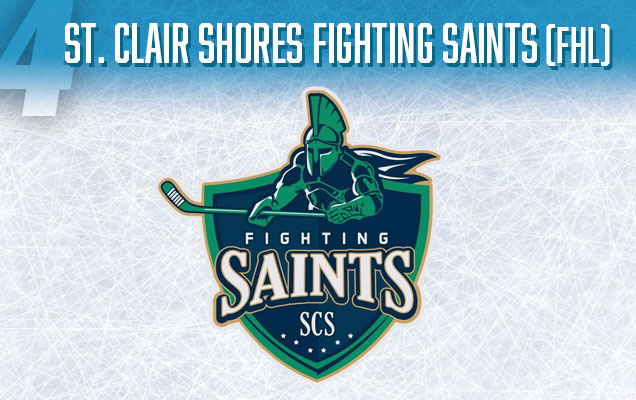 Detroit’s newest FHL team, the Fighting Saints, are a nod to the area’s youth hockey program called the Saints. However, things get a bit confusing when you realize their logo features, not a saint, but a Spartan warrior. There’s nothing saintly about the war-mongering Spartan, who is also used as a mascot by nearby Michigan State University. It seems this new FHL hockey team has taken inspiration from two different sources to create a confusing Frankenstein-esque logo. The execution of the logo design is also little strange, as the Spartan feels disconnected from the shield. Something like this may have been a better solution. However, there is one saving grace to this Saints branding, and that is their actually jersey design is pretty nice looking.

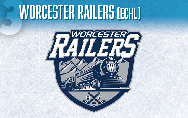 The Worcester Railers HC (yes the HC stands for ‘Hockey Club’ and is an official part of the name) are the ECHL’s first franchise is Massachusetts. The team’s name pays homage to the strong railroad presence in the area, and their logo design shares similarities with other train themed hockey teams such as the Chicago Express (ECHL) and Bloomington Thunder (USHL). However,the Railers logo is a little overwhelming at first glance, there’s a lot going on. The mountains and train get a little lost in the grey and navy blue color scheme, as they are squished to the upper part of the shield to make room for the crossed hockey sticks ‘HC’ emblem at the bottom (but why? This isn’t soccer!) I’m going to the give the logo designer the benefit here, and assume that the team management may have asked for all of these logo elements to be included. In such case, I’m sorry friend. But really it’s not that bad, the train was done well, and I dig the W on the front plate, which could also be used a shoulder patch or alternate logo.
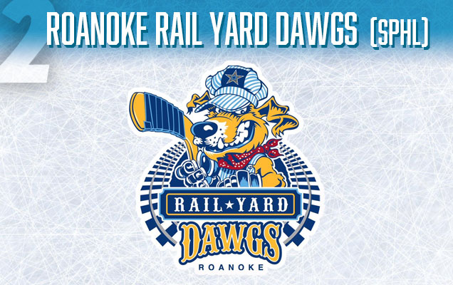 This logo is a glorious, sickening, absolute, wonderful mess. I mean I love it…mostly. I think I need to lay down for a second, actually…okay, I’ve figured it out. The Roanoke Rail Yard Dawgs logo was not created by a designer, per say, but by famed Canadian sports caricature artist, Rob Macdougall, who is a fine artist who does stuff like this mostly, but also has created a few sports team logos, such as this masterpiece. Roanoke’s new SPHL team has fully embraced the trailer park vibe, which I think is a completely fair observation on my part, given that they spelled it ‘Dawgs’ instead of ‘Dogs’. Such a team name requires an equally quirky logo and they certainly have one. I love the actual dog illustration in the railroad uniform. Though a little too complicated for an NHL team, I think it will work great in the SPHL. However, I do think all the extra element designs could be toned down, the multi-lined star, on the striped hat, plus the polka-dot handkerchief, all tightly encircled by those railroad tracks…it’s all a little much. With that being said, I would totally buy the jersey. Seriously, I would.
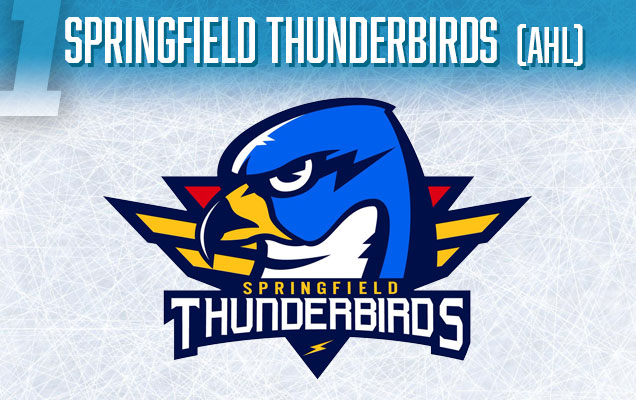 The new AHL Thunderbirds logo origin is exactly the happy fairytale ending that I know you were looking for in this article. You see, when the Springfield team was looking for a logo designer they approached Matt McElroy (who has been featured on our site before), who had previously submitted a logo concept for the Seattle Thunderbirds over on the Icethetics website, which had impressed the management for the new Thunderbirds team. As a designer, this makes me feel all warm and fuzzy inside! Matt’s design for the new AHL team turned out great, making excellent use of the primary color scheme throughout the bird illustration and the crest behind it. The lightning bolt at the bottom doubles as a letter ‘S’ for Springfield and is also echoed in the design of the bird. The look and feel of this branding matches the AHL perfectly, which lands this bird the top spot on our list!
Agree? Disagree? Let us know in the comments or join the conversation on Twitter and Facebook! And don’t forget, we’re now on Instagram too.


Just a little extra background on the Worcester logo is that the mountains are actually suppose to be hills because Worcester is known as the city of seven hills
Thank you for the feedback! I definitely over-looked that part. It’s amazing that they jam-packed seven hills into that logo!
Yeah its really interesting from a local residents point of view because its one of the first semi pro teams from Worcester to not just adopt the affiliates logo and to actually reference the city
[…] • “5 brand-new groups across the North American minor leagues Have actually quietly emerged and Have actually revealed some unique (and sometimes odd) names, branding, and logos to start the 2016-17 season.” [Hockey By Design] […]