
Top 5: Anaheim Ducks Concepts
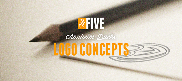
In this edition of Top 5 Logo Concepts, we have collected some gems from around the design community for the Anaheim Ducks. A team who went from a colorful 90’s Disney branding to a now conservative minimalist logo and muted color scheme, which they brought deep into the playoffs this season. Could a change in branding take the Ducks all the way next time? These brave designers have a few ideas about how that could happen…

Chad B. Stilson (Detroit, MI) :: Dribbble :: Concept Source Page
A return to a teal palette is a bold move, and though I am not sure that the team would actually ever revert back, I appreciate the real ducky-ness of this logo relative to the infamous Mighty Ducks era. A few issues I have with this logo: The shape behind the duck is distracting, it reminds me of a baseball home-plate, and I think the colors used on the duck and on the ‘Anaheim’ type are overly complicated. The whole thing could be simplified to really make the duck illustration “pop”. The alternate logo that the designer included with the primary is what really sold me on this branding, honestly.
 Josh Benkelman (Buffalo, NY) :: Dribbble :: Concept Source Page
Gather ‘round kids, and pay attention. This is what a Mighty Duck looks like. The illustration style here is stunning. Even though there is an argument to be made that the line work is over-complicated, for a primary logo (but is it?) I still think this duck would look fantastic on a jersey. Using a gold color for the duck’s body and the orange only on the beak is really interesting, and allows for Anaheim’s continued love of the color black as a backdrop. Furthermore, I would love to see this duck along with a bold typeface to get the whole experience.
 Slavo Kiss (Dublin, Ireland) :: Behance
This full frontal duck logo is a fresh-take on many duck concepts that we’ve seen. As HbD’s editor John van der Woude mentioned to me, “The A makes it feel like a vintage air bomber logo…” which I completely agree with. The way this designer made the ‘A’ mimic the duck’s body was a great solution, and really works with the style that he established with his full branding concept. However, I’m not sold on the color scheme. There’s a fat chance that Anaheim would go navy blue before they go back to teal. As Anaheim’s current slogan proclaims,”PAINT IT ORANGE!”I would love to see this logo and jersey as an orange, gold and black mock-up to see how it works with the modern day Ducks colors.
 Kris Bazen (Columbus, OH) :: Website :: Concept Source Page
This is a hattrick for designer Kris Bazen, making his third appearance in a row on our Top 5 column. This logo revisit’s the teal and eggplant color scheme of the former Mighty Ducks in a very convincing way. This simplified duck head is both smart and sophisticated, communicating just enough fierceness and mischievousness but not going too far over the top. I sense that a letter ‘D’ could almost be formed with this head with a little more design work. There’s a lot of potential here. I am really impressed with this duck and think it could fit right in with the NHL’s current crop of head logos (Predators, Coyotes, Blackhawks etc.)
Related Reading: HbD Interviews: Kristopher Bazen
Related Reading: Top 5: New York Islanders Concepts
Related Reading: Top 5: Tampa Bay Lightning Concepts
 Rudolf Vychovali (Trencin, Slovakia) :: Dribbble :: Concept Source Page
Somewhere over in Eastern Europe this designer has made a splash with a nice solution for working in that ‘D’ into a duck themed logo that the design team over in Anaheim didn’t quite accomplish as well with their current duck foot logo, in my opinion. The balance between sophistication and simplicity with this mark is really quite applause worthy. The ‘D’ letter forming from the duck wing and head shape feels natural and thought I do like subtle dark green and gold color scheme being used, I think this logo could work with just about any color scheme really. Overall, this is a fantastic effort, and would be a great direction for a future Ducks re-brand.
What do you think? Have you seen other awesome Ducks concepts out there? What team would you like to see featured next in this series of Top 5 posts? Let us know in the comments below!


[…] • Five of the best fan created concept logos for the Anaheim Ducks. [Hockey By Design] […]
[…] • Five of the best fan created concept logos for the Anaheim Ducks. [Hockey By Design] […]
[…] • Five of the best fan created concept logos for the Anaheim Ducks. [Hockey By Design] […]
No. 1 by a mile. I’m not even a Ducks fan and I want it.
The other 4 are AHL-level, at best. The alternative logo for No. 5 is basically a phallic symbol so fail x2 for No. 5.
I am truly glad to read this webpage posts which consists of lots of useful data, thanks for providing these kinds of statistics.
Legendario.
The number one logo surely takes the cake. It’s the only logo on the list no to take it so literally. And the more abstract a logo is in hockey, the better (see Philadelphia Flyers). With great visual movement, references and change in color palette, This catapults a ton of ideas for jerseys into my head. The only criticism would be the lightning bolt looking white accent. With another team in the league using “Lightning” a team’s brand should avoid making any sort of resemblance to another. Smooth out the accent with rounded edges, and this logo would be perfect.
Chris, Great commentary! I had the exact same thoughts about the lightning shape on the #1 logo but due to keeping my paragraphs to a reasonable size I decided to exclude the observation. I’m really glad you brought it up!
[…] Reading: Top 5: Anaheim Ducks Concepts Related Reading: Top 5: New York Islanders Concepts Related Reading: Top 5: Tampa Bay […]
[…] Reading: Top 5: Toronto Maple Leafs Concepts Related Reading: Top 5: Anaheim Ducks Concepts Related Reading: Top 5: New York Islanders Concepts Related Reading: Top 5: Tampa Bay […]
[…] • More: BTLNHL #30: Anaheim Ducks • More: Worst to First Jerseys: Anaheim Ducks (Redux) • More: Top 5: Anaheim Ducks Logo Concepts […]
Outstanding post for me.Thanks
Oh my goodness! Incredible article dude! Thanks, However I am going through issues with
your RSS. I don’t know the reason why I am unable to join it.
Is there anybody having similar RSS problems?
Anyone that knows the solution can you kindly respond? Thanx!!
funny dope pictures
dope funny t shirt