
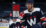
Top 5: Washington Capitals Logo Concepts
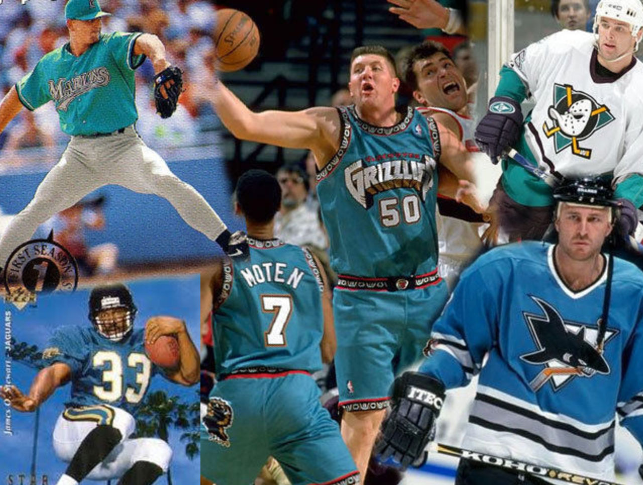
 The Washington Capitals are hot right now, winning the President’s Trophy and hoping to begin a deep playoff run, starting this week. Their current primary logo and jersey design is a revised classic that they’ve had for the past decade, and has been a safe step-back from a dark time between 1995-2007 when they shamelessly incorporated the trendy 90’s teal color (Hey, everyone was doing it!). Anyway the Caps are in a better place now, but some fans and designers think the Caps are due for an update, and have some notable ideas. We ranked the Top 5 Capitals logo concepts that we found on this big, crazy place called the internet. Enjoy!
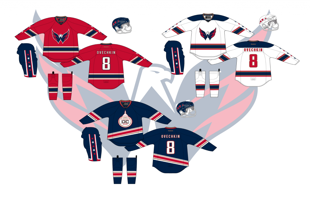
 bkknight95 (Idaho, USA) :: Concepts Page
Even though this logo is unrefined, I think this concept is going in a good direction. Especially dropping ‘Washington’ in favor of the ‘DC’ initials, like Washington’s NBA team has done before. I even enjoy seeing the ‘DC’ in gold letters on the full uniform concept (Just don’t bring back the teal!). The rounded crest, may not be the best solution, and the five stars in the logo should be dropped back down to three…and while we’re simplifying this thing, drop the word ‘hockey’ at the bottom. It’s extremely unnecessary. The main takeaway here, is that the Capitol building and ‘DC’ initial combo feels good! I would love to see a further refined version of this one.
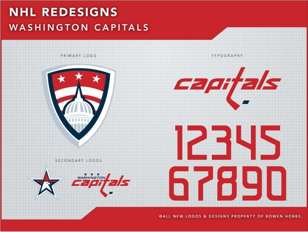
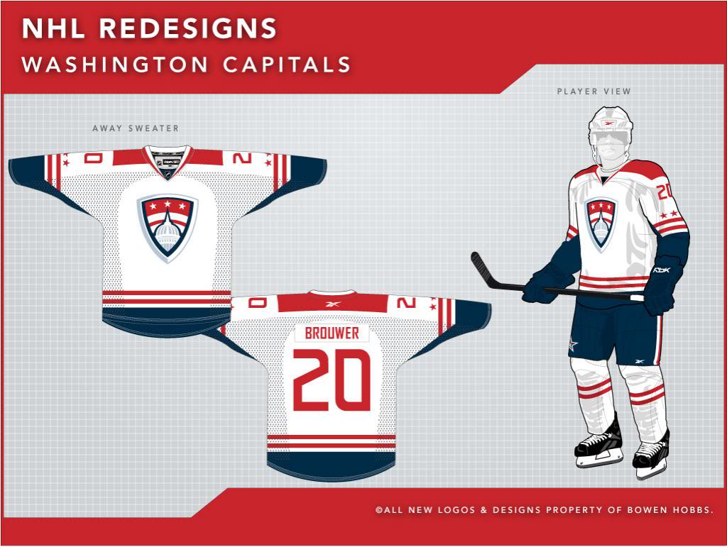
 Bowen Hobbs (Oshkosh, Wisconsin) :: Facebook Page
This is a sleek version of the Capitol building concept that looks really nice on a shield! Moving the three stars to the top of the logo, as a focal point, is working for me on this one, and with the two stripes behind, it’s a great play on the DC flag. Though it may feel somewhat stark without any sort of word-mark, it would definitely be possible to work in a ‘W’ somewhere on the shield. I’m not sure if the full branding is there yet. The alternate eagle-star logo is nice, but I’m not feeling the slightly tweaked ‘capitals’ lettering. In conclusion, seeing this logo on a uniform is proof enough that a shield could definitely work for the Caps!
• More: BTLNHL #24: Washington Capitals
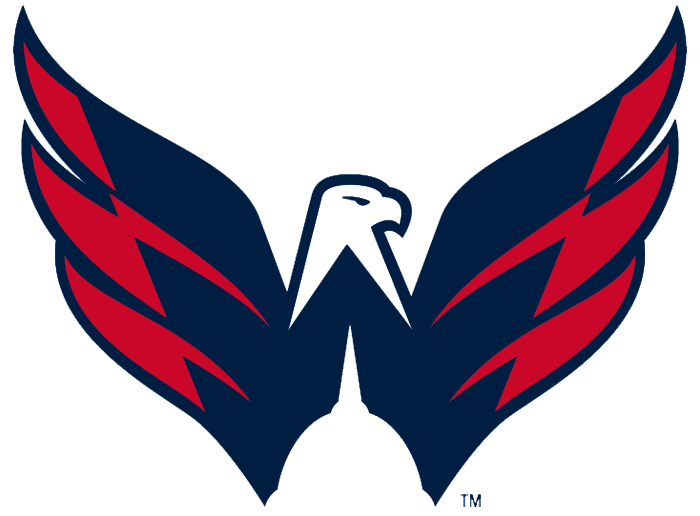
 Roge Roge (Montreal, QC) :: Dribbble :: Concept Source Page
Another entry in this designer’s ‘Minimalist NHL logo’ series on Dribbble, This version of the ‘Weagle’ feels like something between Weezer and Captain America. The only thing lost in this simplification is the capital building in the negative space of the origina ‘Weagle’. However, this minimalist version could be great as an alternate logo, embroidered on the shoulder, or somewhere smaller, it reads wells at a small size, and overall is a tasteful evolution of the logo.

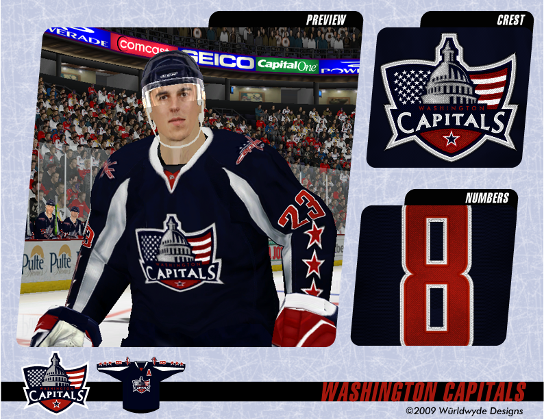
 Ken Chernoff (Vancouver, BC) :: Website
Originally designed for use in an NHL video game custom mode in 2009, and posted on thebreakaway.net, I’m not sure how UX designer Ken Chernoff feels about it now…but it remains one of the best looking Caps concepts that incorporates the actual Capital building. It’s a better design than the actual Capitol building logo that the Caps used until 2007, and if they ever wanted to go back to using the building, this would not be a bad direction to look at. It might even work without the U.S. flag background. Lots of possibilities here, which is a testament to this concept holding up over time.
• More: Worst to First Jerseys: Washington Capitals
 Andrew Sterlachini (Indianapolis, IN) :: Dribbble
Andrew Sterlachini is the graphic designer who created the actual 2015 Capitals Winter Classic jersey, but this winter classic logo concept that never got used is pretty great! When viewing from left to right, the monogram’s ‘D’ turns into a ‘C’ that is nicely woven through the ‘W’, which is capped by a hint of the Washington Monument, and the classic three stars above the whole thing. The logo’s readability might be questionable at first glance, but it’s the kind of smart logo that graphic designer’s drool over, and it’s a fun take on DC’s initials. I can definitely imagine a version of this making it onto a future Winter classic jersey, and for that it has earned our top spot for Capitals concepts!
• More: HbD News: Washington Capitals’ Winter Classic Jersey Announced
 HONORABLE MENTION: Andrew Sterlachini (Indianapolis, IN) :: Dribbble
(Ed note: Andrew informs us that the work was actually done by his co-worker Matt McCarley.)
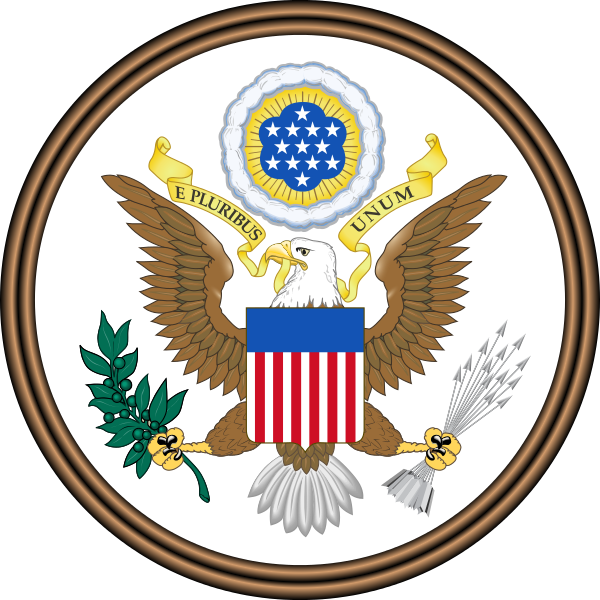
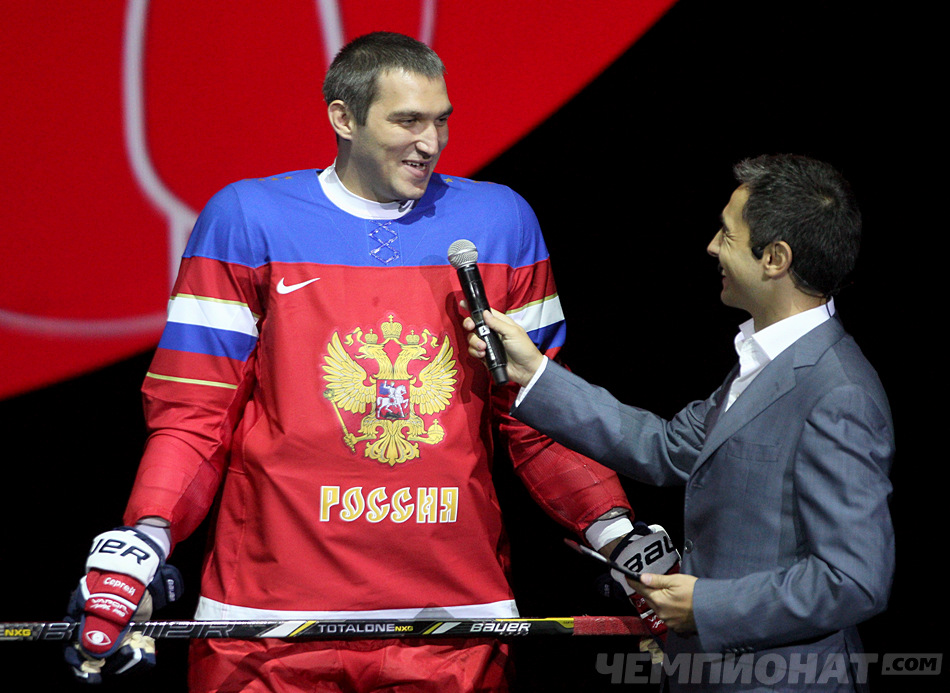
Not included in our official list, due to this designer having another entry, but this version of the eagle is a nod to the Seal of the United States (you might recognize from the US dollar bill), even so, it has a suspiciously Russian vibe to it…maybe because we’ve seen Washington’s Captain, Alex Ovechkin, wearing a similar design: the 2014 Russian Olympic uniform.
Agree? Disagree? Let us know in the comments or join the conversation on Twitter and Facebook! And don’t forget, we’re now on Instagram too.


[…] • Top 5 Washington Capitals idea logo designs. [Hockey by Design] […]
[…] • Top five Washington Capitals concept logo designs. [Hockey by Design] […]
[…] • More: Top 5: Washington Capitals Logo Concepts […]