
HbyD Breakdown: Washington Capitals Third Jerseys
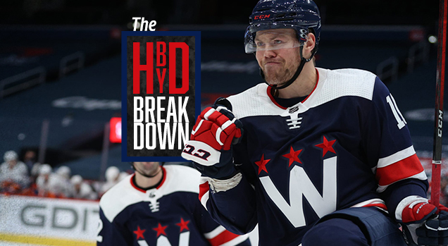
Not so long ago, the Washington Capitals made a relatively surprise jersey unveiling, showing off new third jerseys that they’ll be wearing for a few games in the 2021 season. With a callback to the logo from their 2015 Winter Classic jersey (which we loved) as the foundation for this new one. How does this one stand up? Find out after the jump…
• More: The 2020 Winter Classic Jersey Countdown
America’s Team
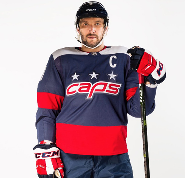
Americana vibes reign supreme on the latest Capitals third jerseys that made their debut late last month. The familiar red, white and blue paired with a redesigned primary “W” logo on the chest gives these a bold, clean and classic look.
The official Capitals press release was pretty succinct in describing the entire meaning behind the design:
The large W on the front of the jersey serves as a tribute to Washington, DC, with the Washington monument structure peaking in the middle of the W. The “W” stands alone as a Capital Letter to symbolize the strength of the nation’s Capital. The color scheme is aligned with the United States of America’s flag; with each color also representing attributes displayed by Capitals fans: red stands for dedication, white represents loyalty and blue honors community. The Three Stars represent Maryland, Washington, D.C., and Virginia.
Well, there you have it. Four abrupt sentences that quickly describe what was assuredly a thorough design process that led to these hitting the ice. Let’s dive in just a little bit deeper on a few of the details…
Take What Works, Leave Out the Rest
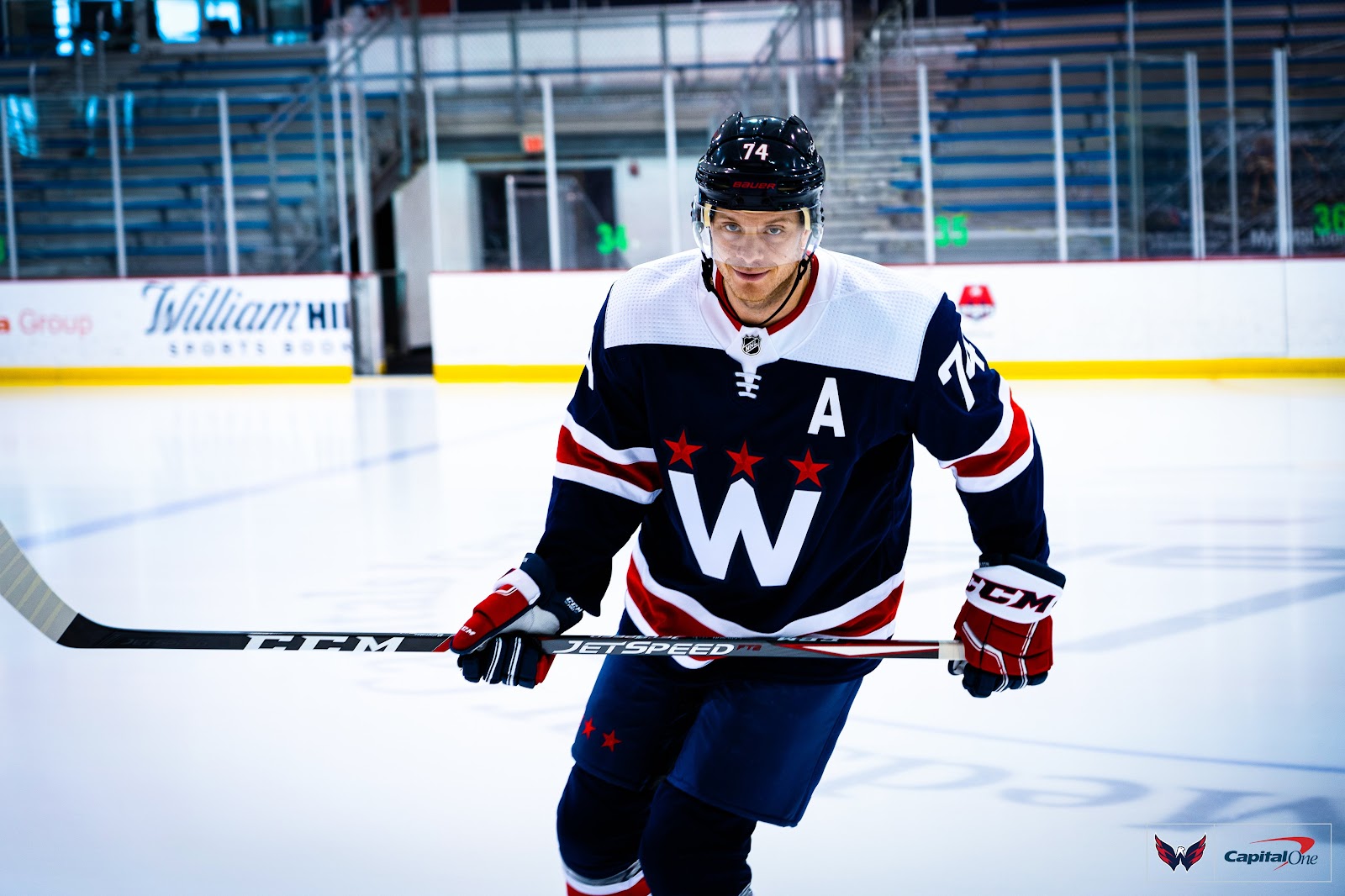
The result of these new thirds is essentially a mashup of the Caps 2015 Winter Classic unis and the 2018 Stadium Series effort. It starts with the basic color blocking structure of the 2018 jersey, but adds in some much needed additional white striping to the sleeves and bottom of the jersey.
The 2018 jersey had its downfalls in terms of massive amounts of unbalanced color…which we’ve covered before. It’s a relatively simple change, but the white stripes are a significant upgrade and instantly improve the visual balance of the jersey in a major way.
• More: HbyD Breakdown: 2018 Stadium Series Jerseys

+
=
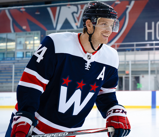
Also, with the additional white elements of the chest logo, collar tab/lacing and shoulder yokes, it really helps the jersey achieve a unified and balanced look, which was definitely missing previously. Speaking of that primary logo…
Modern Retro

The updated “W” logo simplifies and modernizes the 2015 Winter Classic jersey logo and it works very well on these new 2021 third jerseys. It’s a case study in “less is more” and the benefits of proper contrast in design. The main design elements are still there – the three stars and the Washington monument as the middle of the W – but they are presented in a cleaner, bolder way.
Previously, the navy serifed W was a little lost behind the Capitals text and by being placed on the darker red jersey without a contrasting stroke. The new iteration removes all the clutter and makes much better use of color, resulting in a fresh take on a retro logo. Again, simple modifications in theory, but big visual improvements overall.
Final Verdict

Is this a groundbreaking jersey design? No, not really. Is the primary chest logo one of the best in the league? Nah, don’t think so. However, there’s just something about how all the elements of this jersey come together and end up working very well together.
In most cases I’m typically not a huge fan of plain white shoulder yokes on a darker color jersey…it always seems unfinished or out of balance. Yet, in this case I don’t mind ‘em at all. As mentioned previously, additional focal points of white really tie everything together. Even the cuffs on the gloves pair excellently with the shoulders and red/white jersey striping.
Plus, in general, it’s usually fairly hard to go wrong with red, white and (navy) blue as a color palette and this is no exception. Overall it’s an updated look that uniquely blends modern and retro features as it draws upon classic elements of Capitals history and branding. Job well done. Go ‘Merica.
Agree? Disagree? Let us know in the comments below or join the conversation on Twitter, Facebook, or Instagram!


Good assessment, and I agree. Maybe these uniforms would have been laughed at in the 1990s, but simple and clean usually wins in the end.
The striping pattern and colours make me think a lot of the Rangers’ 2010-17 alts, but in a good way. I love the Rangers alt, but the way this one avoids adding a “vintage” treatment to the colours keeps it all bright, crisp, and clean. The yoke even works really well, as mentioned. I wouldn’t be at all opposed to seeing this become their full-time uniform.