
HbD News: Washington Capitals’ Winter Classic Jersey Announced
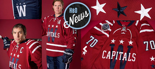 The jerseys that the Washington Capitals are wearing for their upcoming turn at hosting the Winter Classic have been announced. And they are awesome. Don’t believe it if anyone tells you otherwise. There’s a lot of excellent design decisions happening here – a lot more than you might think. Here’s why they are so damn good:
Washington Historical Relevance? Check.
Seeing as they exhausted their historical look for the 2011 Winter Classic (and nobody wants to bring back that crazy foray into the blue mid-’90s designs…especially not us), the choice of designing something brand new for the team is actually pretty exciting.
The Reebok team that designed these jerseys (and you can read a little bit about the process behind the scenes here) worked on it for over a year, and researched the historical aspects of the game (and sports in general) in Washington. First, the “Washington” across the front is an homage to the Washington Lions/Presidents from the early American Hockey League and Eastern Hockey League days, while it also, of course, has a connection to the text-crest on their current and original jerseys.
Second, the W logo was used for other Washington-based hockey teams, and was also a very common logo for Washington-based baseball teams, even before the current iteration of the Nationals. The old Washington Nationals/Senators franchise had, up until 1935, a logo primarily consisting of nothing but a big W. Seeing as how the Winter Classic is being played in the current Nationals’ baseball park, it’s a logical design choice. And the big W has a beautiful simplicity to it, with the blue on maroon making it visible, but not overpowering.
Hockey Historical Relevance? Check.
Some people don’t like the barber-pole look. I get it. But to call these barber-pole jerseys is overstating that a bit much. These are barber-pole jerseys. The Caps ones, not so much.
The heavy use of stripes on a hockey jersey has a long (and sometimes sordid) history, especially back in the ’20s and ’30s. There’s just enough stripes on these Caps jerseys to make them look authentically historical, but it’s simplified and consistent: all the stripes are white on maroon, all of equal width, and all relatively equally spaced apart.
I’ve heard a lot of people comparing them to the old New York Americans jerseys. There’s stars and stripes and text, sure, but the actual design of the Caps jersey has updated that historical look with something much more polished and professional.
The laces always help augment an historical aspect too, and almost always look good doing it.
Innovative? Check.
Obviously, the most controversial part of it is using the striping pattern on the shoulder yokes. I don’t think vertical striping only on the shoulder yokes (as opposed to horizontal stripes, which both St. Louis and the Rangers have) has ever been done in the NHL. In that sense, these jerseys are incredibly innovative for the NHL, introducing something to the jersey design conversation that hasn’t ever been done before, but still looks familiar. It’s a gutsy step to take, and it pays off here.
There’s a historical relevance to the striping on the yokes as well, having been used in minor-league Washington teams historically, but again, unless someone can show me otherwise, I don’t think it’s ever been in the NHL.
Why does it work? Because there’s actually little else on the jersey. Take them off, and while it still looks pretty good, it’s a little more plain and looks more like a regular hockey jersey. It also works because, again, the striping is simple and consistent with the striping elsewhere on the full uniform.
They tried something new, and it works. Good on them.
Current Capitals Relevance? Check.
I love the addition of the blue and white stars on the sleeves, a reference to the original Capitals jerseys. But instead of being overly large and ostentatious like the original jerseys, these are a little more subtle, with fewer and smaller stars on them. It makes for a nice compliment rather than demanding the attention it does on the originals. Basically, they took that element and improved on it.
There’s also the three stars across the top of the W that is reminiscent of the three stars they have across the top of their current logo. And there’s the three stars on the pants as well, also an homage to their original uniforms. But again, it’s less obnoxious and looks more refined.
Then, of course, they used the same general colour scheme: red, white and blue. And, as previously mentioned, the text-crest across the front is something they still have today.
The City of Washington Relevance? Check.
Just like the Caps’ alternate Weagle logo subtly places the Capitol Building into the design, the large W has the Washington Monument subtly integrated in the middle spire of the W. It’s a design element (like the aforementioned Weagle) that rewards the viewer as soon as you notice it, something you can enthusiastically point out to friends who haven’t yet noticed it and feel very sophisticated and smart. And it also adds a layer of complexity to the logo you hadn’t noticed before.
Then, again, there’s the three stars on the sleeves, on the pants and across the top of the W, which is in reference to the DC flag.
Bringing It All Together? Check.
When bringing in a franchise’s history, hockey history, a city’s sports history and a city’s relevancy, things can get messy very quickly. Then, include something innovative (yet still oddly familiar) and make it all look good…there’s strokes of genius in here somewhere. Trust me, I’m a designer, and this is an extremely difficult thing to do. To have something so incredibly complex with multiple levels of meaning and yet so simplistic and consistent, it’s an incredibly monumental (pun intended) feat.
If there’s one complaint I have, it’s that the spaces between the two stripes along the bottom is a little too large. Narrow that up a bit, and it’s pretty close to perfect for a Winter Classic jersey. Historical, innovative, relevant. And, I wouldn’t mind if these jerseys become the new third jerseys for the Capitals. They’re that good.
Agree? Disagree? What do you think? Let us know in the comments below.


Not sure if you noticed it (it wasn’t mentioned), but the same point at the top of the center of the ‘W’ that invokes the Washington Monument also tops both of the ‘A’s in CAPITALS.
Yeah, I did notice it, but didn’t think it was worth mentioning. It’s actually a little bit of overkill, but doesn’t really add or detract anything from the design overall. Thanks for pointing that out!
Small note but the 3 stars thing for the Caps has always been a representation of DC, MD, and VA. It’s been mentioned by the team several times that they are meant for that as oppposed to an homage to the DC Flag (total aside but how do MD and DC have such great state flags but VA is meh?)
Yeah, I’ve heard that too, but I just assumed that’s what the three stars on the DC flag always represented. But, I’ve also never bothered to check if that was true and, after looking, I see that it’s not.
And yes, agree about the flags. Love the Maryland flag!
Fun and informative read as always.
Do you mean “Capitals” in the following sentence?
First, the “Washington” across the front is an homage to the Washington Lions/Presidents from the early American Hockey League and Eastern Hockey League days, while it also, of course, has a connection to the text-crest on their current and original jerseys.
Good catch Duff, yes I did! No one’s perfect. 😉
[…] Further Reading: HbD News: Washington Capitals Winter Classic Jersey Announced […]
[…] Full Analysis: HbD News: Washington Capitals’ Winter Classic Jerseys Announced […]
[…] Full Breakdown: HbD News: Washington Capitals’ Winter Classic Jersey Announced […]
[…] Full Analysis: HbD News: Washington Capitals’ Winter Classic Jerseys Announced […]
[…] Related Reading: Worst to First Jerseys: Washington Capitals Related Reading: BTLNHL #24: Washington Capitals Related Reading: HbD News: Washington Capitals’ Winter Classic Jersey Announced […]
[…] • More: HbD News: Washington Capitals’ Winter Classic Jersey Announced […]
[…] More: HbD News: Washington Capitals’ 2015 Winter Classic Jerseys Announced • More: Worst to First Jerseys: Washington […]
[…] […]
[…] • More: HbD News: Washington Capitals Winter Classic Jersey Announced […]
[…] More: HbD News: Washington Capitals’ 2015 Winter Classic Jerseys Announced • More: Worst to First Jerseys: Washington […]
[…] More: HbD News: Washington Capitals’ 2015 Winter Classic Jerseys Announced • More: Worst to First Jerseys: Washington […]