
HbD News: Capitals Announce New Third Jersey
 The first jersey announcement of the off-season came yesterday with the Washington Capitals introducing a new third jersey they’ll be wearing next season. They’ll be replacing their current thirds – their original white jerseys – with…their original red jerseys. From the Capitals website:
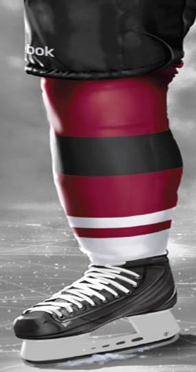
The Washington Capitals will wear a third jersey modeled after the team’s original red jersey for select home games during the 2015-16 season, senior vice president and general manager Brian MacLellan announced today.
The primary color for the uniform is red and closely resembles the team’s jersey worn from 1974-75 through 1994-95. The original Capitals wordmark is featured on the front of the jersey with six stars above it and five stars beneath the numbers on each sleeve. The Capitals will wear blue pants and red helmets with their third jerseys. The new third jersey will replace the white third jersey the Capitals wore from 2011-12 to 2014-15.
In this case, “modelled after” means “exactly the same as”. Any changes made to the jersey is strictly because of the new jersey formatting and construction, using the Reebok Edge jerseys. For all intents and purposes, it’s exactly the same, just as the white alternates that are now retired after this season, were exactly the same as their originals.
That’s probably why the announcement was somewhat expected, being advertised only a day or two before it happened. It’s a bit of a non-event.
But, it allows them to wear their new alternate jerseys at home. With the white ones, they could only wear them for road games, as they did throughout the playoffs this season. Generally, fans of the home team don’t really care that much about what jerseys the road team is wearing, as long as they lose. Which is a shame as there’s been extremely few white alternates in the NHL’s third jersey history. Dallas had (a bad) one a few years back, as did the Leafs, and there’s also the Rangers’ Lady Liberty jerseys and the Blues, back when teams still wore white at home.
So, how do we breakdown the design of this new Capitals alternate? Well, we already have, when we did the Worst to First post for the Capitals, ranking all of their jerseys, but here’s the highlights about these ones:
…[t]he other elements, like the shoulder yokes, they’re strong and simple, but the main issue is that they don’t leave much room for the stars on the sleeves and the numbers to co-exist, making it look and feel too cluttered.…All of this adds up to a jersey that makes perfect sense for the location and nature of the city of Washington. The concept is strong, simple, iconic and definitely working, but it just needs some tweaks to make it a better jersey.
I still stand by that, but to pile on a bit, that’s not a nice logo. The “Washington” is way too small for any practical purposes. The typeface is some weird italicized Helvetica. The whole thing lacks any sort of element that makes hockey great: motion, dynamism, style, boldness, grace, etc. It’s pretty boring. Their new one is better with a little more style and movement, but not by that much. That Weagle on the other hand, that’s something awesome.
@HockeyByDesign I thought it was going to be the Weagle and I was going to lose all my money.
— Michelle Timian (@michelle_timian) June 23, 2015
Yup. Exactly. Or, I was kind of hoping they’d be bringing their fan-fucking-tastic Winter Classic jerseys from last season into regular rotation. Those things were great and don’t let anyone else tell you otherwise.

(Image from Monumental Network. Click here to see more.)
The only really interesting element of this jersey are the white shoulder yokes. It’s definitely not a common look in the NHL. Only Philadelphia and the Islanders use them today. It’s pretty loud and obnoxious on an otherwise already crowded jersey, but it does give it something of a more unique look today. Are they necessary? Probably not, you could remove them and still have a decent-looking jersey (and give those stars a little more breathing room), but these are third jerseys which usually demand something a little more unique to stand out.
Related Reading: Worst to First Jerseys: Washington Capitals
Related Reading: BTLNHL #24: Washington Capitals
Related Reading: HbD News: Washington Capitals’ Winter Classic Jersey Announced
So, the first jersey announcement of the off-season comes with a bit of a thud. More of a ‘meh’ than anything.
But, we don’t have to wait long for the next one, which comes on Friday with the Coyotes announcing new jerseys, which they just released a sneak peek of, and it makes me cautiously pessimistic. Of course, we’ll have a full breakdown here after they’re announced, so check back.


[…] • Taking a closer look at the new Washington Capitals jerseys. [Hockey by Design] […]