
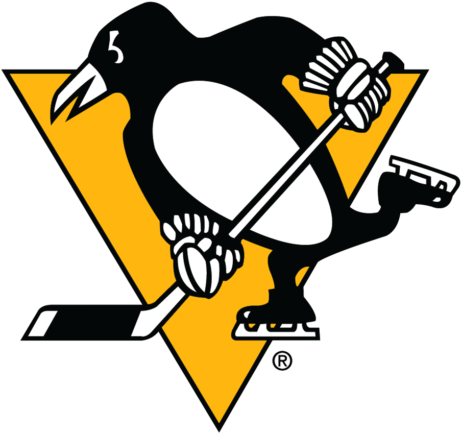
Top 5: Pittsburgh Penguins Logo Concepts
 Last week we featured the top 5 logo concepts for the Nashville Predators created by the online hockey-loving designer community. So it’s only fitting that, in honour of the Stanley Cup Finals, we tackle the Penguins as well. There’s tons of great concepts out there, but very few veer away from the penguin-in-a-golden-triangle variety. Why? Because it works. And it works well. But there are different ways to tackle that concept and these designers show some of the better ways to do it.
• More: Top 5 Logo Concepts Series
• More: BTLNHL #6: Pittsburgh Penguins
• More: Worst to First Jerseys: Pittsburgh Penguins
 Stephen MacEachern (Toronto, ON) :: Website :: Behance :: Concept Page
A Penguins logo without a golden triangle?! Our first logo concept on this list explores just that, creating something that explores a (relatively) brand new concept for the Penguins’ franchise – one of the few concepts out there that try this. Granted, it’s still a stylized penguin, but it’s just the head and it’s not sitting on a triangle. I applaud the artistry (which shows the obvious talent by the designer) and the courage to try something a bit different with the logo, but I’m not convinced a dismembered head is the best course of action (this isn’t Game of Thrones after all), especially when the eye looks a bit lifeless, with no pupils. The shape itself is a bit awkward too, with the penguin’s beak sticking far out from the rest of the head in a way that just…well…sticks out. But it’s still a good attempt and definitely worthy of being on this list.
 Gary Punzak (Pittsburgh, PA) :: Concept Page
If you know the Penguins logo at all, you’ll know that this one isn’t really a new concept at all, but rather a more modernized version of their current logo. Now, I’m on record as being a really large fan of their logo (I did rank it 6th best in the league after all), but there are still issues with it. A big one…those gloves that look like strange cactus plants than hockey gloves. This concept goes a long way to fixing that (though it’s still not quite there yet). And this penguin looks a little fiercer, with an angrier expression, and not the slightest smile on its best. The rest of the penguin’s body is modernized as well, with a few more details added to the shadow/highlights in the figure, as well as including a small detail from the Penguins ’90s logo.

 mcrosby (Wisconsin, USA) :: Website :: Concept Page
Speaking of the Penguins ’90s logo, this concept uses that as a basis to build a more modernized version of it, removing those strange lines on the right hand side of the logo (which gave it the aesthetics of penguin tech company than a sports team) and replacing it with more curves and highlighting details. What sells it for me is the inclusion of the pale sky blue, which dominated the Penguins original visual brand up until 1980, and then brought back again for their trips to the Winter Classic in 2008 and 2011. While I can’t argue too much with their current jersey set/branding, I’d love to see that included more permanently somewhere, somehow. Don’t crucify mcrosby for the the Vegas gold though, this concept was create in 2009, when there was no hint of them changing to their classic gold.
 Elliott Strauss (Atlanta, GA) :: Dribbble :: Behance :: Concept Page
This might be the strangest and most unique concept on this list, but let me explain. What I’ve always loved about the Penguins logo is its quirkiness, its ability to be playful and professional at the same time. Within the library of NHL logos, it’s an oddity that works, and this is the only new concept that I saw that approaches that kind of aesthetic. It’s odd, it’s weird, it’s unique, but the aggressive contrast in the design mixed with the added bonus of heightened symmetry makes it appealing. It also shows that a penguin doesn’t have to be anthropomorphized and holding a hockey stick to appear strong and intimidating, which is quite an accomplishment all things considered. It still needs some work, with slightly too much detail in the shadowing/highlighting, as well as the arms/wings which stretch out awkwardly and looks like the penguin’s hands have been dismembered. But, there’s something really interesting and unique happening here.
 Quentin Brehler (Portland, OR) :: Website :: Dribbble :: Concept Page
Quentin took first place for the Nashville Predators concepts article, and he takes first place here again with this concept. It’s somewhat reminiscent of the Penguins ’90s logo (i.e. a penguin head/upper torso contained within a golden triangle) but in a more modern and stylized aesthetic that evokes a simple word to describe this penguin: majestic. There’s also a good balance between detailing and minimalism in the application of highlights/shadows, with strong simple lines that add movement and colour without detracting from (or overtaking) the logo. It shows a good sense of clarity, thoughtfulness, and professionalism from the designer. Another job well done.
• More: Top 5: Nashville Predators Logo Concepts
Agree? Disagree? Let us know in the comments or join the conversation on Twitter, Facebook and Instagram! And if you’re interested, we’re now on Pinterest too.


How about one with a referee saying NO to any potential penalty against Crosby. It would be true to life.