
Top 5: Nashville Predators Logo Concepts
 In this brief period of time before Nashville makes their first appearance in a Stanley Cup Final, we take a look at the team’s identity and what could have been…or at least, what other designers out in the interwebs think what should have been. Because of the Preds’ historical inauguration to the final round of sports’ greatest tournament, we’ll give them a bit of a initiation ceremony, a look at the best alternate logos for the team designed by you, the hockey community.
• More: Top 5 Logo Concepts Series
• More: BTLNHL #18: Nashville Predators
• More: Worst to First Jerseys: Nashville Predators
 Tyler Rodgers (Greensboro, NC) :: Concept Page
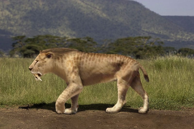
One thing you notice fast when going through online suggestions for alternate logo concepts for the Preds, most people stay pretty close to the current concept: a profile of a sabre-toothed tiger of some sort. It makes sense, considering that the current logo has a strong connection to the city of Nashville itself, (here’s the story, if you didn’t know) but what about that spice of life?
Regardless, Tyler Rodgers’ comes in with a solid entry. The yellow/gold/mustard is replaced with orange, which is paired with its complimentary blue (albeit a darker navy blue). There’s obvious illustration and design skill with this interpretation, but compared to the current logo, this tiger is a little more cuddly than ferocious. Don’t get me wrong, I still wouldn’t want to get stuck in a room with this guy, but with more curves on a head that seems to be sitting still rather the lunging, it’s lost its edge. And the smaller teeth turns it more info a regular old tiger rather than a fierce historic predator. One thing I really like is how the whiskers almost look like guitar strings which would make an elegant and clever connection to Nashville’s musical legacy. Turn those three whiskers into six, and you’ve got something great in the works!
 Colin Stasuik (Calgary, AB) :: Website :: Dribbble :: Concept Page
Another fierce predator that’s an interpretation of the current Predators’ logo, this concept uses more basic and modern aesthetics without losing any of its fierceness. Like the previous concept, the colour scheme is changed to orange and navy blue, but with a steel grey added in as well which connects with the teams previous colour schemes. There’s some really nice artistry and illustration here, walking a line between simplified and complex detailing, stoic and dynamic. I think that with the white fangs, there’s just slightly too complex of a colour scheme happening though and the obvious victim should be the steel grey. I doubt that Nashville will be moving away from their gold anytime soon either. Everybody has bought into it at this point.

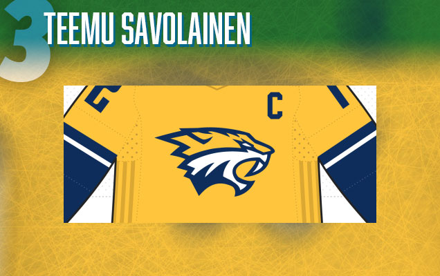 Teemu Savolainen (Tampere, Finland) :: Website :: Concept Page
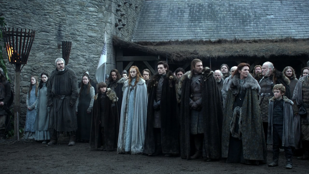
Would you like a little Game of Thrones thrown into your Predators logo? Teemu’s happy to oblige, and with a really cool result. I have no idea if it was intentional or not, but the resemblance of this concept to the stylings of the Stark banner’s direwolf is undeniable (and there’s nothing wrong with taking inspiration from it). This concept has more flat aesthetics to it, with very simplified lines and tons of fierceness. With tons of angles and jagged lines, it’s got tons of movement to it but the relative lack of detailing within the shape itself veers it towards the iconographic. The colour scheme is kept to the current gold/blue/white (which is a better and more unique look for the Preds). The only issue is that all the jagged angles makes it look more like a hairy wolf than a tiger in some respects. But who knows, maybe sabre-tooth tigers rocked a killer salad.
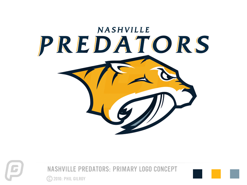
 Phil Gilroy :: Concept Page
Here’s the only non-tiger-head logo concept on the list. There weren’t many out there, but this was one that caught my eye for its simplicity while still having some good movement and ferocity to it. Well, a ferocious as the letter P can be anyway. It’s actually sold as an alternate logo to a tiger-headed primary logo, but this P has some good potential to it. The P’s tail is reminiscent of the exaggerated tooth on the Preds’ logo (and could even by emphasized a bit more, which a strong curve on it), while the claw marks within the P adds a subtle aggressiveness to it. The gold-blue-white colour scheme is kept intact, although I’d like to see the white and gold reversed perhaps. It’s not a finished product per se, but as a non-tiger-head concept, it’s got some legs.
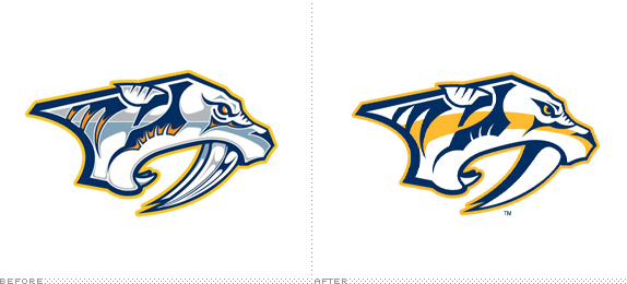
 Quentin Brehler (Portland, OR) :: Website :: Dribbble :: Concept Page
An argument could be made that this isn’t an alternate logo concept at all, and you would be right. It resembles the Predators current logo very closely, with a similar shape, similar features, and similar styling. But, it takes everything that works on the Preds current logo and simplifies it closer to its core concept, which is not always an easy task. All the detailing around the eyes and across the face work a lot better: simplified and more integrated into the general movement of the logo as a while. The addition of the steel grey actually works better here (although I still wouldn’t want to see that brought back into the jerseys). It’s essentially a positive continuation of the current logo’s path from its inception: simpler and more iconic. Not unlike Starbucks. Just don’t take it too far. And in your humble writer/designer’s opinion, it’s a better logo than what they have now.
Agree? Disagree? Let us know in the comments or join the conversation on Twitter, Facebook and Instagram! And if you’re interested, we’re now on Pinterest too.


[…] week we featured the top 5 logo concepts for the Nashville Predators created by the online hockey-loving designer community. So it’s only fitting that, in honour […]
Each of us has a proper comprehension of the info supplied
to the public, so I truly liked the report and anticipated you to provide us
with more things like this one.