
NHL Playoffs 2017 (Round 4) Countdown and Predictions
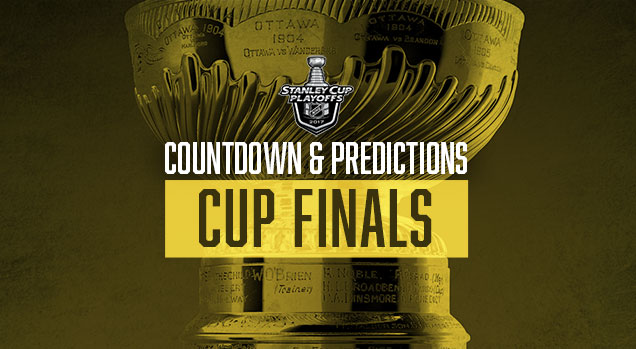 Glad I didn’t use the colour gold for the banner image in any of the previous rounds, because this Cup Finals is going to be glowing with it all over the ice. But before we get to that, better branding won both Conference Finals, pushing the record to 6-for-14. Still not good, but at least it’s closer to the 56% bar the past four years of doing this has set. If branding wins this Cup Finals as well, that 56% shouldn’t drop too much. Let’s see who has the better branding between Pittsburgh and Nashville.
• More: NHL Playoffs 2017 (Round 1) Countdown and Predictions
• More: NHL Playoffs 2017 (Round 2) Countdown and Predictions
• More: NHL Playoffs 2017 (Round 3) Countdown and Predictions
As a recap…how does it work? We’ll compare the overall branding of each series and see how they match-up. This includes the logos, alternate logos, jerseys, historical logos and jerseys, general legacy and everything else that builds a team’s brand. This year, we’ve got the handy and comprehensive brand rankings that we did at the beginning of the season to help us out.
• More: 2016 NHL Brand Power Rankings
But on top of that, for this final round, we’re ranking the jersey match-ups from an aesthetic standpoint for all 15 of the 2017 playoffs match-ups (along with showing which brand-based predictions we got right/wrong). Some jerseys work better together than others, and you’ll see why. And we’ll start with the worst match-up…
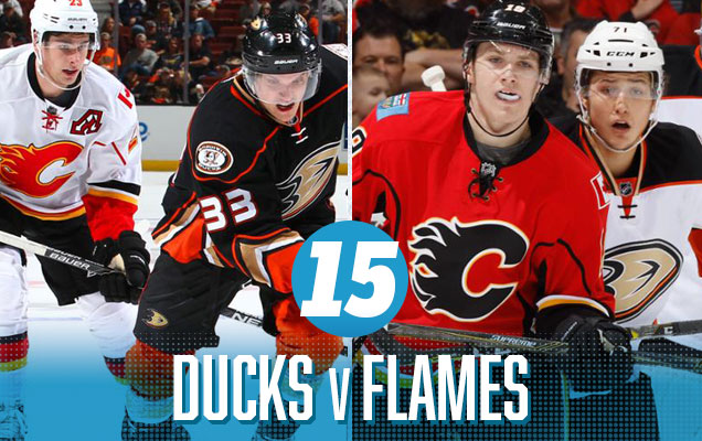
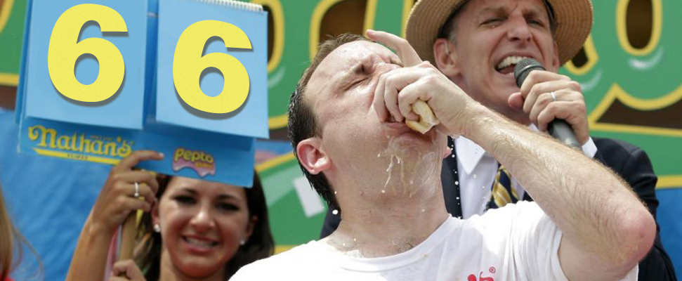
It’s a battle of Striped Bowl, featuring two of the worst jersey sets in the league because of the obnoxious and stupidly-designed stripes that covers them more than Leonard Cohen’s Hallelujah gets covered. And it’s an onslaught of black, orange and red, with some yellow and beige thrown in. It’s a jersey match-up that has all the elegance, refinement and subtlety of a hot dog eating contest, killing your retinas with awful jersey design mixed with no break from the intensity of the colours. If your fans of the teams, enjoy. If you’re a student of design, switch the channel.
Anaheim Ducks NHL Brand Power Ranking: 24th.
Calgary Flames NHL Brand Power Ranking: 20th.
Prediction: Flames in 7 (Ducks in 4)

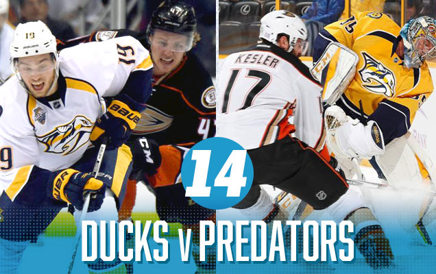
I’m starting to realize that the major problem with the Ducks jerseys is that they make every other team’s jerseys look worse when paired up against it. In the first round, Nashville/St Louis took the top spot on this ranking, with perfectly paired sets of jerseys, visually speaking. Here, the Preds jerseys get dragged down by the Ducks’ overbearing striping, clashing styles, and mis-matched colours: gold, orange, navy blue, beige, black…it’s just too much.
Anaheim Ducks NHL Brand Power Ranking: 24th.
Nashville Predators NHL Brand Power Ranking: 21st (tie).
Prediction: Predators in 7 (Predators in 6)

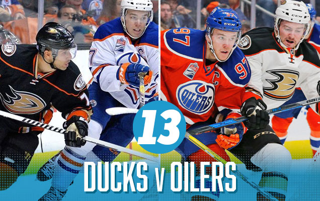 These Ducks jerseys take the bottom three spots on this list, and again, there’s just too much going on here. Too many stripes, too much orange (at the games in Edmonton), too little orange (at the games in Anaheim), as well as a clashing of styles between the Oilers’ more classic approach (or pre-classic, with their WHA-inspired orange jerseys), and the Ducks failed attempt at modern jersey design. For two teams that carry a colour-connection in their visual branding, it’s strange how badly these jerseys match-up against each other.
Anaheim Ducks NHL Brand Power Ranking: 24th.
Edmonton Oilers NHL Brand Power Ranking: 10th.
Prediction: Oilers in 6 (Ducks in 7)

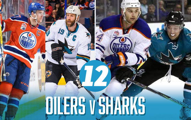
It’s a massive step-up from 13th to 12th on this list, and the Oilers decision to wear their orange jerseys through the playoffs changes this match-up completely. The games in Edmonton are now a nice mixture of complimentary colours: orange and blue(/teal). The more convoluted Oilers’ jerseys doesn’t really compliment the Sharks’ overly-minimalist approach, but the games in San Jose will look better in that regard…although significantly less colourful as the Oilers’ white road jerseys have much less orange, turning it into a match-up of blue vs teal. So, there’s pros and cons to both of the jersey match-ups in this series.
Edmonton Oilers NHL Brand Power Ranking: 10th.
San Jose Sharks NHL Brand Power Ranking: 14th (tie).
Prediction: Oilers in 7 (Oilers in 6)

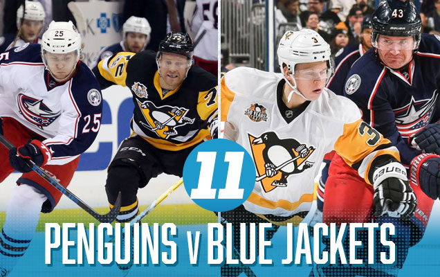
All the primary colours are represented here (yellow, blue and red), so visually, it’s a series that has great splashes of colour – with some caveats. For Columbus, their current jerseys are pretty well-designed, but the navy blue is a bit too dark (if you’re using a dark blue that’s going to look like black, then what’s the point?). For Pittsburgh, their new road jerseys are great, but their home blacks are just that – black and relatively monochromatic. While the splashes of that bright classic gold definitely helps, the match-up is still leaning towards the monochromatic too much.
Pittsburgh Penguins NHL Brand Power Ranking: 4th.
Columbus Blue Jackets NHL Brand Power Ranking: 30th.
Prediction: Penguins in 5 (Penguins in 5)

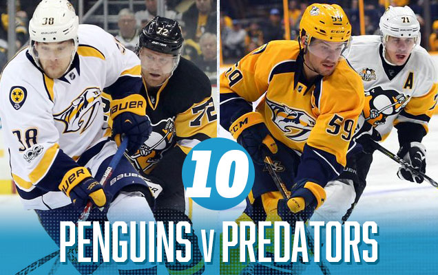
It’s an epic gold-on-gold matchup for the Cup Finals this year, with Nashville’s gold-navy blue-white taking on Pittsburgh’s gold-black-white. And while it may seem to be glorious, it’s going to turn out pretty brazen. There’s not enough of anything else to break things up a little bit and add some contrast and relief to the golden onslaught, despite the fact that these are two classy and modern jersey sets competing against each other. At least Scrooge McDuck will be happy about all this gold.
Prediction
(Remember, these are brand-based predictions, so the first two games already played didn’t actually have any bearings on the predictions.)
Pittsburgh Penguins NHL Brand Power Ranking: 4th. The only non-Original Six team in the top spots, the Penguins get this high on the basis of their great visual brand (including logo and jerseys), their recent accomplishes (a 2016 Cup, of course, as well as a 10-year playoff streak, which is now the longest in the league), and a fanbase that’s dedicated and engaged. And things don’t seem to be going to change anytime soon. In fact, their brand new (old) jersey set is generally considered an improvement. And their current logo they’ve had in their history, ahead of the regular gold penguin of the ’70s – ’90s, the corporate-looking penguin of the ’90s, the older penguin within the thick band of text, and the original penguin who looks like he’s going to join Bonhomme at Quebec’s Winter Carnaval. But the Pens do get points for a fantastic Winter Classic jersey (but also get points taken away for a not-so-fantastic one), and a tremendous Stadium Series jersey.
• More: BTLNHL #6: Pittsburgh Penguins
• More: Worst to First Jerseys: Pittsburgh Penguins
• More: 2017 Stadium Series Jersey Countdown
Nashville Predators NHL Brand Power Ranking: 21st (tie). There’s no question that Nashville is trending upwards. They’ve got a fearsome team, a pumped-up fanbase and are most likely only to improve their on-ice performance results. Their visual brand isn’t considered great, although it’s an improvement over their past logos/jerseys. They had some design missteps (primarily their former alternative logos – checkerboard…really? – and third jerseys), but their current jerseys are solid and their fans have latched onto the mustard yellow and own it. It’s – in a lot of ways – one of the few continuous success stories in the NHL’s southern expansion.
• More: BTLNHL #18: Nashville Predators
• More: Worst to First Jerseys: Nashville Predators
Prediction: Penguins in 6

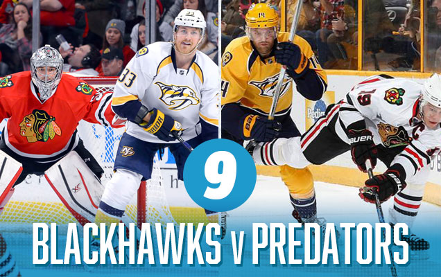
The Blackhawks have one of the best jerseys in the league: their classic home reds. The Preds have one of the most underrated and innovative jerseys sets in the league (not sure yet about those gold helmets though). It excellence in classic jersey design versus excellence in modern jersey design. The games in Chicago will look better because (spoiler: unpopular opinion) the ‘Hawks road jerseys aren’t nearly as good as their homes. They’re a great classic design, but too monochromatic and need more red in there. And while the red versus gold makes for an intensely-colourful matchup, the old vs new design aesthetics tend to clash a little bit.
Chicago Blackhawks NHL Brand Power Ranking: 1st.
Nashville Predators NHL Brand Power Ranking: 21st (tie).
Prediction: Blackhawks in 4 (Predators in 4)

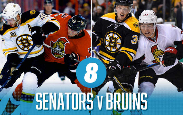
Despite the Senators not having great jerseys (and there’s rumours that might change for next season), this is a classic example of a jersey match-up that the sum is greater than its parts…or at least from Ottawa’s perspective because the Bruins have absolutely great jerseys. As much as I’m generally not crazy about black jerseys, it’s so perfectly balanced with a large amount of gold and white that it just works. And the Sens’ jerseys work great with them, bringing a ton of colour to the Bruins’ road whites and balancing the black with some of their own. Their road whites don’t bring enough colour to the table though.
Ottawa Senators NHL Brand Power Ranking: 23rd.
Boston Bruins NHL Brand Power Ranking: 3rd.
Prediction: Bruins in 5 (Ottawa in 6)

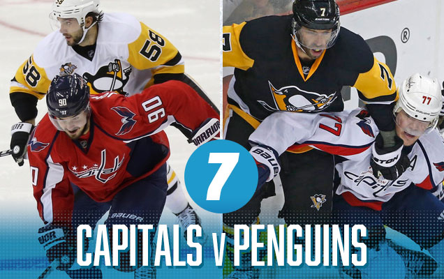
It pains be to place this match-up second-last, it really does, because these two sets of jerseys work really well together. An argument could be made for placing any of the remaining jersey match-ups in first place on this list, but there’s no ties in Bettman’s NHL, so the only thing holding this back is the clashing styles of the ultra-modern Capitals design with the more old-school Penguins design. It’s minor, but when the top 3 are this close, it’s the little things that can drop you. The games in Washington, with the heavy use of red versus gold, will look fantastic.
Washington Capitals NHL Brand Power Ranking: 12th.
Pittsburgh Penguins NHL Brand Power Ranking: 4th.
Prediction: Penguins in 7 (Penguins in 7)

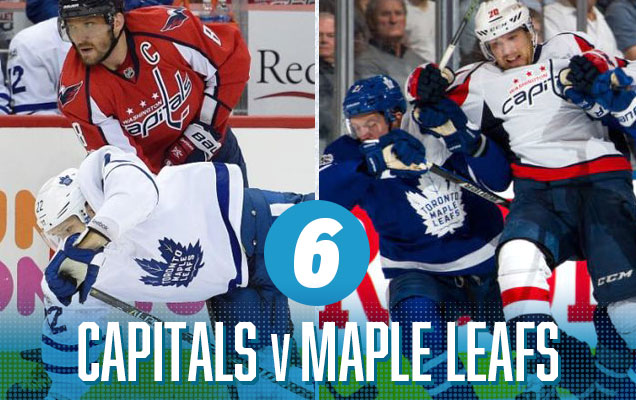
A classic red versus blue match-up, featuring the consistently classic and minimalist Leafs jerseys again Captials jerseys that have much more modern sensibilities. This is all assuming that the Caps don’t wear their vintage reds this year. Because of the Leafs’ more minimalist approach, the jerseys don’t clash in styles as much as the aforementioned ‘Hawks-Preds match-up. And the Cap’s road whites have enough red in them to break up the blue and white of the Leafs. It’s a solid jersey match-up with slightly competing styles that don’t detract enough to make it slide down the rankings further.
Washington Capitals NHL Brand Power Ranking: 12th.
Toronto Maple Leafs NHL Brand Power Ranking: 5th.
Prediction: Leafs in 6 (Capitals in 6)

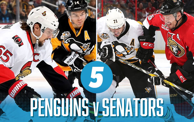
There is a clash of bold, warm colours set against a backdrop of black and white, which creates a sense of visual cohesion (with the jerseys sharing the black/white) and distinction (red vs gold) – a perfect match-up in some ways. The Sens’ road whites are a little too red-shy, but the good amount of gold on the Pens’ home blacks help make up for it. The the blast on gold on the Pens’ road whites are a great compliment for the Sens’ uber-red home jerseys.
One thing about the Sens jerseys: they’re generally dismissed as pretty boring (which they are), but for rankings like this, they work almost like a blank canvas or white (or red) for the other team to work with, which usually elevates the match-up visually. In other words, most team’s jerseys work well with the Sens jerseys. Except the Ducks.
Pittsburgh Penguins NHL Brand Power Ranking: 4th.
Ottawa Senators NHL Brand Power Ranking: 23rd.
Prediction: Penguins in 5 (Penguins in 7)

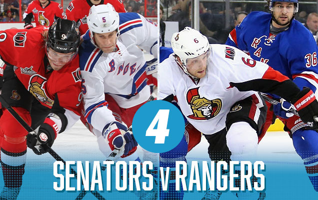
It’s hard to beat a red versus blue match-up. It’s the most used and iconic colours in almost any sports uniform design, creating a combination that looks classic and timeless, and these two jersey sets fit that bill well. Ottawa’s home reds, for all its flaws, is very red, and combined with the Rangers’ whites that have a good amount of blue in them, it looks great. The one thing keeping this match-up from greatness is Ottawa’s road whites, which are too monochromatic against the Rangers’ iconic blueshirts.
Ottawa Senators NHL Brand Power Ranking: 23rd.
New York Rangers NHL Brand Power Ranking: 7th.
Prediction: Rangers in 5 (Ottawa in 6)

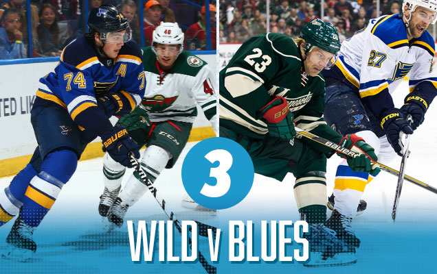
I love this match-up. A cool-coloured green and blue match-up, with just a touch of yellow to bring some warmth and intensity. And both jersey sets combine modern and classic aesthetics, so they work well together in that sense as well. This is a great-looking modern jersey match-up that should be aesthetically-pleasing to watch in either city.
Minnesota Wild NHL Brand Power Ranking: 13th.
St Louis Blues NHL Brand Power Ranking: 9th.
Prediction: Blues in 7 (Blues in 5)

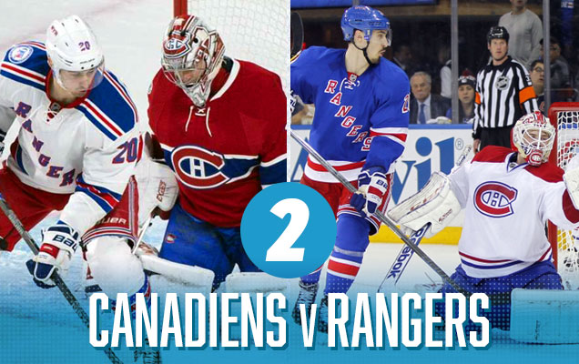
The match-up of the league’s most iconic jerseys! Was there any doubt this would be near the top? A classic red-vs-blue match-up between Montreal’s reds and the Blueshirts of New York. Even the white road jerseys of both these teams are some of the best in the league, with a nice amount of colour of the shoulder yokes and stripings. It’s another excellent series that will be an absolute pleasure to watch no matter what team you’re cheering for or what the score is.
Montreal Canadiens NHL Brand Power Ranking: 2nd.
New York Rangers NHL Brand Power Ranking: 7th.
Prediction: Canadiens in 7 (Rangers in 6)


The top spot features two jerseys that both have elements of traditional jersey design mixed with contemporary jersey design with a thread of gold, white and navy running through it all to make them compliment each other almost flawlessly. The games in St Louis still feature enough gold on both jerseys to make things interesting, working almost like neon striping on both jerseys. The games in Nashville feature enough blue to do the same. All the games will be great to watch, aesthetically-speaking. Still not sold on those gold helmets though.
St Louis Blues NHL Brand Power Ranking: 9th.
Nashville Predators NHL Brand Power Ranking: 21st (tie).
Prediction: Blues in 6 (Predators in 6)

Agree? Disagree? Let us know in the comments or join the conversation on Twitter, Facebook and Instagram! And if you’re interested, we’re now on Pinterest too.


Leave a Reply