
Top 5: Colourful Jerseys

Four years ago, we started a tradition to celebrate St Patrick’s Day: we ranked the best green jerseys to ever exist in the league. Because green is the obvious St Paddy’s colour. That was fun, so the next we went with gold jerseys, because leprechauns and pots of gold. It became a tradition, so we did black jerseys the next year, because Guinness. Last year, it was orange, because Ireland’s flag has orange.
And we’re running out of colours. But pots of gold need rainbows, right? And rainbows are colourful, right? So, instead of focusing on just one colour, how about jerseys that are a virtual rainbow of colours? Let’s go with that.
I’m terrified for next year.
• More: Top 5: Green Hockey Jerseys
• More: Top 5: Gold Hockey Jerseys
• More: Top 5: Black Hockey Jerseys
• More: Top 5: Orange Hockey Jerseys
But this means a little bit of ground rules as to what classified a “colourful” jersey. Basically, it has to include three colours without counting white, black, or grey. That’s about it, but it narrows the field considerably. In fact, no jerseys currently being worn (on a regular basis…spoiler!) qualifies. So, we’re digging into the past a bit. And by the past, I mostly mean the ’90s.
Oh, and we’ll give brownie points for any rainbow-esque arcs on it.

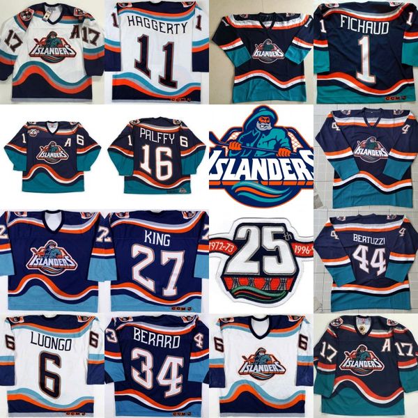
This jersey stretches the rules a bit, as there’s two tones of blue to create the necessary three colours. But the two tones are pretty distinct from each other and, like I said above, brownie points for rainbow-like arcs. And these jerseys have enough of those to make you seasick.
And this also gives you an idea of the types of jerseys we’re dealing with on this list. Brash, aggressive, over-the-top, somewhat-painful, but it gets more fun as the list goes on. Don’t get me wrong, these are still pretty terrible jerseys, but the pickings are slim, and these ones sneak into fifth place.
• More: Worst to First Jerseys: New York Islanders

Here come the Thrashers, the now-in-Winnipeg franchise originating in Atlanta, with their (if you include the logo patches) two tones of blue, burgundy, golden yellow, and brown onslaught of a jersey. And even gold gloves to add some more colour in there. Their other jerseys also could’ve qualified for this list, but there’s not question these are the more “colourful” ones.
Again, not a great jersey, but you gotta give it kudos for just how painfully aggressive it is with it’s layout and palette. From the red shoulder yokes, the golden trims and stripes, the navy blue, it was all put together to create a strong visual impact. And…it certainly does that.


Unlike Joey Lawrence, this entire list doesn’t have relevance only in the ’90s. The Colorado Rockies, for their 6 seasons of existence, embraced the same primary-based red-yellow-blue colour scheme as the Thrashers, but with greater panache and cleaner lines.
The blue is lighter than the Thrasher’s navy blue, and the red is brighter than their burgundy, making the whole jersey that much more garish, aggressive…and colourful!
• More: BTLNHL Vintage: Colorado Rockies
But the stronger, simpler, and more consistent lines also give these jerseys an edge. The design is more of a classic hockey jersey, keeping the design elements to a minimum and allowing the bursts of colour to make the visual impact.
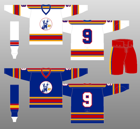
We also could’ve gone with the Kansas City Scouts, the franchise’s original location before moving to Denver (and then to New Jersey), but we like to more minimal striping on these ones. And those red gloves!

Another red-blue-yellow based colour scheme jumps into the second-place spot on this list, featuring the original (and much beloved) Florida Panthers jerseys and jumping cat logo.
Everything about this jersey is pure ’90s, from the way-too-detailed logo, to the unorthodox diamond-shaped shoulder yokes, to the angled sleeve striping, to the aggressive use of colours. But the thing that bumps it up the list is that the blue and gold don’t compete as much with the jersey’s red base. Sure, it’s still aggressive, but it’s better balanced than the other primary-coloured jerseys on this list.
• More: Worst to First Jerseys: Florida Panthers

The only jersey that’s still seeing the ice these days on this list is also the one that lands in first place. Featured in the original Phoenix Coyotes’ jerseys are the following colours (including the logo crests): red, green, sand, brown, and purple. Throw in the white and black used, and these become some of the most colour jerseys to ever be worn in the league.
But what places it in first place is the originality of its elements (like the kachina-styled logo and striping), and how all the colours work well together rather than trying to compete with each other, creating a symphony – rather than a cacophony – of colour.
• More: Worst to First Jerseys: Arizona Coyotes
Agree? Disagree? Let us know in the comments below or join the conversation on Twitter, Facebook, or Instagram!


/https://www.thedailymeal.com/sites/default/files/2019/03/01/iStock-488675262_0.jpg)
/https://www.thestar.com/content/dam/thestar/entertainment/music/2019/10/11/10-million-gift-has-spirits-soaring-at-tso/tso.jpg)
:format(jpeg):mode_rgb():quality(90)/discogs-images/A-371367-1395689093-4771.jpeg.jpg)
[…] • Trying on the most colourful jerseys in NHL historical past. (Hockey By Design) […]
Good list! I can only imagine that the Blackhawks did not qualify for this list because it’s their logo that’s multi-color and not their jerseys. Otherwise, they would have waltzed away with the number one spot. I suppose it’s also a testament to the team’s branding. They’ve stuck with only red, black and white on their jerseys. Lesser franchises might have plucked some of those colorful feathers from the logo to make off-brand, technicolor monstrosity jerseys by now.
You’re exactly right. I thought about including the Blackhawks, but it’s an incredible small amount of colour in a very concentrated area, so didn’t seem within the spirit of the list. Good catch though!
If you are a Chicago fan you should be proud. Fantastic jersey and they have not screwed with it since day one. I applaud all the original 6 teams for not ruining a good thing, except for some small tweaks here and there over the years
[…] • Looking at the most colorful jerseys in NHL history. (Hockey By Design) […]
[…] • More: Top 5: Colourful Hockey Jerseys […]