
HbD Breakdown: Northeastern Huskies Rebrand
 From our Worst to First series to the BTLNHL, we talk a lot about hockey jerseys and logos on this site, but rarely do we venture into the world of college hockey. Last year, friend of the site and NCAA design connoisseur Mark Majewski ranked all 60 Division 1 schools’ uniform sets (yes, that’s six-zero), but last week my alma mater went through an athletics rebrand, and I couldn’t pass up the opportunity to break down the new logos and sweaters.
• More: College Hockey Uniform Rankings: #60–#51
• More: College Hockey Uniform Rankings: #50–41
• More: College Hockey Uniform Rankings: #40–31
• More: College Hockey Uniform Rankings: #30–21
• More: College Hockey Uniform Rankings: #20–11
• More: College Hockey Uniform Rankings: #10–6
• More: College Hockey Uniform Rankings: #5–1
Coming off Northeastern’s first Beanpot title in 30 years, and heading into the school year with a new athletic director and a huge partnership with Under Armour, everything’s coming up Huskies from a marketing standpoint. With Northeastern athletics already ushering in so many changes, the school took the opportunity rebrand and unveil the Under Armour uniforms with a new logo set designed by the school’s internal marketing team. The designs were revealed at an on-campus ceremony last Tuesday night, and like with all things logo and jersey-related, I have quite a few opinions, so let’s dive in.
The Logos
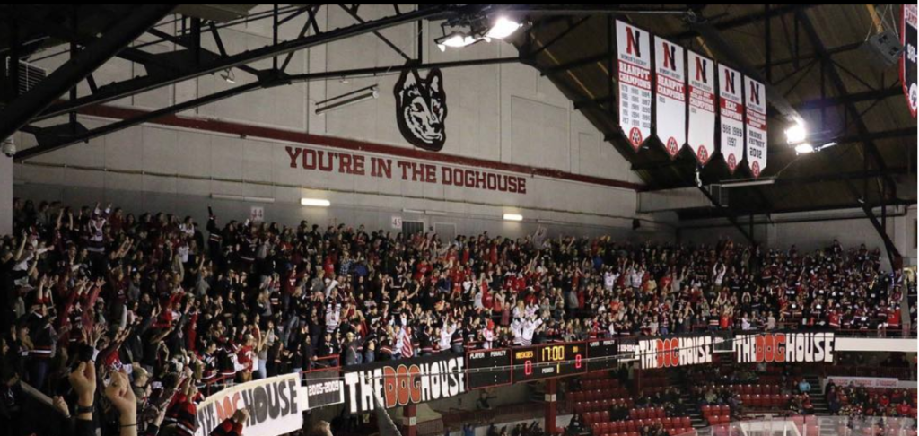
Since my time as a college freshman, I’ve had a love-hate relationship with Northeastern’s array of primary logos. Particularly when you can make apples-to-apples comparisons with logos of other Husky schools like UConn, NIU and UW, it’s easy to pick apart every little detail in illustrations of the same animal. All of the since-retired designs bring back some sense of nostalgia from my college days and games in the DogHouse at Matthews Arena, but for the purposes of this breakdown, we’ll look them all objectively.
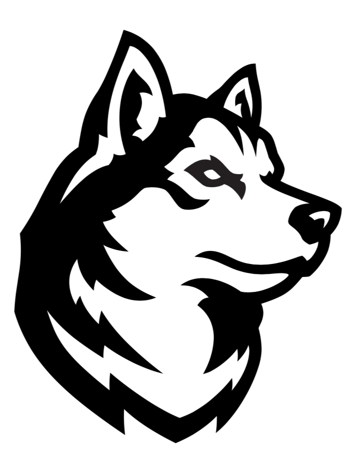
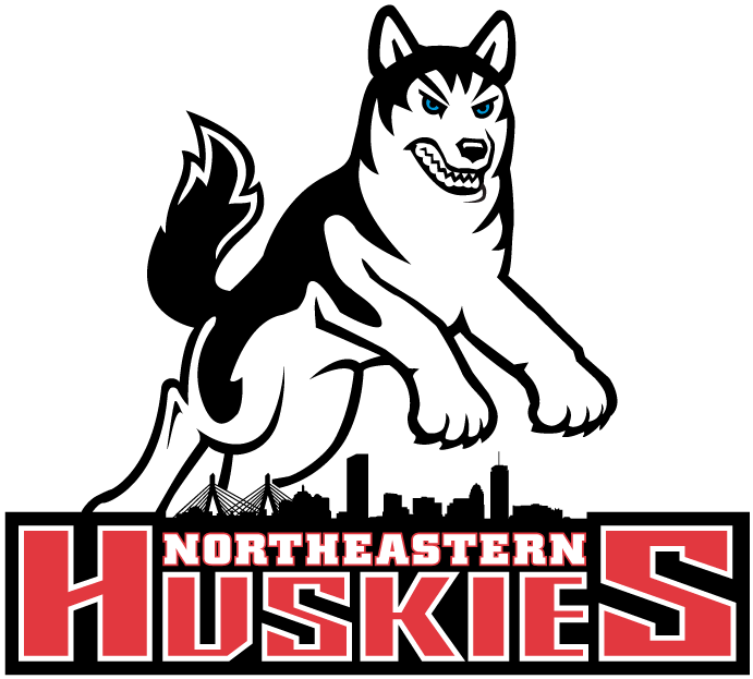
Released with the tagline “a new breed is born,” the new “King Husky” head primary logo is described by new AD Jeff Konya as bold and striking, and regal. “His eyes are away and upward and really trained on the future ahead,” Konya explained at Tuesday’s ceremony.
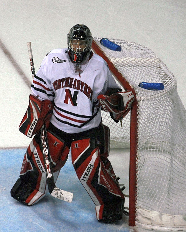
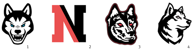 In contrast with the University’s past primary logos, the new King Husky (4) is a vast improvement. The blue-eyed husky (1) from years past has a ferocious expression, but the cartooney rendering looks dated by today’s design standards and lacks the sophistication of a top University or successful athletic program. The two-toned N (2) became the school’s primary mark for some years, adorning the front of the team’s jerseys underneath the lengthy – as Mark pointed out in his post – word mark. The N lacked any sort of character and was replaced with what I like to call the demon husky (3) shortly thereafter. The red outside stroke and heavier use of black give this logo the weight to look appropriate on the front of a jersey, but the abstract and busy design lack the structure and power to make the red-eyed demon dog a really great logo.
King Husky’s positioning and the more graphic rendering of the dog’s head make the logo far more legible and powerful looking than anything the school has had in the past. The attention to detail is really great here, particularly in the shapes around the eye and the way it ends in a point at the bottom that give this thing a really nice flow.
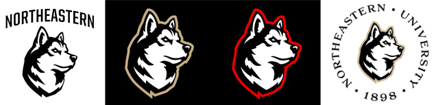 The alternate options of using the logo with the word mark, or with a red or gold stroke show its versatility for application to different mediums and situations. The typography in the circular variation gives me a more dated feeling, whereas a more modern typeface would lend itself better to the illustration style, but the overall concept works just fine.
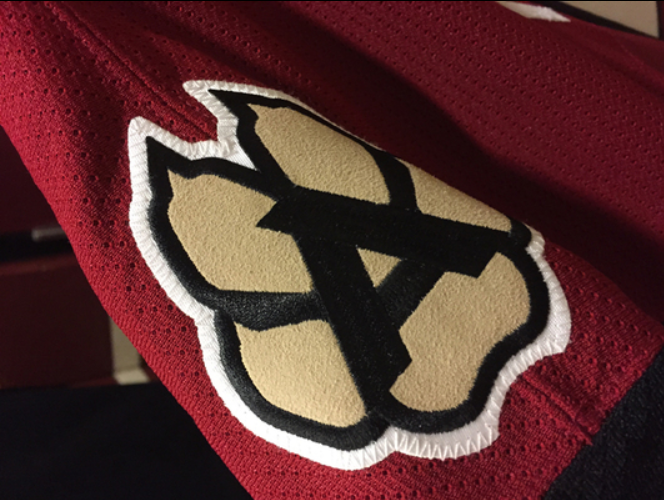
The secondary logo set is where we have some issues.
The strength and legibility in the King Husky design that makes it so successful is seriously lacking in these secondary marks. The standing Husky logo (1) faces the same challenges as many of the school’s past designs in that it’s just too busy. It’s certainly more modern than past iterations (I mean, yikes), but the regal feeling gets lost when the dog is rendered full body. The paw print (2), replacing the now retired two-toned paw print, has more of a tribal-art feeling than that of the sleek King Husky. Seeing this as a shoulder patch design gives me all the Arizona Coyotes vibes, and not in a good way.
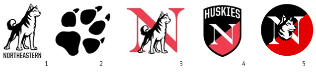 The monograms also seem to lack some cohesion with the choice of typography. The shield (4) has an Ivy league feel, and when used appropriately, is a nice variation, but the contrast between the rendering style of King Husky – both the head (5) and full body (3) versions – and the thin weight of the traditional N look a bit dated and disjointed.

The Jerseys
With the new contract with Under Armour, the Huskies’ jerseys have not only a new manufacturer but a new look. “The new athletics brand reflects that energy and spirit while still honoring our traditions,” says the school’s Vice President and Chief Marketing Officer, Brian Sullivan.
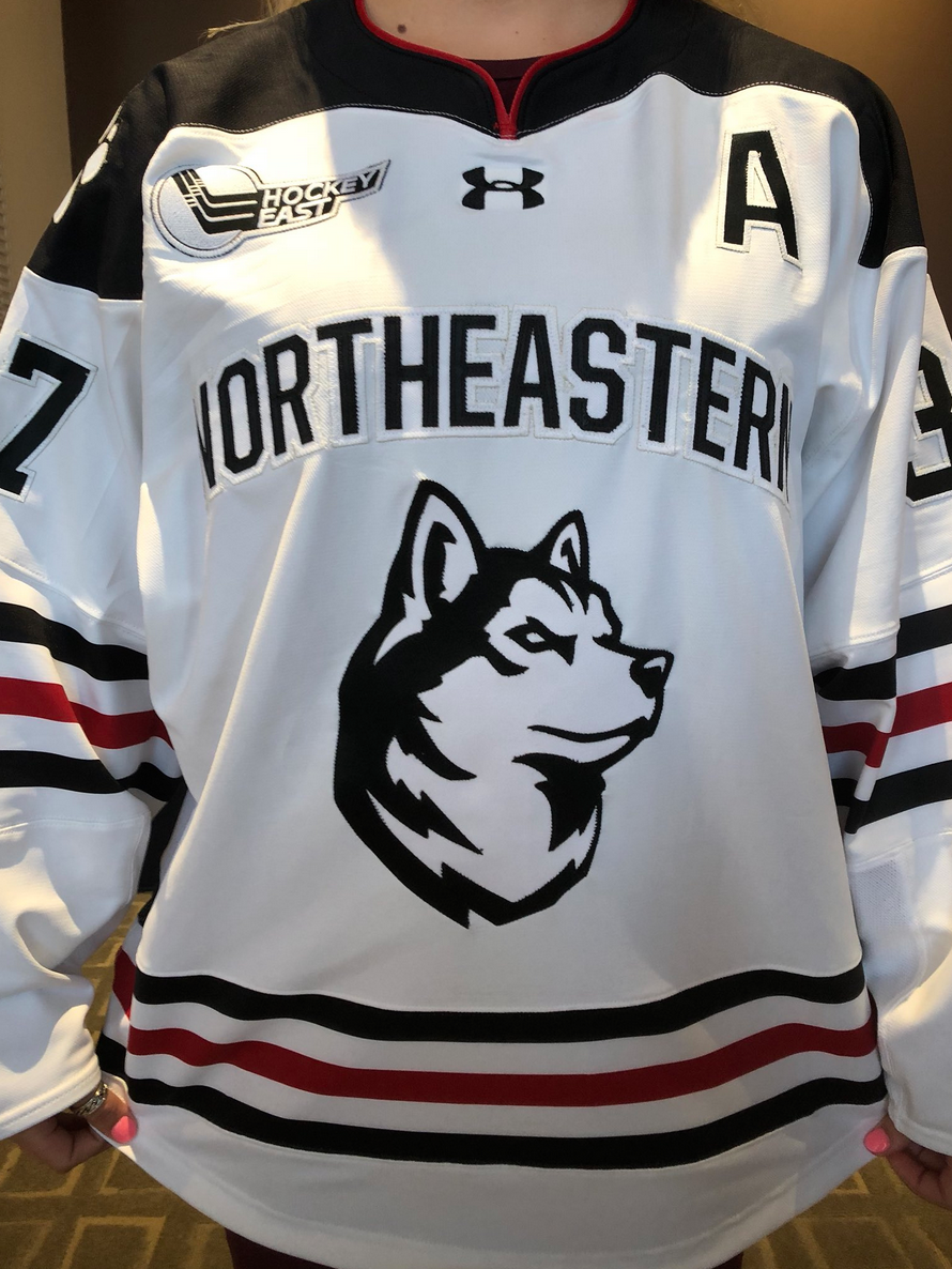
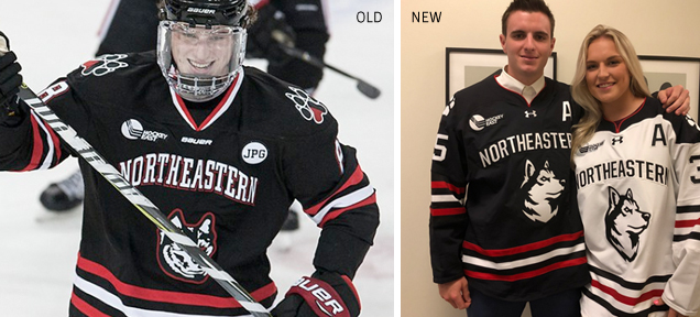 Even with the new logo and new typography, Under Armour kept the general design of the Huskies’ #21-ranked sweater (thanks, Mark!) with a few small improvements that I think make a world of difference. On the black jerseys, the classic red and white trio of stripes still adorn the elbows and waistband, while the collar has been simplified from a two-color stripe down to just red.
‼️ FIRST LOOK ‼️
Here are our @GoNUmhockey and @GoNUwhockey jerseys with our brand new logos! | #HowlinHuskies pic.twitter.com/YrfrQ97A2w
— Northeastern Huskies (@GoNUathletics) August 14, 2018
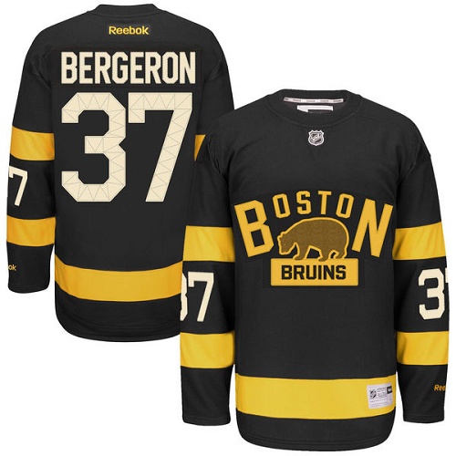
The most positive simplification in my mind is with the typography. Similar to what the Bruins did with their 2016 Winter Classic jersey, the elimination of the stroke around the numbers really gives the backs of these jerseys a crispy, classic look.
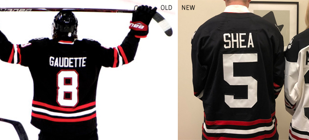 The only issue I have on the black sweater is with the King Husky on the front. While the logo itself looks far more striking and stands out with the simplified word mark, King Husky is just screaming for the red stroke that his predecessor had. The black-on-black makes the dark portions of the logo virtually invisible (particularly on television or from the stands) and would really benefit from another pop of red to encompass the Husky silhouette.
It’s unclear at this point if the white sweaters with the shoulder yoke are strictly for the women’s team, or if the men will wear this design at home too, but the logo looks much better as is against a white backdrop.
![]() Not to be lost in all the hooplah over these new jerseys, the smart people over on Huntington Avenue realized you don’t mess with a good thing when you have it and are keeping the red alternate jersey with the demon Husky logo as a throwback option. From Mark’s review of the Huskies’ third sweaters:
Not to be lost in all the hooplah over these new jerseys, the smart people over on Huntington Avenue realized you don’t mess with a good thing when you have it and are keeping the red alternate jersey with the demon Husky logo as a throwback option. From Mark’s review of the Huskies’ third sweaters:
The uniform is an ode to Northeastern’s mid 1980s teams, when the program was in its heyday as the Huskies captured four Beanpot trophies in 1980, 1984, 1985 and 1988 (their only four…) NU donned these red uniforms then and they’ve been perfected in this go around.
I love everything about them. The sleeves may be my favorite part because I have not seen any other program emulate this look. The old school ‘Northeastern’ wording, emphatically arched over the Husky head with extremely easy to read names and numbers in white on the back. It’s beautiful.
These truly have got it going on and are so unique, and with the school’s dedication for carving out a visual niche in the NCAA, keeping these beauties was the right decision.
Final Verdict
Overall, this rebrand has really grown on me. It’s smart, minimalist, and keeps the best traditional elements of the school’s visual identity while updating (or outright scrapping) others as needed. “Our team worked tirelessly to develop an identity unique and distinctive to Northeastern, and I think we hit a home run,” AD Konya shared of the work. “We believe these marks, along with an integrated marketing plan, show the vibrancy of Northeastern Athletics and is a product that our loyal constituents will gravitate towards.”
A New Breed Is Born | #HowlinHuskies pic.twitter.com/6RVe5yMC4o
— Northeastern Huskies (@GoNUathletics) August 14, 2018
Agree? Disagree? Let us know in the comments or join the conversation on Twitter, Facebook and Instagram!


Just how many alternate logos does a team need? The only ones they should be using are the primary husky head, the paw print, and the crest. You’re right, the husky head on the black jersey needs an outline, or to be made larger, since the primary black outline is lost in the jersey, so the head logo becomes smaller. Also what’s with the shoulder yolk on the back? Why split it up at the neck? Just straight across would look better.
I’d prefer they ditch the black yokes all together on the white jersey, but the choice of making it look like a shoulder pad on the back is definitely odd.
I also don’t see them using *all* of the alternate logo variations for athletics; I imagine they just created them to show the different ways in which the school can leverage the brand. I agree though, it does seem like overkill, and I would’ve rathered see fewer, smarter options rather than such a wide variety.