
Design Trends: Digitally-Printed Goalie Pads
 by Kristopher Kern (@RadKern)
(Ed. note: Today, we’re totally excited to introduce a new contributor to the site: Kristopher Kern. He’s worked in design and marketing for 15+ years, is currently the Creative Director for a large convenience store/travel stop chain in the States, and – of course – is a big hockey fan. Welcome Kris!)
The goalie mask has long been the primary medium for artistic expression and graphic design when it comes to on-ice equipment. However, in recent years goalie pad technology has evolved in not only materials and construction, but the ability to digitally print graphics on leg pads, blockers and catchers. This opens up a whole new world when it comes to the visual aesthetic of goalies.
Since the early 90’s the full set of goalie gear has been an extension of expression, but up until now it has been restricted to simply the usage of team colors via patterns of sewn materials on each piece of equipment. The possibilities of design are nearly limitless now, with companies like Bauer leading the charge in this new era of goalie gear. The one-piece, flat design of newer generation leg pads essentially create blank canvases that can showcase custom designs and patterns. There are a handful of NHL goalies that are currently using these types of digitally printed pads, with Henrik Lundqvist being the most prominent. (More on him below.)
 This new technology will definitely reveal which goalies will choose to work with talented graphic designers on their pad designs. In order to be visually effective, the approach will have to be different than most mask designs today. The majority of current mask designs are highly detailed, with intricate layers of colors, textures, logos, numbers, graphics, etc. There’s typically a lot of content on a relatively very small canvas.
If the same approach is taken on pad designs it will be a visual mess. The temptation to go overboard will have to yield to restraint, especially with the ability to print photo-real images that span the entirety of the leg pads and blockers is available. “Less is more” should be the direction given to any designer working on pad designs. Keeping it simple with symmetrical graphics and a limited color palette will produce a visually striking look as these types of pads continue to evolve amongst goaltenders.

At this point most NHL goalies have done a good job utilizing a simple, “less is more” design approach, but there are some that have taken that approach a little too far and are utilizing graphics that are so simplistic it’s boring. Some of the more creative designs that use this technology can currently be found in the collegiate and minor league ranks. The following breakdown takes a look at some examples of this burgeoning trend in goalie gear…and since it’s an ever-changing landscape, this list is more of a sampling and by no means comprehensive.
The NHL’s Best: The King Has Been an Early Adopter
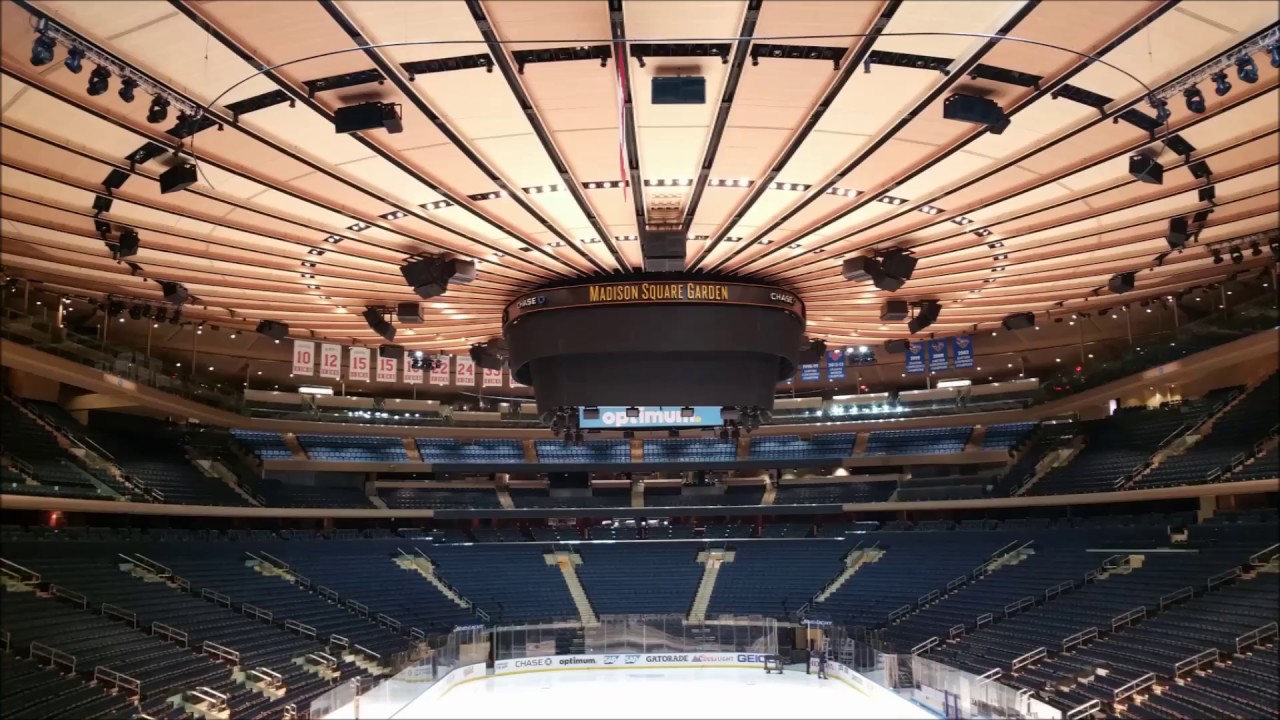
Henrik Lundqvist was a very early adopter of the digitally printed pads and continues to utilize a set that prominently features the Statue of Liberty with the NYC skyline, along with the ceiling design at Madison Square Gardens. The design works very well due to its symmetry and excellent usage of Lady Liberty’s seven crown spikes as a graphic element. The red, white and blue color scheme perfectly accent the Rangers uniforms in this set of pads that exemplify the best of the “new school” goalie pad designs.
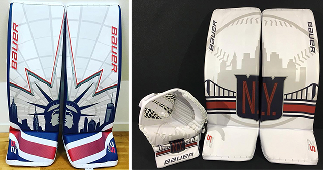
Lundqvist’s pads (left), Lundqvist’s 2018 Winter Classic pads (right)
Lundqvist also shared via social media a prototype set of special edition pads for the 2018 Winter Classic at Citi Field. While he ended up not wearing them in the game, the pads did an excellent job of showing off another example of digitally printed design, featuring the vintage NY Rangers crest along with a greyscale baseball outline as a nod to the NY Mets. Symmetry in design is achieved here as well with all design elements (the skyline, baseball, bridge, logo and striping) creating a cohesive layout across both leg pads.
The Rest of the NHL’s Best
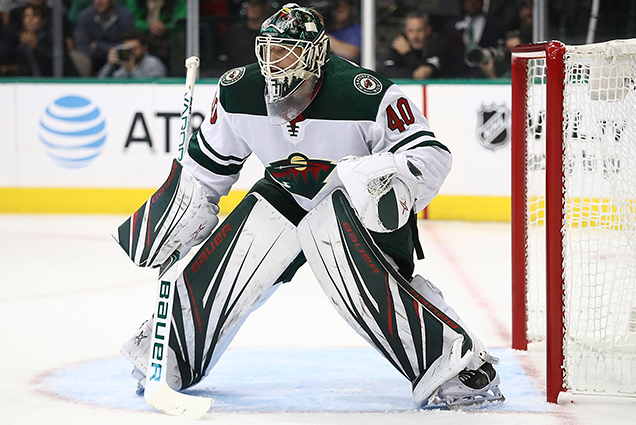
Devan Dubnyk
Devan Dubnyk incorporates graphic patterns in the green/red color scheme of the Minnesota Wild into his custom pad design. While not quite as creative as Lundqvist’s pads, these mesh very well with the uniform and overall aesthetic of the Wild. The striping design evokes a connection with the inlaid tree and sky-streaks pattern within the primary Wild logo. The graphics flow well from the leg pads to the blocker to create a unified look. All-in-all it’s a pretty straight-forward design that plays it safe.
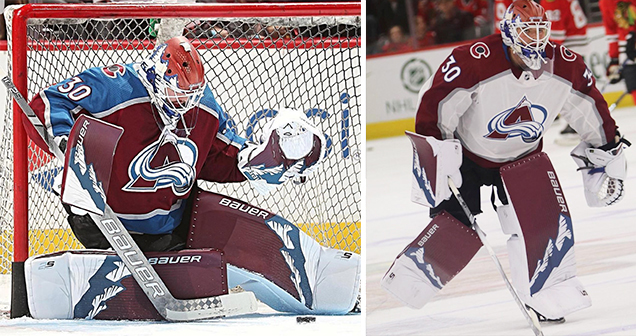
Spencer Martin
Spencer Martin’s Rocky Mountains-inspired graphics are subtly fantastic. While he’s currently in the AHL, here’s to hoping he sees some time with the Avalanche at some point this season. The actual design of this graphic is fairly simplistic, but it proves the point that design doesn’t have to be overly complicated to be highly effective. Bold, illustrated mountains serve as an angled stripe that separates the maroon upper from the white lower on the leg pads, catcher and blocker. Also, tons of bonus points for utilizing a mask design (done by the reliably great Dave Gunnarsson) that replicates the design of the pads for a truly cohesive look.
• More: HbD Interviews: Dave Gunnarsson
Could mask designs that directly correspond with pad designs be the next step in the customization of goalie gear? Hopefully the answer is yes, as this is a very sharp look. There’s definitely something to be said for a well-executed design that can not only be impactful when viewed up close, but have nearly the same impact when viewed from upper level seating within the arena.
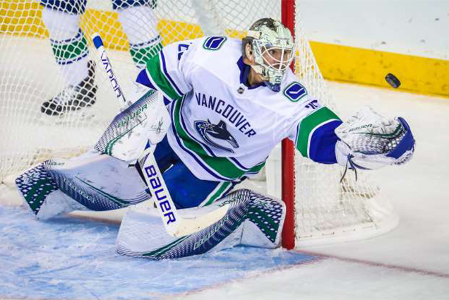
Jacob Markstrom
Jacob Markstrom has the benefit of a color palette that typically always looks good on ice: royal blue and kelly green. Similar to Dubnyk’s setup, Markstrom utilizes an abstract, bold graphic pattern that matches his team’s colors. Overall pretty straight-forward, the graphic resembles a dimpled mesh and it does a good job of conveying motion or action. Nothing earth-shattering exciting here, but much better than the NHL’s rest….

NHL’s Rest: Minimal Design & “Stock” Graphics
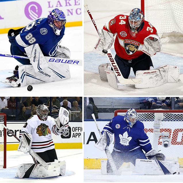
(clockwise, from top left) Andrei Vasilevskiy, James Reimer, Frederick Andersen, Cam Ward
There are numerous other NHL goalies that utilize digitally printed gear, but for the most part they are very minimal with an underwhelming design that is also available at the retail level. The graphics on these sets of pads don’t take advantage of the full capability of digital printing customization. Perhaps in the near future even “stock” graphics will further push the envelope when it comes to the overall graphic design and aesthetic of each set of pads.
The True Showcase: Minor League and Collegiate Ranks
It’s the wild, wild west when it comes to the digitally printed designs found on goalie pads at the collegiate and minor league levels. The up-and-coming goalies seem to be more willing to experiment when it comes to designs on pads, furthering the evolution of how a goalie looks on the ice.
Whether it’s oversized logos, striking patterns, or even designs that mimic pads from those early 90’s days, the true showcase of this technology can be found at all levels of hockey below the NHL. It will be interesting to see if these goalies continue the trend of bolder graphics as they climb the ranks of the hockey world. The gallery below highlights some very good examples, all with the common theme of a simple, yet very effective design.

Wrapping Things Up
Overall, the emerging trend of digitally printed pads will most likely only become more prevalent in the near future. The result will be a very noticeable impact to the visual aesthetic of watching games. Similar to the rise of custom painted goalie masks, each goaltender could have the opportunity for a much larger canvas to express their individuality or rep their team’s colors in new and different ways.
The overall design direction on these types of pads could end up going a few different ways:
(a) A single design that is essentially repeated from the leg pads to the blocker/catcher and doesn’t really correspond to the mask design, which is the most common execution today.
(b) The same type of repeated design/graphics on the pads, but it includes a mask design that matches for a more cohesive look, like Spencer Martin’s Colorado Avalanche look.
(c) Or, a very unique approach that would include an overall design theme that carries from the mask down through all pieces of equipment, but doesn’t repeat the same pattern throughout. This has the potential to be the most interesting approach, albeit difficult to pull off. It will take a skilled designer to create such a look that will seamlessly span across the different types of equipment in a visually dynamic way.
Some hockey traditionalists may view this advancement in gear technology as a little too “new school” for their taste, but as long as the on-ice performance of the gear meets the demanding standards for goalies then these types of pads will be here to stay. One thing is clear: from a graphic designer’s perspective it will be interesting to see how the creativity and design executions continue to evolve along with this digital printing technology.
Agree? Disagree? Let us know in the comments or join the conversation on Twitter, Facebook and Instagram! And if you’re interested, we’re now on Pinterest too.


Leave a Reply