HbD InDepth: The Seals of California
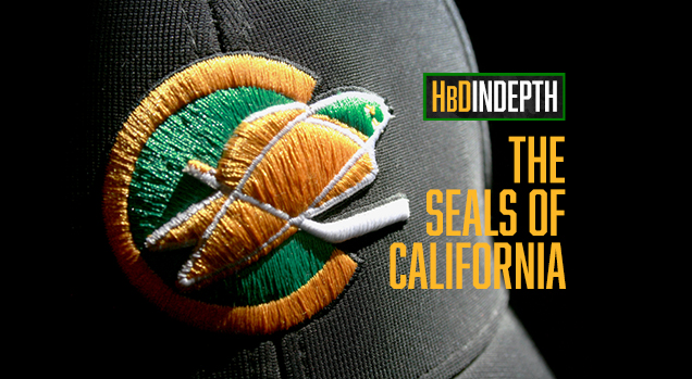
Editor’s Note: We’re proud to announce that Dave Kottler of SportsBrandJury.com is now contributing his great writing and design analysis for NHL-related topics exclusively to Hockey By Design. This is his first post for us – which is also the first in a new series of in-depth looks at hockey brands – looking at the design and history of the California (née Oakland (née California)) Golden Seals (née Seals). Hope you enjoy!
Seal of Approval
In the early days of league expansion, California was introduced to big-time NHL hockey. With the creation of the Bay Area franchise in 1967, fledgling hockey fans were introduced to bizarre marketing tactics, an eccentric owner, white hockey skates and even an ice-streaker. Lost in all the craziness was a team branding identity crisis that featured some of the best and worst designs in league history.
I still remember how excited I was when the NHL expanded from six to twelve teams for the 1967-68 season. Six new logos, six new color schemes and six new uniforms. Plenty of opportunities for Crayola greatness when you’re a kid obsessed with drawing NHL logos. But as much as I liked sketching out all the new expansion team logos, I was most drawn to the new team on the West Coast with the unusual name – The Seals.
Seal Appeal
The 1967 expansion saw the NHL award franchises for the first time to areas of the country not known for cold weather. In an attempt to broaden their fan base, California was awarded two of the six new teams – the Los Angeles Kings and the California Seals.
The original ownership group for the Seals franchise actually purchased an existing minor league team called the Seals, moved them from the San Francisco Cow Palace (yes, inside it even smelled like manure) across the bay to Oakland and morphed them into the new NHL club.

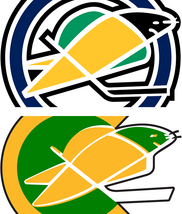
The initial team logo was a smartly designed seal with a hockey stick framed by a large letter “C”. The colors of the seal were green, gold and black, while the large “C” was a deep navy blue. Heavy black outlines were the weakest part of the logo design as they nearly overpowered the sleekness of the image. The seal was portrayed leaning dramatically forward with its stick and it captured a real sense of flying down the ice.

Realizing quickly that they needed to create a stronger local fan base due to dismal ticket sales, they changed the name to the Oakland Seals. The logo adjustment was happily a simple one, replacing the large “C” with a full circle representing the letter “O” for Oakland. Some small but subtle design changes gave it an improved look, notably making the “O” more dominant by reducing the white space between it and the outer black ring, while positioning the seal and stick more integrally within the circle.

In the side-by-side comparison of the two logos, the difference is easily noticeable. The visual “vibration” that the California version creates is almost gone in the Oakland design. This is a great example of how simple adjustments to proportional spacing can make a huge difference in the readability and eye appeal of a logo design.
Golden Era
The Seals won only 15 games in their dismal inaugural season but made the playoffs in the following two seasons (albeit with losing records in both years). After a failed attempt to sell the team, and continuing money woes, the NHL finally approved the sale of the Seals to flamboyant Oakland A’s owner Charlie Finley. In a telling comment after buying the team, Finley admitted on camera “I know absolutely nothing about the game of hockey.” That would quickly become apparent to Seals management, players and fans.
In one of his first moves, Finley adopted the green and gold colors that his baseball Athletics had made famous playing in Oakland, and changed the team name first to the Bay Area Seals (along with adding “The” to the wordmark, which lasted all of 2 games into the 1970/71 season), and then to the better-known California Golden Seals.
The Seals logo was updated to the new color palette, and the dark blue was eliminated from the design. Also gone from the design was the black seal head and hockey stick, the head now in green and the stick in white.

Some interesting design details were also included in redesigned seal logo. The consistent overall spacing in the Oakland version were traded for more freeform shapes that were offset, creating a more artistic seal image. Subtle changes to the seal’s head, eye, mouth, whiskers and legs (legs?) were also part of the redesign.
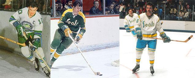
In one of countless strange decisions made by the new owner, the team hit the ice for the 1970-71 season wearing new all-type jerseys featuring the name “Seals” in a clunky, oddly angled logotype, and sporting the garish Oakland A’s yellow and gold color scheme. Sadly, in these days third jerseys were unheard of, so the slick seal logo would never be worn on a game jersey again.
• More: BTLNHL Vintage: California Golden Seals


White Whine
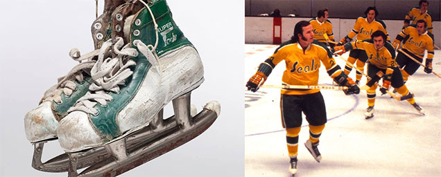
What would be seen on the ice during the Charlie Finley reign, however, became the stuff of NHL legend and laughingstock. Ever the showman, Finley implemented the first of many gimmicks by forcing the players to wear white skates.
This apparently was to imitate the similar mandated white cleats that his baseball Athletics had introduced, first in Kansas City and then again once they had moved to Oakland. But in the days when the only white skates were women’s figure skates, the hockey players as a whole were against the move. Much to the players’ chagrin, the order was enforced, and the Seals were left to endure the heckling of their opponents and fans.
Equipment managers were tasked with touching up the skates between periods by applying multiple layers of white paint, eventually making them heavy and cumbersome.
Among the other brilliant Finley promotional schemes was a skating donkey (two skaters in a donkey suit), a proposal to the NHL that all teams adopt a bright orange puck to make following the action easier, and paying a woman to glide across the rink during intermission wearing nothing but a pair of skates (whether they were white or not, no one seems to have noticed).
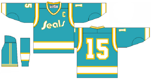
Hard as it is to believe, the uniforms that were mediocre at best under Finley’s ownership took a turn for the worse after he sold the team back to the NHL in 1974. They kept the horrid Seals typography jersey logo but dropped the A’s green color in favor of a new pacific blue, which was essentially an ugly teal.

Without the seal logo, and with an even worse typography treatment (if possible), the team finished out its time in the Bay Area in one of the worst hockey uniforms ever seen on NHL ice. The white jerseys were paired with hideous teal pants and white stockings with gold and blue stripes.
Signed, Seal’d and Delivered
Needless to say, the Seals soap opera on ice eventually came to an end when the team was sold back to its original minor league owner who moved it to Cleveland to become the Barons after the end of the 1976 season. There it faltered for two years before being merged with the Minnesota North Stars team, effectively ending the short and ill-fated lifespan of the franchise.
However, in what may have been the most fun development during the Seals branding odyssey, they unveiled a cartoon mascot named Sparky. In a little-known bit of trivia, Sparky was created by Peanuts comic strip creator Charles Schulz, who lived in Santa Rosa and was an avid Seals fan.

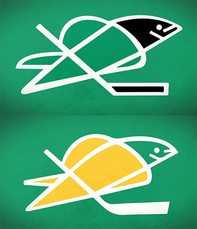
But oh, what could have been. With their super cool seal logo, and a decent brand strategy, the team could have had one of the sharpest logos in the NHL today. As seen in these two wallpaper graphics (of unknown origin), the seal image could easily stack up against today’s NHL team brand identities. White skates excluded, of course.
For more information about the Golden Seals, check out the documentary film The California Golden Seals Story.
Agree? Disagree? Let us know in the comments below or join the conversation on Twitter, Facebook, or Instagram!


Loved this story! Looking forward to more…
Great post! Loved the balance between history, analysis, and fun facts!
Great article but I have two questions about the original Seals logo. Does anyone know who actually designed the logo? The second question is about the logo itself. The C style Seal is seen with a hockey stick but I am not clear on what the green areas on right and left side are supposed to be-it looks like perhaps Seal is jumping through a hoop? Or does the green represent water splashing for movement? Can anyone clarify this.thx.
Hi John:
Thanks for reading the post and asking the questions. Unfortunately, I wasn’t able to discover who actually designed the logo so I don’t have an answer for you on that. As for the other question about the green areas, I don’t think this logo was designed as thoughtfully as you are wondering. My judgment is that the green is just a fill color inside the “C” letterform and any specific shapes that might occur where it intersects the seal image are unintentional. Anyone else have thoughts on this?
–SBJ | HbD