Worst to First Jerseys: Arizona Coyotes
As we go through the 2019-20 season, we’ll be updating all of the Worst to First Jersey posts every Monday, as almost all the teams in the league have unveiled new jerseys since their original posts. We’ll start with the ones most needing updating and work our way through the league. Today, it’s time for the Arizona Coyotes to get updated.
Also, a huge thanks to SportsLogos.net for most of the jersey images and NHLUniforms.com for the jersey references.
When I counted down the Best Team Logos in the NHL (BTLNHL) on my blog, I like to think I surprised a few people by ranking the current Coyote’s logo so high on the list, coming in at #9, and beating iconic teams such as the Rangers and Oilers. But it wasn’t always so great for the Coyotes brand.
• More: BTLNHL #9: Phoenix Arizona Coyotes
Here’s how this works: I’ll count down, from worst to first, all the jerseys the Coyotes have ever worn. Homes and aways will be lumped into the same category (so, more of a jersey “era”) and I won’t worry about small changes (like slightly changed positions of piping for example). Third jerseys will stand on their own. And I’m focusing on the jerseys only, not the entire uniform. For the Coyotes, there’s six different jerseys/eras. And we’ll start with the worst one:
6. 1998–2003 Third Jersey
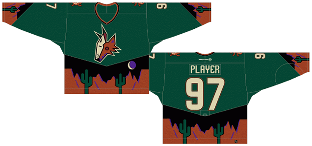
Regular readers of the blog would see this one coming from a million miles away. This is not only the worst jersey the Coyotes have worn, it’s one of the worst NHL jerseys ever. Having a landscape that resembles an 8-bit Nintendo Ninja Gaiden-esque backdrop to replace the striping on the jerseys is certainly something that you don’t see on an NHL jersey everyday. And thank god for that.
The problem is, it’s something you might see on a minor-league hockey jersey. They put out crazy stuff like this all the time. Like the Bakersfield Condors’ Abraham Lincoln/Gettysburg Address-inspired jerseys. I could not make this up if I tried. And then there’s the Albany River Rats’ Ronald McDonald jerseys, where they even dyed the ice yellow. This jersey is on par with these messes of jerseys. I’d roll my eyes if Phoenix were a minor league team and leave it at that, but in the NHL – the best hockey league in the world – it’s just reeks of amateur.
I can appreciate that the third jersey campaigns that NHL teams are doing allow the teams to play around with traditional jersey design and create something different and exciting. Most of the time, it draws on the history of the team. Phoenix Arizona, having a history of about two seasons at this point (aside from being in Winnipeg of course), couldn’t draw on that, so they introduced one of the worst inclusions of horrible design that epitomized the ’90s. Seriously, the ’90s were bad.
The alternate logo they used on these jerseys are just the head of their primary hockey-playing Native American-influenced coyote, which is also a logo I was never crazy about, and also a product of the ’90s era of hockey design. But the head by itself is actually more simplistic than it’s minor-league-looking full-bodied version and actually is the only plus on this whole jersey.
Everything here just reeks of ’90s design, and any jersey like this should remain banished in a minor league somewhere.
Jersey Recommendation: #97 Roenick. Loud, colourful, abrasive and quasi-offensive. The jersey, I mean. But that’s Roenick too, so it’s a good fit.
5. 2008–14 Third Jerseys
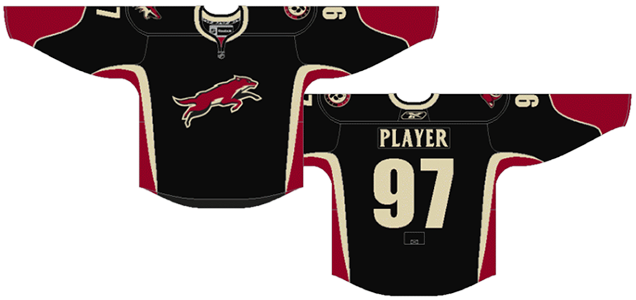
The rebranding that happened for the Coyotes in 2003 greatly improved the overall quality of design for the team (more on that later), but this third jersey was a slight mis-step. This jersey features the weakest logo (alternate or otherwise) that the team has ever had. A coyote, caught in mid-motion leaping (or running away?) over nothing in particular may portray speed and grace (which are integral to the sport of hockey) but it has absolutely no sense of strength or intensity (also integral to the sport of hockey).
The orientation of the logo is also badly-considered for a hockey jersey. The extreme horizontal nature of the icon gives it less prominence on the jersey and that’s mixed with the over-complexity of having a full animal’s body in the design.
As for the rest of the jersey, I’ve already expressed the problems with having black jerseys in hockey: black jerseys vs a team in white jerseys on a sheet of white ice makes for really boring aesthetics. The wavy lines along the sleeves and sides of the jersey are somewhat inexplicable. They’re non-traditional for a hockey jersey, but there’s no apparent reasoning for doing so. The only thing I can think of is that its meant to match the movement in the alternate logo itself.
But because the logo is already accentuating that aspect (and because this third jersey is the only place this logo is used), the jersey can be used to accentuate the strength and intensity of hockey. Like sleeping in on Black Friday, it’s a missed opportunity…if you like getting trampled and injured. Also, the sand/beige stripes on the sides don’t match the width of the stripes on the sleeves. That shit bugs me. It makes it look like a mistake.
Jersey Recommendation: #89 Boedker. The Dane was drafted by the Coyotes the year these third jerseys came out and has played with the team every year they’ve worn it.

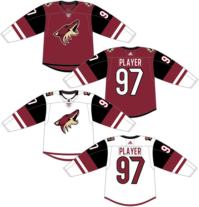
4. 2015–present Home & Away Jerseys
It’s so sad, really. Arizona had a good thing going with their jerseys and overall visual brand since their 2003 re-design. And then they came out with this. It’s a perfect example of the if-it-aint-broke-dont-try-to-fix-it principle. I encourage and appreciate any attempt, of course, to come up with something new (and the Coyotes also encourage and appreciate any attempt, of course, to get more money out of fans’ pockets), but these are not an improvement.
The most obvious and dramatic element in this jersey are the sleeves, where they have multiple black, white and burgundy stripes. While the black inclusion looks weird on the home burgundy-coloured jerseys, but it looks worse on the road whites. The human eye is automatically drawn to places of high contrast, and the highest contrast on the jerseys are now the upper arms: the white numbers on black. And it’s only accentuated on the road whites with the black placed against a white background.
The stripes themselves? Non-sensical. Inconsistent in size, width and numbers. You can’t help but feel they’re just randomly placed, but apparently, they’re meant to connect with Arizona’s distinctive striated landscape. That’s a bit of stretch, and not a very good justification for including it. Striated landscapes generally have somewhat subtle striping patterns, or different tones of the same colour. Now, that might’ve been cool to see on a jersey. But, these stripes are about as unsubtle, high-contrast, and non-striated as they come.
One of the shoulder patches has also changed (a new alternate logo I guess) to a coyote’s paw print with an “A” incorporated. They’ve used a similar idea for a patch in recent seasons, but I do like this new one: clean, simple and a little more iconic. Works for a patch or alternate logo, but wouldn’t want to see it big on the front of the jersey. The other patch, the AZ state patch to be worn on the road whites, remains relatively the same, with a typeface change to match the team’s branding, which is a good idea.
For the white jerseys, they have a thin sand stripe along the bottom, which…whatever. I could take it or leave it. But, it makes less sense to have a black stripe on the bottom of the coloured home jerseys, since the pants are black anyway. They just kind of bleed into one another and makes the jersey look shorter than it actually is.
Overall, it’s a jersey that’s just overly complicated in a non-sensical way.
Jersey Recommendation: #23 Ekman-Larsson. Oh captain, my captain. With the jury still out on how Kessel and Hall are going to pan out, maybe the latest Coyotes jersey set deserves to have it’s captain and current longest-serving Coyote on it. Get it in burgundy.
3. 1996–2003 Home & Away Jerseys, 2014–present Third Jersey
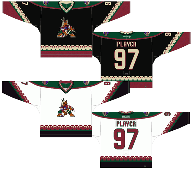
When the original Winnipeg Jets made the trip to the deserts of Arizona in 1996, it was at the height of experimentation in the league aesthetically. The first third jerseys had rolled out in 1995. There was a new sublimation technology for printing on jerseys allowing for gradients and more complex imagery. Expansion and relocation, particularly to the southern US, was unprecedented which brought in a whole new phase of different aesthetics to appeal to the new markets.
Some of this experimentation was on a mad-scientist-blow-up-in-your-face-charring-your-face-leaving-you-googly-eyed-and-unable-to-move level. It was bad. One of the biggest experimentations was with the traditionally simple straight lines on the sleeves and bottoms of the jerseys. Colorado and Dallas added angles. Los Angeles added words. ArizonaPhoenix, like Carolina and Atlanta, added patterns.
For the Coyotes, their logo drew from kachina-inspired aesthetics of the traditional Indigenous societies, and these first jerseys became an extension of that aesthetic, creating a relatively complex pattern along the sleeves and bottom of the jersey. Nothing wrong with bringing in Indigenous influences in your design, as the Canucks did it with their logo, but did anyone think that these jerseys might look like a poncho when being worn?
The problem with the complexity of the patterns is that it becomes the focal point of the entire jersey, which should instead always be the main crest on the front. Look at this picture and try tell me you’re staring at anything other than Tkachuk’s neck. The complexity, heavy contrast and multitude of colours draws the eyes away from the logo and to the perimeters of the jersey.
The other bad aspect of this era of hockey was the overly complex colour palettes. Florida was guilty of it. Atlanta was guilty of it and so was PhoenixArizona, using sand, green, burgundy and brown. None of these colours are common in the NHL, so it’s great they chose unique colours, but did they need so many? Luckily, they fixed that later on.
I’m usually not a fan of black jerseys either, as I prefer as much colour as possible on jerseys considering the players are playing on a blank canvas of white ice. But, with the amount of colour splashed all over jerseys, I’m OK with it. It’s the complexity of it that brings it down.
Jersey Recommendation: #7 Tkachuk. The captain of the Coyotes from the time they moved from Winnipeg to when he was traded in 2001. The most obvious choice to represent this era. Get it in black.
2. 2007–15 Home & Away Jerseys
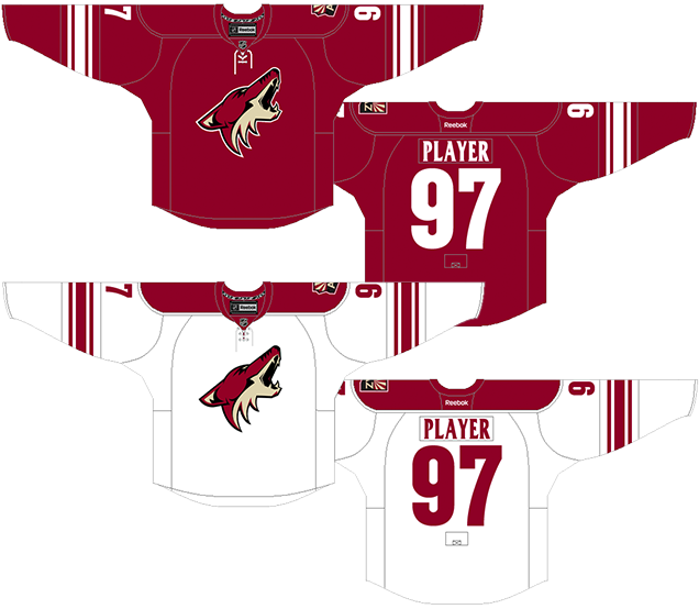
This jersey and the one in first place are extremely similar to each other (and are the easy #1 and #2 on this list, by a mile) with only minor details separating them, but these details were enough to keep their current jersey in second place. It was, in my mind, one of the nicest jerseys in the league. Part of that starts with the logo and the rebranding the team did in 2003.
They threw out the complexity of the kachina-inspired designs in favour of something that simplified the colour scheme to the burgundy and sand. They simplified the logo to something more elegant and refined, while still being distinctive. It really is a wonderful logo, and I once had the pleasure of chatting with the designer of it, Daniel Price.
• More: HbD Interviews: Daniel Price (Avalanche & Coyotes)
The jerseys were reduced to one colour: burgundy. Only the Colorado Avalanche use burgundy in their brand as well, and they mix it with blue, so PhoenixArizona’s remains distinctive and unique within the league. Some of the most iconic jerseys in the league, like the Maple Leafs and the Red Wings, also use a single colour on their jerseys. Gone are the overly complex patterns in favour of traditional hockey stripes: simple, strong and elegant.
PhoenixArizona also wore what I consider to be one of the best designed shoulder patches in the entire league on these jerseys (the new two-lettered Arizona versions don’t work quite as well). Even the fonts were changed, from the standard cut-off angles traditionally used in hockey, to something unique to PhoenixArizona. You don’t often see a serifed font on any sports jerseys, but it works on these nameplates because they’re very slight and, for the most part, don’t impede readability. It’s actually a gutsy move, and it worked well.
In all, when combined with the logo, the jerseys are distinctive, simple, strong, elegant and even iconic. There’s only a couple things that kept these from first place. In 2007, when Reebok redesigned all the NHL jerseys, PhoenixArizona did what quite a few teams did and eliminated the stripes from the bottom of the jerseys. For the burgundy jerseys, PhoenixArizona didn’t change anything else, making the jersey change almost too minimal. A big complaint after teams removed the stripes was that they started to look like practice jerseys, and these jerseys are certainly heading that way. As the lack of stripes at the bottom becomes more commonplace, that complaint has subsided since viewers have gotten used to it, but it’s still important to make a distinction.
For the white jerseys, they moved the burgundy stripes at the bottom to the top, in the form of burgundy shoulder yokes. It’s not bad, but shoulder yokes are pretty hit-and-miss. It can make a jersey look incredibly blocky, or accentuate an already nice design. Generally, with simplistic jerseys like the Coyotes have, it’s a detriment.
Jersey Recommendation: #17 Vrbata. Vrbata’s career with the Coyotes is almost exclusively while they wore these jerseys, having most of his best years wearing them. If you prefer goalies, I’d go for a #30 Bryzgalov, the most chill philosopher-goalie to grace the NHL. Either way, get it in burgundy.
1. 2003–07 Home & Away Jerseys
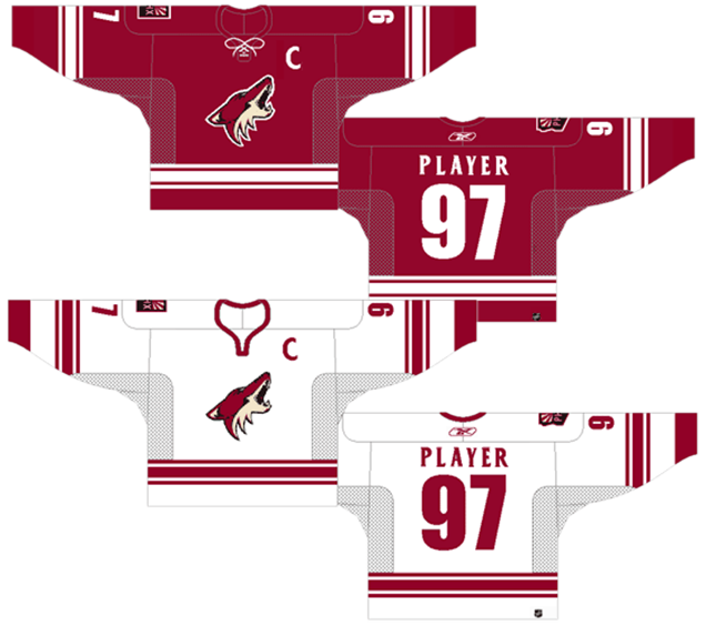
The original outcome of 2003’s rebranding of the team, these jerseys are as close you can get to classic, iconic hockey jersey design while still being distinctive and unique to the team. Again, the simplicity of the logo, the colour palette and the overall design is wonderful. And they take the top spot because the shoulder yokes are gone from the whites, and they have the stripes along the bottom of the jerseys.
In comparison to the jerseys at No. 2, these are just barely a step ahead. Simple, strong and intense, but with the logo, full of movement and grace. It’s a great combination of all the elements that make hockey such a great sport to watch and play. Not much more to say than that.
Jersey Recommendation: #19 Doan. He became the captain in 2003, when these jerseys were introduced. And he’s been the undisputed leader of the team until he retired. This era belonged to Doan, no question. Get it in white.
Agree? Disagree? Let us know in the comments below or join the conversation on Twitter, Facebook, or Instagram!


[…] originals have been panned in recent times, with one writer saying that they are “not only the worst jersey the Coyotes have worn, […]
[…] originals have been panned in recent times, with one writer saying that they are “not only the worst jersey the Coyotes have worn, it’s […]
[…] originals have been panned in recent times, with one writer saying that they are “not only the worst jersey the Coyotes have worn, it’s […]