HbD InDepth: 2020 Stadium Series Branding (Part 2)
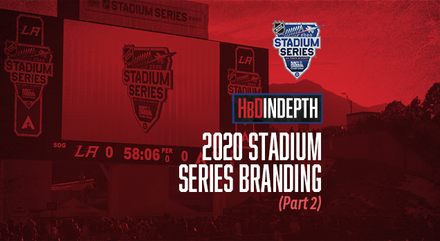
The 2020 Stadium Series game featured a tight battle between two scrappy teams, temperatures that dipped below freezing, and a majestic high-altitude setting. But the real treat was the NHL’s spectacular transformation of the Air Force Academy’s Falcon Stadium into a pond hockey ice palace.
We previously had an inside look at the development of the 2020 Stadium Series logo, but now let’s take a deep dive into how the branding translated to the stage of the game itself…because we were actually at the game to see it in person.
• More: HbD InDepth: 2020 Stadium Series Branding (Part 1)
High Anticipation
My sneak peek at the Stadium Series venue early in game week piqued my interest for what I could tell would be one of the most creative and impressive sporting events that I would ever attend. I’ve been to a Super Bowl, witnessed NBA and MLB playoff games, and even scored tickets to an NCAA Football National Championship Bowl Game, but none of these came close to the amazing creativity and attention to detail that the NHL provided to the sold out crowd at this first-ever outdoor hockey game at the US Air Force Academy.
Admittedly, most of the other events I mentioned were in the past when event branding wasn’t nearly as thorough and extensive as it is today. But the 2020 Stadium Series venue was a perfect example of superb strategic branding and impressive execution.
High Impact
With the puck scheduled to drop at 6:00pm Mountain Time, I wanted to arrive at the stadium early enough to allow myself plenty of time to explore and take in all the event branding details. Once sundown hit and darkness descended on the stadium, I knew it would be harder to evaluate and document the scene. With the only major drawback of the event being the huge traffic jams both in and out of the venue, I was happy I was ahead of the game, so to speak!
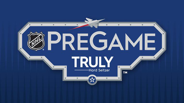
The grounds outside the stadium entrance featured a huge fan festival that included its own logo which truly epitomized the overall branding system (sorry, couldn’t resist the pun). But the main visual draw was a series of huge banners that hung from the grandstands and greeted fans as they approached the gates.
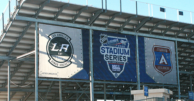
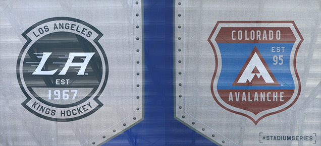
These banners showed not only the main event logo, but each of the team Stadium Series logos which were incorporated into sharp crest designs. This was done in honor of the emblems and patches that represent the numerous Air Force units and squadrons. Both the Avalanche and Kings team crests were beautifully transformed into a pair of competing symbols, no doubt to encourage unit pride during this unique event. Subtle elements in each logo indicated the teams’ inaugural NHL seasons (1967 for the Kings and 1995 for the Avs).

These banners also gave fans an inkling of the overall event design theme, which was a system of aircraft-like metallic panels and rivets that framed the logo emblems. These badges and metallic design elements were often placed against a background of subtle contrasting speedline patterns derived from the jet exhaust element in the main Stadium Series logo, creating a perfect combination of the spot-on and the sublime.
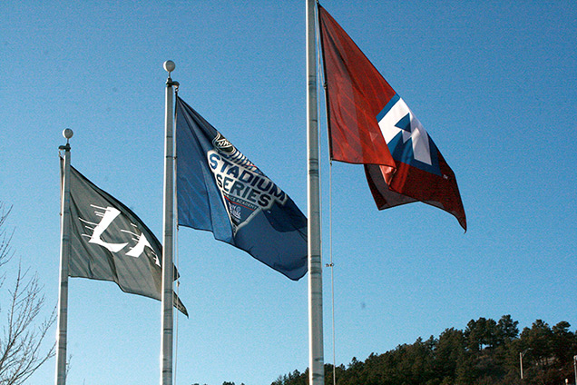
The stadium perimeter was flanked by a multitude of flagpoles, each flying the custom designed logos which flapped briskly in the winter breeze. If you look closely, you can see the subtle exhaust stream patterns also applied here with precision. This pattern could be seen in most executions throughout the venue, but in each instance, the subtlety of its presence was well-executed.

High Level
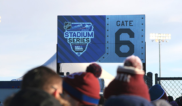
As we entered the stadium, we were treated with yet another extension of the metal and rivets theme which was applied to the entrance gate signage around the stadium. This incredible attention to detail was prevalent throughout Falcon Stadium.
When I inquired about the enormous effort involved in strategizing, designing and executing such a huge and high profile sporting event, I was informed that the NHL partners with a Salt Lake City-based creative agency called Infinite Scale, whose message is “We Impact Sport Through Design.” I had to admit that I was definitely being impacted by their collaborative efforts so far.
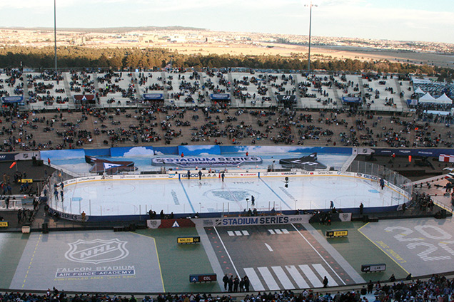
Once inside the stadium, the rink at first appeared almost miniature-sized, sitting at field level and dwarfed a bit by the rising concrete stands on all sides. But rather than seeing the scale as a negative issue, the creative teams took advantage of every bit of available real estate to create a mock-up of an air base, complete with a super impressive, actual F-16 Fighter Jet perched rinkside.
Runway lights, air strip marker signs, stripes and a series of “easter egg” graphic elements were smartly included all around the field level. There was even a helipad which would act as the stage for live entertainment during the intermission.
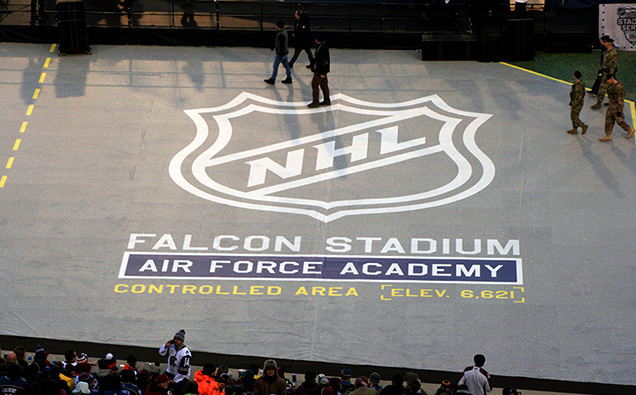
The “easter eggs” (hidden graphics and messages) included realistic runway markers with various league and team indicators, a large space that featured a “Controlled Area” warning with the stadium elevation [6,621ft], and a large typographic “2020” that seemed to represent a runway number or landing zone.
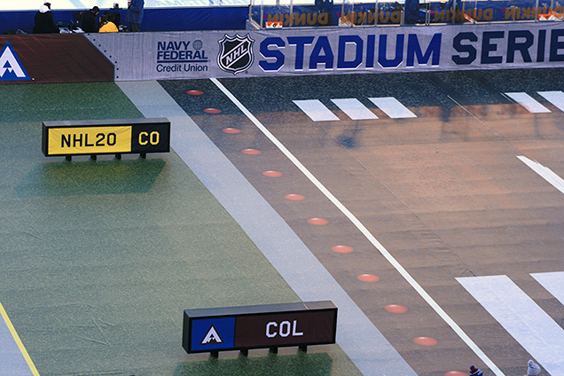
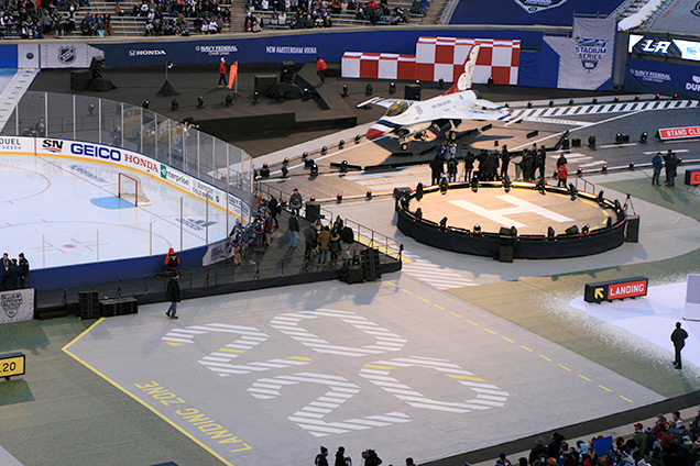
In addition, there were several red and white checked barriers that mimicked the instantly recognizable obstruction markers that are mandated at all ICAO-approved airports (that’s International Certified Aviation Organizations for you non-fliers). Okay, I had to look it up myself, but it definitely highlights the incredible depth of research done by the event design and production teams.
Aside from the game itself, the F-16 fighter jet was surely the center of attention for most fans who waited patiently for opportunities to take selfies and group photos with the sleek and sparkling red, white and blue machine in the background.
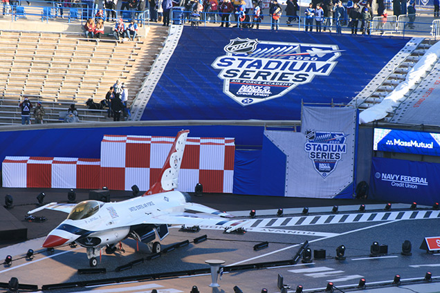
Behind the rink on the team benches side, sat two large 3-dimensional jet shapes (taken from the event logo) which were custom-branded for each team. Other details were hidden unless viewed from certain vantage points. These included images of blue sky and white clouds as well as detailed renderings of snowy Colorado mountains which were used to add background imagery on the ground level areas surrounding the rink.
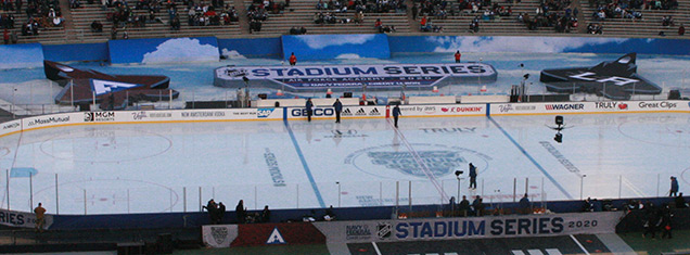
One of the coolest design touches was the use of a spattered white snow-like treatment that softened the edges of several large white square areas that housed similarly white-painted stadium speakers. This gave the effect of a fresh snowfall.
The traditional stadium and sponsor signage was tastefully done. The scoreboard animation and graphics were spectacular. And the overall effect of the event branding was in a word high-quality (okay, I know that’s technically two words, but one wasn’t nearly enough to do it justice).

High Praise
As I walked around the stadium before and after the game, I marveled at so many of the incredible design details. Most of these would perhaps not be noticed nor generally appreciated by the majority of the fans, but to a designer who’s had more than his share of sports and event marketing experience, they were absolutely mind-blowing!
Alas, for me the only disappointing part of the experience was the final score. My Avalanche hung tough until the last minute of the game but gave up a late goal (and an empty-netter) and lost to the visiting Kings 3-1. It was a bit of a home crowd let-down that took the edge off the excitement level after the game (although there were plenty of LA fans who braved the Colorado winter weather to support the Kings).
And aside from the fact that it took me almost two hours to travel the paltry five miles from the stadium back to my home, my first experience with NHL outdoor hockey was well worth it.
If you’ve followed this two-part series, you know that my opinion of the event branding from start to finish was extremely high. But I’d be remiss if I failed to mention one small flaw that I just can’t unsee since I noticed it.
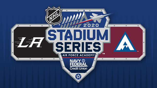
In the overall event logo, the letterspace between the “S” and the “T” in the word “Stadium” is peculiarly wide. The rest of the letterspacing seems perfectly fine, but for some reason that first “S” is hanging out on its own just a tad too much for my taste. If you think that’s being too picky, maybe you’re right. But with the level of perfection applied to everything else, that has me scratching my mind-blown head just a bit.
So, bravo to the NHL, Infinite Scale and everyone else who played a part in this fantastic event branding spectacle! They continue to raise the bar with every pond hockey pageant they present. Now, I wonder what the airfare is from Colorado Springs to Raleigh?
What did you think of this year’s Stadium Series branding? Let us know in the comments below or join the conversation on Twitter, Facebook, or Instagram!


[…] A cool look at the Stadium Series branding at Air Force. […]
[…] A cool look at the Stadium Series branding at Air Force. […]
[…] A cool look at the Stadium Series branding at Air Force. […]
[…] A cool look at the Stadium Series branding at Air Force. […]
[…] A cool look at the Stadium Series branding at Air Force. […]
[…] A cool look at the Stadium Series branding at Air Force. […]
[…] A cool look at the Stadium Series branding at Air Force. […]
[…] A cool have a look at the Stadium Series branding at Air Force. […]
[…] A cool look at the Stadium Series branding at Air Force. […]
[…] A cool look at the Stadium Series branding at Air Force. […]
[…] miss this second part of the Hockey By Design series by Sports Brand Jury that reviews the event branding for the recent […]
[…] A cool take a look at the Stadium Sequence branding at Air Pressure. […]