Top 5: America’s Proudest Hockey Logos
It’s the smell of burgers grilling in the backyard and the crackling of sparklers and firecrackers in the driveway. It’s your obnoxious, beer guzzling Uncle and it’s the Red, White and Blue flags and swim trunks in every park in America. It’s Independence Day and nobody parties harder than America on her birthday. Americans are notoriously patriotic, and as such, love to put the stars and stripes on everything they can! In honor of the 4th of July, I have humbly rated the logo designs of America’s most patriotic looking hockey teams…in true HbD fashion, from worst to first.
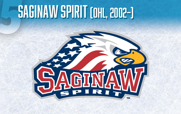
Though they are one of the most popular teams of the Ontario Hockey League (OHL) – one of the Major Junior leagues of the Canadian Hockey League (CHL) – the Saginaw Spirit are an American team located in Saginaw, Michigan. This team’s one and only logo ever used, is a ferocious looking bald eagle. An American flag pattern is blended with the eagle’s neck, which dips down behind a big, bold, Varsity font.
Now don’t get me wrong, this logo is very patriotic, and in fact, could have been higher up on this list, if it weren’t for the amateur-ish use of the ‘squeeze’ effect of the words, which makes the whole logo look like it may belong to a high school instead of a professional sports team.
The Saginaw Spirit have a cool name, and frankly, as a red-blooded American myself, I like the look of this eagle too, but there are obvious issues. Though this logo has suited the team and fans seemingly well over their 12 years existence, maybe it’s time for a logo refresher? Updating the text to a newer, sharper (less squeezed) font may be exactly what is needed to elevate this proud logo to the glory that is deserves.
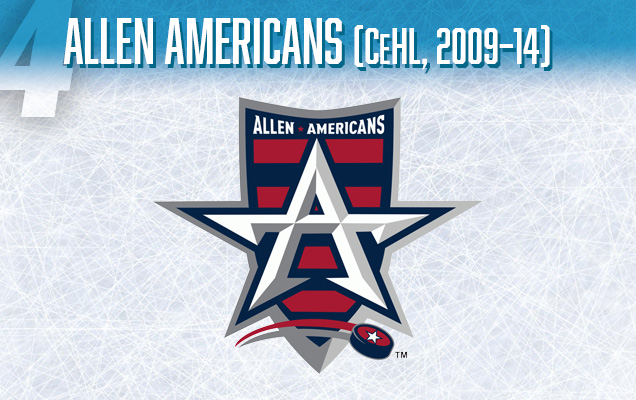
Located in Allen, Texas and founded in 2009, The Americans are a fairly new, but successful addition to Central Hockey League (CeHL). The team became only the third CeHL team to win back-to-back Ray Miron President’s Cup championships. Like almost all Texas sports teams before them and following true Texas tradition, the Americans feature a star-shape as a logo. Their logo has some similarities with the old logo of their NHL affiliate team, the Dallas who utilized the top point of their star to create a sort of vague ‘A’ shape as part of the word ‘Dallas’.
The Allen Americans pushed the ‘A’ star idea even further to create a stand alone ‘A’ logo that is entirely also a star. Honestly, this design kicks ass, It looks like something that Captain America should be wearing on his helmet. As a design-nerd, this sharp and smart looking form gets my heart racing and blood pumping. With the inclusion of a red and blue striped shield behind the A-Star, this logo, unlike the Saginaw Spirit, looks like it was created by a designer with some modern sensibilities and some great drafting skills.
This logo could have competed for 2nd, or even 1st place on this list if it weren’t for the questionable hockey puck soaring across the bottom of the shield complete with a long red and grey streak behind it. Seriously, why is it there? It has no reason to exist besides that someone may have thought that the logo would have been bland without it. The puck is distracting and takes away from an otherwise strong logo. (Not to mention, the over-kill extra star placed on the top of the puck!).

Yes, we have two teams on this list named ‘Americans’ and, actually, the real count here is three teams with the same name on this list if you count our honourable mention (coming up!). Apparently, the U.S. is not very clever when coming up with patriotic team names, but I digress…
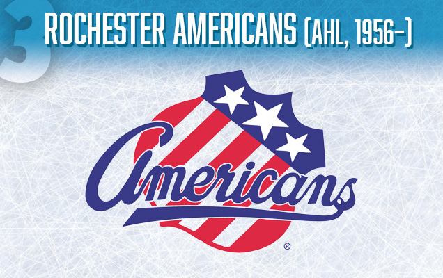
Located in Rochester, New York, The Americans are the AHL affiliate of the NHL’s Buffalo Sabres, and they alone may have proper claim to the name ‘Americans’. They are one of the oldest and longest consecutive running franchises in the AHL, this year they are celebrating their 58th season. Their logo, has been in use, nearly unchanged since 1956, making it a true classic.
The Americans logo features their name in a bold, royal blue, underlined script font set on a classic shield, which has been adorned with a salute inducing stars and stripes of the U.S. flag. The simplicity of this logo feels refreshing in a sea of minor league teams whose own logos can seem too busy or complicated. The old-school genius of this simple design can be found in the way that the shield is curiously tilted, at a 45 degree angle and somehow fits in snugly with the script text. This logo works, and it has worked for a long time! It reminds me of the old phrase, “If it ain’t broke, don’t fix it.”
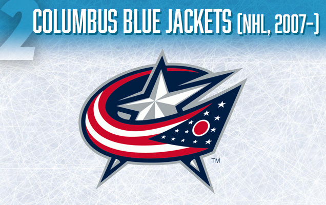
Because of the team’s awful original logo, many people incorrectly assume that a ‘Blue Jacket’ is some sort of wasp or insect, when, in fact, the team’s name is a reference to the blue jackets worn by Union soldiers in the American Civil War. Ohio is a proud U.S. state with a rich history of American patriotism and their current logo, which became their primary logo in 2007, is a fantastic piece of Americana that I’m sure they will hold onto for years to come.
The Blue jackets logo consists of two elements: an exaggerated, sharp looking star and a flag that is wrapping around the star, perhaps furling in the wind, making the flag the main element of the logo upon first glance. The flag is a stylized version of Ohio’s state flag, which could easily be confused for the American flag to a foreigner…okay, or even anybody that doesn’t live in Ohio. Instead of 15 stars, the logo’s flag has 12 stars, and the big star in the middle of the logo makes a 13th star, presumably these stars represent America’s 13 original colony territories, while a little research reveals that the big star in the middle also represents Columbus as the state capital of Ohio.
Like most great designs, it contains subtle genius that is so graceful that you may have completely overlooked it. There are multiple layers to this logo, it’s like the movie ‘Inception’ except, you’re not dreaming, and this is, in fact, a real life hockey logo. For example, you may have completely missed that the flag around the star is actually creating a letter ‘C’ that stands for ‘Columbus’. See?! Look at it again. It’s pretty awesome.
Before #1, here’s a couple honorable mentions…
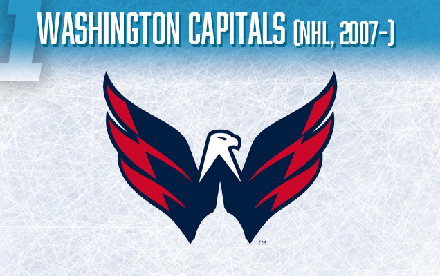
Appropriately located near Washington D.C., the very capital of the United States, there is no doubt that the NHL’s Caps are meant to embody American patriotism in the purest.
Washington fans may disagree with me here, but I strongly believe that the Caps secondary logo, is both a better design and more patriotic then their primary logo. It is their secondary logo that has earned them such a high spot on this list. To understand this choice, let’s first discuss their primary logo; It’s main feature is the word ‘Capitals’ in a navy blue, lowercase, sans-serif font. The ‘t’ in ‘Capitals’ is a hockey stick. Besides this, there are also 3 red stars and the word ‘Washington’ in a smaller upper case font above the word ‘Capitals’. This is one of the blandest logos in the NHL, it also only barely hints at being patriotic. America deserves better than that!
Behold: The beautiful secondary logo, affectionately nicknamed ‘The Weagle’ that serves as some much needed eye-candy on Washington’s sweaters. Introduced in 2007, the logo features a red, white and blue bald eagle, it’s outstretched wings create the shape of a ‘W’. The zig-zaggy alternating red and blue color pattern on the wings really makes this logo stand out, and as a special bonus we get the top of the U.S. Capital Building in the negative space at the bottom of the ‘W’ wings! This logo makes me want launch a thousand bottle rockets into the air while singing the “The Star-Spangled Banner” at the top of my lungs or perhaps even vote in a public election…maybe. This logo crams an incredible amount of ‘America’ into one design without feeling busy or over-stuffed, and that is impressive. The superb craftsmanship of this design combined with its finely balanced patriotic elements has earned it the top spot on this list! U-S-A! U-S-A!
So, how did I do? Do you agree with my ranking of the top American patriotic hockey logos? Do they do the “land of the free and the home of the brave” justice? Do you love primary colors as much as I do? I bid everyone a happy 4th of July holiday, and please keep any and all fireworks away from windows and the elderly.
Agree? Disagree? Let us know in the comments below or join the conversation on Twitter, Facebook, or Instagram!


Hey Chad, great work! Good first post. I think the alternate Caps logo is one of the best in the NHL and definitely patriotic! I would have picked the NYR’s Statue of Liberty alternate logo for the list though. Or even NYR’s primary logo, with its red, white and blue color scheme.
Really loved the post though….you kept the humor and fun of usual HbD posts!
…and apparently the author of this didn’t notice the angle of the blue/white line in the Weagle’s neck, which is the Washington Monument.
Also, the three stars in the primary logo are from the D.C. flag.
The thing on the top of the Washington Capitol is not the Washington Monument. It is a statue. A common misbelief.
You’re nuts if you put any logo above the Amerks’.
Columbus’ logo is, as you note, the Ohio state flag and not the American flag. Automatic DQ. The Capitals’ eagle is pretty sharp, but fancy hidden symbols and cutesy letter-logos have no place on a list of best logos. Come on.
[…] • In honor of the upcoming Fourth of July holiday, the top five hockey logos representing ‘Murrica [Hockey by Design] […]
Could we get a Top 5: US International Competition Jerseys? I’ve got my own list, but would love to hear from the experts!
1: 1980 Olympics
2: 2010 Olympics
3: 2017 Juniors
4: 2014 Olympics
5: 2002 Olympics/2004 WCOH
That’s definitely a good list, and it’s definitely an idea we’ve had for a while. Thanks for suggesting!
[…] • Taking a look at the most patriotic logos in American hockey. [Hockey by Design] […]