
HbD Masks: 2021-22 Bucket Preview

Phew, this off-season was a roller coaster when it came to goalies trading teams, which for us, means a slew of new masks to review. Even the goaltenders who tend to stick with the same traditional themes will be forced out of their comfort zone with something new.
With just about a month to go until the regular season starts, masks are starting to roll out for both goaltenders on the move and the ones who stayed put.
• More: HbD Masks: 2019-20 Eastern Conference Preview
• More: HbD Masks: 2019-20 Western Conference Preview
As always, you know the drill; we’ll look at each mask’s style, legibility, composition and branding, and grade them accordingly. Be sure to keep checking back though, as we’ll continue to add new masks to the roundup before and once the season gets underway!
To jump to a specific division, use the links below:
Metro | Atlantic | Central | Pacific
Metropolitan Division
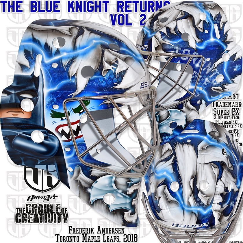
Frederik Andersen, Carolina Hurricanes
Dave Gunnarsson (Daveart)

One of the first masks unveiled this summer was for a netminder on the move; Frederik Andersen, formerly with the Leafs, now joining the Carolina Hurricanes for the 2021-22 season.
• More: HbD Interviews: Dave Gunnarsson
Leaving behind the Lego and Batman themes of the past, Gunnarsson’s Canes bucket for Freddie sticks strictly to the Carolina brand, using layers of logos in signature Daveart style. Carolina’s primary logos sit angled on each side, with the alternate flag logo centered on top, surrounded by small holographic logos filling the negative space.
Unlike some of the Lego-themed masks of Andersen’s past, this design is lacking the same personality or creativity. It’s well balanced and fits the brand, but the generic design leaves something to be desired.
Grade: B
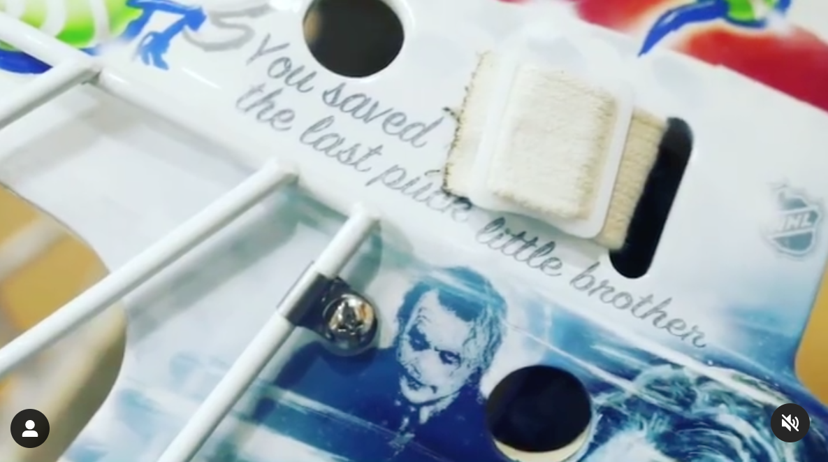
Elvis Merzlikins, Columbus Blue Jackets
Dave Gunnarsson (Daveart)

Following an emotional off season of both tragedy and joy, Merzly commissioned a beautiful tribute to his friend and fellow goaltender Matiss Kivlenieks who lost his life during a fireworks accident, saving Merzlikins and his then-pregnant wife in the process, who gave birth to their son Knox Matiss in August.
While goaltenders typically put their own names or numbers on the chin of the mask, Gunnarsson instead featured Kivlenieks’ number 80, framed by angel wings glowing in Blue Jackets colors. The Joker-themed design is complimented by other touching elements like “you saved the last puck, little brother” in script on the side.
While there’s a lot going on in this mask, the sentiment is really moving, and Gunnarsson did a beautiful job honoring Kivlenieks and capturing Merzlikens’ new form of motivation on the ice. In a recent interview with The Athletic, Merzly told Aaron Portzline “my plan is to win a Vezina Trophy. I’m gonna win a fucking Vezina for him.”
Grade: A
Martin Jones, Philadelphia Flyers
Steve Nash (Eyecandyair)

Known as a master for creating amazing compositions with little but impeccable logo placement, Steve Nash‘s new Flyers mask for Martin Jones lives up to the artist’s reputation.
If you recall, nearly all of Jones’ masks while in San Jose followed a similar approach of layering logos in a manner that created a beautiful, dynamic composition, and for his first year in Philly, Nash has given us just that once again.
Using crisp line work and focusing in on the wings of the Flyers’ logo, the artist created an Eagles-esque symmetrical look, with smaller logos shadowed underneath that create a phenomenal graphic pattern on the chin, like come on!
Even though its super simple conceptually, just using logos and typography with a very minimal color palette, the design and execution of this mask is just really flawless; another home run by Eyecandyair!
Grade: A
Atlantic Division
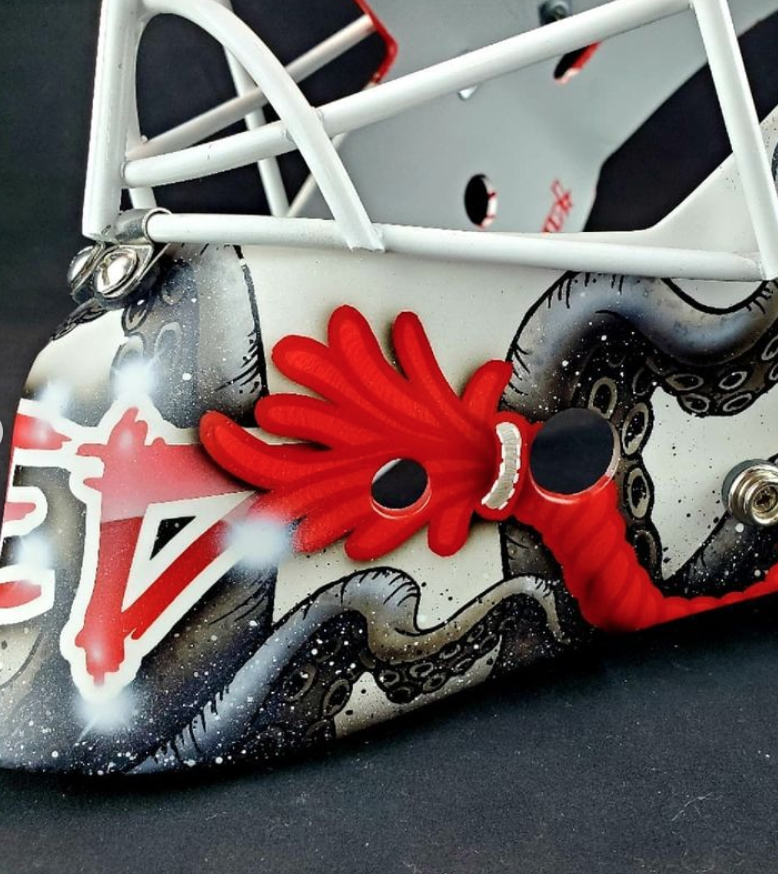
Alex Nedeljkovic, Detroit Red Wings
Ray Bishop (Bishop Designs)

The carousel of goalies continues with Alex Nedeljkovic, making the move from Carolina to Detroit. Working with the same artist from his rookie season, Ray Bishop, the goaltender will once again be sporting a toque-style bucket similar to what he wore in Carolina, posting on Instagram “the beanie on the mask is here to stay.”
“Ned and I have been working together for several years now, and a few years ago he came to me with the idea of painting his mask to look like a winter toque,” Bishop shared with us of the concept. “He wears a toque when he is not on the ice around the rink, so he thought it would be cool to make his mask look like one also.”
There’s a ton of subtle detail in this mask that could be missed at first glance, particularly the yarn knit texture that Bishop puts into the negative space. Each “decorative” element has been treated like a patch, with stitching effects around the edges that create an interesting juxtaposition between realism and two-dimensional art.
Bishop gives us even more style variation as we move to the bottom of the mask, where we see inky looking tentacles wrapped around the sides behind cartoonish hat strings complete with chunky outlines. “The history of the octopus is well documented in Detroit,” Bishop shared, “so after some brainstorming, we decided to put them on the chin / jawline of the mask to tie in that heritage.”
Overall, I really like this design. Bishop manages to merge a number of different styles into one cohesive design, which is an impressive feat, and the toque design I’m convinced will never go out of style.
Grade: A-
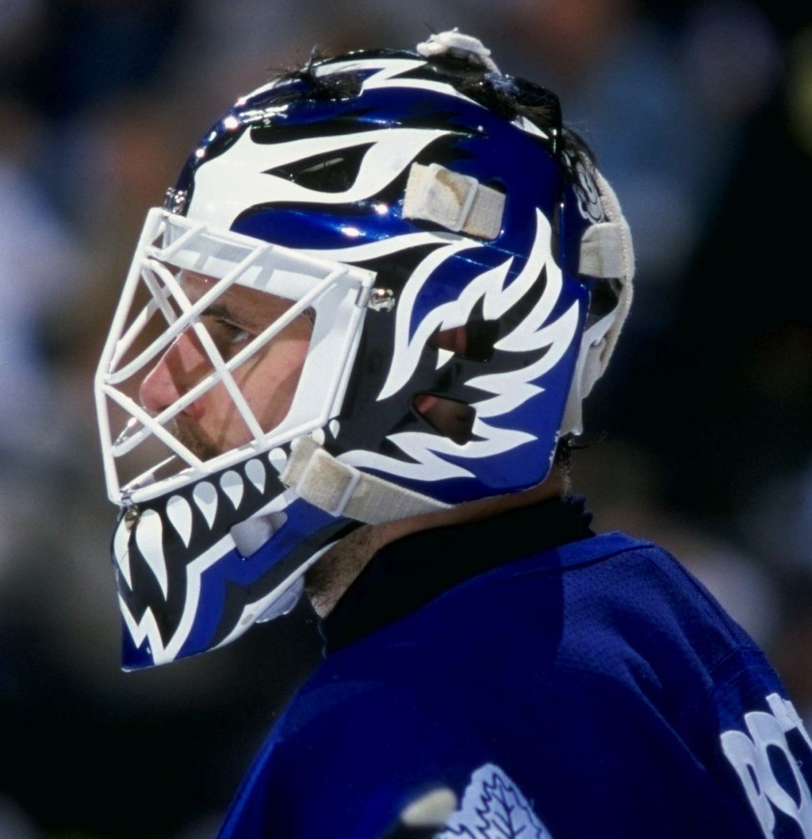
Petr Mrazek, Toronto Maple Leafs
Dave Gunnarsson (Daveart)

Trading places with Freddie Andersen, former Hurricane Petr Mrazek has headed north to Toronto and has a new bucket to match. “Petr wanted his new Leafs mask to be a tribute to the city of Toronto and The Hockey Hall Of Fame,” the artist posted. Using a matte paint finish and stone-like textures, Gunnarsson created leaf silhouettes to frame weathered vignettes of the Toronto skyline and Hall of Fame on each side of the mask.
It wouldn’t be a Daveart mask without some special effects, like lightning strikes and holographic leafs in the negative space, but the architectural drawings on the sides are where Gunnarsson’s artistry shines, as well as in the crisp typography along the bottom.
Grade: B+
Brian Elliott, Tampa Bay Lightning
Sylvie Marsolais (Sylabrush)

Another netminder on the move this summer, Brian Elliott is heading into his first season with Tampa Bay coining the term B.P.E., or “Big Potvin Energy.” Working with artist Sylvie Marsolais, known best for her stellar work with fellow Bolt Andrei Vasilevskiy, Elliott’s new mask combines the best of 90’s nostalgia with the bold and slick execution we’ve come to expect from Marsolais’ work.
• More: HbD Interviews: Sylvie Marsolais
One of the most iconic masks of the 90’s was that of Felix “the cat” Potvin, whose stark, signature look featured teeth around the front and abstract flame shapes up the sides. While a bit ironic that Elliott’s teammate Vasilevskiy is the one known as “big cat,” Marsolais pulled inspiration from the 2D style and flames of Potvin’s signature design and incorporated Tampa-specific elements like palm trees and lightning bolts.
“For his first Tampa Bay mask, Brian wanted a 90’s simple clean design,” Marsolais shared. “He drew us a rough sketch with the palm tree becoming lightning on the sides, his Moose antlers on top, [and] a triangular shape on top created with 2 lightning bolts.”
The artist subtly added some more contemporary elements like reflective paint and lightly sketched in logos to add dimension and further tie the design back to the Tampa Bay brand.
Overall, this is a fantastic piece, both due to the nostalgic references and Marsolais’ flawless execution. While Elliott likely won’t see much playing time this season, we’re hoping to see this beauty in net sooner rather than later.
Grade: A+
Craig Anderson, Buffalo Sabres
Sylvie Marsolais (Sylabrush)

For Craig Anderson’s first season in Buffalo, Marsolais really knocked his bucket out of the park with a vintage-style Sabres design that merges realism and bold graphic elements. “Andy’s first mask [has] a clean graphic look, visible from far, with logos, [and the] Buffalo skyline,” the artist shared with us.
Marsolais wisely opted to use the Sabres’ 50th anniversary retro-style logo that was adopted as a full time alternate last season. Beneath the logos and the Buffalo skyline sits two hyper-detailed swords and the triple gold stripe mimicked from the team’s jerseys. “Instead of doing regular stripes, we thought that tire treads would be more appropriate for Craig to represent his passion for racing,” Marsolais explained of the personal touch in the textures.
The detail in this mask is really fantastic without overwhelming the overall legibility. Another home run from Marsolais and Anderson to kick off his career in Buffalo.
Grade: A+
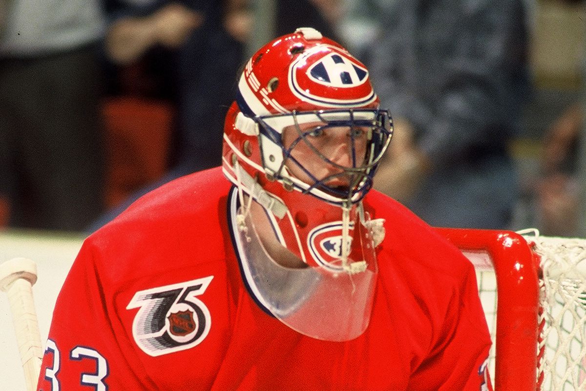
Jake Allen, Montreal Canadiens
Dave Gunnarsson (Daveart)

In a rare minimalist Daveart moment, we get Jake Allen’s new Canadiens mask with very few special effects or holograms. Titled “Habs 2D Retro,” the design lives up to the name, taking an old school approach to creating a graphic composition solely out of elements from the team logo –– one of the league’s best.
• More: BTLNHL #5: Montreal Canadiens
I love how the logos gets sliced on each side by the blue stripe going up the center that’s accented by the negative space rectangles from inside the H –– clever placement and usage by Gunnarsson.
Not to be remiss about the retro part of the name, Gunnarsson also incorporated a tribute to a Habs great. “The 3 lines on the sides is an homage to Patrick Roy and his classic Habs mask,” the artist shared on social media.
Overall, this is a great tribute to Roy and a fresh-yet-tasteful take on a very traditional brand. High marks for both Gunnarsson and Allen on this beauty.
Grade: A-

Central Division
Cam Talbot, Minnesota Wild
Dave Gunnarsson (Daveart)

Titled “Furious Wild White Edition,” Cam Talbot’s latest mask is classic Daveart style, including light flares, holograms, and lots and lots of detail. Described by the artist as “a paint ride filled with 3D action and raw fury, and some scary stuff in the forest,” it kind of hits the nail on the head with a lot going on.
As always, Talbot’s now-signature Ghostbusters make an appearance on the top of the mask, but the rest unfortunately feels pretty generic. The texture in the M’s is quite nice, but there’s not really enough hierarchy or negative space here to pull your eye to any one element, which leaves the design falling a bit flat.
Grade: B-
Pacific Division
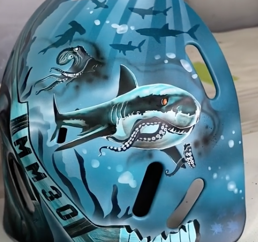
Adin Hill, San Jose Sharks
Dave Fried (Friedesigns)

Joining the Sharks from the Arizona system, newcomer Adin Hill has a stellar mask by Dave Fried to kick off his career in San Jose. Fried incorporated some fun hidden touches into this design, like illustrating 30 sharks to represent 30 years of the team and a shark snacking on a Kraken on the back plate (welcome to the league, Seattle!).
Fried does a great job on this mask of creating contrast within a monochromatic palette, using the rich blacks of the logo on top and the sunken ship to balance out the teal. I love the light rays in the water as well that really help create depth and give more visual interest to the design.
Grade: A
Philipp Grubauer, Seattle Kraken
Dave Gunnarsson (Daveart)

Last but not least, after long awaited anticipation, the Kraken has been released onto a mask. Grubauer gave us a sneak peak of his new Seattle gear on Instagram, but now we have the pleasure of seeing the league’s first Seattle bucket in detail.
• More: HbyD Roundtable: Seattle Kraken Brand Identity
Aptly titled “Release the Kraken,” Gunnarsson describes the mask as “a design built on the awesome team logos loaded with 3D effects and vintage style.” As we discussed in our roundtable following Seattle’s brand reveal, the whole HbyD crew are big fans of the logos Gunnarsson had to work with. As John succinctly put it:
The primary “S” logo does a good job, subtly integrating the tentacled leg into it. And it feels really timeless too. It could last a really long time, this identity. It contains the kraken element without going down the overly-cheesy rabbit hole it easily could’ve.
In this design, the artist gives the timeless S the full Daveart treatment with crackled stone texture and light flares in the background. While the composition is great, it’s somewhat of a shame to take something so elegant and clean, and make it look so ungapatchka (yes, we’re going Yiddish to describe this one).
The color palette is great, and it’s exciting to see the Kraken brand activated on a mask, but this one fell short in my book given the incredible brand we had to work with.
Grade: C
Don’t forget to keep checking back as we add more masks to the roundup!


Leave a Reply