
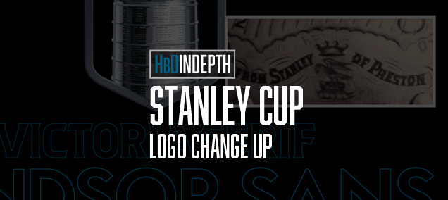
HbD InDepth: Stanley Cup Logo Change Up
In the realm of professional sports trophies there’s one that stands head and shoulders above the others. With apologies to Vince Lombardi, the NHL’s Stanley Cup is the Holy Grail of championship prizes, and the new brand identity recently unveiled for the Stanley Cup Playoffs is indeed a thing of beauty.
Lordy, Lordy!
For something that’s been around since 1892, Lord Stanley’s Cup has aged nicely. As the oldest trophy awarded to North American professional athletes, I doubt even its original donor Frederic Arthur, Lord Stanley of Preston (Canada’s sixth Governor General) imagined that it would still be around over a century later. Let alone be the most exquisite and cherished championship trophy in pro sports. But 130 years after it was first awarded to the Montreal Amateur Athletic Association team, it’s still the dream of every player who’s ever laced up a pair of skates to lift The Cup. Since it became the exclusive prize of the National Hockey League in 1926, The Stanley Cup has become instantly recognizable to fans of any pro sport.
A Recent History of the Stanley Cup Logos
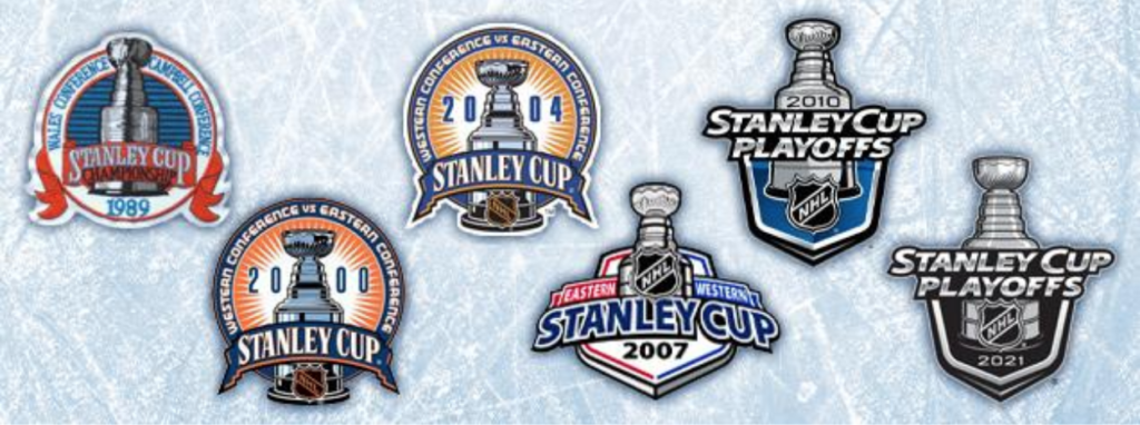
Finding examples of a Stanley Cup logo prior to the early 1990s is a difficult task. The earliest version I could find was 1988-89, which began a long series of circular badge-style designs that featured the trophy flanked by the names of the Wales and Campbell conferences. It changed little over the next decade save for some minor color and design adjustments, including the addition of the NHL logo. From 2000-2003, a cleaner, updated version was fairly consistent, but in 2005-06, the first dramatic change to the design was introduced. It featured a shield/badge and a more three-dimensional look to the typography. This basic shape and design have been used through last season, but the 2021 version would prove to be the last of its kind.
A Rebrand Worthy of the Cup
In 2021, NHL Creative Services teamed up with FanBrandz, a New Jersey-based branding agency who has created multiple event logos for the NHL over the last decade.
This visual rebranding project would dig deep into the history of the NHL and the Stanley Cup for inspiration, culminating in custom-crafted fonts with ingenious historical relevance and a purposeful fusion of design elements.
More Than Meets the Ice
At first glance, the new logo has a satisfying but hardly knock-your-skates-off appearance. But the beauty of the design is revealed when you start to see below the surface. Presented in an animated (although a bit slow-moving) web page, the smartness of the rebrand is detailed piece-by-piece.
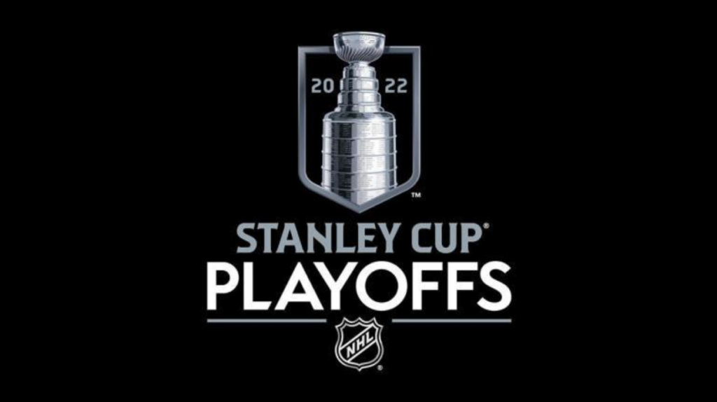
The primary Playoffs logo is presented against a black background and it gave me a bit of an LA Kings flash at first, not just because of the silver and black colors, but also due to the banner shape. So, in hindsight, my initial reaction was actually a bit ho-hum in all honesty. And although first impressions are an important part of how a rebrand is perceived, in this case, they would prove to be unusually inaccurate. Why? I thought you might ask…
The Stanley Cup® Logo Reimagined for 2022 and Beyond
“Legendary, Majestic, Mystical”
The presentation of the new logo starts with those statements, which perfectly capture the essence of the Cup. Each element in the design is identified and described as you scroll down the page, and with each new piece of information, the genius of the rebrand is slowly revealed.
THE BANNER
The overall shape of the logo represents a rafter banner, which symbolizes “team and individual excellence.” Raising a championship banner in the NHL showcases the “pinnacle of NHL team achievement.” (I’m using a lot of their words because they present the strategic thinking better than I could by myself!)
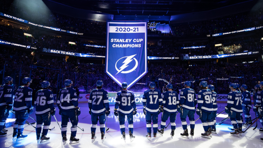
As a side comment, most of the Championship banners that I saw in my research were not shaped like the one raised by the 2020-21 Champion Tampa Bay Lightning. In fact, most of them are just rectangular. But historic symbolism and plain old design sense would rule out using a rectangle, so I’m buying their use of more traditional banner shape without any objection.
THE CUP
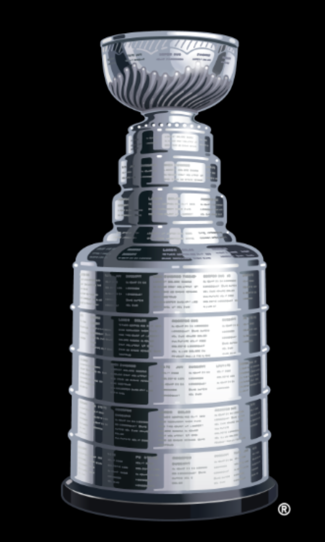
The central focus of the logo is, of course, Lord Stanley’s spectacular silver beauty. Here is where I look back on my initial reaction in seeing the logo. When I first saw the cup image, I thought it was actually a photo! This depiction of the Stanley Cup is incredibly accurate and detailed, down to the almost-legible names that are engraved on the trophy. The actual Cup trophy is a gorgeous piece of sculpture, with sublime curves, exquisite detailing and perfect proportions. Fortunately (or unfortunately, I’m still not sure) the logo design captures all that detail in a spectacular piece of design-craft that must have taken hundreds of versions to achieve. If you zoom in on the design, the minute detailing is unbelievably well done. To depict a chrome/silver element is extremely tough because of the reflections, contrast and density range. If you’ve ever tried to draw or paint anything made of chrome, you know exactly what I am talking about.

But this points to my only criticism of the entire spectacular design–because the rendering of the Cup is so detailed, it reads like a photo. In this case over-achievement of the rendering actually detracts a bit from the logo. And that is a strange Catch-22 that creates a kind of “love-hate” situation for me. It makes me wonder if scaling back on the detailing by creating a simpler alternate version might alleviate the “photo realism” that was a result of such an incredible piece of design. It begs the question, can something actually be designed “too well”?
Having said that, I could definitely see myself displaying a large poster of this logo on my office wall, where the intricacies are large enough to appreciate each and every detail. It’s that spectacular.
THE TYPOGRAPHY
In an age when type fonts are numerous and readily available, creating a custom typeface for a branding project is pretty rare. Let alone creating two of them. But this is where the depth of the rebrand starts to get really impressive.
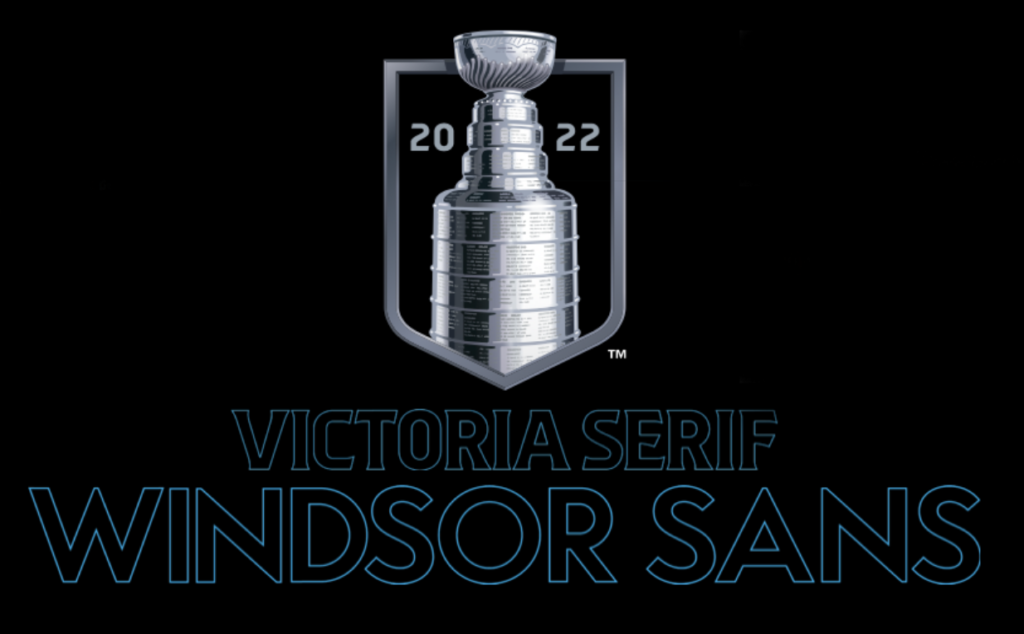
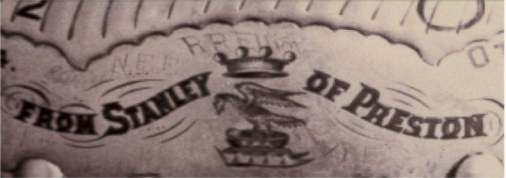
The STANLEY CUP font is displayed in a specially designed style called “Victoria Serif.” Their description indicates that the typeface was inspired by the “hand engraved letterforms that decorate the bowl and collar of the Stanley Cup.” A close look at that engraved lettering shows that Victoria Serif is a beautifully crafted font that includes just the right application of sharp serifs, creating a contemporary look while capturing the essence of the hand engraved letters.
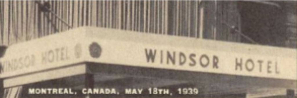
The word PLAYOFFS is rendered in the second custom font that is called Windsor Sans. This was inspired by lettering originally displayed on the Windsor Hotel in Montreal, where “the NHL was founded on Nov. 26, 1917.” Both custom fonts have been nicely created, and are paired in a perfect complementary balance. The historic relevance of the fonts, although subtle, adds an extra layer of thoughtful design to the logo.
THE COMPLETE LOGO
The NHL shield logo adds the finishing touch to the overall primary playoffs logo. It “serves as the unifying symbol of the League’s 32 Member Clubs.” Perfect reasoning to me.
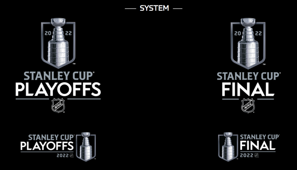
THE SYSTEM
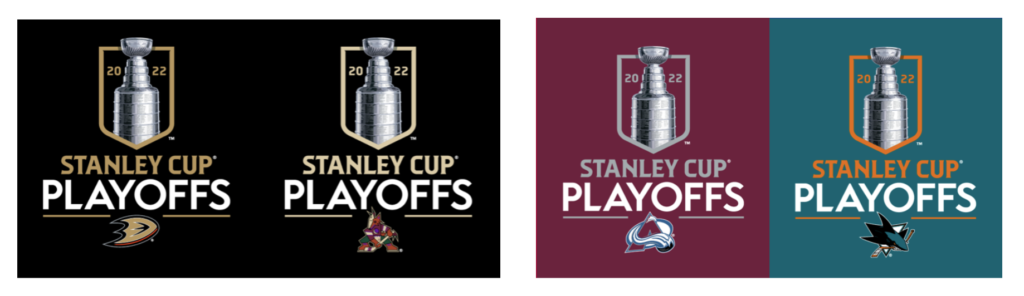
The new logo lends itself nicely to a complete system, including a version for the Finals that maintains the same basic elegance. But the really fun part is the expanded execution of the design to all 32 teams in their own color palettes. The logo really comes to life when it’s applied to brighter hues, and is especially striking in the versions for the Sharks, Preds and Sabres. Matching the playoff teams should be an interesting luck of the draw, hoping that the background colors for each team will be different.
For example, a Ducks-Yotes playoff match up would be a yawner (and luckily highly unlikely this year), but something like an Avs-Sharks match up could be pretty awesome.
FINAL THOUGHTS
If this was baseball, I’d call the Stanley Cup rebrand project a Grand Slam, but nothing similar in hockey comes to mind. So, let’s just say it’s cool as ice.
Agree? Disagree? Let us know in the comments below or join the conversation on Twitter, Facebook, or Instagram!


Leave a Reply