
The Best Dead NHL Logos
 by Chad Pinckney
I love October! The trees turn orange and red where I live, Halloween is around the corner, and a new season of “The Walking Dead” will be on TV. Yeah, I know it’s over-rated, but I have a thing for zombies, alright. More importantly, it’s the start of a new hockey season! So, in honor of this time of year, I am counting down the Top 5 logos from NHL teams that are now dead. Spooky, huh?
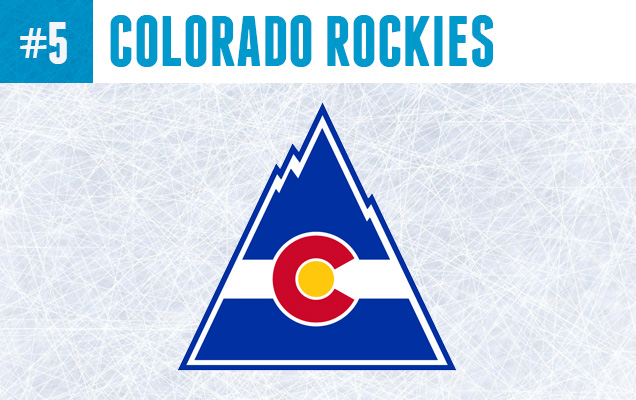 This long dead hockey club, the original “Colorado Rockies”, was founded in 1976, a whole 17 years before the major league baseball team of the same name. Even though they only made it to the Stanley Cup Playoffs once, It’s really a shame that in 1982, the NHL took a chainsaw to this club, because they truly had a great logo and the best use of a primary color scheme that I’ve ever seen in the NHL.
Their classic logo was comprised of the red letter ‘C, yellow sun, and horizontal white stripe of the Colorado State Flag set on a blue backdrop of the Rocky Mountains. This logo was a perfect fit for the state nicknamed, “Colorful Colorado” and is still a stronger branding effort than the state’s current NHL team. Sorry Avalanche, I just can’t get behind your burgundy and blue color combo, and you know what else, Howler the Yeti was a WAY better mascot then Bernie the Dog. You really screwed up.
(Editor’s note: We fully critiqued the old Rockies logo in the BTLNHL Vintage series here.)
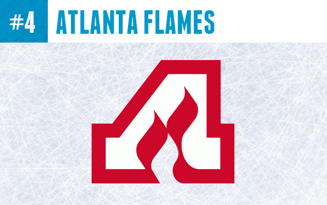 The Atlanta Flames were extinguished in 1980 when ownership cited financial losses and were suffering low viewer-ship in the local television market. The club was shipped to Calgary, Alberta where it’s logo suffered a Frankenstein-ish re-assembling of parts to become the flaming ‘C’ that the Calgary team wears today.
The original Flames ‘A’ logo, which made it’s debut appearance in 1972, was fire-engine red with a yellow outline stroke around the edges, featuring curling fire flames inside the negative space of the A. The logo has become a cherished classic in the NHL. Calgary currently uses the Flames ‘A’ as an alternate captain patch, and most recently, the Adirondack Flames of the American Hockey League (AHL) have brought back Atlanta’s old logo. The only addition, adding a bold black outline to the ‘A’ logo. IT’S ALIVE!
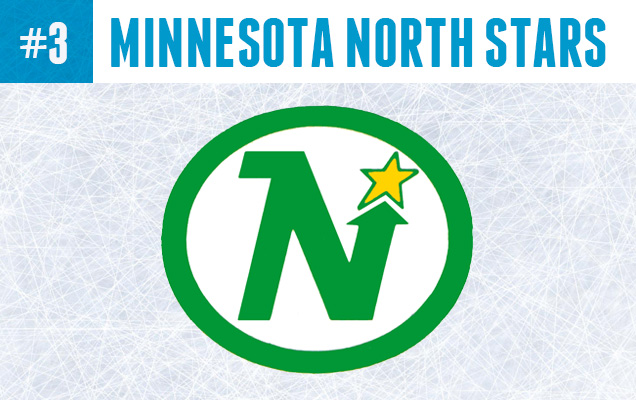 Minnesota can be an icy slice of hell in the winter, which makes the hockey fans here some of the toughest around. With a nickname like “The State of Hockey”, you would think that another city would have to pry their NHL team away from their cold, dead hands, but unfortunately in 1993 this logo was buried when the team was re-located to Dallas, Texas, which made owner Norman Green the most hated man in the North.
The North Stars iconic green ‘N’ fused with an arrow pointing to a gold star has been sorely missed by NHL fans, and it’s kind of annoying that a star is such an equally appropriate logo for a Dallas team, right? If it’s any consolation, a homage to the ‘North Star’ is currently featured in a small way in the logo of the NHL’s Minnesota Wild, which showcases a wilderness landscape outlined by the head of a bear…or cat…or something.
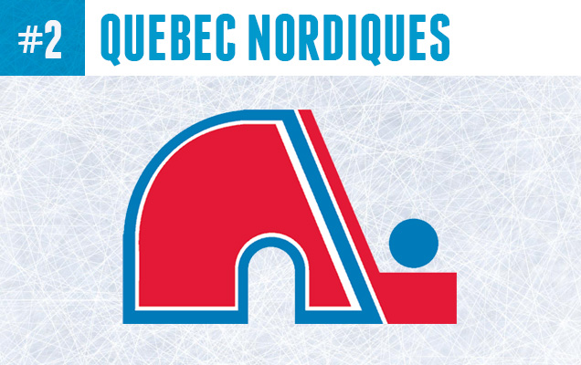 The difficulties of being a small-market team with limited marketability combined with the French/English speaking language barrier for both potential players and fans weighed heavy on the proud Nordiques of Quebec city, who saw their demise in 1995, when the team was re-located and re-named the Colorado Avalanche…who went on to win the Stanley Cup the following year. Ouch!
The Nordiques, whose name roughly translates to “Northmen”, had a logo, whose “red and blue igloo holding a hockey stick” has become a retro classic and a symbol for a displaced fan base. Another unrealized horror in this story, is that the team ownership was planning to change the igloo logo to this terrible 90’s stylized monstrosity and change the color scheme to blue and teal…yeah, seriously. That was going to happen. Gotham City’s Harvey Dent said it best: “You either die a hero, or live long enough to see yourself become the villain.”
(Editor’s note: We fully critiqued the old Nordiques logo in the BTLNHL Vintage series here.)
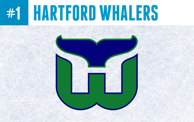 Did you see this one coming? The New England Whalers were once one of the most popular teams in the World Hockey Association (WHA) before being absorbed into the NHL in 1979. Their former logo featured a harpoon, which in retrospect, seems kind of morbid, considering that their mascot was a whale! Fortunately, the logo was updated during the changeover to the NHL and has since acquired status of legend amongst designers.
The Whalers logo features 3 symmetrical elements: a blue whale’s fin, a green letter ‘W’ and an ‘H’ made in the negative space between the fin and ‘W’ that creator Peter Good once humbly described as “a gift”. During the Whalers existence the logo was considered by many to be the best in the NHL. Unfortunately the team struggled with ticket sales, being on the dividing line between New York and Boston. The Whalers were re-located after the 1996-97 season and became the Carolina Hurricanes, who ironically, have possibly the worst logo that exists in the NHL today. Strangely, the Whalers legacy lives on, and their merchandise is still selling well, even after being dead for 17 years. But maybe it’s not so strange? That’s just the power of an amazing logo.
(Editor’s note: Yup, we fully critiqued the old Whalers logo too in the BTLNHL Vintage series here.)
Which logo would you like to see raised from the dead? Let us know in the comments below.


Norm Green is still persona non grata in Minnesota, as far as I’m concerned. I do miss the North Stars and their logo, however, the Wild aren’t doing too bad. Good choices of missed logos:
1) I love the Hartford Whalers logo;
2) I like the Nordiques old jerseys;
3) I especially liked the North Stars’ green, yellow, white and black jerseys;
4) I still have a Atlanta Flames jersey (#25 – Willi Plett);
5) I didn’t follow the Colorado Rockies, but it’s a good logo.
Possible other choices:
1) St. Paul (or Minnesota) Fighting Saints; Dave Hanson (one of the infamous Hanson brothers of “Slap Shot”) played with them. Okay, they weren’t NHL teams (WHA and AHA), but they are still classic!
2) Oakland (or California Golden) Seals; While the team pretty much sucked, I did like the logos.
We actually did a breakdown of the Golden Seals’ logo a while back: http://hockeybydesign.com/2012/11/btlnhl-vintage-california-golden-seals
Thanks for the comment! Pretty cool you have an old Atlanta Flames jersey. Classic!
[…] • What is the no. 1 all-time dead hockey logo? Nordiques? Whalers? Rockies? [Hockey by Design] […]
What? No Kansas City Scouts? That was a cool logo. I don’t remember what the Cleveland Barons looked like, but it couldn’t have been too cool…
Yes – Agree with the five here… but the KC Scouts – rider on a horse was very very cool. Also… the Kings original crown and the original 1967 Gold (home) and Purple (road) uniforms were some of the best ever… and definitely the franchise’s best. Ironic that they’ve won 2 Stanley Cups in the worst uniforms in sports history.
Totally agree with you about the Kings, but that logo’s not technically dead since they use them as an alternate logo/jersey.
Cleveland’s logo was kind of strange (http://www.sports-logos-screensavers.com/user/Cleveland_Barons.jpg), wouldn’t have made the list.
In fact no matter if someone doesn’t be aware of after that its up to other users that they
will assist, so here it occurs.