
Top 5: San Jose Logo Concepts
 Once again, we have boldly cast our design net into the deep ocean of the internet, to catch some great logo concepts from designers, artists, and sports fans. This time around, we went shark hunting and why not? The Sharks are currently competing in the Western Conference Final, and their bandwagon is growing more unruly than Brent Burns’ beard.
Since their inception in 1991, the team has only changed their primary logo once (2007), updating the look of the shark, but keeping the overall concept of shark + triangle. Admittedly, it’s a very strong branding, and any further changes will most likely be minor, but it’s been nearly a decade since their logo has been updated and we can’t help but wonder what the evolution of this shark could be? And so, with careful consideration HbD presents the Top 5 logo concepts for the San Jose Sharks.
(Ed note: For a ton of great background and insight on the design of the current (and previous) Sharks’ logo, check out the interview we did with Terry Smith, the designer of those logos.)
• More: HbD Interviews: Terry Smith (San Jose Sharks)
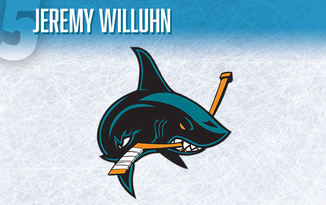
Jeremy Willuhn (Edmonton, AB) :: Behance :: Concept Page
This design is not a big departure from San Jose’s current primary logo. However, what it does bring to the table is a great balance between the black and teal highlights on the shark, and has also done away with the background triangle shape, giving the shark breathing space and making it feel more powerful. Most noticeably, it features a more fluid shark body, a change from the stiffer looking shark currently in use. This twisting, turning shark concept could be a good direction (similar to their current alternate logo), but needs refinement. The curling tail gets lost in the rest of the body, under the blade of the hockey stick. And finally, it feels a little too similar to the Vancouver Canucks’ whale, with both it’s arching back and eye/mouth area. With a few changes, this shark could be higher up on the list.
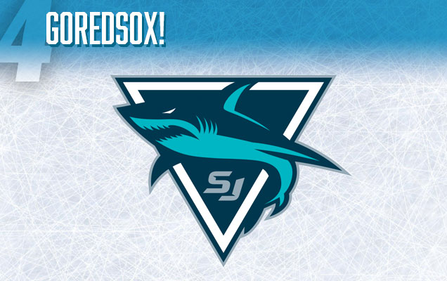 Sportslogos.net User: GoRedSox! :: Concept Page
This logo comes from a somewhat anonymous forum user, so I apologize for not crediting properly, but thought the logo was worth making the list due to it’s unique color direction. No more orange. It’s gone. Instead the primary teal now becomes the secondary color and *gasp* navy blue takes over as the primary. There is also both white and grey as highlights, which is probably too complicated. Pick one or the other. The ‘SJ’ initials at the bottom of the triangle would look fine in white. The shark rendering is fine, but could be made bigger to stand-out more against the triangle background since they both share that shocking navy-blue addition. If the shark was a little more dynamic, this logo could be higher on the list, especially with some unique ideas being presented. I especially like that this shark is wrapping around the background triangle instead of coming out of it.

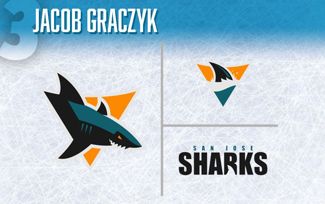 Jacob Graczyk (Buffalo, NY) :: Behance :: Concept Page
This logo feels like the minimalist version of Mike Ivall’s logo (which you’ll see in a minute), with a few major differences. This is a successful reduction of the shark’s details to basic shapes, and as a logo, would probably be pretty readable on the ice. Like Mike’s, this logo has ditched the hockey-stick, and features deadly sharp teeth, but this time, with an open mouth. There is a nearly zen-like balance between the black, teal, and orange in this logo, they all hold equal weight, which is an interesting branding direction, especially if explored further across the entire uniform. The only real weakness that stood out to me, was the use of the amateur-ish ‘Impact’ typeface on the wordmark. It’s line-weights make it hard to read at certain sizes. Try TheSans Basic or Gotham, instead.
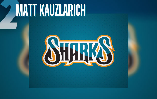
Matt Kauzlarich (Detroit, MI) :: Dribbble :: Concept Page
Could the Sharks really ditch the beast for a wordmark? This designer seems to think so, and apparently, so did former Sharks goaltender Brian Boucher, who once featured this very same concept on his goalie mask! This would be a dream come-true for most designers, but unfortunately, Boucher’s mask artist apparently found this concept floating around on the internet and used it without permission. So what’s so great about this concept that it would be stolen? Well, it’s certainly more dynamic than any of the Sharks acutal wordmarks. It has some nice shark-y fin elements on both S’s. A sense of depth has been created with overlapping letters on both ends, and also with the intersection of teal and black across the letters that has both a reflective quality and mimics an ocean wave across the wordmark. The bright orange border smartly offsets the darkness of the rest of the logo. Overall, this is a very nice effort and deserves it’s place amongst this list of shark logos.
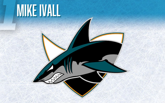 Mike Ivall (Toronto, ON) :: Twitter
This shark has a lot of personality, and overall, I really enjoy the illustration style. However, the black line at the shark’s mid-section is unnecessarily intricate, and could be further simplified. The orange highlight has been reduce to just a border line, in favor of using a light-grey as secondary color, which feels natural for this logo, and I don’t mind it at all. The iconic hockey-stick in the mouth, has been completely left out, in favor of showing off the shark’s big scary teeth, which I also don’t mind. It works for this logo’s tendency towards realism. Finally, the designer has created a wave with the top of the background triangle which compliments the shark’s dorsal fin very nicely. I’m not sure if the white at the top of the triangle, and black at the bottom is working yet, but there are some really great ideas in this logo, which as earned it the top spot on our list!
Agree? Disagree? Let us know in the comments or join the conversation on Twitter and Facebook. And don’t forget, we’re now on Instagram too.


[…] • 5 cool logo concepts for the Sharks. [Hockey By Design] […]
[…] • Five cool logo concepts for the Sharks. [Hockey By Design] […]
Ivall’s concept is amazing. 5 stars.
sharks have never won the stanly cup dying to se them win 2016 playoff season steven matthew pickett methademic xoca godsmack lsd gothic shroom blue caps miller genuine draft
Wow, vary Honored to be 1st. I wish i knew about this a year ago.
This logo has since been updated, with the onset of the sharks newer logos that just came out.
Nice post.! This post looks helpful.Thank you for sharing your views
Thank you for your article. Seeking accurate information is one of the biggest concerns for the younger generation.
I’ve been looking for photos and articles on this topic over the past few days due to a school assignment, 메이저놀이터순위 and I’m really happy to find a post with the material I was looking for! I bookmark and will come often! Thanks 😀