HbD Breakdown: Florida Panthers Logo and Jersey
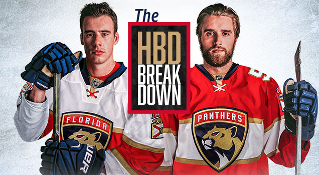 On June 2, the Florida Panthers showcased the new logo and jerseys that they’ll be wearing in the upcoming 2016-17 season and beyond. And while the logo was nothing unexpected – as it had been leaked months back – the jerseys and alternate logos were certainly an unveiling. And while there’s a few negative aspects, there’s no question that it’s an improvement for both the logo and the jersey.
But seriously, I gotta say something about the whole presentation. It was pretty bizarre, from the national anthem and military being brought out at the beginning, to owner Vincent Viola almost definitely going off-script by awkwardly trying to work the crowd into a frenzy by chanting “Go! Cats!” and dragging fans on stage who were obviously uncomfortable being there, to a botched Q-and-A session where a fan slammed them for making it look like the Carolina Panthers logo (um…it doesn’t). It all would’ve been pretty hilarious if Viola hadn’t spent 20 minutes thanking people and forcing everyone to wait about 35 minutes before the logos and jerseys were announced. Yikes!
Overall Concept
Full Metal Jersey (and Logo)
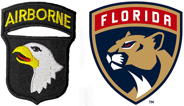 The soliders/anthem at the beginning became understandable though, as the entire overriding concept for both the logo and jersey was made clear: the military. Viola mentioned that a few times throughout the presentation, citing the core values of the army being reflected in what he wants to see in his hockey team. Florida’s 101st Airborne Division is the primary inspiration for the logo (see above) – which Viola himself was a member of. The similarity in the overall design of the two is definitely intentional. Here’s Viola (from panthers.nhl.com):
That means the impact of that patch and the sacrifice it represents, every soldier that came before you, many giving their lives, was honored to wear that screaming eagle patch. I want that same feeling on a young player or a veteran player that comes to our team.
I love the idea of having a comprehensive and over-arching theme for a new brand and carrying that through everywhere, but the above statement is completely heavy-handed. Drawing a line between the lives and duties of men and women who serve and die for their country to those of millionaires playing a team sport is precarious and troublesome at best. There can be a thin line between honouring the military and falsely imbuing its values to add legitimacy to yourself, and statements like this cross it. Badly.
But it certainly makes for a good and comprehensive design aesthetic. And the other words thrown around the presentation, like “maturity” for example, is great to hear, and you can see that in the designs as well. The youthful jumping panther is replaced with a wiser, watchful panther. The colour palette of red, blue and yellow is refined to predominantly red with accents of gold and blue. It’s a more mature look for a team that’s now 22 seasons young. The young cat’s growing up.
Logo
 Shielded From Criticism
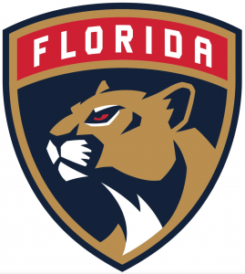
Is it a bit soccer-esque? Sure, but soccer doesn’t have a monopoly on shielded sports logos. The Rangers and Kings both use similar concepts in their logos (as well as, historically, the Montreal Wanderers and Brooklyn Americans), and although you could argue that kings and rangers having shields is more natural than a panther, the over-arching military concept throughout the new visual brand makes it less problematic. The lesson here is that having a cohesive theme to your brand can help focus the designing process, and make your design decisions a lot easier. They’re also not the first southern US NHL team to have an animal within a shield as their main logo – for better or worse. It’s a much more simpler, cohesive and refined shape for the logo than the outline of a leaping cat.
Harder, Better, Faster, Sterner
The sterner, simplified cat should be a welcome change to the Panthers’ branding by the team and fans alike. There’s absolutely no question that this is an improvement to the overly-complex, clunky and ’90-esque leaping panther that previously adorned their jersey.
• More: BTLNHL #26: Florida Panthers
The stern, watchful cat is well-designed and simplified as much as it needs to be. It works on the jerseys, it won’t be a visual mess at small sizes like the previous logo was, and it can stand well on its own. The “Florida” above the cat (which will alternate with “Panthers” for the home jerseys) feels superfluous, but again, the military overarching concept legitimizes it. And it’s a better visual way to have the dominant red in their branding than trying to change the background behind the panther.
And I’ve stated many times on this blog how difficult it can be to have a professional-looking animal logo, with it too often devolving into a cartoony mess (which, again, the previous logo was). But this new cat is refined and professional. It’s much more representative of the best hockey league in the world.
Overall, the logo is unquestionably an improvement. Is it among the best in the league? No. It isn’t iconic or innovative enough. But it is among the best animal-based logos in the league. The young cat’s growing up.
Alternate Logos
Florida Dreaming
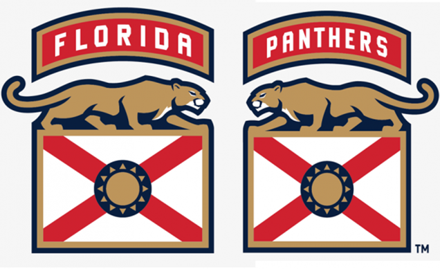 For me, this alternate logo is the best thing to come out of the re-branding exercise, and leaps to being one of the best logo patches in the league. To be clear, it absolutely would not work as a primary logo, but as a shoulder patch…brilliant.
The patch strongly features the Florida flag, with a stylized sun in the middle replacing the state seal, as a means of strongly connecting the team to its state (with all due respect to the Tampa Bay Lightning of course). And the stylized sun is simple, iconic and borrows heavily (and makes a visual connection to) their former alternate logo. It works on a lot of levels.
And then the crouching, lurking panther on top of the flag is well-designed, simple and well-integrated with the flag, giving the whole logo some movement and depth aside from just a simplified flag.
The finishing touch is the military-style word band across the top. Although it sits unconnected to the rest, it completes the whole concept nicely and, because of the military concept throughout the brand, fits extremely well. The “Florida” one will be worn on the “Panthers” home reds, and “Panthers” with the “Florida” road whites. So, every jersey will say both “Florida” and “Panthers” somewhere on it.
Band of Brothers
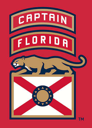 Speaking the word band, they’re doing a really interesting military-esque “earn your stripes” system with them. Here’s Viola speaking to Chris Creamer from the great SportsLogos.net:
The “Panthers” [and presumably, “Florida”] tabs above the flag are basically earned by the players. The idea is that they’ll come to training camp and they’ll only have the flag on their shoulder. Once they make the team, they earn that tab….It speaks to the idea of earning a place.
It’s certainly unique within the league and fits with the military theme on the new brand, so I like this little bit of innovation that they can claim as their own.
It continues with the captains and alternates, where they have an additional worn band above the Florida/Panthers band – another stripe earned.
From what I’ve read, it will not replace the tradition “C” and “A” on the chest of the jersey, as that demands a special jersey variance request from the League and I’m not sure if they’ve allowed that or not. If you know, let me know in the comments.
Cat Changing Its Spots
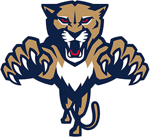 The other new alternate logo is essentially a modernized version of the old leaping cat logo. It’s also not too far off stylistically from the panther’s head of their previous alternate logo.
It’s simpler, streamlined and way better than the original. Comparing them side-by-side, you can see just how much of the details were removed. And it still looks like a ferocious leaping panther. Which means that all the details in the original logo were completely unnecessary. But hey, it was the ’90s, where excessiveness was the design theme of the decade.
It’s still a cheesy leaping panther, but hey, it looks a lot better. And it’s only going to be featured on the players’ helmets (for now, anyway). So, it’s a nice way to remember your branding history is a small but meaningful way, which should placate some of the fans who can’t handle change. Because the young cat’s growing up.
Jerseys
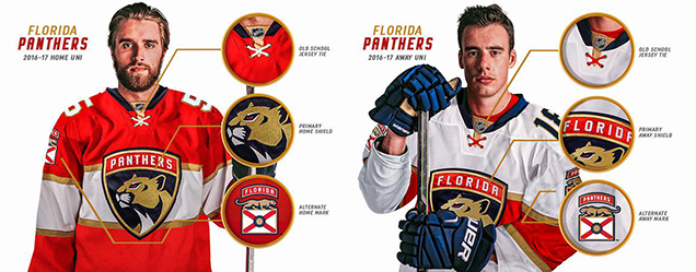
(Above image – and most of the other jersey images – from twitter.com/flapanthers)
The Habs and the Hab-Nots
The element that sticks out the most on the new jerseys is, of course, the stripe going across the chest. And, of course, this was going to draw immediate comparison to the Montreal Canadiens’ jerseys. But Montreal by no means owns the specific design, at least not historically. No other team has had something like this since the 1937 Black Hawks, but it was an extremely common design choice in the very early days of the NHL. The Habs just have the distinction of never changing their jersey away from it. And, you could make the argument that Ottawa uses a similar concept for their alternate jerseys today. Or the recent Red Wings Stadium Series jerseys.
Just like in baseball, the Yankees are iconic for their pinstripes, but they’re definitely not the only team (historically or otherwise) that uses them.
And even if it is intentionally mimicking the Habs’ jerseys, I’m okay with that. For a team that hasn’t had a ton of success and is now heading in a new direction and wanting to establish a new brand identity throughout the organization and be seen as a more mature and established franchise, why not draw a bit from the most iconic and successful hockey franchise ever? Yup, the young cat’s growing up.
Back to the Stripes
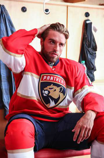 But, the huge problem I have with the stripe is that doesn’t wrap around to the back, ending right at the hem line on the sides of the jerseys, leaving just the name and numbers on the back. Visually, it doesn’t make much sense, especially when you’ve purposefully created an exact replica of the stripe on the sleeves (which is great, btw, because consistency is always a good foundation of branding and design). It leaves the jersey looking slightly incomplete, or at least, inconsistent.
One possible explanation is that the Panthers’ chest stripes is noticeably thicker than the stripes on the Habs’ jerseys, which would give you less space to work with the numbers on the back, which would probably make it look more visually cluttered.
And then there’s issues that pop up with stripe on the sleeves. They obviously wanted to have the alternate logo patch where they’re currently positioned – to, again, draw from military aesthetics – which means you have to put the numbers somewhere else. The stripe is too low (close to the elbow) to put it in the stripe and there’s not enough room above it with the patch. Here, the consistency of the stripe causes problems as much as the inconsistency of the stripe on the back. Common design problems, my friends!
One possible, and simple, option – make the stripe thinner. Not sure if they explored this option, but it might have helped.
Shouldering Responsibility
Speaking of numbers, their design solution to the sleeve/stripe/number conundrum was to move the numbers to the sleeves, continuing a relatively new jersey innovation that’s being started by the Oilers, drawing from their old WHA jerseys.
Personally, I have absolutely no problem with it. It’s a more unique look and it seems like the shoulders would be an easier location for the fans in the arenas to see the numbers anyway, as the shoulders are naturally more stoic than the players arms. And without shoulder yokes, it looks way less cluttered and, thus, way better.
Seeing Red
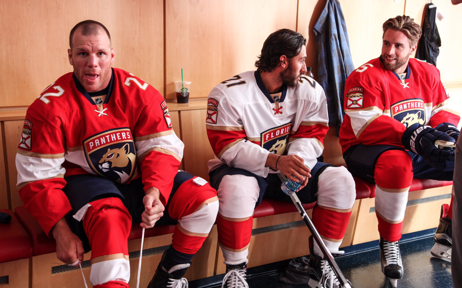 One of the biggest improvements on this jersey from the previous jerseys (and the ones before that) is the refined colour palette. The roles of blue and yellow (now gold) are diminished from equal status of the red to accent colours. The blue is used on the collar, a thin stripe along the bottom of the jersey, the pants and numbers (on the white jersey only), the gold as an outline on the stripe and numbers, and on the league patch at the collar. And that’s it, which allows the red to become the obvious dominant colour instead of having the three compete for your attention. And the introduction of white to the home jerseys (which the previous home jersey had absolutely none of, except on the logo and numbers/nameplate), creates a breathing space for all that colour. Trust me, it was necessary.
The move from yellow to a Vegas-esque gold is a big improvement as well. Using yellow in combination with red and blue is creates a palette of all primary colours (remember those kindergarten lessons?), which is aggressive and obnoxious af, like wearing a child’s playroom on your jersey. The gold is an upgrade, and again, much more refined. Sigh. The young cat’s growing up.
Crosses and Stripes
A couple more small details to mention. The first being the striping on the bottom of the jersey, or the lack thereof. It’s a smart decision to leave it at a single blue stripe for a few reasons.
One, it allows the chest stripe to remain dominant without anything else to distract from it. Two, it’s another more modern innovation in hockey jersey design that lots of other teams are adopting that gives it a more modern and simplified look. Three, it’s something to differentiate it from the Habs’ jerseys, as they use a thin striping pattern on their jerseys. I know it’s not kosher to disparage the Canadiens’ jerseys, but the Panthers’ treatment of the bottom stripe works better than what the Habs have.
The second detail is the laces – a simple cross that has the classic aesthetic of jersey lacing, but uses it in a modern way. And it has the added bonus of perfectly matching the design of the Floridian flag, adding a really subtle but excellent detail to the jersey.
Final Verdict
Overall, there’s no question that this new Florida brand is a major improvement over what they had before. I’d say that the jersey is the bigger improvement over the previous iteration than the logo, but both perfectly represent a new direction for the Panthers, one that symbolizes a newly-found maturity in both their visual brand and organizational brand with a solid all-encompassing military theme. The theme is essential, as it filters down to every aspect of the design and gives a focus to the team’s new visuals. Are there mis-steps? Yeah, some small ones. But, it’s pretty obvious that the young cat’s growing up.
Agree? Disagree? Let us know in the comments or join the conversation on Twitter and Facebook! And don’t forget, we’re now on Instagram too.


Agreed. 100%, as usual. So nice to have the feeling that we may be seeing the back of the 90s’ influence on hockey design, and to see this step in the direction of classic, well-considered design.
Great article, great points made. I really like the new threads, but I have an original Panthers sweater, and I still think it’s their best look. I feel like in 15, 20 years, they will go back to the retro design, but with their current logos, and a navy sweater with a chest stripe as a third, keeping both eras of fantastic looks.
[…] a new logo and new jersey this season also comes a new mask for Florida netminder, Roberto Luongo. Painted by Stephane […]