
Top 5 Scariest NHL Brands
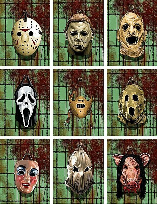
 I’m scrambling this week to get my costume together for my office Halloween party. This procrastination is due to being a borderline manic, busy-person, and not because I don’t love Halloween (which I do!). Let’s go back to costumes for a moment…what makes them great? Recognizable, pop-culture references tend to be successful, but for me, scary is better. That’s the true spirit of Halloween. I’ll take a Jason Voorhees costume over a Jack Sparrow costume any day (But, it’s probably just the hockey mask, right?).
In this edition of ‘Top 5’ we rated the ‘Scariest’ NHL brands. By ‘scary’ we don’t mean ugly or poorly designed, but rather, visually intimidating. Which teams spook their opponents by design? Factors taken into consideration include logos, uniforms, winning history, fan-base, and our own NHL Power Rankings from earlier this month. So let’s get to it…
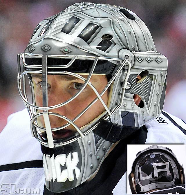
 Though several teams in the NHL call upon the dark forces of a black alternate uniform, nobody owns the color like the Kings do. We’ve argued in the past that black and white uniforms in hockey are a bad idea, due to them being visually boring, and more importantly, hard to follow on a sheet of ice, but you have to respect the Kings for fully embracing their stark, brutalist, branding ever since they switched from purple and gold in 1988. The best horror stories have an iconic mask, and the Kings are no exception, their elite goaltender, Jonathan Quick’s medieval-themed ‘Knight’ face-mask is as iconic as masks come in the NHL, winning two Stanley Cups in this armor since 2011. The Kings branding has proven successful, helping grow their fan base nationally, and casting a dark shadow on their neighbors (Anaheim, Arizona…Las Vegas?) whose own brands may lack the same kind of fear-factor.
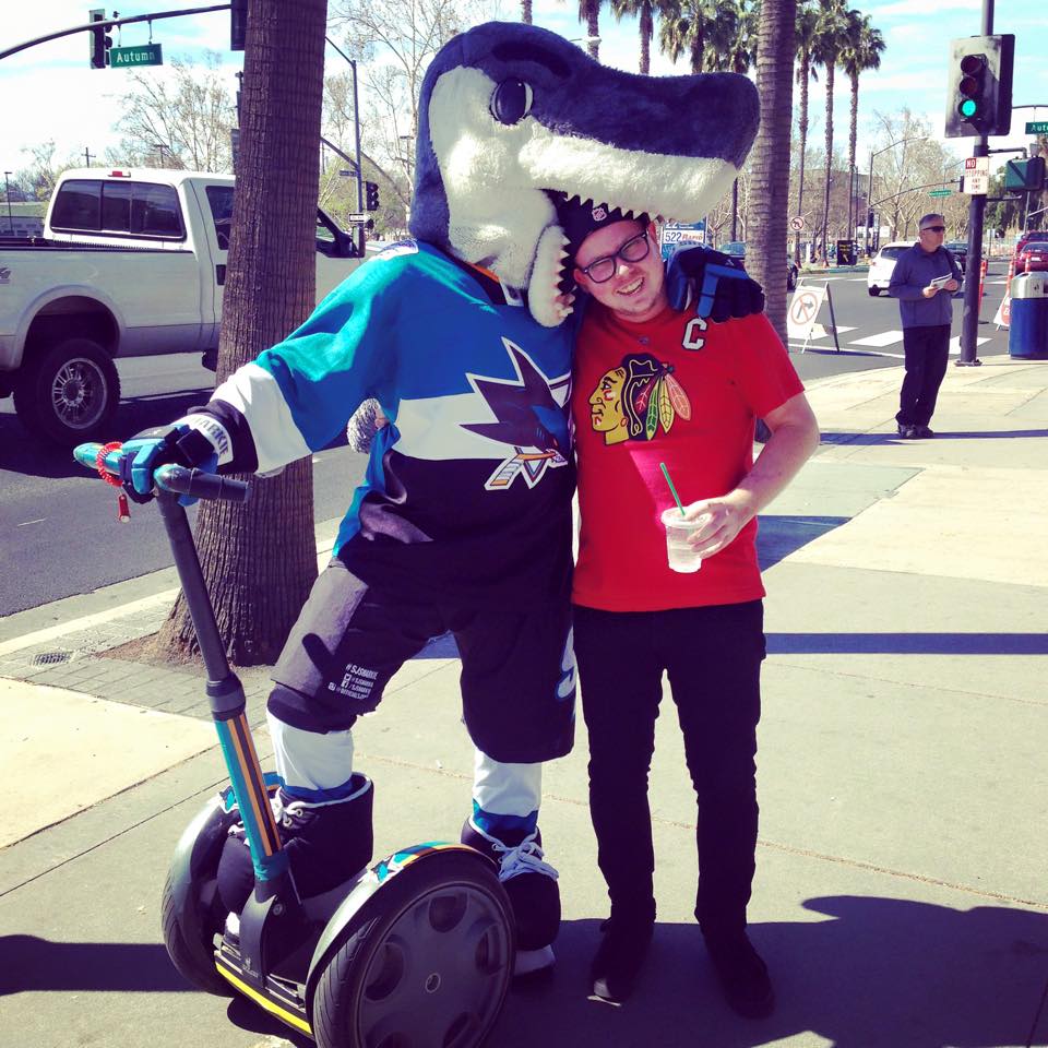
 The Sharks easily have the most aggressive logo/mascot in the NHL, for proof, here’ s a photo of ‘SJ Sharkie’ eating my face last year. Clearly, the shark is a killing-machine. It’s great branding for a sports team. Visiting teams and fans, can certainly feel an intimidation factor when visiting ‘The Shark Tank’ in San Jose, complete with ‘Jaws’ theme music and the home team entering the ice through the mouth of an even bigger shark with glowing red eyes. Terrifying, right? The Sharks recent winning record, including last year’s visit to the Stanley Cup Finals, has increased this brand’s scare-factor and has cemented the Sharks as a chilling force to be reckoned with this season.

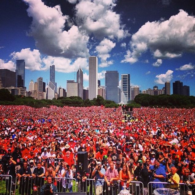
 How did this team make the list? Their logo is literally a smiling face…not scary, right? Well, you’re wrong, so let me explain. Chicago’s Chief Blackhawk logo is actually smirking…he’s smirking because he knows that this modern day NHL dynasty is better than your team…in many categories. The Blackhawks have certainly built an empire in the last decade, including 3 Stanley Cup wins, big TV deals, and casting their spell on an overloaded bandwagon of fans. Their red, white, and black uniforms are powerful and intimidating, with very few changes over the years, because they’re so well designed. The United Center, nicknamed ‘The Madhouse on Madison’ can be a nightmare for visiting teams, with a rabid crowd that screams cheers during the National Anthem. Perhaps the scariest part of this NHL brand is their ability to stay under the salary cap with an All-Star roster…truly, we’re dealing with some sorcery here.
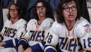
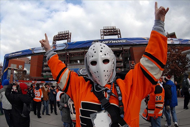
 People who are both horror fans and hockey fans, like myself, are still waiting on that rumored ‘Broad Street Bullies’ Rob Zombie movie. Yeah, I know, it’s probably a lost cause at this point, but I’m still holding out hope. Philadelphia’s ‘Broad Street Bullies’ were the most fearsome unit to ever take the ice. Their violent reputation caused other teams to fear playing them, and their aggression won them two back-to-back Stanley Cups in (1973-74 and 1974-75). The modern Flyers are not bullies, but share a similar gritty, ethos all while wearing those Halloween-esque orange, black and white uniforms and having a Super-Star Captain, Claude Giroux. Philadelphia is a hockey town with some of the most passionate, loyal fans in the NHL and you can count on visiting teams and fans egos to feel a little bruised when entering the Wells Fargo Center.
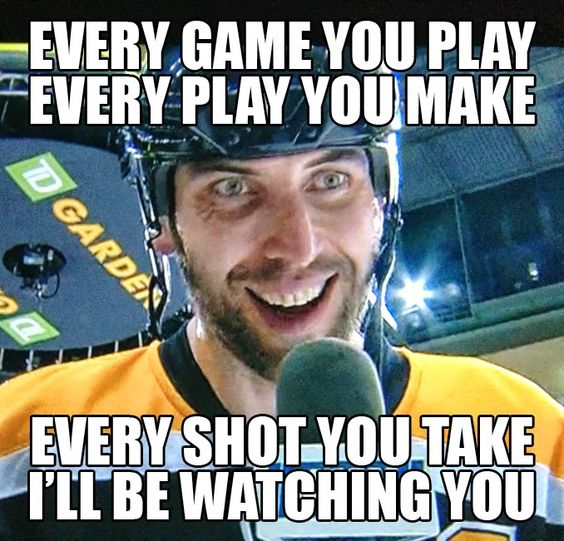
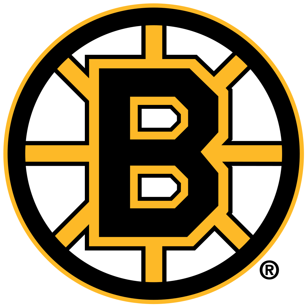
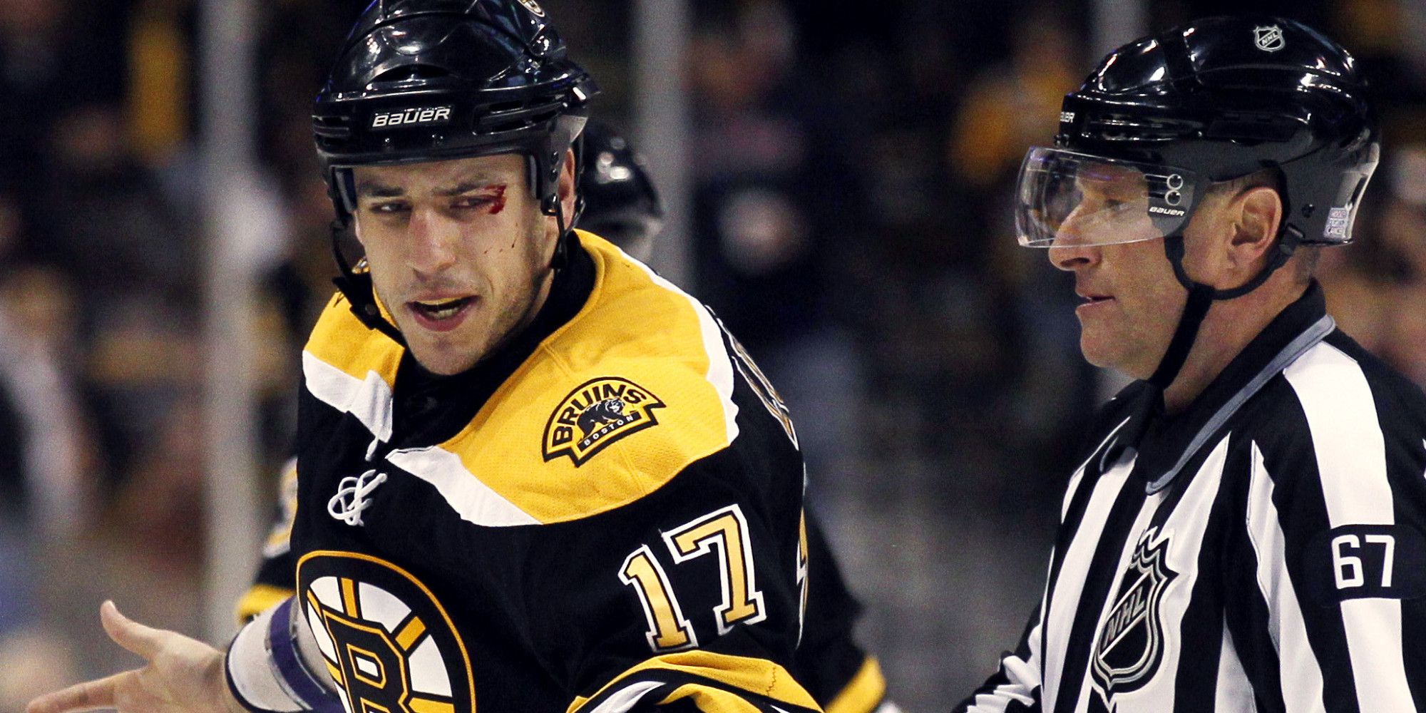
 The Boston Bruins organization likes their ‘tough guy’ reputation. They want to be scary, it’s embedded in the culture of Boston. They have a hard-working, blue-collar, work ethic and the job is not done until you’ve been sufficiently pounded into the ice. The Bruins logo, which is one of the most iconic in the NHL, represents their toughness, with intersecting crossbars and their varsity style letter ‘B’, it’s a solid mark, complimented by their awesome black and gold uniforms. The Bruins roster history includes a long list of enforcers and unsavory characters, like current left-winger, Brad Marchand, nicknamed ‘Little Ball of Hate’ and ‘The Rat’ (Seriously, I did not make those up) and up until 2015, the much hated enforcer Milan Lucic. Clearly, the Bruins don’t care much for nice guys. Their purposeful attempt at being the scariest, has worked well, helping them earn a Stanley Cup in 2011, a Finals appearance in 2013, and of course, the spooky honor of being #1 on our top Scariest list.
Agree? Disagree? Let us know in the comments or join the conversation on Twitter and Facebook! And don’t forget, we’re now on Instagram too.


I get the impression that the writer is either really old and stuck in the past, or really young and believes everything he hears about it. The flyers haven’t been a scary brand in about four decades, unless you’re talking about their mismanagement of money for player salaries. Sure they have halloween colors, sure they have a large fanbase, but neither of those make them scary. The “whatever it’s called this year” center is nowhere near as intimate nor intimidating as the spectrum used to be. Lastly, as probably the flyers player to invoke the most fear for opponents, albeit that he was from almost two decades ago, lindros, I’d like you to ask him what brand he feared the most. I’m sure he still has an impression of the horns and tail somewhere on his body.