
Top 5: Vegas Golden Knights Logo Concepts (Part 1)
 It’s not very often that we get an NHL expansion team to obsessively analyze and dissect. The last expansion was 17 years ago! (The 2000 expansion introduced this masterpiece and also somehow, this). So, we thought we’d take this opportunity to really dig into some of the creative branding ideas that the internet came up with when we learned that Las Vegas’ team would mostly likely have the name ‘Knights’ in it. This will be a two-part series, first looking back on some noteworthy ‘Knights’ themed concepts and in the next edition, we’ll highlight some completely different brand concepts that Las Vegas could have ended up. Let’s get to it!
• More: Top 5 Logo Concepts Series
• More: HbD Breakdown: Vegas Golden Knights (Name and Wordmark)
• More: HbD Breakdown: Vegas Golden Knights (Logo and Alternate Logo)
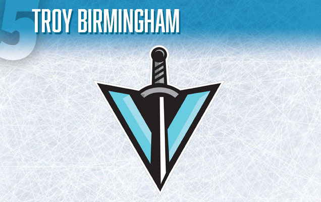 Las Vegas Silver Knights
Troy Birmingham (Maddox Cove, NL) :: Website :: Concept Page
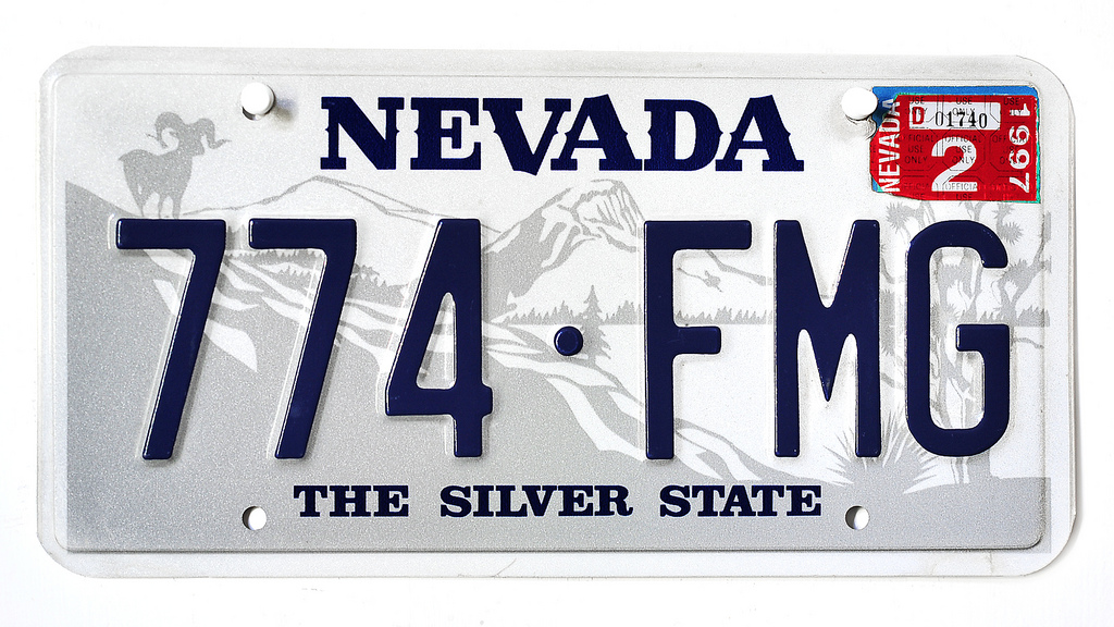
If the Las Vegas franchise must put an adjective before the word ‘Knights’ I think Silver would have made the most sense. Nevada is nicknamed ‘The Silver State’ after all, it’s even on their license plates. With that being said, this is one of my favorite directions for that particular brand identity. The powder blue and silver colors work well together, and could even stand alone without relying so much on the black jersey. Really we don’t need any more of those, right?
Primary logo: A blue letter ‘V’ intersected by a mighty sword. Is it too simple? I would argue no, it’s not. Really, it has all of the elements that the official Golden Knights logo has: a prominent letter ‘V’ and a Knight-type accessory, in this case a sword, rather than a helmet. However my intuition tells me that this logo would work best as a shoulder patch, or other alternate. This branding is not quite resolved, but there are some good ideas in here.
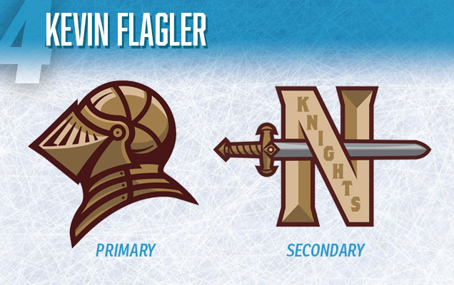 Nevada Knights
Kevin Flagler :: Concept Page
This is one of the few Knights concepts that doesn’t use black or gray…which is refreshing! In fact, if this branding existed in a parallel universe where the Arizona Coyotes didn’t exist, I would say they’re really onto something. It’s much too similar to the brick-red primary color of the ‘Yotes, but in it’s defense, it look really good with that gold and cream! What a shame. Another similarity to Arizona, which, I think works really well, is the use of the state in the title, instead of the city. Nevada Knights has a nice ring to it (It’s called alliteration folks, and it’s a thing, I promise). Using the state’s name encourages being inclusive of all Nevada residents, and can potentially draw in more fans, something these southwestern U.S. teams desperately need. But what about all the tourists that are there to see a LAS VEGAS team?! Ok, you may have a good point there, but only time will tell, on that one.
Primary logo: I like the realistic nature of this particular helmet rendition. It’s detailed, but clean, and feels much more, um, Knightly, then the suspiciously Spartan-looking helmet of the now official Vegas logo. However, the top of the helmet looks very much like a basketball, but could be fixed pretty easily with minor adjustments.
Secondary logo: I like this secondary logo solution, but combining ‘Knights’ with a big letter ‘N’ confuses my feeble brain. It might communicate better if ‘Knights’ was dropped completely, and it was only the letter ‘N’ and the sword. Long live, Nevada!

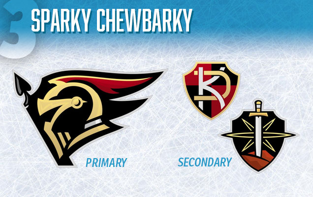 Las Vegas Black Knights
Sparky Chewbarky (Guelph, ON) :: Concept Page
Who is this mysterious Sparky Chewbarky? His presence could be felt all over the hockey concepts world last year as he produced an impressive amount of Las Vegas team concepts, and some fantastic ideas. Many of Knights concepts have a similar theme and color palette, which is notably very close to the four colors of the team’s eventual, official branding. Is this a chicken before the egg, situation? Could the franchise have been influenced by Sparky’s designs floating around the web? We may never know.
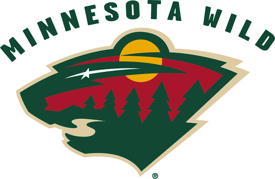
Primary logo: It’s a rather high-end concept for a sports logo. It’s a thing, masquerading as another thing. The pinnacle example of this, of course, is the Minnesota Wild’s rather complicated nature landscape scene inside of a bear…or…cat head? It was a bold decision, that ended up being wildly (sorry) popular. This is the knight themed version of that idea, where a helmet and spear also make a waving flag. It’s pretty cool. This logo could easily work for the name ‘Golden Knights’ as well, since the helmet is, you know, gold.
Secondary logos: There are two alternate logos offered here, one of which, makes a great case for the conspiracy theory that the Vegas franchise was influenced by Sparky’s design work, which features a sword interacting with the starburst icon from the famous Welcome to Las Vegas sign. It’s a great idea, and perhaps a crazy coincidence? The other alternate logo, a monogram on a checkered shield, feels underdeveloped, which in contrast, makes the other option look like a spark of genius.
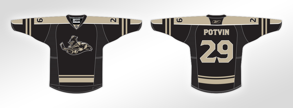
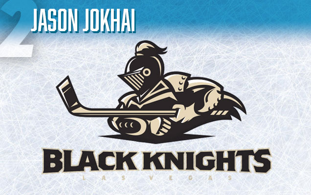 Las Vegas Black Knights
Jason Jokhai (Toronto, ON) :: Website :: Behance :: Concept Page
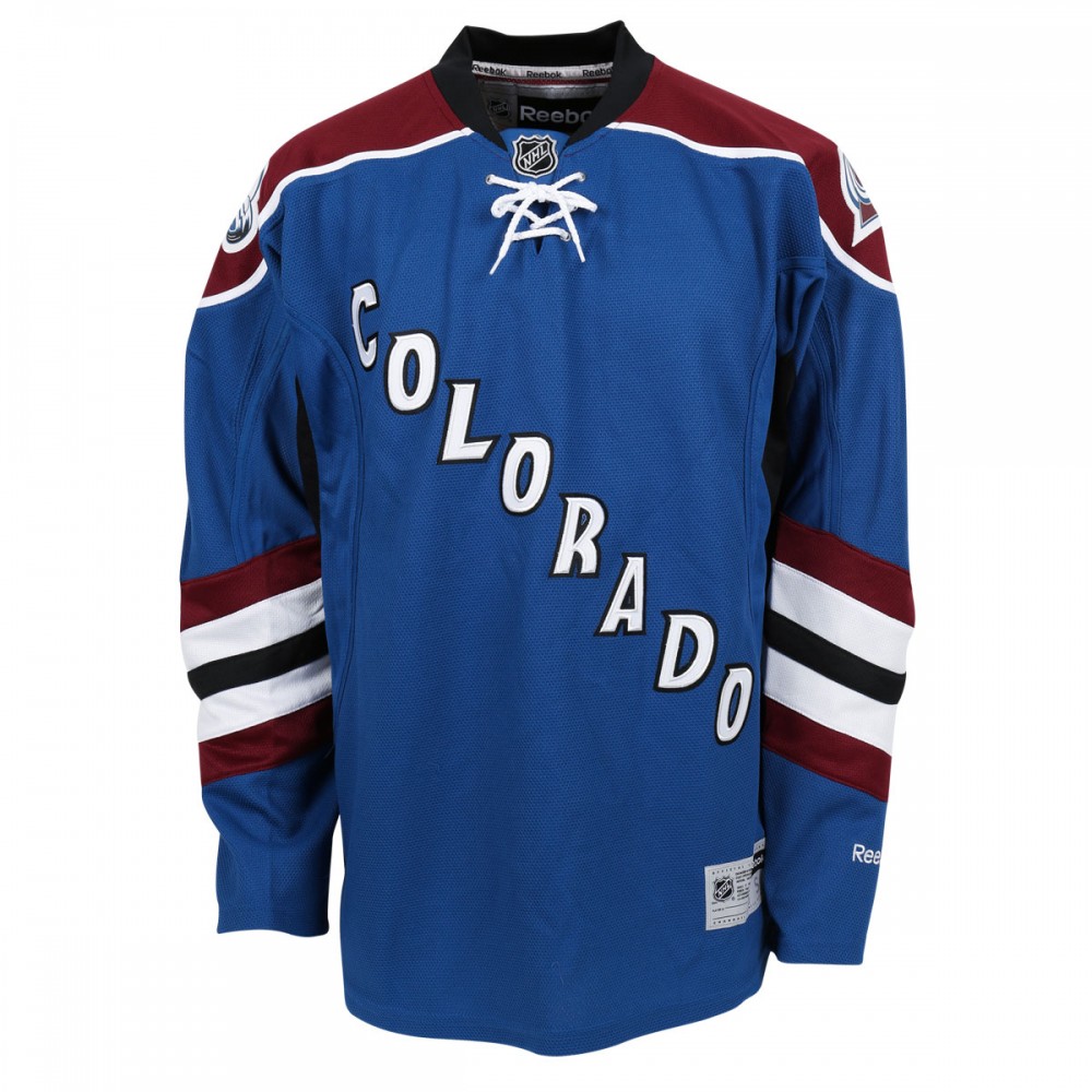
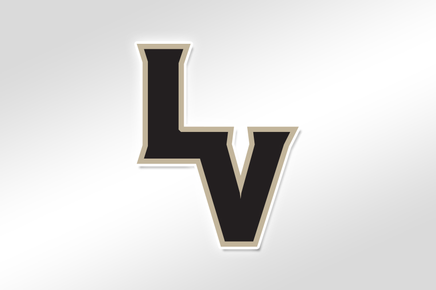
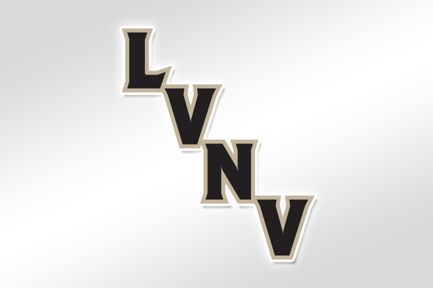
Conceptually, the overall branding here is on the conservative side, but it’s executed so well, and so precisely, that you can’t help but think that, yes! This could totally have been the brand identity if the Vegas franchise had chosen to go with the ‘Black Knights’name. Kokhai’s jersey concepts show a well-balanced black, gold, and white color palette, and a believable alternate featuring diagonal LVNV letters, similar to the Rangers or Colorado’s 2009-2015 alternates.
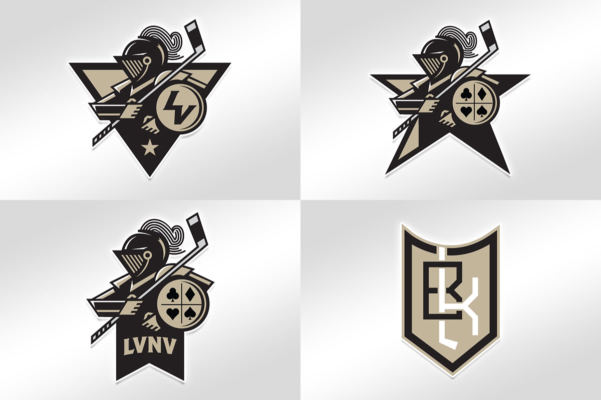
Primary logo: It’s a fully-armored knight holding a hockey-stick. Let’s be honest, It’s exactly what we wanted to see from this franchise the whole time! Sports logos, in general, benefit from having some movement to them, and this one is a great example. It’s potentially much more interesting than just an empty, forward facing, helmet (but it has the clever ‘V’ in the negative space! Don’t you see it?!! Yes, I see it). Anyway, this is one of the better Knights rendering out there – it has some great color balance and the highlights on the armor are well done. Even in a version where it’s just the helmet, it seems to work pretty well.
Secondary logos (These are all visible on his concept page, and linked in the text as well): First, the ‘LV’ and ‘LVNV’ are simple but could work complimentary to the more detailed primary knight. I can easily see the ‘LV’ being a shoulder patch. There are also several different versions of the primary logo, which I think get a little too complicated, and at worst, pretty cheesy when the card suits (heart, diamond, spade, and club) are added to the shield. All things considered, this branding is well thought out and has some very strong elements to it.
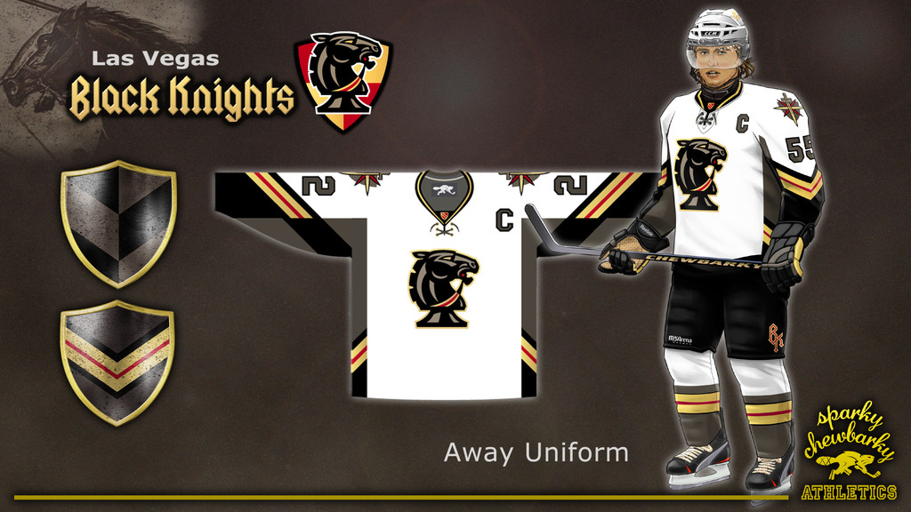
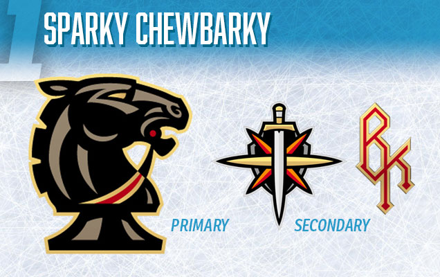 Las Vegas Black Knights
Sparky Chewbarky (Guelph, ON) :: Concept Page
Ah yes, another entry from the now infamous, Sparky Chewbarky. He’s developed so many concepts for this franchise that it’s no surprise that he made it on the list twice. The ‘Chess Knight’ happens to be my favorite version of any ‘Knights’ themed concept that we’ve seen, which of course, is completely subjective, but I’ll back this up with some design thoughts. Once again Sparky is using a black, steel, gold and red color palette that is similar to, but arguably better than the Golden Knights actual colors. In this version, a visual language has been created with the golden stripes crossing over sections of his jersey concept, which is also carried over into some alternate shield logos.
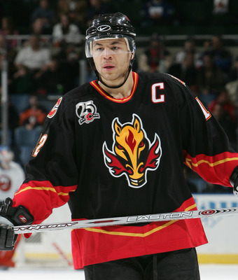
Primary logo: The knight chess piece is a great solution to a ‘Knights’ theme without taking the most obvious direction (like a helmet). The horse head is an instant mascot, and much cooler looking than the last time we saw a horse as a primary logo on a uniform (Calgary fans, what’s up with that fire mustache?). The Chess Knight seems to work well alone on the jersey or placed on a shield, and has a nice balance of being detailed but not feeling too busy.
Alternate logos: There are two alternates shown on this uniform, first the Las Vegas ‘spark’ and sword logo we’ve seen in other Sparky concepts, being shown on the shoulder. Once again it’s a good alternate solution and is suspiciously similar to what the Golden Knights are using. The second is a simple ‘BK’ mark shown on the pants. All three of logos seem to compliment each other and feel like the same identity. They create visual interest without getting too complex.
All of these factors make up a ‘good’ brand identity, in my opinion and it will be interesting to see what visual adjustments the Vegas Golden Knights make as they get a few seasons deep.
Agree? Disagree? Let us know in the comments or join the conversation on Twitter, Facebook and Instagram! And if you’re interested, we’re now on Pinterest too.


[…] • Part one of a two part series exploring design concepts for the Vegas Golden Knights. [Hockey By Design] […]
[…] Part 1 of this series we took a look back at Top 5 Golden Knights concepts from across the web, […]
It is very nice post according to my view and I will keep in touch with this place.
#3 Primary is awesome. They need to rip off sparky again and develop that some more!
Very useful post for me and for every one i love this blog..