
HbD Breakdown: Tampa Bay Lightning Third Jerseys

by Kris Kern
In February the Tampa Bay Lightning introduced their brand new practice jersey…oops, I mean their brand new 3rd jersey that they’ll actually be wearing in some real NHL games. In terms of design features there’s not a whole lot to dissect here, but we’ll do our best to break it all down after the jump.
Black, and Then Some More Black
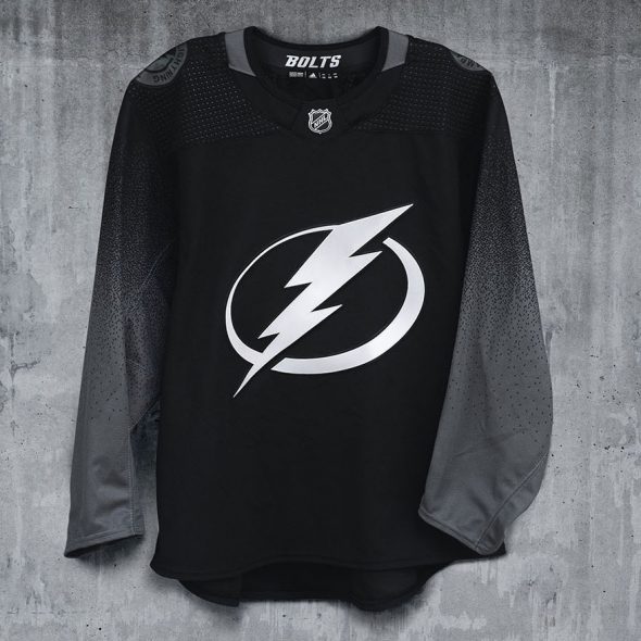
Continuing with majority of other 3rd jerseys unveiled across the NHL this season this Lightning jersey is predominately black, but this particular black jersey iteration doesn’t go much beyond that. Tone-on-tone logos and a very subtle sublimated gradient pattern on the sleeves utilize “flash silver” and “storm grey” as a slight deviation from all the black, making this a truly monotone look.
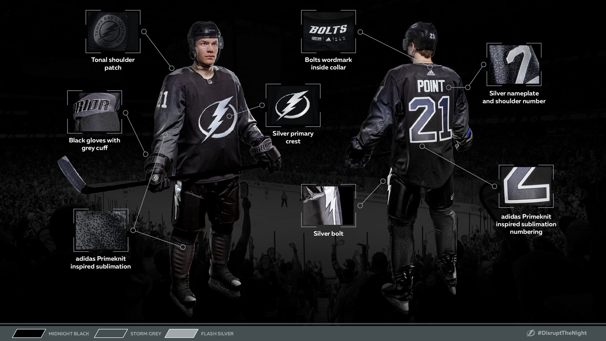
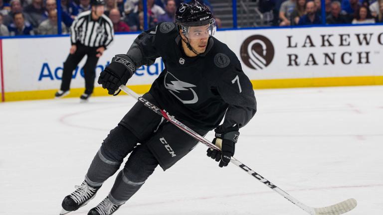
The jersey is paired with items that have a touch of dark grey, but are basically black helmets, black gloves, black pants and black socks for an overall look that could rival any local men’s league team that’s going for that badass stealth look.
Sublimated Sleeves
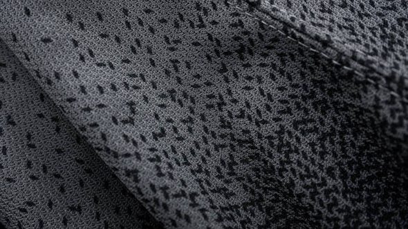
The best and only design feature of the jersey is the sublimated gradient on the sleeves that give a pixelated fade effect from black to grey, but unfortunately it’s so subtle that the impact of this design feature is nearly impossible to see…especially when viewing on a TV broadcast or any arena seats that aren’t right on the glass.
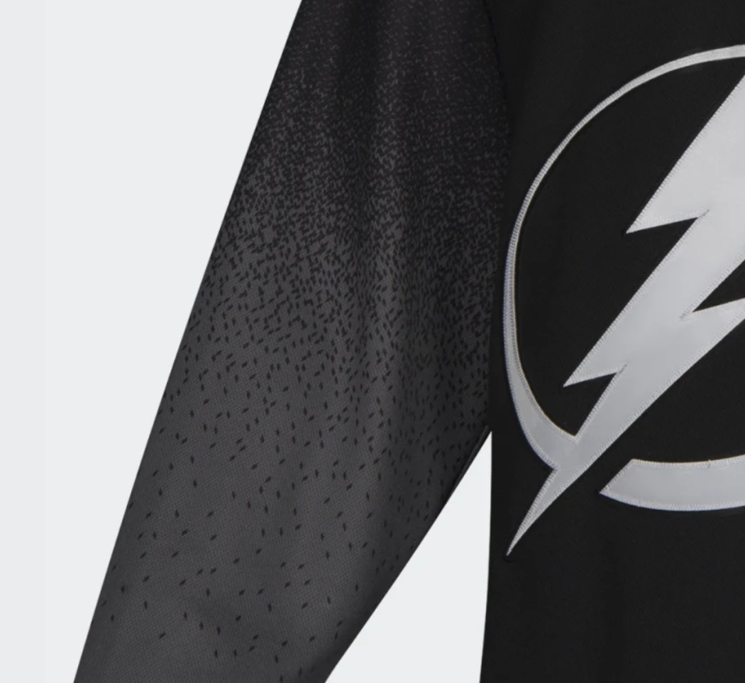
This could have been an opportunity to utilize a transition from black into white and then blue in order to take full advantage of the unique pixelated fade. Adidas cited inspiration from the electricity of the fans for these raindrop-like sleeve graphics, but a design concept story could have easily focused on how the “kinetic energy of a lightning bolt disrupts traditional jersey striping, etc.…”
It almost writes itself based on how Adidas has positioned themselves as a brand that disrupts the norm. The look would still be black-dominant, but a touch of the traditional color palette might have given these a little more visual interest.
The sleeves in general are a unique approach, but a missed opportunity to take full advantage of the effect.
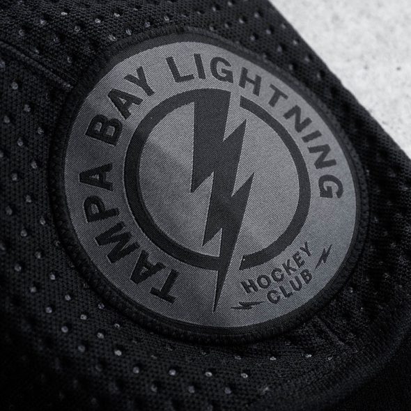
Tone-on-Tone Shoulder Patch
The jersey’s shoulder patch kept with the same design as the current shoulder patch, but took it to the dark grey tone-on-tone look. This logo actually works quite well in the dark grey. It might have even looked good as the primary chest logo for the third jersey, if for no other reason than to be a point of difference vs. the chest logo on the two primary jerseys.
Again, another “what if” scenario when breaking down the details of this jersey. Interesting to imagine how a couple of minor adjustments could have had a major visual impact on this jersey.
For the Fans
The Lightning get credit for two things related to this jersey:
- They actually have a history with black jerseys and black as part of their official color scheme. The franchise won their only Stanley Cup while wearing black. So, unlike many teams that force black into a jersey or logo design for no reason whatsoever, they have a legitimate history with the color black.
- They listened to their fans.
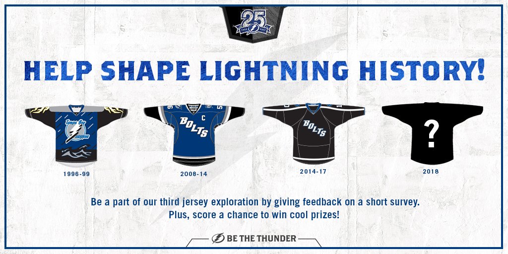
Graphic design aficionados that have a passion for sports design will have their strong opinions on this jersey, but the reality is that it’s purpose is to give their fans something different and to ultimately sell more jerseys. This jersey is successful in that regard. The Lightning actively seeked out the counsel of their fanbase via a survey that was distributed across several digital channels. The fans spoke, and they wanted another black jersey and they wanted it to be different and non-traditional.
Herein lies the problem when you give the opportunity for design input to the masses: you might just have to create what they ask for.
• More: Worst to First Jerseys: Tampa Bay Lightning

However, and perhaps because of this very reason, it appears this new 3rd jersey is exactly what they wanted. As noted in an article on the Lightning website, the debut night for these jerseys saw 500 of them sold in the arena, a drastic spike compared to the typical 60-80 jerseys sold per game.
Tampa Bay Lightning Vice President of Marketing Eric Blankenship knows that 3rd jerseys ultimately have a limited shelf-life and he took that into consideration when developing this year’s iteration.
“Here’s an opportunity for us to do something different, to do something unique…and generally speaking, third jerseys give teams that opportunity because no one is hanging their hat on their third jersey forever. Third jerseys are meant to be just that. They’re in, they’re out, you keep them for one, two, three, four, five years, whatever, you move on and you do other things. That’s what third jerseys give teams an opportunity to do. So, being a non-traditional market, the idea was, ‘Okay, since we have two sets, why don’t we try to do something new and different.'”
As the relationship between the NHL and Adidas continues to develop it will be very interesting to see if Adidas follows a model similar to what Nike is now doing with their NBA jersey/uniform sets. Nike has eliminated traditional home and away jerseys and added a third and fourth, and sometimes a fifth, jersey for all teams in the NBA.
The NBA “City” edition jerseys change every single season. This particular Lightning jersey has the vibe of a “City” or limited jersey that might only last a season or two before it yields to another, hopefully improved, version.
Final Verdict
Overall the new Lightning 3rd jersey leaves you wanting it to be just a little bit more than what it is. It hits the mark for out-of-the-box thinking, but ultimately falls flat. There are some elements of the tone-on-tone look that work, primarily the shoulder patch, but even a slight pop of color could have salvaged the overall execution.
With that said, perhaps this critique is precisely what the Lightning front office was looking for with this jersey design. We’ll wrap this up with another comment from Lightning VP of Marketing Eric Blankenship,
“We wanted to create a third jersey for 13 to 25 year olds. We want kids to wear this jersey. We want kids to think this is the coolest jersey. Furthermore, if you’re over 25, we’re actually okay if you don’t like it. Because if you don’t like it, we’ve got a blue and a white one for you.”
Agree? Disagree? Let us know in the comments below or join the conversation on Twitter, Facebook, or Instagram!


[…] • More: HbD Breakdown: Tampa Bay Lightning Third Jerseys […]
[…] • More: HbD Breakdown: Tampa Bay Lightning Third Jerseys […]