Worst to First Jerseys: Washington Capitals
As we go through the prolonged 2019-20 season, we’ll be updating all of the Worst to First Jersey posts every Monday, as almost all the teams in the league have unveiled new jerseys since their original posts. We’ll start with the ones most needing updating and work our way through the league. Today, it’s time for the Washington Capitals to get updated.
Also, a huge thanks to SportsLogos.net and NHLUniforms.com for most of the jersey images and references.
The Washington Capitals have kept a pretty consistent look since joining the NHL in 1974, aside from the a period from the mid-’90s to mid-’00s. After that hiccup, they went back to the original jersey concept. So, there’s two main concepts/eras for the Caps’ jerseys, with a couple variations within each, and a few specialty jerseys thrown in for good measure. And because of playing in DC, there’s a distinctly American feel to all of them, from eagles to the Capitol building to stars and stripes. ‘Merica!
Here’s how this works: I’ll count down, from worst to first, all the jerseys the Caps have ever worn. Homes and aways will be lumped into the same category (so, more of a jersey “era”) and I won’t worry about small changes (like slightly changed positions of piping for example). Third jerseys will stand on their own. And I’m focusing on the jerseys only, not the entire uniform. For the Capitals, there’s six different jerseys/eras. And we’ll start with the worst one:
6. 1997–2000 Home & Alternate Jerseys, 2000–2007 Home & Away Jerseys
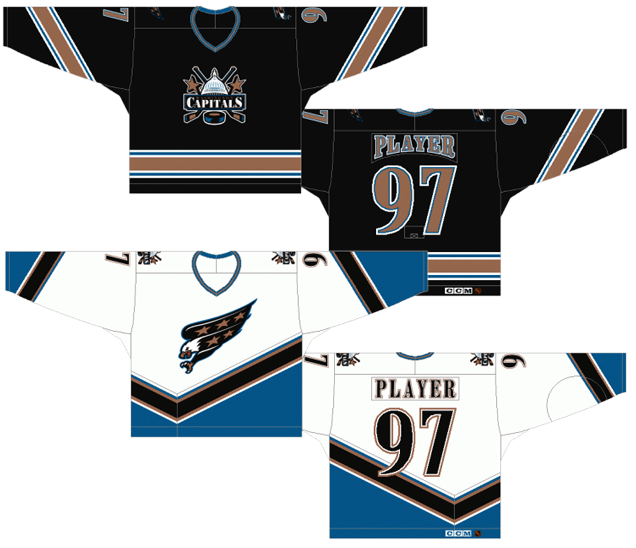
The worst jerseys the Capitals ever wore are from an era that’s seeing a bit of nostalgic re-birth recently. Just remember, the ’90s created very few good designs in hockey, and nostalgia can be the most toxic drug ever, making you crave for something that was never really that good at all.
Before 2000, the darker jersey was the Caps’ third jersey. After 2000, it became their only road jersey (or home jersey after the NHL switched the white to road jerseys in 2003) and there was no third jersey. So, can someone please say what their actual team logo was from 2000–07? Was it the one-legged eagle? Or was it the cheesy overly-complicated Capitol building? Sportslogos.net (which is a great site if you’re not familiar with it) has the two logos switching between primary and alternate logos in 2002, as well as a one-legged eagle version with “Capitals” written on it as the actual main logo, which was never used on the jerseys. Click here if it’s getting too complex, which by the way, it totally is. Identity crisis anyone?
One of the worst things you can do for a brand – any brand – is to have any sort of confusion about your visual identity. Don’t be wishy-washy. Pick something and stick with it so that fans and followers – especially in sports – have something to look up to and respect. If it’s not working, then try something else. But the real problem really is, neither or these are particularly good logos. But that’s a discussion for another day. We’re talking jerseys here.
But, the jerseys don’t necessarily have any consistency between them either, aside from the colour scheme and typeface being used. The striping patterns are totally different. The striping placements are different. The styles overall are different and, as already mentioned, the logos are even different. Take the identifiers off, and it could believably be jerseys for two totally different teams. The Caps are as confused about their brand identity as Tobias Fünke is about his sexuality. The black jersey works as a third/alternate jersey, but when it’s the main coloured ones, it just doesn’t make sense.
And talking about typefaces, I’ll give the Caps credit for at least trying out a different typeface for these jerseys, but it’s too oddly-shaped and doesn’t work, especially when outlined once or twice, as they are. There’s a reason why sports uses sans-serifed fonts as opposed to serifed ones: much easier to read.
Individually speaking, the white jersey isn’t bad. Sure, it has the angled/curved striping which was all the rage back in the late-’90s (over two-thirds of the NHL’s then-28 teams had them at some point from 1995–2000, while today, only 4 or 5 remain), but at least the stripes are consistent on the sleeves and along the bottom of the jerseys. The stripes are a little overly-complicated, but the blue, bronze and white stripes are at least very thin and subtle. The black stripe is a little too thick, but there’s a reason for that (which we’ll get to later).
The black jersey, however, has an even more complex striping pattern and seven(!) individual stripes: white, blue, white, bronze, white, blue, white. That’s overkill. At least, with the white jerseys, they are consistent. Speaking of the colours of the stripes, what’s with the new colour scheme? Red, white and blue? Makes sense. Black, blue and bronze don’t exactly scream USA, or DC, or anything like that. Not that it absolutely has to, but it would be good to know the logic behind that decision.
But the bigger problem with these jerseys are the use of black jerseys. Regular readers of Hockey By Design are incredibly familiar with this rant: Hockey is game played on a sheet of white ice, with one team almost always wearing white. The other team just wearing black makes for incredibly dull games, visually. Red Wings vs Lightning? Awesome. Kings vs anyone? Boring.
So, confused identities, bad logos and complex striping/angles delegate this jersey to the bottom of the pile.
Jersey Recommendation: #37 Kolzig. A nod to goaltenders with this pick, Kolzig was the prime reason the Caps got to the Finals in 1998 and was the Capitals’ starting goaltender the entire time these jerseys were worn. Get it in the white jersey, the obvious better one of the two.
5. 2018 Stadium Series Jersey
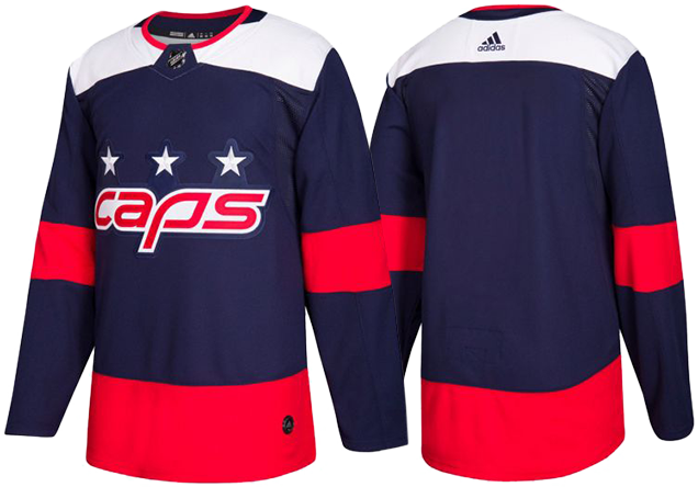
The most recent addition to the Capitals’ jersey is this past year’s Stadium Series jersey, which follows the same quicksand-laden, ROUS-infested, fire swamp path first traveled by the Senators and Lightning by featuring their nickname on the jersey: “Caps”. And I love you Ovi, but you ain’t no Wesley.
The Capitals primary logo is among the worst logos in the league (the worst, according to our Brand Power Rankings), so doubling-down and abbreviating it with their nickname isn’t necessarily a good look, even though it’s actually a better logo – more refined, more compact, less complex. It’s especially disheartening when they’ve had something like the Weagle staring them in the face for the past decade or more, as well as the “W” that they slapped on the pants instead, which actually would’ve worked well on the chest instead of “caps”. Sigh.
• More: BTLNHL #24: Washington Capitals
• More: 2017 NHL Brand Power Rankings
And then there’s the humongous big red elephant in the room: that red stripe across the bottom of the jersey. It makes the cummerbund the focal point of the entire jersey. Or at least, it’s fighting to be the focal point. The white shoulder yokes and logo elements against the navy blue is higher-contrast than red/blue, but that red is so intense that it keeps dragging the eye down to it, and the contrast at the shoulders drag the eye back up, and down, and up, and down, etc…, making the whole jersey incoherent. It also makes the jersey look very heavy, like the entire thing is being pulled down by a gigantic red elastic that could snap back up and smack Ovi in the face at any second. The League’s desire to make the Stadium Series jerseys as simple and minimalist as possible hits another in a series of snags with these jerseys for this element alone. There’s just not enough happening within the red stripe to make it work.
There is a minor detail in these jersey that works really though, and that’s the stitching within the numbers, which were based on Pierre Enfant’s original grid plan for the city of Washington. It’s a somewhat obscure and subtle visual reference (which is not necessarily a bad thing), but the visual representation of it comes out really nicely regardless. It’s strong, simple, geometric (like the jersey), but with great details, so it’s not boring or badly weighted (unlike the rest of the jersey).
Overall, it’s a jersey that’s unbalanced, too minimalist, and a missed opportunity to utilize better logos they already had at their disposal that doesn’t rely on slang and nicknames to be original. It’s another example of the League’s Stadium Series-mandated minimalism and intensely large elements gone awry to create a jersey that’s obnoxious and boring at the same time. And can we just stop staring at Ovechkin’s red belly please? He may look pregnant, but he’s no Arnold.
• More: HbD Breakdown: 2018 Stadium Series Jerseys
Jersey Recommendation: #92 Kuznetsov. He, of the 1-goal, 2-assist perfomance at the 2018 Stadium Series, and the game’s second star. Or, a #74 Carlson would be good too, seeing how he was the first star of the Stadium Series game.

4. 1995–97 Home & Away Jerseys, 1997–2000 Away Jerseys
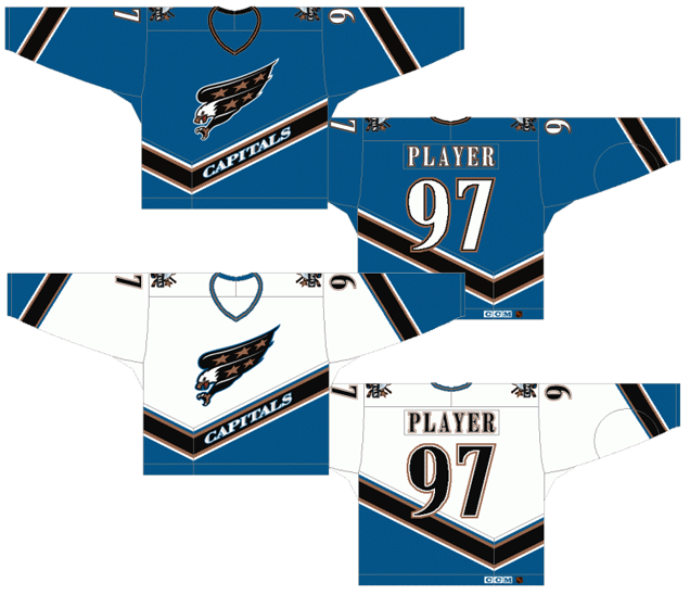
These jerseys are a previous iteration of the ones already discussed, and the road jerseys are better in almost every way. But, the white home jerseys are actually worse because of one detail.
It’s always amusing when hockey jerseys feel the need to put their team names on the fronts of their jerseys. Sure, a lot of other sports do it (actually, all the other major North American sports do it, some more subtler than others), but hockey is unique in the sense that it’s the only sport where the team logo is the most prominent element and the main focal point of the uniform. Whatever is on the front of the jersey is meant to inspire confidence and pride in the fans and players. Adding the team name on a hockey jersey without reason not only cheapens the logo, but looks incredibly odd. Is the team’s logo not recognizable enough that players need reminding of who they’re playing? Hopefully not.
But other than the “Capitals” being there, it’s the identical jersey to the previous jersey discussed, so all the other good and bad things mentioned there applies here. And that’s also why the black stripe is so thick on the jerseys, even when the word is gone. Too bad nobody thought they needed to be changed.
But, the blue jerseys are, obviously, totally different and actually looks similar to the white jerseys. That kind of cohesive branding (which should be a given for any team) is enough on its own to place it ahead of the previously discussed jerseys. Aside from the white area turning blue and the numbers/name switching from black to white, it’s the identical same jersey to the white ones. So again, consistent striping is great (even if it’s a little busy). Angled striping, meh. It’s not bad but glad that the fad is over. The colours are nice but don’t make much sense for the team/region. The typeface is weird and doesn’t really work.
The biggest drawback with these jersey are the “Capitals” on the front. Remove those, and you’ve got it made. It might have even allowed these jerseys to jump a little farther up this list.
Jersey Recommendation: #77 Oates. Another strong contender would have been #12 Bondra, but given Adam Oates long-time affiliation with the club (albeit, not always very positively) and being a huge leader on the team when they wore these jerseys, my vote goes to him. Get it in the blues.
3. 1974–95 Home & Away Jerseys, 2011 Winter Classic Jersey, 2011–17, 2018–present Third Jersey
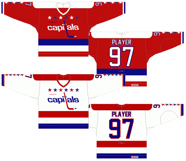
I’ll be the first to admit that I’ve never been crazy about these jerseys. The logo’s kind of weird using a reverse-italicized Helvetica with a hockey stick. The stars at the collar and sleeves seem pretty cheesy. The stripes along the bottom of the jerseys are just really large and dominating. So why are they ranked so highly? Because in many ways, they just make much more sense than anything discussed so far.
First: the colours (sorry, “colors”, but my IP address is in Canada and everything autocorrects to that). Red, white and blue. Gotcha. America. Washington’s the capital. Government town. Patriotism. No problem at all. It makes perfect sense. It’s very traditional hockey colours and not super-unique in that sense, but you can blame Betsy Ross for that. It’s not the Capitals’ fault.
Second: the stars. It’s a double entendre really. Stars and stripes, obviously, are on the American flag, which can account for the stars on the sleeves. Five stars for 50 states. Since all 50 aren’t going to fit on the jersey, 5 makes sense. But, the DC flag also has a line of three stars, which is represented on the front of the jerseys, to the left and right of the collar. Makes sense. Alternating the colours of the stars is cool and all, but it’s what gives the stars that cheesy and gimmicky feel. Keeping them a solid colour would have made for a better jersey. And especially on the sleeves, it’s a pretty tight fit for all 5 stars.
Third: the stripes. Again, looking at the US and DC flags, there’s a double entendre there that works well. Stripes on the US flag and stripes on the DC flag. Again, makes perfect sense. Are the stripes a bit too thick and dominating? Yes they are and would look better if they were narrowed a bit.
As for the other elements, like the shoulder yokes, they’re strong and simple, but the main issue is that they don’t leave much room for the stars on the sleeves and the numbers to co-exist, making it look and feel too cluttered. Removing the yokes could be an improvement and make the jersey looks less clunky overall.
All of these add up to a jersey that makes perfect sense for the location and nature of the city of Washington. The concept is strong, simple, iconic and definitely working, but it just needs some tweaks to make it a better jersey.
Jersey Recommendation: #5 Langway. There’s a few different possible picks here – Iafrate, Gartner, Labre, Hunter – but the Secretary of Defense gets the vote. And that moustache! Get it in the whites.
2. 2007–present Home & Away Jerseys

Speaking of the previous jersey needing tweaks, here’s they are! Not exactly the tweaks that we were discussing, but tweaks that streamlined and refined the jersey into something that becomes the best that the Capitals have ever worn, without any of the chunkiness from the previous jerseys. The Caps took the introduction of the new Reebok Edge jerseys as an opportunity to rebrand themselves and bring back some of their original look. The red, white and blue is still there (and still makes sense). The stars and stripes are mostly gone, aside form adding the three stars (all the same colour!) from the DC flag as part of the updated and modernized logo (which is still not a good logo though).
• More: BTLNHL #24: Washington Capitals
It has a less of an overtly American feel to it missing the overload of stars and thick stripes, but that’s not necessarily a bad thing from a design standpoint. It makes for a more refined and modern jersey that has a good mix of the team’s historical influences with some modern touches.
There’s not so much stripes on this jersey as just chunks of colour. A single line outlines a slightly-wavy shoulder yoke (and oddly, just on the front, not the back) to the cuff which has another thin blue line. That line is mimicked again down near the bottom of the jersey, so there’s a consistency to some of the elements here.
The two odd chunks of colour are the wing-like strips right below the shoulder yoke outline and strips of blue on the sides of the jersey. The wings are a bit strange, as they stand out on the jersey in being the only element that doesn’t have consistency with anything else and seem to appear randomly, not coming out of any particular jersey line (on the non-cuff side obviously). But, they definitely add a sense of movement and flow to the jersey overall and it’s relatively unique within the league. And the chunks of blue on the sides of the jersey are not really that necessary, but at least they kept them solid and minimal, not like some teams. Those two chunks of colour would have been necessary to include in some form anyway as, without them, it probably would have looked like nothing more than a practice jersey.
It was also nice of them to introduce a different typeface to use, namely one that’s legible, but it also has a mixture of classic and modern.
It’s a jersey that was almost universally praised when it first came out. Part of that was because the previous Caps jersey was the mess at the bottom of this list, but also because it’s simply better than any of their other regular jerseys. And when it does something like this, it always makes it look better.
Jersey Recommendation: #19 Backstrom. The Kurri to Ovi’s Gretzky, these two have given their entire careers to the Capitals and it’s hard to imagine either of them not being a part of Washington hockey. We’re saving Ovechkin for the first place jersey, so having Backstrom here seems like an easy choice. If you’re a goalie enthusiast, a #70 Holtby would be a fine choice as well. Get it in the home reds.
1. 2015 Winter Classic Jersey
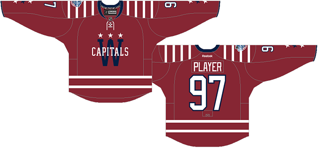
This may be a controversial pick for the top spot on this list, but it really shouldn’t be. It’s not even really that close. They are awesome. Don’t believe it if anyone tells you otherwise. There’s a lot of excellent design decisions happening here – a lot more than you might think. Here’s why they are so damn good
Historical Relevance to DC hockey? Check. First, the “Capitals” across the front is an homage to the Washington Lions/Presidents from the early American Hockey League and Eastern Hockey League days, while it also, of course, has a connection to the text-crest on their current and original jerseys. Second, the W logo was used for other Washington-based hockey teams, and was also a very common logo for Washington-based baseball teams.
Hockey Historical Relevance? Check. Some people don’t like the barber-pole look. I get it. But to call these barber-pole jerseys is overstating that a bit much. The heavy use of stripes on a hockey jersey has a long (and sometimes sordid) history, especially back in the ’20s and ’30s. There’s just enough stripes on these Caps jerseys to make them look authentically historical, but it’s simplified and consistent. The laces always help augment an historical aspect too, and almost always look good doing it.
Innovative? Check. Obviously, the most controversial part of it is using the striping pattern on the shoulder yokes. While this element also has a historical connection to the EHL’s Washington Presidents team, I don’t think vertical striping only on the shoulder yokes has ever been done in the NHL. In that sense, these jerseys are incredibly innovative for the NHL, introducing something to the jersey design conversation that hasn’t ever been done before, but still looks familiar. It’s a gutsy step to take, and it pays off here. Why does it work? Because there’s actually little else on the jersey. Take them off, and while it still looks pretty good, it’s a little more plain and looks more like a regular hockey jersey.
Current Capitals Relevance? Check. I love the addition of the blue and white stars on the sleeves, a reference to the original Capitals jerseys – but with more subtlety and refinement – taking that element and improved on it. There’s also the three stars across the top of the W, the three stars on the pants, all homages to their original uniforms. But again, it’s more refined. Then, of course, they used the same general colour scheme: red, white and blue. And, as previously mentioned, the text-crest across the front is something they still have today.
Relevance to DC? Check. Just like the Caps’ alternate Weagle logo subtly places the Capitol Building into the design, the large W has the Washington Monument subtly integrated in the middle spire of the W. It’s a design element (like the aforementioned Weagle) that rewards the viewer as soon as you notice it, something you can enthusiastically point out to friends who haven’t yet noticed it and feel very sophisticated and smart. And it also adds a layer of complexity to the logo you hadn’t noticed before. Then, again, there’s the three stars, which is a reference to the DC flag.
If there’s one complaint I have, it’s that the spaces between the two stripes along the bottom is a little too large. Narrow that up a bit, and it’s pretty close to perfect for a Winter Classic jersey. Historical, innovative, relevant. And, I wouldn’t mind if these jerseys become the new third jerseys for the Capitals. They’re that good.
Jersey Recommendation: #8 Ovechkin. The best player to put on a jersey for Washington deserves to be placed on the best jersey that any Capitals players has ever worn. And with a goal and an assist, he was also the first star of the game.
Agree? Disagree? Let us know in the comments below or join the conversation on Twitter, Facebook, or Instagram!


one to many, copy paste at the start of the text.
Terrific analysis. I’m not as enamored with the 2015 Winter Classic jersey — I the W should be bigger for one thing and the wine red is too dark for my taste. But as you note, it’s still the best look the Caps have had. I’d also love to see a Navy blue alternate with the Weagle on the chest. Keep up the great work!
Thanks, much appreciated!
You guys absolutely nailed it in the Caps – well done!
Y’all do a great job with these breakdowns – keep up the good work!
Oh, the ’90s. Someone ought to use that particular shade of blue again. It’s a bit greener than Colorado’s, and bluer than San Jose’s. With the copper, it was so distinctive, albeit a bit murky. But then, I’m not sure why anyone thought a team in Washington should wear anything but red, white and blue. Well, anyone but owner Abe Polin, who changed his other team, the NBA’s Wizards, to the same palette.
I am also a big fan of the Weagle and think it’s the best logo mark any major Washington team has ever had. I mean, look at this barrage of atrocities: https://www.sportslogos.net/logos/list_by_team/992/Washington_Senators/
[…] • The Capitals have had a diverse jersey history. Here’s a good examination of the good and bad looks they’ve sported over the years. [Hockey by Design] […]
[…] • The Capitals have had a various jersey historical past. Right here’s a superb examination of the great and dangerous seems to be they’ve sported through the years. [Hockey by Design] […]
I think “5 Star Eagle” was for sure their best logo.
I don’t see the new colours as a bad look, or the maroon, but the blue and black was nice.
The Washington DC flag has 3 stars and two red and two white bars. It is an armorial banner based on the design of the coat of arms granted to George Washington’s great-great-great-grandfather, Lawrence Washington of Sulgrave Manor, Northamptonshire, England in 1592 (Wikipedia)
[…] Like New Jersey’s, the Capitals home jersey is very boring. The stripes on the front and back of the jersey are very thin and don’t add much to the jersey’s concept. The main feature that puts it above some of the league’s worst is the thicker white stripe and thin blue stripe on the front sleeve. While it’s nothing special, it works. At least it’s something. […]