
Worst to First Jerseys: St Louis Blues
As we go through the prolonged 2019-20 season, we’ll be updating all of the Worst to First Jersey posts every Monday, as almost all the teams in the league have unveiled new jerseys since their original posts. We’ll start with the ones most needing updating and work our way through the league. Today, it’s time for the St Louis Blues to get updated.
Also, a huge thanks to SportsLogos.net and NHLUniforms.com for most of the jersey images and references.
Since entering the league in 1967, St Louis has been one of the few teams to keep a team logo consistent for their entire existence, with some few minor tweaks here and there. And the current logo is the best rendition of it yet, ranking as the fourth best logo in the league in this site’s humble opinion. It’s deceivingly simple and deceivingly complex at the same time, with great movement and a classic timeless look to it. But unfortunately, this post is not about their logos over the years, but their jerseys. And most of their jerseys don’t have even close to the classic and refined look that their logo has.
• More: BTLNHL #4: St Louis Blues
Here’s how this works: I’ll count down, from worst to first, all the jerseys the Blues have ever worn. Homes and aways will be lumped into the same category (so, more of a jersey “era”) and I won’t worry about small changes (like slightly changed positions of piping for example). Third jerseys will stand on their own. And I’m focusing on the jerseys only, not the entire uniform. For the Blues, there’s 6 different jerseys/eras. And we’ll start with the worst one:
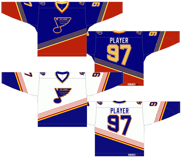
(Dis)Honourable Mention: Proposed 1996 Third Jerseys

Before we get to the actual 6 jerseys the Blues wore, we’ll start with one that was never worn. Luckily these jerseys that were designed, produced and ready-to-wear never made it onto the ice, in one of the few things that Mike Keenan did right after his stint with the NY Rangers. He forbid the players to wears these jerseys on the day they were supposed to, making sure that these jerseys were never seen in an actual game. Because they were never worn, they’re not included in this countdown of the Blues’ jerseys. If they were worn, you can be guaranteed that they would be in 7th place. They are everything that was wrong with mid- to late-’90s design in the NHL. Could you imagine having seen Gretzky wear this? I shudder thinking about it.
There’s absolutely no explanation need as to why they’re so bad. If you need an explanation, then I truly feel sorry for you.
Anyway, on with the show!
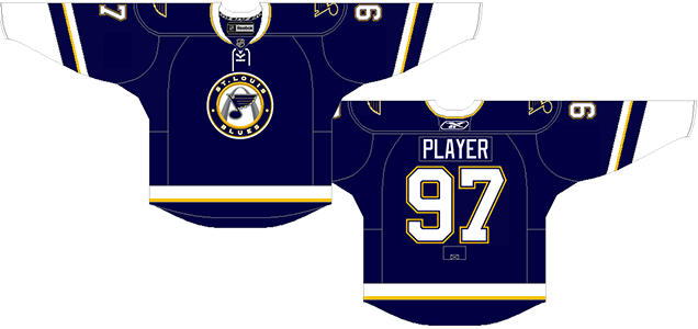
8. 1995–98 Home & Away Jerseys, 2019–20 Third Jersey
Ha! Was there really any doubt of what would be last on this list? Of the multitude of things wrong with the jersey, the most obvious one is the numbers on the back, forcibly warped into odd and uncomfortable positions like a half-assed contortionist. It’s not as bad as it could be in the image to the left, using Hull’s #16, because the 1 is the easier number to manipulate in that smallest amount of space. But then look at Gretzky’s #99. The first 9 just looks stupid, with odd angles and uneven outlining that is mismatched with the other 9 that’s right beside it. Whichever designer thought this would be a good idea was hopefully fired soon afterwards.
The other obvious issue is the unconventional striping on the jersey. The Blues stole a page from the original Mighty Ducks’ jersey design using the exact same angles but just reversed to slant the opposite way. Anaheim had the good sense to just let the numbers on the back overlap the design.
St Louis also expanded on this relatively new use of striping patterns by creating four very thin stripes as a pattern, before turning to thicker stripes and then a solid band of colour. I get the allusion: the thin stripes are meant to be reminiscent of guitar stings to play on them being the “Blues” and the name of the team being based on an old blues-jazz song. That’s no reason for a bad design though.
To see alternative options, Nashville did a great job with their guitar pick alternate logo, and the guitar strings through their numbers. Simple, classy and subtle, which is the opposite of this jersey’s approach: garish, aggressive and badly-designed for a jersey.
The jersey gets very busy very quickly, with the stripes climbing too far up on the jersey and completely taking over. They make the Blues logo an afterthought, or at least, not the main feature of the jersey. That alone is worth a bottom ranking on this list.
Other issues: there’s too many colours happening. These are the only Blues jerseys to (prominently) bring red into the mix, which makes the jersey look like raw sugar (not very refined). Also, the slanted numbers on the sleeves. The original Stadium Series introduced that on their jerseys, and all years later, it still doesn’t work. It’s like raw flour (unenriched).
Over-thought and over-designed, these jerseys are a good example of late-’90s design in the NHL, aka the Dark Ages of NHL design. So, of course, they decided to revive them this season. *eyeroll*
Jersey Recommendation: #14 Courtnall. Geoff Courtnall played for the Blues almost exclusively while these jerseys were being used, so it’s a good fit that way. He was serviceable and filled a need, which is all these jerseys should as well. Get it in the road blues. Because Blues. Get it?

7. 1967–84 Home Jersey, 1979–84 Away Jersey
The pick for last place on this list was pretty obvious. The middle of these rankings are much less obvious. There’s a clear-cut couple favourites, but an argument could be placed for the next few jerseys still to come (including this one) to be placed higher. That sounds like a cop-out (We’re all winners! Yay!), but there’s both positives and negatives to all of these jerseys that make it difficult to make one or two better than the rest. That being said, these jerseys are placed at 5th. We’ll start with the negatives.
First, those shoulder yokes are just ridiculous. The only other team that has really maintained shoulder yokes with even close to that many stripes in the NY Rangers, which they first adopted in 1951 for the white jerseys. Aside from a brief stint in the ’70s, they’ve worn them ever since. Other teams use stripes as well, but they’re relatively simple, consistent and straight-forward compared to the hot mess that the Blues used, especially on the home white jerseys. These stripes are inconsistent, don’t seem to follow any sort of pattern (compared to the sleeve stripes and the stripes at the bottoms of the jerseys), and in practice, just look odd.
Apart from that, it’s actually a pretty good jersey, following the standard aesthetics at the time, and when introduced, they were the first team to have a blue and yellow combination, making them fairly unique. Buffalo followed suit in 1970 and today, Nashville has joined that party as well. The Blues were the first to introduce it, and it looks great. The blue is a slightly lighter than royal blue (more on other blues later) and looks great on the ice.
Jersey Recommendation: #24 Federko. Easy pick for this jersey, as he was a huge leader on the Blues teams in the late-’70s and early-’80s. And aside from a final season with the rival Red Wings (why do they always do that?), he played for the Blues his entire career. Get it in the road whites.
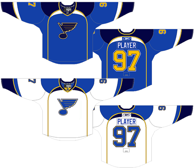
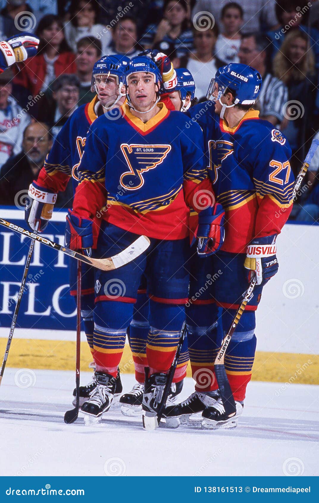
6. 1984–94 Home & Away Jerseys
The jerseys that came immediately after the preceding ones on this list are up next. And yes, the shoulder yokes are gone which is automatically an improvement. But they did something else that stayed with the team until the late-’90s: they threw some red into the branding that did more to hinder rather than help their look.
Consider teams that have been historically successful and have some of the best designed logos and jerseys in the league. Detroit wears only red and has so since their inception. Boston, yellow and black. Chicago (although their logo has a bunch of different colours in it) wears only red and black. Montreal, red and blue. When dealing with colour, simpler is often better than its opposite. Blue and yellow really worked for the Blues. Adding unnecessary red outlines to the their logo, numbers, names and stripes does absolutely nothing other than create more visual clutter. And it’s all the primary colours to boot. And red symbolizes fire, which is the opposite of ice, which is blue. So it’s like you’re melting your team away! I’m surprised the players didn’t go all Raiders of the Lost Ark when they wore these.
The good news: going with the three-colour branding scheme is balanced with a very traditional and classic jersey design. It’s almost too traditional and classic in the sense that it’s pretty stereotypical, but sometimes you don’t want to mess with what works, especially if you’re trying something new with the colours. It’s balanced and, more importantly, makes sense. The striping is strong, consistent and simple.
For this era, they darkened the blue to more of a darker royal blue. Still looks good on the ice and works well with the yellow. Nothing but good stuff there. And we’re just going to glaze over that horrible phase when they plastered the word “BLUES” on the front and shrunk to logo to little more than an afterthought. Awful, awful, awful.
It’s still a pretty good jersey, but someone has to come in fourth (and again, it’s very close with the rest of the jerseys) but the red is this jersey’s undoing. Luckily not the franchise’s undoing, like Red 2 being the movie franchise’s undoing? Use your red judiciously kids.
Jersey Recommendation: #16 Hull. No question here either. Behind Gretzky and Lemieux, Hull was pretty much the most prolific scorer in the NHL for a few years, and those were the years he spent with St. Louis, mostly in this jersey. Get it in the road blues.

5. 2008–16 Third Jersey
As third jerseys go, these are one of the better ones, creating something that’s unique from the team’s regular home and away jerseys, making it feel less like a money grab and more like a jersey people would actually want to own. It’s strong, simple and creates something new and exciting for the team’s brand.
Part of that the problem though is that this is the darkest a St Louis Blues jersey ever got, using a navy blue that’s dark enough to be mistaken for black. People familiar with Hockey By Design will know this rant: hockey is a game played on a sheet of white ice, where one team almost always also wears white. When the other team only wears black (or, in this case, a very dark blue that’s almost black), it makes for a very monochromatic visual experience. Leafs/Red Wings? Awesome. Kings/Third-Jersey Sharks? Boring.
What helps is that the yellow accent was changed to something brighter and more electric, giving almost a neon glow to the trim of the uniform. And the yellow is used just enough to be a good accent to the blue: a little bit here and there to give the whole jersey a visual punch. Not a real punch though. Calm down there Morrow.
The only other fault on this jersey is that, with the white trim, it has some pretty extreme contrast: it’s almost black, with a white and electric yellow trim.
These are relatively small complaints though. There’s a lot to like on this jersey, from the consistent and minimalized striping patterns, to the laces, to the use of a crest that makes sense on a third jersey: a little more detailed and visually interesting on a minimal jersey. The alternate logo works as an alternate logo.
Jersey Recommendation: #27 Pietrangelo. Joining the Blues the same year as this jersey was introduced – and slowly becoming their captain and leader over the years the jersey existed – makes it a natural fit.
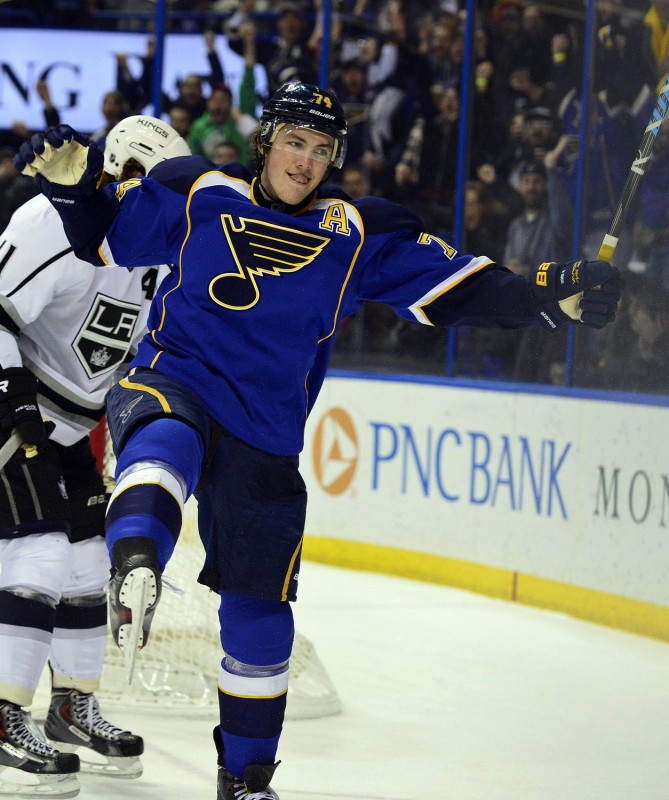
4. 2007–14 Home & Away Jerseys
The introduction of the Reebok Edge jerseys in 2007 gave teams the opportunity to play with new lines and edges to the jerseys, and the Blues were one of the teams that made the most of it. The mixture of classic styles with modern innovations is actually not too bad, creating a jersey that’s definitely leaning more towards something new and contemporary but doesn’t look out of place with classic hockey jerseys.
I’m assuming it was intentional to have the yellow trim follow the lines from the bottom of the jersey up and around to the collar mimic St Louis’ Gateway Arch, giving the jersey a simple and elegant sense of place. The use of a different colour to at the top, coming out of the collar, is – to me – what makes that visual connection a lot more obvious, making sure that the arch has some weight and substance to it, rather than just being a line on a jersey.
But what that line on a jersey also is frame the logo in a really great way, making it the focus on the entire jersey. And that curve and striping pattern is mimicked on the sleeves as well. And that slight curve is used on the shoulder yokes. It makes for a consistent and refined – albeit dated – look across the entire jersey.
But there were also decisions made to keep things simple, like not having any stripes along the bottom of the jersey. The rest of the striping is complex enough that it becomes unnecessary to have stripes there and not have it look like a practice jersey like some other teams did with the Reebok Edge jerseys when they first came out (I’m looking at you Edmonton). And they didn’t do anything stupid anywhere else on the rest of jersey, like on the sides for example (I’m looking at you Calgary). It’s a great mix of complex and simple, new and old, and it used the Edge jerseys’ new lines to its full potential.
Jersey Recommendation: #74 Oshie. His tenure with the Blues almost spans the life of these jerseys exactly, and he was certainly one of the most prolific scorers for the Blues during this era. Get it in the double-blues.

3. 1997 Third Jersey, 1998–2007 Home & Away Jerseys
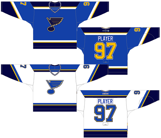
Those striped-shoulder yokes return! But, the difference between the 1979–84 ones and these is that these stripes are simplified and are actually (mostly) consistent with the striping on the rest of the jersey.
Keeping the stripes minimal and more consistent allows it work with the rest of the design much easier, and actually accentuates the main logo crest much better. Also long gone is the red, exchanging it for a different tone of blue. This colour addition actually makes sense, because Blues.
That being said, the yellow works well as an accent colour, complementing the two-tones of blue to give it some needed contrast and depth.
The use of the darker blue though, is where an issue lies. Because the navy blue is so dark, it verges on being black. And if you’re going that dark, there’s not much difference between the blue and black. The home blues use the darker blue well, as the main accent colour to compliment the lighter blue. It’s also consistent over the entire jersey. The white jerseys, however, would have been better with the lighter blue at the cuffs and bottoms and darker blue in the striping, like the shoulder yokes. Much better.
Could I get a count on how many times ‘blue’ has been written so far? Thanks.
Jersey Recommendation: #7 Tkachuk. There’s a few different possibilities here (Pronger, MacInnis, even Demitra), but let’s give it to the guy who led the Blues during this era and wore a Blues jerseys for his last 9 seasons, retiring a Blue. We just won’t talk about that Thrasher episode. Get it in the super-bluesy home blues.
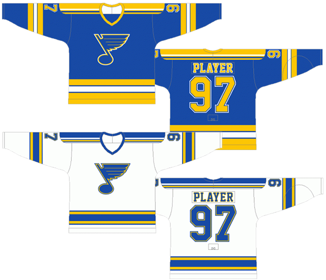
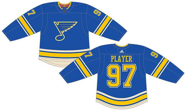
2. 2014–present Home & Away Jerseys
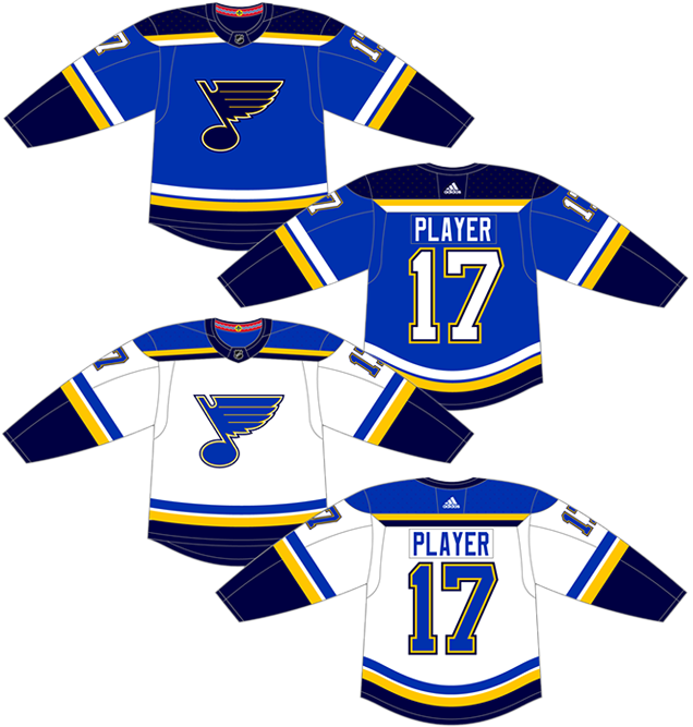
Although they’re very similar to the previous jerseys on the list, these current versions show how small details can make a huge difference.
Where the previous jerseys has a more contemporary aesthetic, with different widths of striping and angled stripes, these have a much more classic aesthetic (thicker and more conventional straight stripes) which works better with the overall design concept.
• More: HbD News: New Ducks and Blues Jerseys
Having the striped shoulder yoke is a classic concept. The typography used (collegiate-style lettering) is a classic concept. A 1967 logo is definitely a classic concept. And these slight modifications to the striping patterns underline the classic approach, instead of undermining them like the 1998–2007 versions did.
The yellow also plays a bigger role in these jerseys, giving them more visual impact and energy, as well as balancing the two tones of blue more emphatically.
Overall, this version is more impactful and much more rooted in a classic aesthetic than trying to bridge a gap between the classic and contemporary, making it a more successful design. Plus, they raised this, which makes everything look better by association.
But still not the best they’ve ever worn…
Jersey Recommendation: #91 Tarasenko. He’s the elite game-breaking player that has pushed the Blues towards new heights during this current era, becoming a major force in the playoffs as well. Also acceptable? #50 Binnington. Assuming he doesn’t become the next Potvin, of course. Get it in the Cup-raising whites.
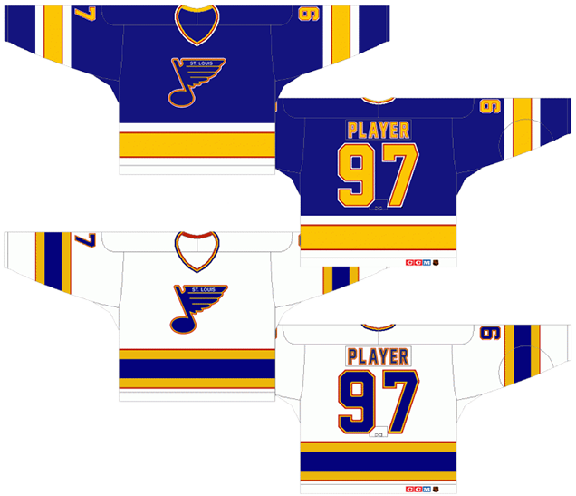
1. 1967–79 Away Jerseys, 2017 Winter Classic Jersey, 2018–present Heritage Jersey
When the St Louis Blues unveiled their 2017 Winter Classic jersey, it was an obvious callback to their original blue jerseys from 1967, complete with ribbed collar and classic sapphire(?) blue colouring, and it looked glorious. And then they introduced a Adizero-verion “Heritage” jersey for this past season with very minor tweaks that looked just as great. This all demonstrates that the Blues finally know a good thing when they see it.

The quirky nature of the Adizero collars is the only minor discrepancy between all three of the jerseys, but given the options available to them with the collar’s design, they went with the best option.
• More: HbD Breakdown: St Louis Blues Third/Heritage Jerseys
• More: HbD Breakdown: Blackhawks and Blues Winter Classic Jerseys
The original jersey has a lower white stripe going all the bottom edge of the jersey that’s much thicker than the white stripe above the yellow one. These newer versions keep it consistent in size with the upper white stripe. That was also the right decision.
All the striping is simple, classic, and consistent, creating a timeless look that allows the relatively unique combination of blue-and-yellow to come to the forefront, and it put their glorious logo front-and-centre.
The #2 jersey on this list gives these a bit of run for their money, but this is the obvious clear-cut winner. It’s the best the Blues have ever worn.
Jersey Recommendation: If you’re going classic, go for #1 Hall, the Hall-of-Famer that led the Blues in net during their infancy. If you’re going more contemporary, #90 O’Reilly, who seemed to be the only Blues player that cared during the first half of this season, and has been leading them ever since he arrived…and has a nice piece of hardware to match.
Agree? Disagree? Let us know in the comments below or join the conversation on Twitter, Facebook, or Instagram!


/cdn.vox-cdn.com/uploads/chorus_image/image/16100961/136538078.0.jpg)
The 2007-14 jerseys should be way lower, likely 7th. I like the 84-94 jersey a lot, if they are not #1, then a slam dunk for top 4. While the 1968 jerseys are very solid, the 2018 version’s collar, and the 2017 version being slightly too light blue push it down to 3 or 4 for me. My order would be likely 2, 3, 6, 1, 5, 7, 4, 8.
[…] • Taking a look at the history of the Blues’ jerseys, from worst to first. [Hockey by Design] […]
You forgot kind of a big one…
http://www.nhluniforms.com/Blues/Blues07.html
They’re lumped under the 1984–94 jerseys (#6). Same general jersey design, but just a different logo (and we do mention that specific jersey in the write-up too).
They did mention in in the 1984-94 jersey comments, “And we’re just going to glaze over that horrible phase when they plastered the word “BLUES” on the front…”