
HbD Originals: Portland Rosebuds Brand Revival (Round 1)
 Note: Brand Revival is a new series where we design a hockey brand over the course of multiple posts, and we take you along for the ride to see the process from start to finish. It’s putting our money where our mouth is, so to speak.
For Brand Revival’s maiden voyage, Chad will be designing a modern brand identity for a potential NHL franchise in Portland, Oregon with input and creative direction from the entire HbD crew.
The Original Portland Rosebuds
The inspiration for this project stemmed (yeah, I guess I’m doing flower puns ) from reading about early professional hockey in Oregon state and two teams that used the unique Rosebuds name.
What was the inspiration for the uncommon floral theme for a gritty northwest hockey team? Portland has been nicknamed the “City of Roses” for a century. In 1905, the city held the world fair Lewis & Clark Centennial Exposition, and in preparation, about half a million rose bushes were planted along the streets of Portland (many of which remain today). Then in 1917, the International Rose Test Garden was set up in Portland and in 1918, hybridists from England sent their roses to the International Rose Test Garden in Portland, as Europe’s roses were in danger of being destroyed by bombings during WWI. Portland’s rose connection has lived on ever since. Currently, rose imagery can be found on signage and artwork throughout Portland.
The first Rosebuds team (1914-18) played in the Pacific Coast Hockey Association and are notable for being the first American hockey team to compete for the Stanley Cup in 1916, losing to Montreal…but still got their name on the Cup! Here’s a whole story about that, if you’re interested.
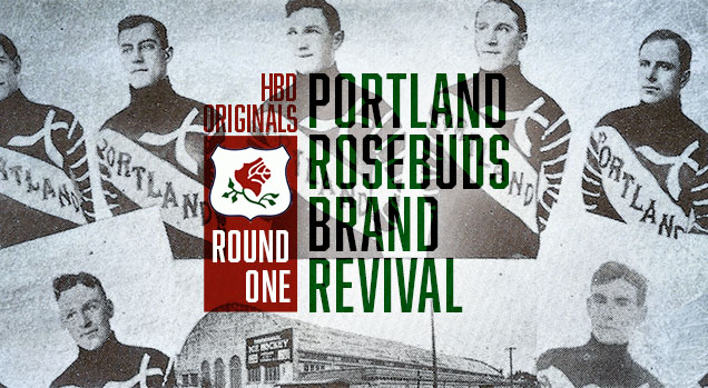
Their original 1914-15 sweaters were pretty fantastic…if not a little odd. The sweater prominently features ‘Portland’ across the front, sash-style, in a gothic typeface. The sleeves are the most ‘regular’ part of the sweater considering the time period, having 8 thin stripes on each arm. The most curious part of the sweater is the large ‘X’ emblem across the heart. Ok, so it’s actually, probably two crossed hockey-sticks turned at a 45 degree angle, presumably, to align the stick bases with the sash…I guess? Also, why are these sticks so fat? Either there wasn’t a good artist or there wasn’t a good seamstress in Portland that year, and we may never know which.
But who cares? Technical design follies aside, there is something pretty cool about this sweater. Sometimes it just works.
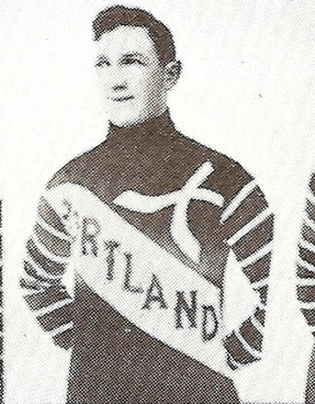
This Rosebuds team switched to much humbler sweaters when they won the Stanley Cup in 1916. They appear to feature only a (very) small logo front and center on the chest, and unfortunately, only a few photos exist from this time period and none of them show the logo up close, so we might not ever get a good look at this design. However, it does appear to be the outline of the state of Oregon, with possibly, stripes inside of the shape, or maybe even some sort of rose design in there . . . we can only hope.
As a side note: I dig the white pants. Bold choice, gentlemen!
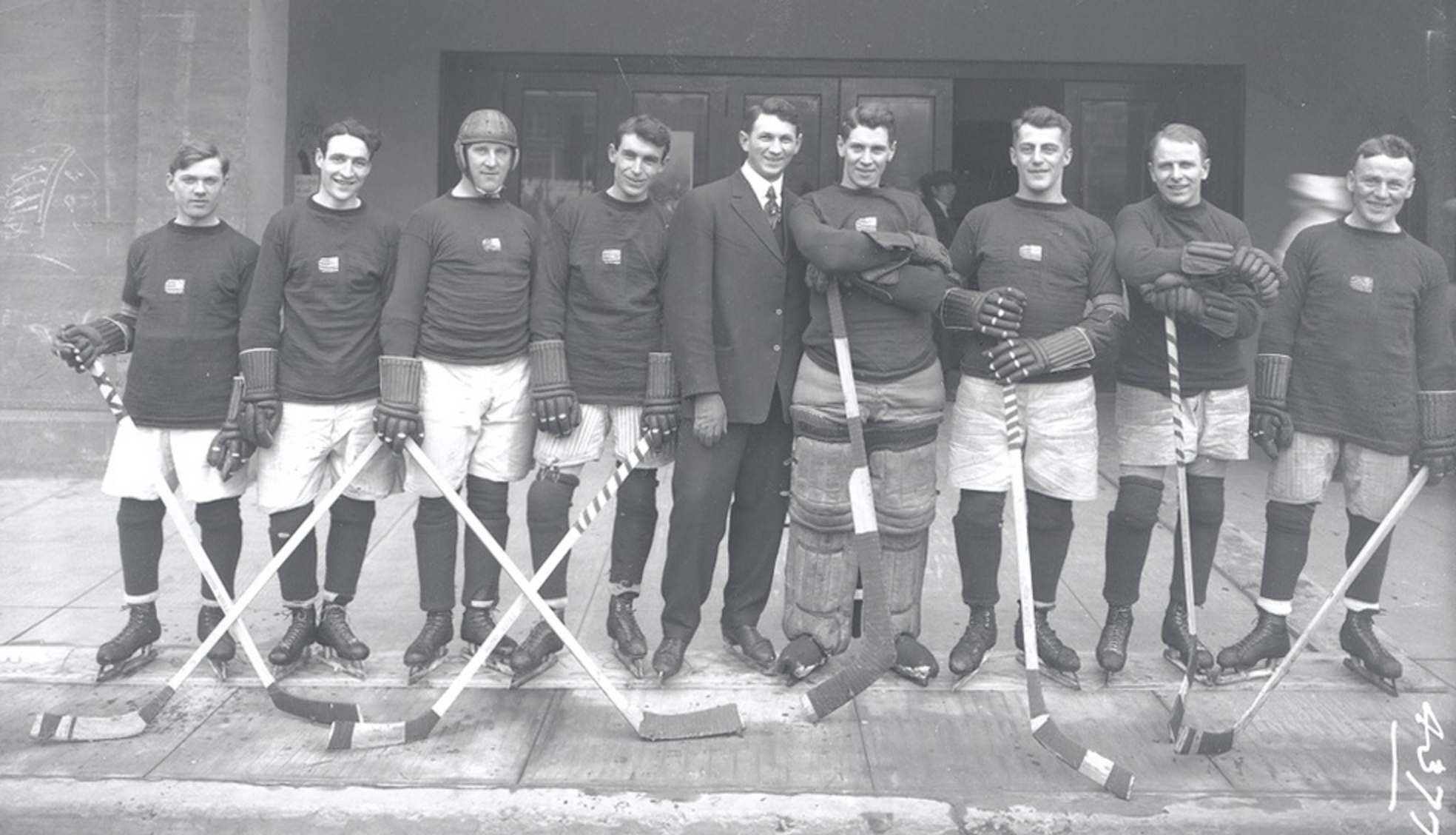
Apparently, In those early days, Portland’s team completely changed their looked every year…it truly was the wild west. In this photo from 1917, the sweaters feature a big, slab-serif letter ‘P’ set on a thick dark stripe. I’ll admit it, these are awesome.
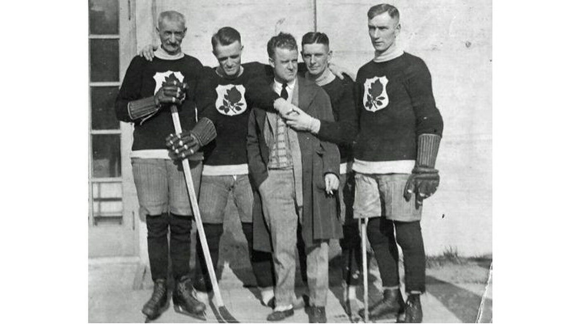
The short-lived, second Portland Rosebuds franchise were formed a whole decade later, having only played the final season of the Western Hockey League (1925-26) but are notable for their players being sold to create the newly formed Chicago Black Hawks NHL franchise.
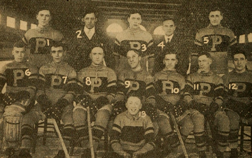
This Rosebuds team had a much more charismatic logo, and some semblance of a brand. I mean, look at that! It’s a clearly defined red rose with a green stem (and leaves). The rose is framed by a white shield. Magnificent!
The Re-Design
Our challenge is to take what we know about the history of Portland hockey and use it as inspiration to create an brand identity for a new, NHL worthy, Rosebuds franchise.
All great brands start as concepts, just ideas and scribbles, really. For this post, I sketched potential directions that a new Rosebuds franchise could take. Generating loose concepts is a necessary step to flush out those hidden gems of ideas that you didn’t know existed until you tried out everything else. The sketch phase is important, and so the HbyD team will discuss a few rounds of sketches before I get into any technical design work for the brand.
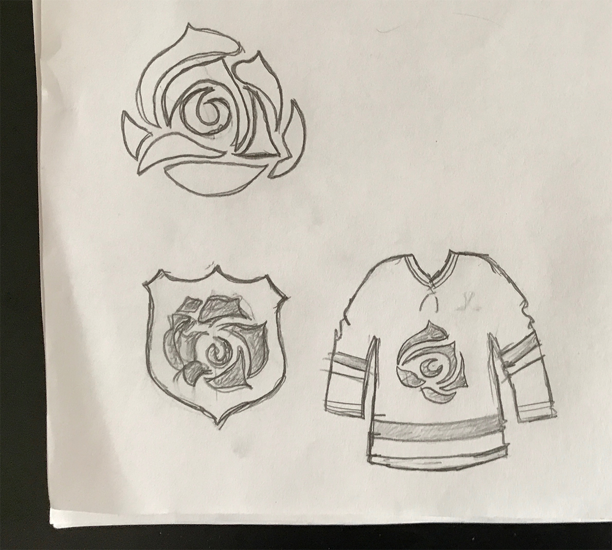
The Real Deal
The idea behind this direction is to feature a flat perspective rose, but in great detail, with many overlapping petals. This logo should be strong enough to stand alone and in contrast, the rest of the uniform design would be simple, to let the rose take center stage.
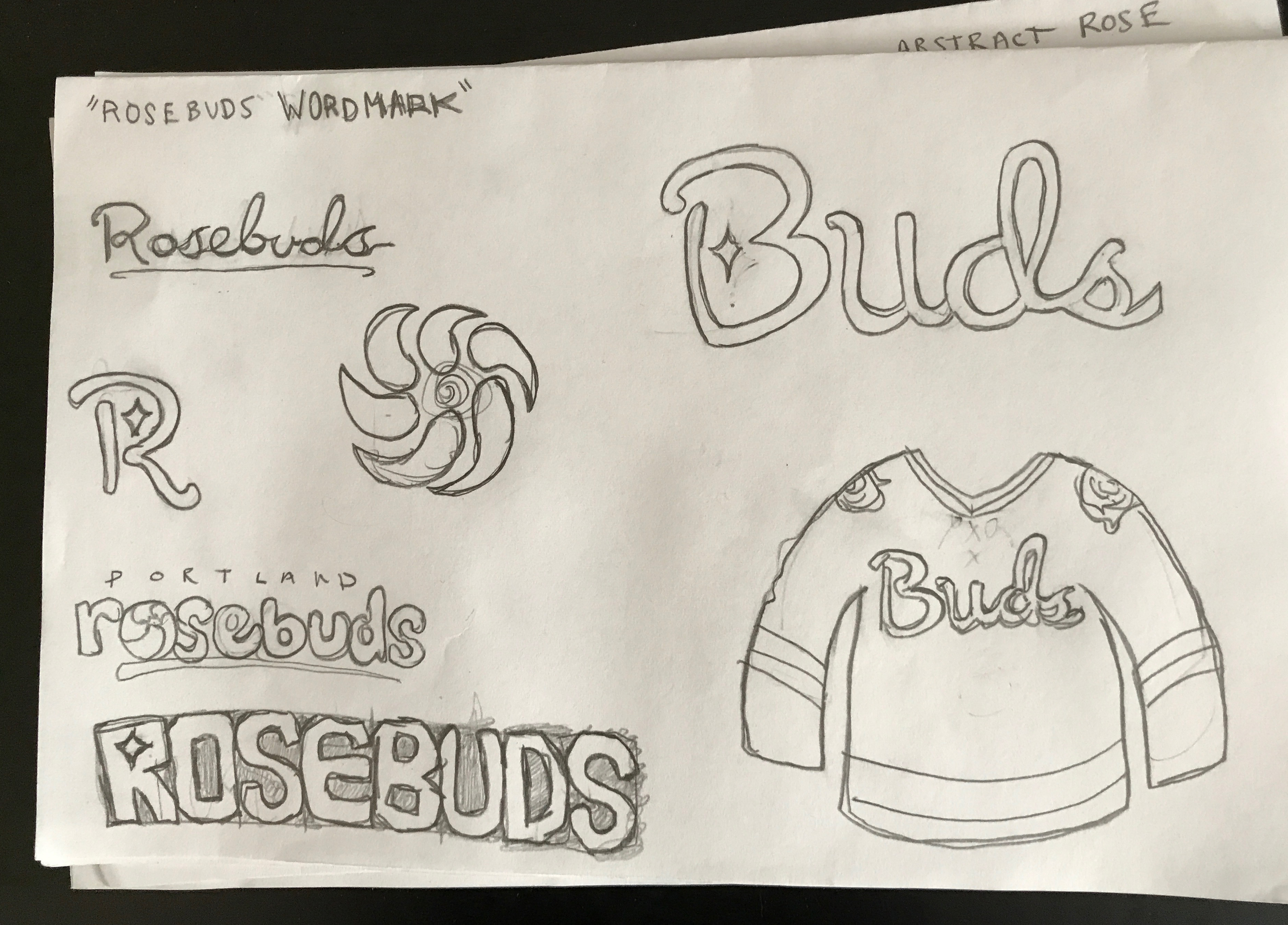
Keep it Casual
On this page I sketched ideas for a word mark focal point. This could be similar to the Minnesota Wild’s alternate jerseys featuring the cursive word mark. I also played with the idea of shortening the moniker to just ‘Buds’, not only because it’s adorable, but also because casually shortening a team’s name like Rosebuds is inevitable. Think of fans chanting ‘Preds’, ‘Hawks’, or ‘Bolts’.
Other items of interest in this sketch may be the diamond/star shape being used in the ‘B’ and ‘R’, which is my nod to the City of Portland flag, which has a negative space diamond shape in the center. Also, that swirly abstract rose, which looks like an unfortunate cousin to the Hurricanes logo, but the idea behind it was to create something with movement that maybe wasn’t a regular rose illustration.
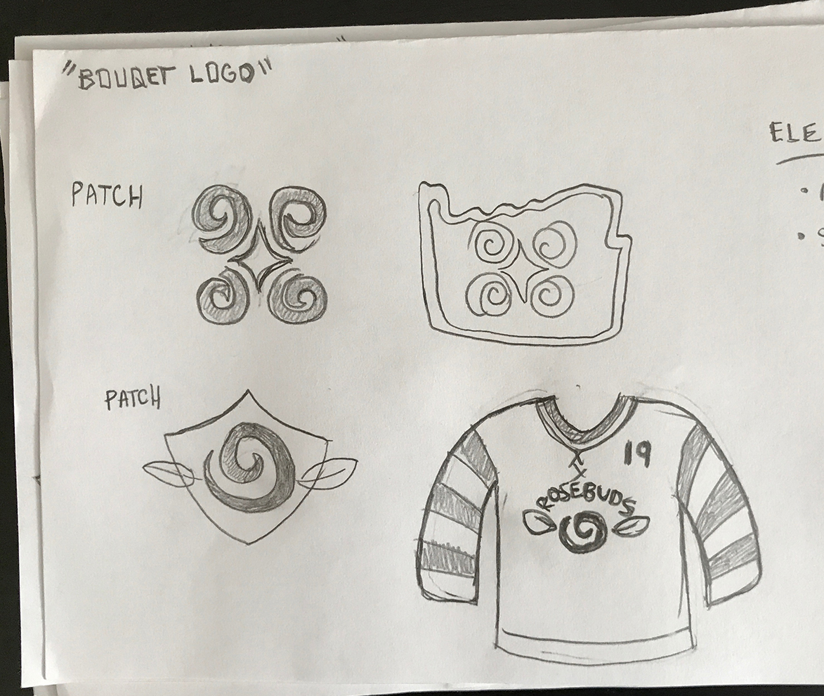
The More the Merrier
This sketch is an exploration of a ‘bouquet of roses’ direction, using simple spiral shapes to create the flower. I experimented with integrating the city flag diamond into the middle of the roses and also framing them with the state outline, a nod to the design on the 1916 team sweater.
 “P” is for Portland
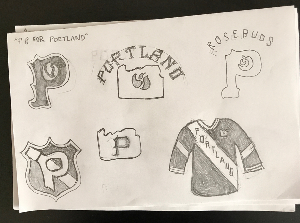
These sketches focused on the name ‘Portland’ being a main feature of the branding. A big glorious letter ‘P’ with a rose inside the shape’s negative space could become a powerful symbol, perhaps in a similar fashion to the way that the NHL’s Minnesota North Stars had such a memorable letter ‘N’ as their logo (R.I.P.)
Like the previous sketch pages, I switched out this idea with various elements such as the shield, the state outline, and the sash.
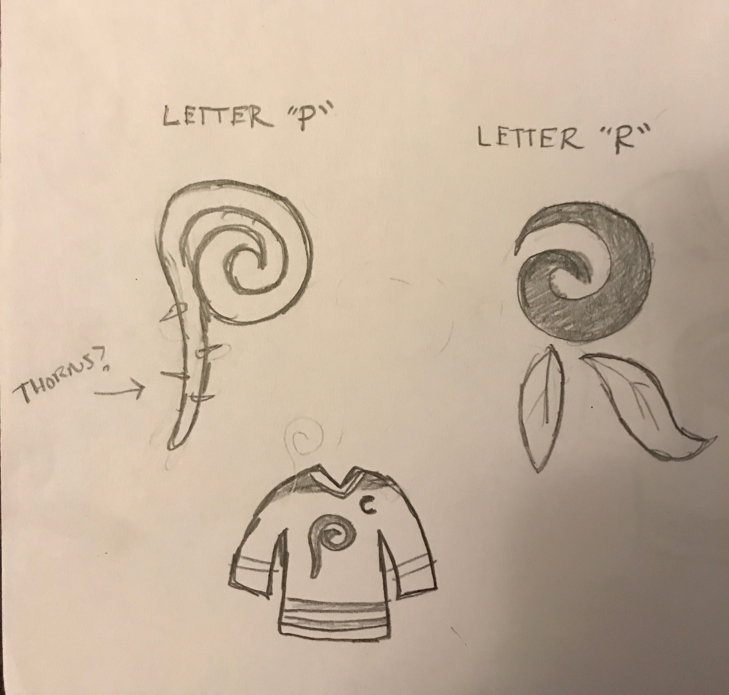
Letter Forms
These sketches push the stand alone ‘P’ concept a little further. The challenge here would be in designing a well-formed, rose illustration that also reads quickly as a ‘P’ or an ‘R’ to the casual observer. This direction could be tricky but has the possibility of also being exceptionally kick-ass.
Coming up next . . .
In the next post, the HbD crew will give their input on the direction of these concepts, followed by the next stage of revisions. Feel free to add your own thoughts in the comment section! Stay tuned.
Want to get involved in the process too? Let us know what you think in the comments or join the conversation on Twitter, Facebook and Instagram! And if you’re interested, we’re now on Pinterest too.


I hate to nitpick, but the Rosebuds did not win the cup in 1916. They were the first American team to compete foe the cup, but Montreal won in 1916.
Hello fellow Chad,
I think we may both be somewhat correct. Portland is engraved on the Stanley Cup as “1915/16 Champions”. Check it out: https://s3.amazonaws.com/wapopartners.com/wweek-wp/wp-content/uploads/2016/03/26170721/rosebuds-stanleycup-cropped5141.jpg
I’d be curious to see if using thorns has potential. Adds some toughness.
[…] • More: HbD Originals: Portland Rosebuds Brand Revival (Round 1) […]
My theory on the 1915-1916 “logo” on the sweaters? It’s actually the United States flag, done in a style that it is flowing/rippled in the wind. “If” that is correct, there is one issue regarding that– the blue field that has the white stars in it would be on the right side of the logo, which would mean the design is backwards from what we normally think of (i.e. the flag is flying backwards, or you’re looking at it from the rear).
This is plausible because of the following reasons: first, the Rosebuds were the first-ever American team to play for the Stanley Cup; since the Final was “Canada” vs. “America”, why not show off a bit of patriotism for the occasion? Secondly, World War I was going on; while the U.S. had not entered the war yet, Canada had as part of the U.K.’s territories. During the course of the war, the Ottawa HC (a.k.a. original Senators) actually added a crossed Union Jack/then-flag of Canada logo to the front of their sweaters during this time frame as a show of support for the war effort. So there was a precedent for displaying your nation’s flag on your hockey sweater at the time due to the war….
I have no definitive proof that Portland’s “logo” is the U.S. flag rippling in the breeze, but to my naked eye as I zoom into the photo (until the resolution falls off), that’s what it looks like to me. There is another question surrounding this “logo”– I have seen other pictures of the Rosebuds that are allegedly from the ’15-’16 season, but there is nothing on the sweaters. In other words, the sweaters are a solid color– no stripes, no logos, etc. Assuming all of the photos in question are indeed from the ’15-’16 season, does this mean that the “logo” (U.S. flag or otherwise) was added/removed at some point of the season? And if so, wouldn’t adding it for the Stanley Cup Final make sense– again, the whole “Canada vs. U.S.” theory?
Does anyone know when (regular season/Stanley Cup Final) or where (Portland, Montreal, or elsewhere) the above ’15-’16 photo was taken for sure?