
HbD Originals: Portland Rosebuds Brand Revival (Round 2)
 Welcome to the second round of the “Portland Rosebuds” brand revival!
(If you haven’t yet, I strongly recommend reading the first post, where I discuss the team’s past logos and uniform history, and then introduce some different directions, in sketches, about what this brand could look like as a team in the NHL today.)
• More: HbD Originals: Portland Rosebuds Brand Revival (Round 1)
The Feedback
In this second round, I asked HbD’s John and Ally to weigh in and supply some creative direction, in helping me decide which elements could be successful in a Portland Rosebuds team branding. It should be noted that their feedback was sent independently of each other, so it was up to me to decide a direction to move forward with even if their feedback conflicted each other.
John:
“First, I like the direction of the abstract rose that you have in the first sketches. I think there’s something there that could be great with some more refinement and exploration. There could also be some subtle inclusions of hockey-related (or Portland/Oregon-related) elements in the abstract swirls/petals somehow.
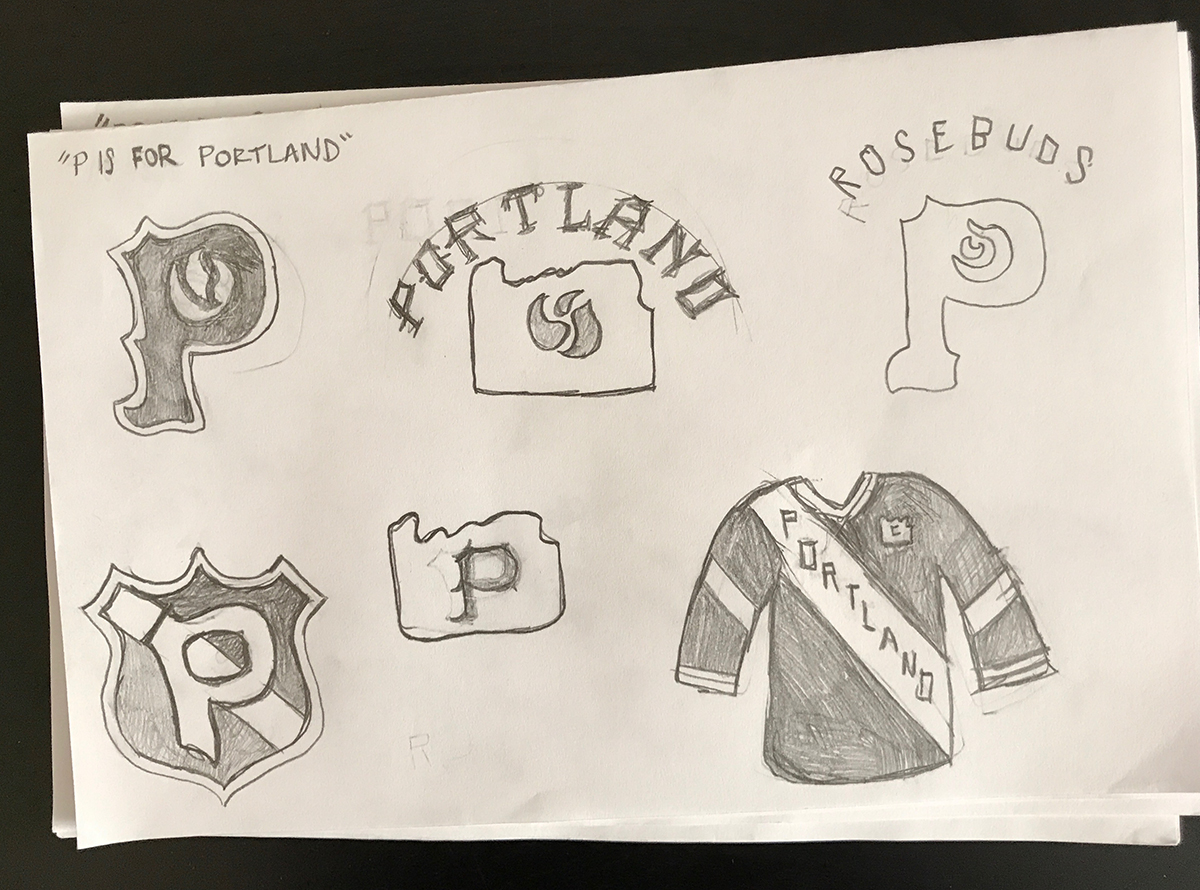
Another direction I liked is the top-left and top-right sketches in the “P is for Portland” sketches, with a rose in the negative shape of a strong and simple P. It’s a nice juxtaposition of a strong P with a graceful rose, and the spiky serifs on the P could symbolize the thorns of a rose stem as well…”
Ally:
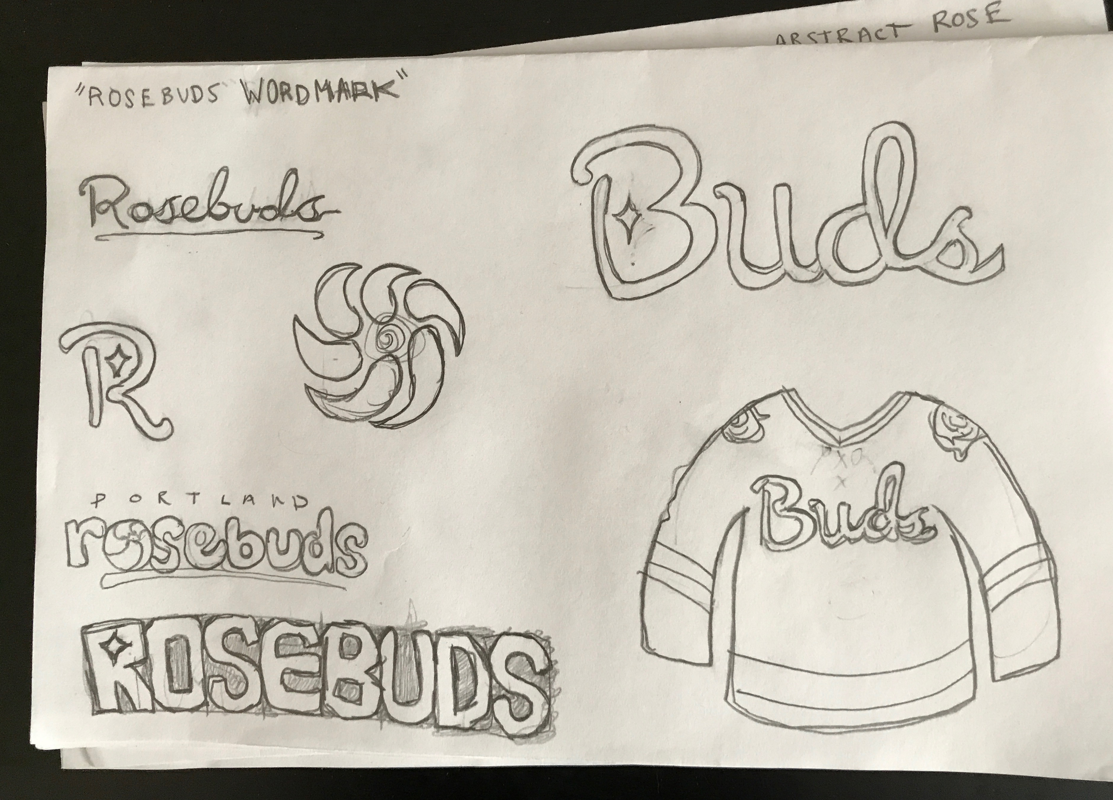
“I think you have some great concepts in the post – some stood out to me more than others, so my favorites would be the first rose on the shield concept as the primary logo and the script “buds” wordmark as an alternate.
The bouquet logo feels a bit too simplified, and I think the spiral interpretation might be a little too whimsical for a sports franchise. I actually really liked some of your ideas for the P logo, but the shield option gives me more of a hockey feel, where as the P with the rose feels more like it belongs on a baseball cap (albeit a really cool baseball cap!)”
Taking Time to Smell the Roses
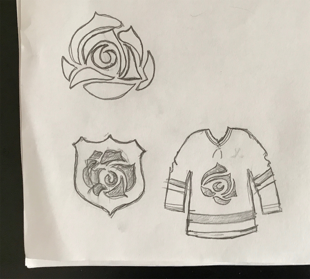
This feedback was a great jumping off point, and I focused my final round of sketches on those elements that seemed most promising. The favorite element in my sketches, for a primary logo might be the abstract rose, which I drew as a stand alone icon and also placed on a shield, similar to Portland’s 1925 era sweaters.

John and Ally’s feedback seemed to disagree a bit on the whether the letter ‘P’ could be used as a primary logo in the branding, which actually gave me an idea, that could serve as compromise. I designed the ‘P’ into the center of an abstract rose icon. Now, it’s not the masterpiece that is the Hartford Whalers logo, but perhaps it’s knocking on the door…or is at least visiting the neighborhood, or something.
 I explored the abstract rose concept further with a simplified variation. A rectangular spiral creates both a rose and a also ‘P’ shape simultaneously. The design challenge here is making sure that it’s obvious that it’s a rose, and not just a weird spiral. What this concept has going for it, is that it’s sharp angles are more aggressive and gives the logo a sense of movement, which is a desirable trait in sports branding.
 Finally, I wanted to keep the classic looking rose in the discussion, as the ‘real rose’ concept in my initial sketches felt pretty strong. Going in this direction, could be a safer bet, and has the potential to be a ‘timeless’ look. However, it’s the least modern direction of the three, and will need to be rendered perfectly for it to do the rose justice. In brand identity design it’s important to keep in mind that we’re not just designing a logo or graphic, but it’s visually representing the brand’s ethos. It’s certainly not common for a sport’s team to have a plant or flower as their symbol, but a rose has the potential to communicate great ideas that a team can get behind, such as passion, strength, and growth.
What’s Next?
In the third round the sketch phase is over, the HbD team will help me choose one of these distinct rose directions for the primary logo, and begin digitally rendering various brand assets. We will begin thinking about how the primary logo will interact with team uniforms, brand colors, alternate logos and more.

Want to get involved in the process too? Let us know what you think in the comments or join the conversation on Twitter, Facebook and Instagram! And if you’re interested, we’re now on Pinterest too.


Leave a Reply