What if… The Seattle Metropolitans Returned?
 With the news last night of the Key Arena in Seattle being approved for large-scale upgrades – upgrades which would allow for an NHL team to play there – in brings the prospect of a 32nd team to join the league, which seems pretty likely according to Bob McKenzie (which means it will definitely be happening).
But due to unstable arena/ownership issues in SEA not long after after that (4 yrs ago), Las Vegas vaulted ahead of SEA in terms of practical readiness and ultimately got the GK.
— Bob McKenzie (@TSNBobMcKenzie) December 5, 2017
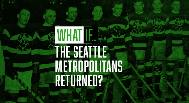
Seattle has already had a major professional team – the Metropolitans – which was the first American team to win a Stanley Cup, and the last team to win before the creation of the NHL, in 1917. And they were very close to having another team in the NHL – the Totems. So, we thought it would be a good opportunity to show what Chris LoBosco has been working on, which is what it might look like if the old Seattle Metropolitans brand returned to the NHL today. Besides, Take it away, Chris!
What if… The Seattle Metropolitans returned? Well the Vegas Golden Knights have a team and some snazzy uniforms, so let’s play Expansion Draft Round 2, this time in Seattle. After we revived the Maroons, the people spoke and they wanted to see a new Mets concept. If this was really happening, I would hope their mascot has more manners than Mr. Met.
• More: What If…The Montreal Maroons Returned
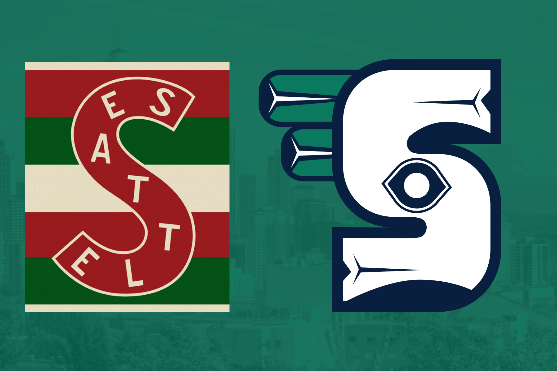
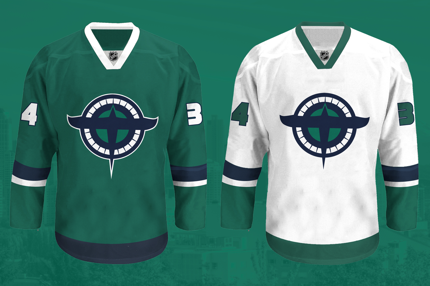
Since our Maroons sweater donned a letter on the front, I decided against that for my second take. I wanted to embody the history of the city as well as what makes it so iconic now. The crest is a combination of the giant totem poles and the Space Needle. The circle formation with spires around the perimeter is taken from the Space Needle being viewed from ground level. The totems were created by people north of Seattle on the Pacific coast, and in summation the totem poles were brought to Seattle as it was seen as the “Gateway to Alaska” and became an icon. The totem based “S” sticks with the branding set and still keeps from the old logo.
Unfortunately, for the new concept I decided against barber stripe pole uniforms, the Minnesota Wild took the horizontal stripe, making it three teams using the striping pattern. After seeing all of the new NHL uniforms all on one page, red and blue are predominant colors over the league. So only three teams use green/teal so let’s add a fourth! The color scheme borrowing from the Seattle Seahawks using green and blue, that shade of green being Kelly green reminiscent of the California Golden Seals.
Here’s the jersey set, keeping a very minimalist design, the primary focus remains on the crest of the jersey. Next to all of the leagues in the league, I think this jersey and logo set wouldn’t feel out of place. It’s more of a traditional jersey and I’ll have to admit I didn’t take as much risks as I could have, but in the end it holds up. Which the same could be said for the Vegas Golden Knights, as much as I feel that they could have done something better, they introduced a new color to the NHL uniform palette, took some risks, and overall made something that is pretty good.
And for fun, if I was doing an expansion draft in the same year my starting 6 would be:
LW: Matt Calvert (CBJ)
RW: Jesper Fast (NYR) Fast … AND MORE FAST … the guy does everything
C: Matt Stajan (CGY) …2:48 of the clip—huge comeback win
D: Marco Scandella (MIN)
D: Dylan McIlrath (DET)
G: Keith Kinkaid (NJD)
Hard hitting defensemen on the back-end, and a two-way forward group (I know Fast is injured to start the season, but you had to know I would pick a Ranger, and a former Ranger (McIlrath)) And I believe Keith Kinkaid could be a starter given the chance… (Also no coincidence he’s from New York, so that might play a role in why he’s a favorite). Don’t like my picks? Think the jerseys could use something else? Share your thoughts in the comment section.
Agree? Disagree? Let us know in the comments or join the conversation on Twitter, Facebook and Instagram!







Seattle is called The Emerald City so green work and I’m partial to naming them Metropolitans.
I don’t like how close the colors are to neighboring Vancouver’s though. It would make for a visually lame feud.
I would prefer Seattle to use green and some warmer colors. Red? Yellow? Yellow as in yellow that is, gold is overdone now.
I love the idea of some yellow or gold. Maybe some red piping?
I like it, but that S is too similar to the Spokane Chiefs in my opinion. also maybe another waist stripe so it matches the arms
This is great work I think. The design looks amazing, the only issue is name. Metropolitan is a division name so the Nhl will want to avoid confusion. Best idea I have seen recently is Seattle Cascadians, a mishmash of Canadiens jersey and Cascadian flag.
It’s very Mariners-esque. In fact, the “S” looks like it has two bats extending from the left side
I say the metropolitans
Seattle Starbucks. Yeah, I know. But it has ring to it.
Seattle Freeze all the way. Abominable snowman mascot.
As a die-hard hockey fan from Seattle, we’ll be lucky if the actual uniforms look as good as this. These mesh with the current Seattle uniform roster (especially the Mariner’s teals) but with less of the Seahawks’ and Sounders’ neon green, which would look atrocious on the ice.
One tiny bit of advice that would push this design over the top, though, would be to rotate the totem/bird 45 degrees counter-clockwise. This design is very compass-like, so why not have it point North-West for the most North-Western city in the lower 48? This would simultaneously make this design more tied to the identity of Seattle as the beating heart of the Pacific Northwest, and add more dynamism and movement to an already great logo. Plus, assuming the team will place their C/A patches in the normal place (player’s upper left), the balancing wouldn’t be to thrown off. But all in all great work!