
What if…The Senators Changed Their Identity?
 The Ottawa Senators have a rich history and have been improving their recent on-ice play, yet Hockey by Design’s 2016 NHL Brand Power Rankings ranks the Senators 23rd out of 30, and trending downward. But why? The Senators have a lot of potential in their branding, given their history, location, and recent design choices to be one of the best in the NHL. With a visual style that is lacking, it’s time for Ottawa to re-invent their brand.
• More: 2016 NHL Brand Power Rankings
What if…The Senators lost their head?
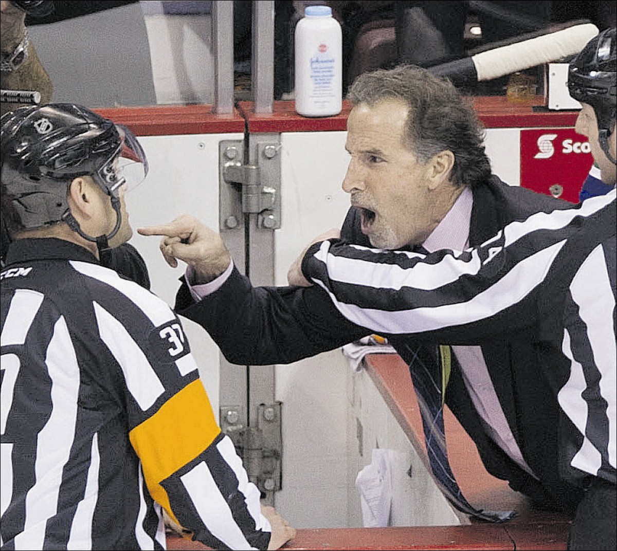
 No, I don’t mean “lose their head” like Tortorella on the refs, the Senators new brand should drop the senator head logo and instead use their alternate ‘O’ logo. The Senator head logo was great for its time, many teams in the 90’s used characters (the infamous Fisherman Gorton logo) to brand the NHL as a family entertainment venue. When the team made its return to the league, they used a two dimensional version of the senator head that worked (as opposed to what could have been). In 2007 the senator head was given some depth, keeping the design modern with the trends. But things continued to move forward and now the Senators need to take that step to improve on what they have.
The modern era of design has brought a more serious tone, depicting brand values in a more abstract manner, much like the Florida Panthers did with their recent rebrand. The Panthers old logo depicted a fierce cat with claws out and blood red eyes, an obvious depiction of the type of intensity they wanted their on-ice play to emulate. With the re-brand, they wanted to grow up, be taken more seriously. They accomplished this by giving the cat a more stern expression and establishing hierarchy to their uniform. The Senators need to learn a lesson from them. The senator head logo uses a facial expression and obvious depiction to convey their message. Switching to the “O” logo (which makes use of typeface selection, color scheme, and patterning) would bring a historical aesthetic to the branding.

What if…A third jersey became primary?
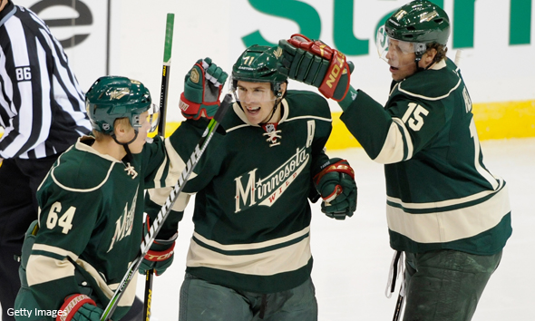
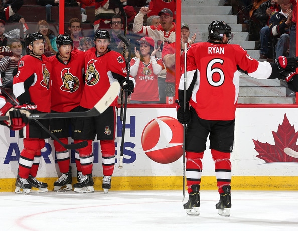
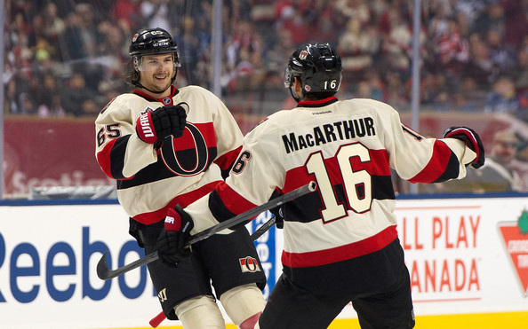
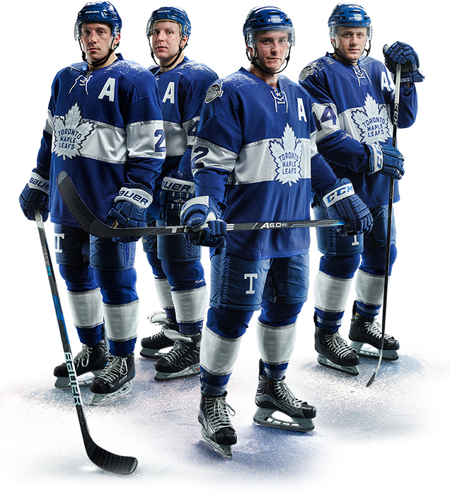
 Ottawa has fallen into the category of teams that have great third jerseys that should be used as their primary (I’m looking at you Minnesota). With alternate jerseys becoming testing grounds for uniform changes, it’s time for the Sens to ditch their red jerseys in favor of their black alternates and a white version of their Heritage Classic uniforms. With the release of the Maple Leafs Centennial classic uniforms, horizontal stripes through the center of the jersey have become the new trend (although Montreal did it before it was cool).
Hockey by Design ranked Ottawa’s third as the best jersey set the Senators have ever worn, read it here: Worst to First Jerseys: Ottawa Senators. In my opinion, a good hockey jersey displays the team’s logo, establishes a clear hierarchy of color and uses striping to create a pattern and enhance the branding. These alternate uniforms have been well received and hits all of these key points for a successful uniform.
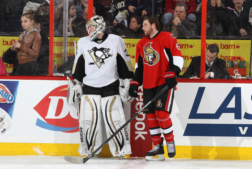
Their current uniform set features an uninteresting jersey design that was shared with the Pittsburgh Penguins until this year. I’ve already discussed the flaws in this jersey in the last What if…? Here’s a quick summary: No hierarchy of color. No pattern or striping.
• More: Worst to First Jerseys: Ottawa Senators (Redux)
• More: What If…Vegas Gold Lived On in Pittsburgh?
The Senators brand feels disconnected between its visual aesthetic and brand values but has so much potential to enforce a strong identity that boasts their rich history while keeping their style modern.
So what if the Senators changed their identity?
Agree? Disagree? Let us know in the comments or join the conversation Twitter, Facebook and Instagram! And if you’re interested, we’re now on Pinterest too.


If the Ottawa Senators actually did this, I’d like to see a red-and-cream alternate with no black except on the logo and numbers.
I’m not sure I know what you mean by “hierarchy of color”. You state that the Sens’ current red home uniform doesn’t establish this, but I’m not sure why. The jersey and socks are red with black and white accents, and the pants and helmet are black. Very similar to the Blackhawks or Devils. Clearly the heirarchy is red (primary), black/white (secondary). I don’t think the Sens’ current heritage third jersey establishes a heirarchy any more clearly; there is more red and cream on the jersey than their is black and white on the home jersey. Plus, the secondary logo uses red and black in exactly equal parts, making it hazy which color is primary.
All that said, I agree with you for the most part that the current third uniform and Heritage Classic uniforms would make a much stronger home and away combo. However, there are a few things I think need working out on these uniforms:
1. The cream–this color is extremely trendy and has been used on practically every throwback or fauxback alternate jersey in recent years. I don’t think this color being a part of the jerseys would withstand the test of time. On the other hand, I think both uniforms lose a lot of attractiveness when you replace the cream with white. It just doesn’t look as good.
2. The name/number font–I don’t think the big, chunky numbers and player names jive at all with the graceful, curved “O” on the front of the jersey. They look like a default block typeface that a small-time company would use on some directional college’s uniforms. The current home/road number set is a better choice, though it is very similar to the Copperplate currently used by Columbus.
Lastly, I think you do the team a disservice by ignoring the excellent and completely unused alternate logo the team released in 2007, which has been used by every amateur designer on their redesign concepts since:
http://www.sportslogos.net/logos/view/x8dxgo0eh0zensmq7icp/Ottawa_Senators/2008/Alternate_Logo
This is a far superior upgrade to the team’s original 1991 logo and its bizarrely sharp nose.
[…] also includes a nod to their original barber-pole stripes. It’s a great look, that we recently suggested could be their primary uniform, which is a testament to the strength of their original […]
[…] be the easiest decision Ottawa makes all season long, and it’s something we’ve also explored in length previously. That easily gives it top spot on this […]
[…] Source: Hockey By Design […]
We should change completly our logo and make it that we stick with that logo and never change it !!!
The Sens really need to change and get away from the centurion representing the name Senators. The only problem with this as the primary logo now is that they need to get a win in their first few games, or the endless taunting of the O and 4, O and 5, or even the O and 9 Sens will be merciless.
I don’t know man but I’m really digging the new uniforms that the Senators unveiled recently. I love the “Back to our roots” concept that they went with, turning back the clock for their 2D logo and then incorporating the “barbershop pole” striping on their sleeves really complete the heritage/throwback look for me and I think they definitely achieved the look of their on-going campaign that I read about on site. I like seeing the O logo from time to time but the white ones man, those white jerseys hit differently. Love the classic white/red/black color combo going on with the right amount of gold to top it all off, super clean!
I don’t know man but I’m really digging the new uniforms that the Senators unveiled recently. I love the “Back to our roots” concept that they went with, turning back the clock for their 2D logo and then incorporating the “barbershop pole” striping on their sleeves really complete the heritage/throwback look for me and I think they definitely achieved the look of their on-going campaign that I read about on this site. I like seeing the O logo from time to time but the white ones man, those white jerseys hit differently. Love the classic white/red/black color combo going on with the right amount of gold to top it all off, super clean!