Top 5: Canada’s Proudest Hockey Logos
This post is unabashedly Canadian. For that, I apologize. In fact, I’m very sorry for even putting together this post because, though Canada is often ranked as one of the best places to live on the planet, we’d rather not talk about it. If we can get in a humblebrag once in a while, we might take that, but we’ll probably apologize for it right afterwards. We’re very proud of our accomplishments in hockey, because other than making up odd names for our money and institutionalizing terrible coffee, there’s not too much more that Canada’s better than most of the world at.
But oddly (or perhaps not), our Canadians hockey teams don’t really express much Canadianism in their designs. Sure, Montreal has the Canadiens (French for ‘Canadians’) and Vancouver has the Canucks (slang for ‘Canadians’, similar to ‘Yankees’ in the States), and Ottawa has the ’67s (commemorating the 100-year anniversary of 1867, when Canada became a nation) but nothing in their logos have Canadian themes to them, either recently or historically. Our patriotism in these matters only goes so far, otherwise we’ll have to constantly apologize for being too patriotic. It makes you wonder who has/had the most Canadian of hockey logos?
So this Canada day, we’re looking at the logos in hockey (all hockey, not just NHL) that have the best amount of Canadiana in them. As is HbD fashion, we’ll pick the Top 5, worst to first, with a combination of good design and patriotism taken into account.
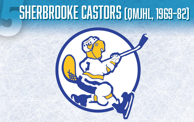
Ah, the noble beaver (ou “castor,” en français). Nothing says Canada like this giant rodent, featured on Canadian five cent coins. Give the rodent some skates and a stick, and baby, you’ve got a very Canadian stew goin’. The fact that the beaver is skating awkwardly and appears to be on the verge of falling over speaks to the humbleness of both the rodent and Canada in general.
But, holy Timbits, the colour palette is decidedly un-Canadian. The blue speaks more to Quebec (which is not necessarily unexpected, considering the team played in Sherbrooke, QC) than it does to Canada. It’s got an authentically classic aesthetic, but the Canadiana could be taken up a notch.
It’s also more of a cool, retro team crest than the second iteration of the Sherbrooke Castors (from 1998–2003) which featured a stylized beaver wearing a jersey featuring a logo similar to this one. Very meta.
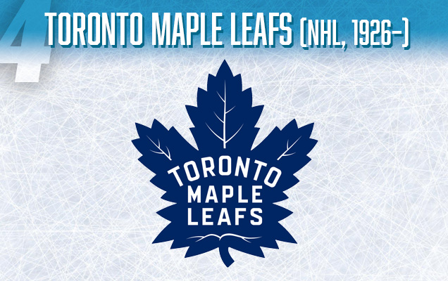
The Maple Leafs were an obvious inclusion in this list. The Canadian name (actually named after a regiment in the Canadian army from WWI – which is why it’s the ‘Leafs’ and not the ‘Leaves’, since it’s a proper noun) with the traditional symbol of Canada…in blue?
To be fair, Canada’s red maple leaf flag wasn’t introduced until 1965, before which Canada just used Britain’s Union Jack as the national flag. So the Maple Leafs have had this as they’re symbol long before it was ever a symbol of Canada, so it became very convenient that Canada’s largest city was using a quintessentially Canadian icon on a sport identified as Canadian.
But still, holy chesterfields, blue? I’ve seen green maples leaves, red ones, orange ones, yellow ones, and combinations of all of those colours on the same leaf, but I’ve never seen a blue one. Like hearing non-Canadians pronounce Nanaimo, it’s always a little bit strange. You know what I’m talking a-boot.
The concept of the Leafs logo has always been the consistent since 1926, but this latest version of the Maple Leafs logo is probably their best iteration, or at least, it has the most classic aesthetic to it.
• More: HbD Breakdown: Toronto Maple Leafs Logo
• More: BTLNHL #8: Toronto Maple Leafs

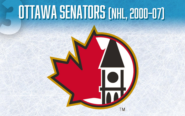
This alternate logo used by the Ottawa Senators from 2000–07 is probably the most “Canadian” logo on this list, with a big ole red maple leaf behind an illustration of the Peace Tower from the Canadian Parliament Buildings (Canada’s closest equivalent to the Capitol Building in Washington, DC), but holy Mounties, is it ever slapped together from a design perspective.
The maple leaf is fine and basically uses an extremely similar design to the leaf on the Canadian flag (minus the stem), but that Peace Tower looks like something thrown together in MS Paint, or found online for free in a last-ditch effort to put an alternate logo together in 5 minutes before the deadline. The structure of it below the clock (that big black circle) is technically incorrect, there’s four tall window, not two, and they’re not oval-shaped at all. The outline separating the roof from the rest of the structure is way thicker than the outline around the whole building for some reason. Then there’s the triple outline, yeesh!
Back to the leaf, it’s obvious that the other side of it would extend to the other side of the Peace Tower. Like most good things, it ends when it gets to Parliament.
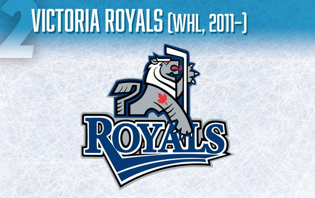
The Victoria Royals are a relatively new team, playing in the Western Hockey League (major junior) since 2011. If you don’t know of Victoria, BC, where the Royals play, it’s a very ‘British’ city, using the love of all things colonial to build up the tourism industry.
But holy Gordon Downie, for the most part, it works, with tourists coming in droves to ride British double-decker busses, see classic Victorian architecture and mistake Union Jacks as the Canadian flag. So, it’s no surprise the local hockey team is called the Royals and features a Victorian crested lion aesthetic. For all our constant desire to be seem as a strong, independent nation in the most politest way, the truth is, Canada’s not completely independent and is still part of the British Commonwealth. Queen Elizabeth is our queen, and her face graces almost all of our money. Prince Charles will one day be our king (probably). This logo celebrates our connection to the our mother country with the name and the lion logo, but with a maple leaf tattoo on its arm.
Little known fact, about 75% of Canadians have a maple leaf tattooed on their body somewhere. About 2% have it tattooed in a normally visible place. Quietly proud, us Canadians. Much like this Victoria Royals’ logo.
It’s not the best logo out there, being overly complex and with typeface choices sloppier than a gravy-saturated poutine, but the logo icon is pretty sweet and it’s the epitome of Canadiana.
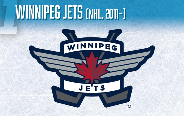
The Jets. The little team that exists because of pride and love. It’s the smallest market in the NHL with the smallest rink in the NHL with the most passionate fans. Why? Because it’s –40 (Fahrenheit and Celsius are the same at –40) there in the winter and +40 (104 Fahrenheit) in the summer with giant mosquitoes eating you. The hockey rink is the most inviting and normalized environment there is for a Winnipeger. They love their hockey, they love their Jets, and they love Canada.
And, holy Sandra Schmirler, their logo loves Canada right back. The one featured here is their alternate logo, worn as patches on their shoulders and, in terms of proud Canadian logos, is better than their primary logo which turns the maple leaf into something that be construed as a jet being destroyed in flames.
• More: BTLNHL #15: Winnipeg Jets
But the alternate logo makes no mistake as to the Canadian-ness of the logo. Here, the red maple leaf is like Ann Murray at a folk festival, the obvious headliner.
Winnipeg is also home to the Royal Canadian Air Force base, so the name and the wings in this logo represent the proud history of the Air Force, which include the world-famous Snowbirds. Or at least I think it’s world-famous. We Canadians like to think that everything uniquely Canadian is world-famous. Is it world-famous?
And although it’s got too many elements to be a really successful primary logo, it’s a sweet alternate logo that is unapologetically Canadian, show the leaf, our history and our sport.
So go pin that Canadian flag to your window, proudly display your stuffed beaver, and sing Gordon Lightfoot as loud as you can, and be a proud Canadian today.
Oh, am I singing too loudly? Sorry about that.
Agree? Disagree? Let us know in the comments below or join the conversation on Twitter, Facebook, or Instagram!


[…] on Hockey by Design, celebrating the 4th of July and all things ‘Merica. Yesterday’s Proudest Canadian Hockey Logos was a very-apologetically day late, so it’s fitting that the American version is a […]
The playoffs ARE the saseon for me. Now, if this were say 1920 s NFL football, that would be different. Back then, the champs were the team that finished first in the single-table league.The regular saseon is for entertainment and profit. Some teams make a profit by entertaining their fans with first-place finishes and little else, while other owners prefer making money by not spending theirs.In the end, it’s all about what the observer prefers. I think it’s a waste of time to get excited about the regular saseon since parity rules all sports nowadays, and (especially in the NHL) many positions are open for teams to qualify for the playoffs.
Now I’m like, well duh! Truly thankful for your help.
Liza, is this 4-6oz solids he is eating, or formula? If it’s solids, that’s more than enough! I wouldn’t worry if a 5 month old baby was not eating solids at all, and remember that milk is their main source of nutrition until 12 months.
I really enjoyed that one, as it’s full of fascinating facts and it’s a kind
of article. I spent just a couple of minutes studying, and
because of well-structured text, I understand it totally.
Thanks!
Hello, you used to write excellent, but the last few posts have been kinda boring… I miss your tremendous writings. Past few posts are just a little bit out of track! 온라인바카라사이트