
Worst to First Jerseys: Minnesota Wild
As we go through the prolonged 2019-20 season, we’ll be updating all of the Worst to First Jersey posts every Monday, as almost all the teams in the league have unveiled new jerseys since their original posts. We’ll start with the ones most needing updating and work our way through the league. Today, it’s time for the Minnesota Wild to get updated.
Also, a huge thanks to SportsLogos.net and NHLUniforms.com for most of the jersey images and references.
The Wild has secretly been developing one of the most underrated jersey sets in the league over the last decade, but Minnesota’s jersey history isn’t easily compartmentalized. Throughout their history, they’ve overlapped third-home-road jerseys: road jerseys replaced while the home jersey remained the same, third jerseys becoming home jerseys, etc. And often, their home-and-aways don’t even constitute a “set” of jerseys, with different aesthetics of their own. What’s a hockey blog countdown writer to do? Don’t worry, we’ll make it work.
(I should note too, this is a Wild-only countdown. You won’t find any North Stars jerseys here.)
Here’s how this works: I’ll count down, from worst to first, all the jerseys the Wild have ever worn. Homes and aways will be lumped into the same category (so, more of a jersey “era”) and I won’t worry about small changes (like slightly changed positions of piping for example). Third jerseys generally stand on their own. And I’m focusing on the jerseys only, not the entire uniform. And, as always, I have to thanks Chris Creamer and the good people at SportsLogos.net for the jersey images. For the Wild, there’s five different jerseys/eras. And we’ll start with the worst one:
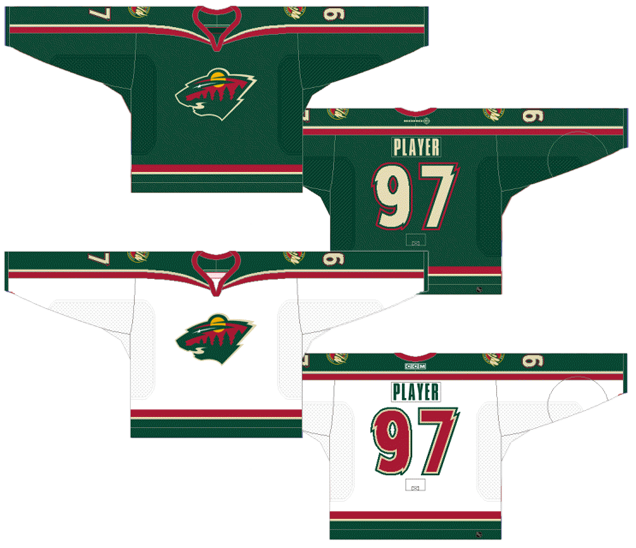
5. 2003–07 Third Jersey, 2007–17 Home Jersey

The worst jerseys the Wild have ever worn aren’t that bad per se, but when you’ve got a pretty solid grouping of jerseys in the library, the small errors and mis-steps get magnified. And like a plastic toy in the sun, the magnification burns these ones down.
First, it’s the jersey that most equally balances the red and green in their colour palette (especially with the green pants). And while the red-green combo is complementary, it’s also impossible to disassociate that combo from Christmas. And let’s be honest, the Wild haven’t always given the world the gift of exciting hockey. (Thanks a lot, Jacques LeScrooge). Plus, this is the only red jersey the Wild have worn despite having never changed their logo and colour palette during their existence, making it the black sheep of the family.
That’s not to say that the black sheep of any family is automatically worth less than the rest of the members, but the odd choices of the weirdly-shaped green upper shoulders mixed with an outlined shoulder yoke, inconsistent cream stripes/lines, and lack of any stripes on the bottom part of the jersey create an unbalanced combination of elements that are trying to be too modern in their approach and end up creating a disjointed jersey.
I’m also not crazy about the roundel logo. Not because roundel is becoming the overdone sports logo application, but because it diminishes the interesting and subtle details within the Wild’s primary logo.
• More: BTLNHL #16: Minnesota Wild
Jersey Recommendation: #22 Clutterbuck. There’s lots of Wild players from this era that could get on here, but really, I just like the name and I’d like to have an unusual jersey with the unusual name on there.
4. 2000–07 Home & Away Jerseys, 2007–13 Away Jersey
The Wild’s original jerseys are probably the most cohesive they’ve ever had, with repeating elements between the home and away jerseys so that they actually looks like a classic home and away set. Novel idea!
It even lasted a whole seven seasons (well, six, because lockout) before the home greens were replaced with the red jerseys in last place on this list. These get the nod above those because they’re much more representative of a classic hockey jersey with consistent striping on the sleeves/shoulders and along the bottom, along with a much better balance between green and red. But what keeps it in second-last is that – especially as we’ll see as we continue through this list – they played it too safe with them, and then mixed in some contemporary elements that just don’t jive together. As opposed to these two, who definitely jive together.
The straight cuff-to-cuff shoulder yoke is a classic jersey design, but specifically, it’s a very ’70s and ’80s jersey design. Teams still do these types of designs, but they’re either curved/tapered in some way, have more contemporary elements attached, or are broken up by other stripes, taking the emphasis off the long shoulder yoke. These Wild versions just looked dated as soon as they hit the ice.
But, then they combined that with more contemporary elements, like the jagged (sorry, I mean “wild”) player numbers and an ultra-condensed typeface on the nameplate. It’s a strange juxtaposition, combining these more contemporary elements with the very conservative striping. Still, it’s not a horrible jersey, especially as expansion team jerseys go, but there’s nothing incredibly memorable here either.
Jersey Recommendation: #10 Gaborik. The first ever draft pick for the Wild was the second-highest scorer for the Wild in their inaugural season, and quickly became the face of the franchise and its first superstar during their inaugural decade. Get it in the whites.

3. 2016 Stadium Series Jersey
There’s fifth place, fourth place, a massive chasm, and then very little space between third and first place. I’ve been saying for a while that the Wild have sneakily, and consistently, been delivering solid jersey designs since ditching their original jerseys for good. These 2018 jerseys are the best ones to be worn in a Stadium Series game, and still rank third on this list. But just barely.
• More: HbD Breakdown: Blackhawks and Wild Stadium Series Jerseys
• More: 2020 Stadium Series Jersey Countdown
It’s got the signature Stadium Series simplicity and bold stripes that the league demands for these event jerseys, but it all works harmoniously together. Remember, in design, more is not more, less is not more, ‘just enough’ is more. And these feel like they’re perfectly ‘just enough’ given the design concerns and constraints.
The red and cream stripes on the arm are thick, on-brand and consistent. They’re also far enough down the sleeve that there’s a comfortable amount of room for the uber-large numbers, which has the nice effect of – while they’re still obviously large – sitting on the jerseys without looking incredibly awkward.
The cream shoulder yokes are simple, logical (follow the hemlines and nicely squared-off) and are certainly prominent, but don’t take over the entire jersey. The balance between the dominant forest green with red and cream is pretty much perfect. Not enough red to make it look like a Christmas-themed uniform, and the cream provides a nice contrast to the green.
It’s simple, modern and perfectly balanced with all the distinctive elements of a Stadium Series jersey and elements unique to the Wild. Touchdown Minnesota. Get it? Stadium Series? Touchdown? Also, Minnesota scored 6 goals in the game, so, literally, a touchdown worth of points.
Jersey Recommendation: #40 Dubnyk. I like to give the goalies some love when I can, and Dubnyk allowed just 1 goal on 32 shots, so he deserves to sit on this goalie. Plus, the two best players in this game for the Wild (Pominville and Haula, each with a goal and two assists), well, aren’t around anymore.
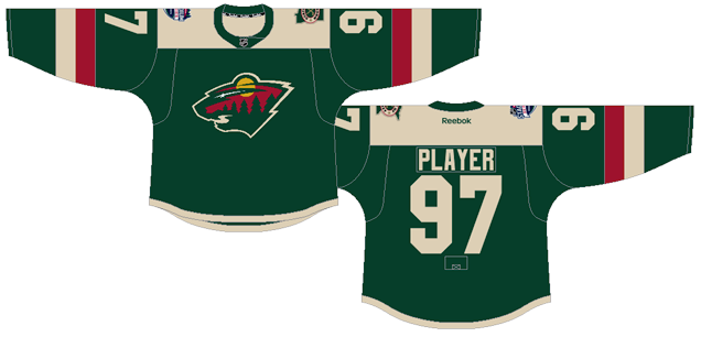
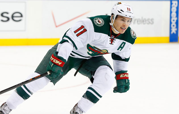
2. 2013–17 Away Jersey, 2017–present Home & Away Jerseys

The Wild’s current jersey set is a wonderful marriage of classic hockey jersey design and contemporary elements that also strike a great balance between the green and red colour palette, letting the red remain an accent colour to complement the forest green.
As a set, there’s obvious inconsistencies. The chest stripe only the home jerseys is one (although, nobody complains about the Habs jerseys). The striping on the bottom of the jerseys is another. But there also some subtle consistencies that make the Wild’s primary home and away jerseys work as a set…for the first time since 2007.
• More: HbD Breakdown: Minnesota Wild Home Jerseys
The sleeve stripes are deceptively identical in their structure. Deceptive because the pattern of the colours differ between the two jerseys, but what they chose compliments each jersey individually. The white middle stripe on the road jerseys keep the jersey looking clean, strong and minimalist. And because those jerseys already have red on the collar and numbers, there’s no need for the additional red accent. On the home greens, the red middle stripes adds some much needed accent colouring to the jersey, which would otherwise be pretty much devoid of any red.
The striping is consistent, but serves totally different purposes on the different jerseys. It’s really a clever and simple design.
When the road whites were first unveiled in 2013, I was a big fan of them (although there were bigger things to talk about that day), and I still am. The consistent and simple thick and thin striping on the jersey’s sleeves and bottom are what gives this jersey a historical nod while the shoulder yokes and font moves it into the modern and contemporary. They’re some of the best road jerseys in the league, and it’s nice that they brought in a home jersey to compliment it.
• More: HbD Breakdown: New Minnesota Wild and Buffalo Sabres Jerseys
Jersey Recommendation: #11 Parise. While Zach hasn’t exactly lit it up as some expected when he left New Jersey, the Minneapolis-native is obviously a hometown boy who is a leader (both on- and off-the-ice) on this team since he joined the Wild in 2012. Get it in the road whites.
1. 2009–17 Third Jersey
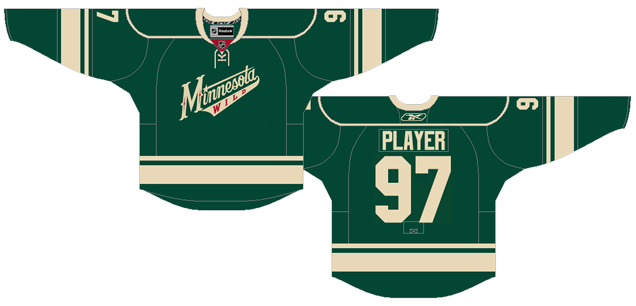
Do you know how rare it is for a third jersey to make the top of the list in these Worst to First articles? Wild-ly unusual. Ba-dum-tssssss.
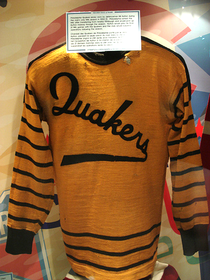
But Minnesota pulled it off with these beautiful jerseys. Like the previous jerseys, they’re such a great marriage of classic and contemporary jersey design aesthetics, and they throw in some faux-classic elements for good measure. That, of course, is the script type/logo crest. It’s the only jersey that has successfully pulled-off a script font since the Quakers, despite a few other teams trying and failing trying to do it for themselves.
Minnesota’s version has great style and exceptional lettering without trying to slap on the primary logo somewhere as an afterthought. Instead, they bring in the shooting star element from the logo and successfully integrate it into the new crest. It’s really nicely done.
The consistent and elegant thick/thin striping that we see in the current jersey set was born here, which is again, a great combination of historical and modern jersey design, looking old and yet different and new at the same time.
Two very small complaints: The outlined shoulder yoke is probably unnecessary, but it does keep the jersey from being too minimalist. Also, there’s not much red to balance out the dominance of green. But, third jerseys are always given a little bit of leeway as they’re meant to push the boundaries a little bit for what a jersey could be, so it’s not a deal breaker by any stretch.
These are just great jerseys, not just third jerseys: old, new, stylish, contemporary, classic, interesting, minimalist, and boundary-pushing. It’s about all you can ask for a great jersey to be.
Jersey Recommendation: #9 Koivu. He’s not the flashiest player, not the most exciting player, but he’s been an extremely consistent producer and leader for the last decade plus, becoming the face of the franchise in the process. One of the best leaders the Wild have had deserves to be on their best jersey.
Agree? Disagree? Let us know in the comments below or join the conversation on Twitter, Facebook, or Instagram!


[…] Ranking the Minnesota Wild‘s jerseys in franchise history. [Hockey By Design] […]
[…] Ranking the Minnesota Wild‘s jerseys in franchise history. [Hockey By Design] […]
[…] Ranking the Minnesota Wild‘s jerseys in franchise history. [Hockey By Design] […]
[…] Ranking the Minnesota Wild‘s jerseys in franchise history. [Hockey By Design] […]
[…] Ranking the Minnesota Wild‘s jerseys in franchise history. [Hockey By Design] […]
[…] Ranking the Minnesota Wild‘s jerseys in franchise history. [Hockey By Design] […]
[…] Ranking the Minnesota Wild‘s jerseys in franchise history. [Hockey By Design] […]
[…] Ranking the Minnesota Wild‘s jerseys in franchise history. [Hockey By Design] […]
[…] Ranking the Minnesota Wild‘s jerseys in franchise history. [Hockey By Design] […]
[…] Ranking the Minnesota Wild‘s jerseys in franchise history. [Hockey By Design] […]
[…] Ranking the Minnesota Wild‘s jerseys in franchise history. [Hockey By Design] […]
[…] Ranking the Minnesota Wild‘s jerseys in franchise history. [Hockey By Design] […]
[…] Ranking the Minnesota Wild‘s jerseys in franchise history. [Hockey By Design] […]
[…] Ranking the Minnesota Wild‘s jerseys in franchise history. [Hockey By Design] […]
[…] Ranking the Minnesota Wild‘s jerseys in franchise history. [Hockey By Design] […]
Im really not a fan of this third.
You said about the new third of the Canes. The logo need to be some king of somehow more like a square in term of space usage. All script jersey (except Quackers) have this problem they share with that awful ducks jersey. Leave it to the baseball shirt please.
At least with the Canes, you can have a bigger logo and i like that.
I see your point, but I think the Wild’s third jersey does a good job of keeping it as compact as possible. It’s definitely closer to a square in its shape than the Ducks’ old logo, or the Canes new thirds.
I’m with you. That jersey is so flat without the red to give it some pop. Their current set is a much better progression of that 3rd jersey.
[…] Ranking the Minnesota Wild‘s jerseys in franchise history. [Hockey By Design] […]
[…] Ranking the Minnesota Wild‘s jerseys in franchise history. [Hockey By Design] […]
[…] Rating the Minnesota Wild‘s jerseys in franchise historical past. [Hockey By Design] […]
[…] Ranking the Minnesota Wild‘s jerseys in franchise history. [Hockey By Design] […]